Folders
Files
DESCRIPTION
index.html
next_motif.gif
PACKAGES
previous_motif.gif
R-logo.gif
Simple_0.6.tar.gz
Simple_0.6.zip
simpleR.R
stat.html
stat001.gif
stat001.html
stat002.gif
stat002.html
stat003.gif
stat003.html
stat004.gif
stat004.html
stat005.gif
stat005.html
stat006.gif
stat006.html
stat007.gif
stat007.html
stat008.gif
stat008.html
stat009.gif
stat009.html
stat010.gif
stat010.html
stat011.gif
stat011.html
stat012.gif
stat012.html
stat013.gif
stat013.html
stat014.gif
stat014.html
stat015.gif
stat015.html
stat016.gif
stat016.html
stat017.gif
stat017.html
stat018.gif
stat018.html
stat019.gif
stat019.html
stat020.gif
stat020.html
stat021.gif
stat021.html
stat022.gif
stat022.html
stat023.gif
stat023.html
stat024.gif
stat024.html
stat025.gif
stat025.html
stat026.gif
stat026.html
stat027.gif
stat028.gif
stat029.gif
stat030.gif
stat031.gif
stat032.gif
stat033.gif
stat034.gif
stat035.gif
stat036.gif
stat037.gif
stat038.gif
stat039.gif
stat040.gif
stat041.gif
stat042.gif
stat043.gif
stat044.gif
stat045.gif
stat046.gif
stat047.gif
stat048.gif
stat049.gif
stat050.gif
stat051.gif
stat052.gif
stat053.gif
stat054.gif
stat055.gif
stat056.gif
stat057.gif
stat058.gif
stat059.gif


8 Exploratory Data Analysis
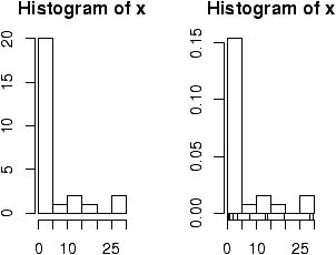
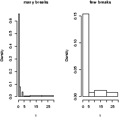
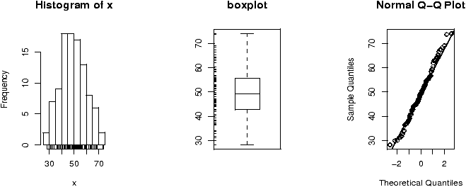
Experimental Data Analysis (eda) is the process of looking at a data set to see what are the appropriate statistical inferences that can possibly be learned. For univariate data, we can ask if the data is approximately normal, longer tailed, or shorter tailed? Does it have symmetry, or is it skewed? Is it unimodal, bimodal or multi-modal? The main tool is the proper use of computer graphics.8.1 Our toolbox
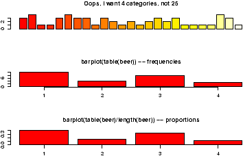
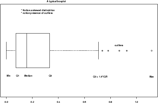
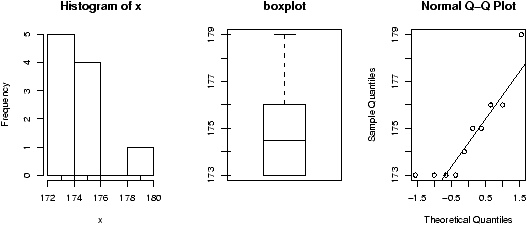
Our toolbox for eda consists of graphical representations of the data and our interpretation. Here is a summary of graphical methods covered so far:- barplots
- for categorical data
- histogram, dot plots, stem and leaf plots
- to see the shape of numerical distributions
- boxplots
- to see summaries of a numerical distribution, useful in comparing distributions and identifying long and short-tailed distributions.
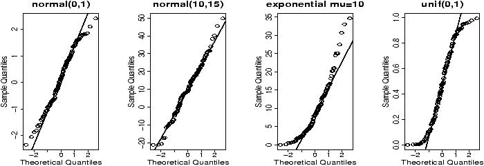
- normal probability plots
- To see if data is approximately normal
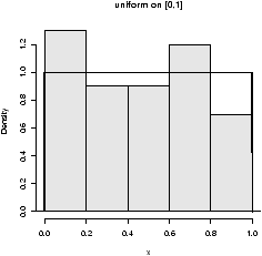
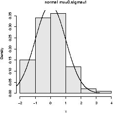
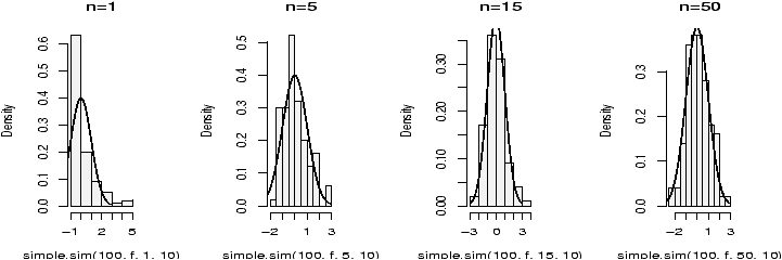
Here are some examples of distributions with different shapes.
8.2 Examples
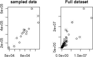
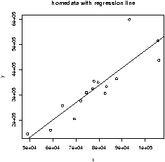
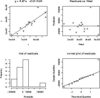
Example: Homedata
The dataset homedata contains assessed values for Maplewood, NJ for the year 1970 and the year 2000. What is the shape of the distribution?
The dataset homedata contains assessed values for Maplewood, NJ for the year 1970 and the year 2000. What is the shape of the distribution?
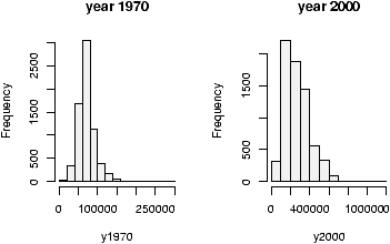
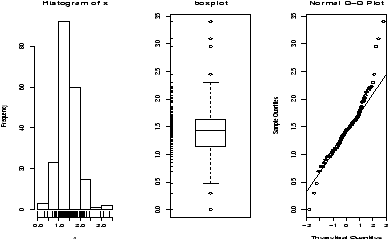
> data(homedata)                # from simple package
> attach(homedata)
> hist(y1970);hist(y2000)       # make two histograms
> detach(homedata)              # clean up
On first appearances (figure 35), the 1970 data looks more normal, the year 2000 data has a heavier tail. Let's see using our simple.eda function.
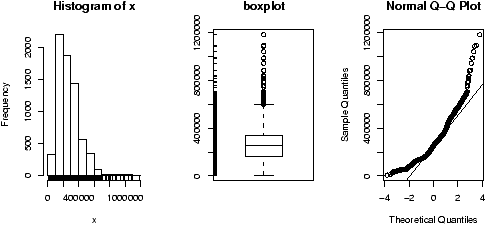
> attach(homedata)
> simple.eda(y1970);simple.eda(y2000)
> detach(homedata)              # clean up
The 1970 and year 2000 data are shown (figures 36 and 37).
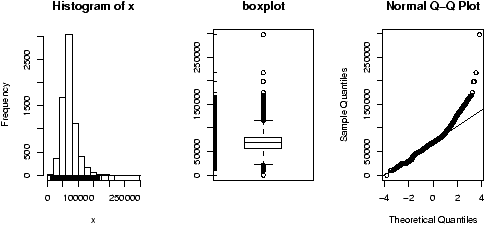
Neither looks particularly normal -- both are heavy tailed and skewed. Any analysis will want to consider the medians or a transformation.
Example: CEO salaries
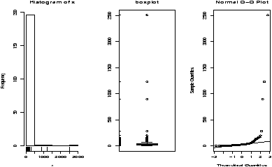
The data set exec.pay gives the total direct compensation for CEO's at 200 large publicly traded companies in the U.S for the year 2000 (in units of $100,000). What can we say about this distribution besides it looks like good work if you can get it? Using simple.eda yields
The data set exec.pay gives the total direct compensation for CEO's at 200 large publicly traded companies in the U.S for the year 2000 (in units of $100,000). What can we say about this distribution besides it looks like good work if you can get it? Using simple.eda yields
> data(exec.pay)                # or read in from file
> simple.eda(exec.pay)
we see a heavily skewed distribution as we might expect. A transformation is called for, let's try the logarithmic transformation (base 10). Since some values are 0 (these CEO's are directly compensated less than $100,000 or perhaps were forced to return all profits in a plea arrangement to stay out of jail), we ask not to include these.
> log.exec.pay = log(exec.pay[exec.pay >0])/log(10) # 0 is a problem
> simple.eda(log.exec.pay)
This is now very symmetric and gives good insight into the actual distribution. (Almost log normal, which says that after taking a logarithm, it looks like a normal.) Any analysis will want to use resistant measures such as the median or a transform prior to analysis.
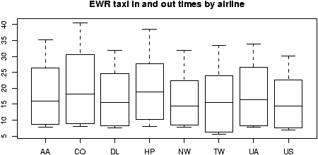
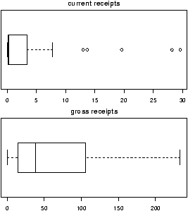
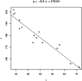
Example: Taxi time at EWR
The dataset ewr contains taxi in and taxi out times at Newark airport (EWR). Let's see what the trends are.
Notice the taxi in times are more or less symmetric with little variation (except for HP -- America West -- with a 10 minute plus average). The taxi out times have a heavy tail. At EWR, when the airport is busy, the planes can really backup and the 30 minute wait is not unusual. The data for Northwest (NW) seems to be less. We can compare this using statistical tests. Since the distributions are skewed, we may wish to compare the medians. (In general, be careful when applying statistical tests to summarized data.)
The dataset ewr contains taxi in and taxi out times at Newark airport (EWR). Let's see what the trends are.
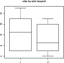
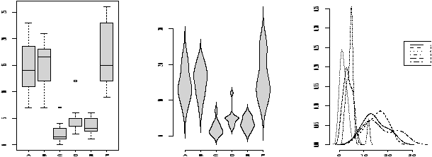
> data(ewr)
> names(ewr)                    # only 3-10 are raw data
 [1] "Year"    "Month"   "AA"      "CO"      "DL"      "HP"      "NW"
 [8] "TW"      "UA"      "US"      "inorout"
> airnames = names(ewr)         # store them for later
> ewr.actual = ewr[,3:10]       # get the important columns
> boxplot(ewr.actual)
All of them look skewed. Let's see if there is a difference between taxi in and out times.
> par(mfrow=c(2,4))             # 2 rows 4 columns
> attach(ewr)
> for(i in 3:10) boxplot(ewr[,i] ~ as.factor(inorout),main=airnames[i])
> detach(ewr)
> par(mfrow=c(1,1))             # return graphics as is (or close window)
(The third line is the only important one. Here we used the boxplot command with the model notation -- of the type boxplot(y ~ x) -- which when x is a factor, does separate boxplots for each level. The command as.factor ensures that the variable inorout is a factor. Also note, we used a for loop to show all 8 plots.
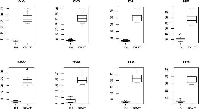
Notice the taxi in times are more or less symmetric with little variation (except for HP -- America West -- with a 10 minute plus average). The taxi out times have a heavy tail. At EWR, when the airport is busy, the planes can really backup and the 30 minute wait is not unusual. The data for Northwest (NW) seems to be less. We can compare this using statistical tests. Since the distributions are skewed, we may wish to compare the medians. (In general, be careful when applying statistical tests to summarized data.)
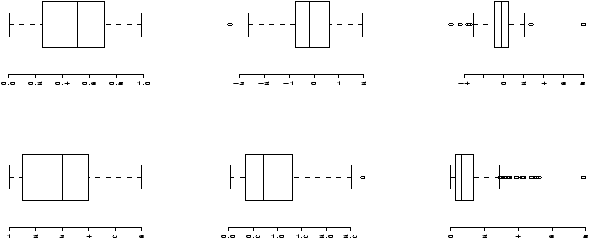
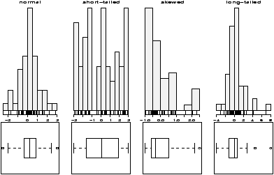
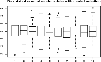
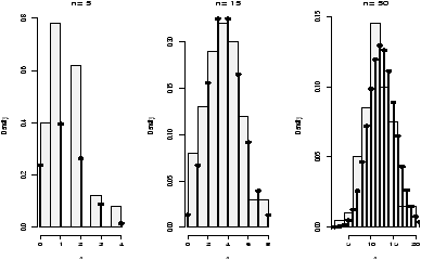
Example: Symmetric or skewed, Long or short?
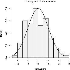
For unimodal data, there are 6 basic possibilities as it is symmetric or skewed, and the tails are short, regular or long. Here are some examples with random data from known distributions (figure 42).
For unimodal data, there are 6 basic possibilities as it is symmetric or skewed, and the tails are short, regular or long. Here are some examples with random data from known distributions (figure 42).
## symmetric: short, regular then long
> X=runif(100);boxplot(X,horizontal=T,bty=n)
> X=rnorm(100);boxplot(X,horizontal=T,bty=n)
> X=rt(100,2);boxplot(X,horizontal=T,bty=n)
## skewed:  short, regular then long
# triangle distribution
> X=sample(1:6,100,p=7-(1:6),replace=T);boxplot(X,horizontal=T,bty=n)
> X=abs(rnorm(200));boxplot(X,horizontal=T,bty=n)
> X=rexp(200);boxplot(X,horizontal=T,bty=n)
8.3 Problems
- 8.1
- Attach the data set babies . Describe the distributions of the variables birth weight (bwt), gestation, age, height and weight.
- 8.2
- The Simple data set iq contains simulated scores on a hypothetical IQ test. What analysis is appropriate for measuring the center of the distribution? Why? (Note: the data reads in as a list.)
- 8.3
- The Simple data set slc contains data on red blood cell sodium-lithium countertransport activity for 190 individuals. Describe the shape of the distribution, estimate the center, state what is an appropriate measure of center for this data.
- 8.4
- The t distribution will be important later. It depends on a parameter called the degrees of freedom. Use the rt(n,df) function to investigate the t-distribution for n=100 and df=2, 10 and 25.
- 8.5
- The c2 distribution also depends on a parameter called the degrees of freedom. Use the rchisq(n,df) function to investigate the c2 distribution with n=100 and df=2,10 and 25.
- 8.6
- The R dataset trees contains girth (diameter), height and volume (of boardfeet) measurements for several trees of a species of cherry tree. Describe the distributions of each of these 3 variables. Are any long tailed, short-tailed, skewed?
- 8.7
- The Simple dataset
dowdata
contains the Dow Jones
numbers from January 1999 to October 2000. The Black-Scholes theory
is modeled on the assumption that the changes in the data within a
day should be log normal. In particular, if Xn is the value on
day n then log(Xn/Xn-1) should be normal. Investigate this
as follows
> data(dowdata)
> x = dowdata[['Close']]        # look at daily closes
> n = length(x)                 # how big is x?
> z = log(x[2:n]/x[1:(n-1))     # This does X_n/X_(n-1)
Now check if z is normal. What do you see? - 8.8
- The children's game of Chutes and Ladders can be simulated easily
in R. The time it takes for a player to make it to the end has an
interesting distribution. To simulate the game, you can use the
Simple function simple.chutes as follows.
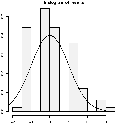
> results=c()
> for(i in 1:200) results[i]=length(simple.chutes(sim=TRUE))
> hist(results)
Describe the resulting distribution in words. What percentage of the time did it take more than 100 turns? What is the median and compare it to the mean of your sample.
To view a trajectory (the actual dice rolls), you can just plot as follows> plot(simple.chutes(1))
Copyright © John Verzani, 2001-2. All rights reserved.