Folders
Files
DESCRIPTION
index.html
next_motif.gif
PACKAGES
previous_motif.gif
R-logo.gif
Simple_0.6.tar.gz
Simple_0.6.zip
simpleR.R
stat.html
stat001.gif
stat001.html
stat002.gif
stat002.html
stat003.gif
stat003.html
stat004.gif
stat004.html
stat005.gif
stat005.html
stat006.gif
stat006.html
stat007.gif
stat007.html
stat008.gif
stat008.html
stat009.gif
stat009.html
stat010.gif
stat010.html
stat011.gif
stat011.html
stat012.gif
stat012.html
stat013.gif
stat013.html
stat014.gif
stat014.html
stat015.gif
stat015.html
stat016.gif
stat016.html
stat017.gif
stat017.html
stat018.gif
stat018.html
stat019.gif
stat019.html
stat020.gif
stat020.html
stat021.gif
stat021.html
stat022.gif
stat022.html
stat023.gif
stat023.html
stat024.gif
stat024.html
stat025.gif
stat025.html
stat026.gif
stat026.html
stat027.gif
stat028.gif
stat029.gif
stat030.gif
stat031.gif
stat032.gif
stat033.gif
stat034.gif
stat035.gif
stat036.gif
stat037.gif
stat038.gif
stat039.gif
stat040.gif
stat041.gif
stat042.gif
stat043.gif
stat044.gif
stat045.gif
stat046.gif
stat047.gif
stat048.gif
stat049.gif
stat050.gif
stat051.gif
stat052.gif
stat053.gif
stat054.gif
stat055.gif
stat056.gif
stat057.gif
stat058.gif
stat059.gif


5 Multivariate Data
Getting comfortable with viewing and manipulating multivariate data forces you to be organized about your data. R uses data frames to help organize big data sets and you should learn how to as well.5.1 Storing multivariate data in data frames
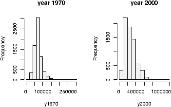
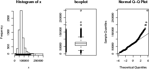
Often in statistics, data is presented in a tabular format similar to a spreadsheet. The columns are for different variables, and each row is a different measurement or variable for the same person or thing. For example, the dataset home which accompanies these notes contains two columns, the 1970 assessed value of a home and the year 2000 assessed value for the same home.R uses data frames to store these variables together and R has many shortcuts for using data stored this way.
If you are using a dataset which is built-in to R or comes from a spreadsheet or other data source, then chances are the data is available already as a data frame. To learn about importing outside data into R look at the ``Entering Data into R'' appendix and the document R Data Import/Export which accompanies the R software.
You can make your own data frames of course and may need to. To make data into a data frame you first need a data set that is an appropriate candidate: it will fit into a rectangular array. If so, then the data.frame command will do the work for you. As an example, suppose 4 people are asked three questions: their weight, height and gender and the data is entered into R as separate variables as follows:
> weight = c(150, 135, 210, 140)
> height = c(65, 61, 70, 65)
> gender = c("Fe","Fe","M","Fe")
> study = data.frame(weight,height,gender) # make the data frame
> study
  weight height gender
1    150     65     Fe
2    135     61     Fe
3    210     70      M
4    140     65     Fe
Notice, the columns inherit the variable names. Different names
are possible if desired. Try
> study = data.frame(w=weight,h=height,g=gender)
for example to shorten them.You can give the rows names as well. Suppose the subjects were Mary, Alice, Bob and Judy, then the row.names command will either list the row names or set them. Here is how to set them
> row.names(study)<-c("Mary","Alice","Bob","Judy")
The names command will give the column names and you can
also use this to adjust them.5.2 Accessing data in data frames
The study data frame has three variables. As before, these can be accessed individually after attaching the data frame to your R session with the attach command:> study weight height gender 1 150 65 Fe 2 135 61 Fe 3 210 70 M 4 140 65 Fe > rm(weight) # clean out an old copy > weight Error: Object "weight" not found > attach(study) > weight [1] 150 135 210 140However, attaching and detaching the data frame can be a chore if you want to access the data only once. Besides, if you attach the data frame, you can't readily make changes to the original data frame.
To access the data it helps to know that data frames can be thought of as lists or as arrays and accessed accordingly.
- To access as an array
-
An array is a way of storing data so that it can be accessed with a
row and column. Like a spreadsheet, only technically the entries
must all be of the same type and one can have more than rows and
columns.
Data frames are arrays as they have columns which are the variables and rows which are for the experimental unit. Thus we can access the data by specifying a row and a column. To access an array we use single brackets ([row,column]). In general there is a row and column we can access. By letting one be blank, we get the entire row or column. As an example these will get the weight variable> study[,'weight'] # all rows, just the weight column [1] 150 135 210 140 > study[,1] # all rows, just the first columnArray access allows us much more flexibility though. We can get both the weight and height by taking the first and second columns at once> study[,1:2] weight height Mary 150 65 Alice 135 61 Bob 210 70 Judy 140 65Or, we can get all of Mary's info by looking just at her row or just her weight if desired> study['Mary',] weight height gender Mary 150 65 Fe > study['Mary','weight'] [1] 150 - To access as a list
-
A list is a more general storage concept than a data frame. A
list is a set of objects, each of which can be any other
object. A data frame is a list, where the objects are the
columns as vectors.
To access a list, one uses either a dollar sign, $, or double brackets and a number or name. So for our study variable we can access the weight (the first column) as a list all of these ways> study$weight # using $ [1] 150 135 210 140 > study[['weight']] # using the name. > study[['w']] # unambiguous shortcuts are okay > study[[1]] # by position
> study[study$gender == 'Fe', ]  # use $ to access gender via a list
      weight height gender
Mary     150     65     Fe
Alice    135     61     Fe
Judy     140     65     Fe
5.3 Manipulating data frames: stack and unstack
In some instances, there are two different ways to store data. The data set PlantGrowth looks like> data(PlantGrowth) > PlantGrowth weight group 1 4.17 ctrl 2 5.58 ctrl 3 5.18 ctrl 4 6.11 ctrl ...There are 3 groups a control and two treatments. For each group, weights are recorded. The data is generated this way, by recording a weight and group for each plant. However, you may want to plot boxplots for the data broken down by their group. How to do this?
A brute force way is do as follows for each value of group
> attach(PlantGrowth)
> weight.ctrl = weight[group == "ctrl"]
This quickly grows tiresome. The unstack function will do this all at once for us. If the data is structured correctly, it will create a data frame with variables corresponding to the levels of the factor.
> unstack(PlantGrowth)
   ctrl trt1 trt2
1  4.17 4.81 6.31
2  5.58 4.17 5.12
3  5.18 4.41 5.54
4  6.11 3.59 5.50
...
Thus, to do a boxplot of the three groups, one could use this command
> boxplot(unstack(PlantGrowth))
5.4 Using R's model formula notation
The model formula notation that R uses allows this to be done in a systematic manner. It is a bit confusing to learn, but this flexible notation is used by most of R's more advanced functions.To illustrate, the above could be done by (if the data frame PlantGrowth is attached)
> boxplot(weight ~ group)What does this do? It breaks the weight variable down by values of the group factor and hands this off to the boxplot command. One should read the line weight ~ group as ``model weight by the variable group''. That is, break weight down by the values of group.
When there are two variables involved things are pretty straightforward. The response variable is on the left hand side and the predictor on the right:
response ~ predictor (when two variables).When there are more than two predictor variables things get a little confusing. In particular, the usual mathematical operators do not do what you may think. Here are a few different possibilities that will suffice for these notes.9
Suppose the variables are generically named Y, X1, X2
| formula | meaning |
| Y ~ X1 | Y is modeled by X1 |
| Y ~ X1 + X2 | Y is modeled by X1 and X2 as in multiple regression |
| Y ~ X1 * X2 | Y is modeled by X1, X2 and X1*X2 |
| (Y ~ (X1 + X2)^2) | Two-way interactions. Note usual powers |
| Y ~ X1+ I((X2^2) | Y is modeled by X1 and X22 |
| Y ~ X1 | X2 | Y is modeled by X1 conditioned on X2 |
5.5 Ways to view multivariate data
Now that we can store and access multivariate data, it is time to see the large number of ways to visualize the datasets.- n-way contingency tables
-
Two-way contingency tables were formed with the table
command and higher order ones are no exception. If w,x,y,z
are 4 variables, then the command table(x,y) creates a
two-way table, table(x,y,z) creates two-way tables x
versus y for each value of z. Finally
x,y,z,w will do the same for each combination of values of
z and w. If the variables are stored in a data frame,
say df then the command table(df) will behave as
above with each variable corresponding to a column in the given order.
To illustrate let's look at some relationships in the dataset Cars93 found in the MASS library.> library(MASS);data(Cars93);attach(Cars93) ## make some categorical variables using cut > price = cut(Price,c(0,12,20,max(Price))) > levels(price)=c("cheap","okay","expensive")) > mpg = cut(MPG.highway,c(0,20,30,max(MPG.highway))) > levels(mpg) = c("gas guzzler","okay","miser")) ## now look at the relationships > table(Type) Type Compact Large Midsize Small Sporty Van 16 11 22 21 14 9 > table(price,Type) Type price Compact Large Midsize Small Sporty Van cheap 3 0 0 18 1 0 okay 9 3 8 3 9 8 expensive 4 8 14 0 4 1 > table(price,Type,mpg) , , mpg = gas guzzler Type price Compact Large Midsize Small Sporty Van cheap 0 0 0 0 0 0 okay 0 0 0 0 0 2 expensive 0 0 0 0 0 0 ...See the commands xtabs and ftable for more sophisticated usages.
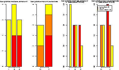
- barplots
- Recall, barplots work on summarized data. First you
need to run your data through the table command or something
similar. The barplot command plots each column as a variable
just like a data frame. The output of table when called with
two variables uses the first variable for the row. As before
barplots are stacked by default: use the argument
beside=TRUE to get side-by-side barplots.
> barplot(table(price,Type),beside=T) # the price by different types
> barplot(table(Type,price),beside=T) # type by different prices
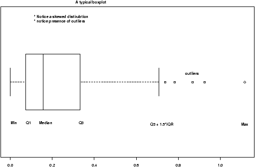
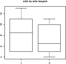
- boxplots
- The boxplot command is easily used for all the
types of data storage. The command boxplot(x,y,z) will
produce the side by side boxplots seen previously. As well, the
simpler usages boxplot(df) and boxplot(y ~ x)
will also work. The latter using the model formula notation.
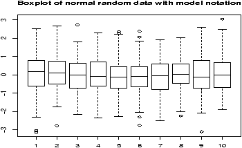
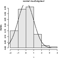
Example: Boxplot of samples of random data
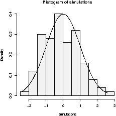
Here is an example, which will print out 10 boxplots of normal data with mean 0 and standard deviation 1. This uses the rnorm function to produce the random data.> y=rnorm(1000) # 1000 random numbers > f=factor(rep(1:10,100)) # the number 1,2...10 100 times > boxplot(y ~ f,main="Boxplot of normal random data with model notation")
Note the construction of f. It looks like 1 through 10 repeated 100 times to make a factor of the same length of x. When the model notation is used, the boxplot of the y data is done for each level of the factor f. That is, for each value of y when f is 1 and then 2 etc. until 10.
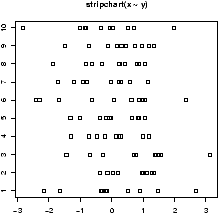
- stripcharts
- The side-by-side boxplots are useful for displaying
similar distributions for comparison -- especially if there is a lot
of data in each variable. The stripchart can do a similar
thing, and is useful if there isn't too much data. It plots the
actual data in a manner similar to rug which is used with
histograms. Both stripchart(df) and
stripchart(y ~ x) will work, but not
stripchart(x,y,z).
For example, as above, we will generate 10 sets of random normal numbers. Only this time each will contain only 10 random numbers.> x = rnorm(100) > y = factor(rep(1:10,10)) > stripchart(x ~ y)
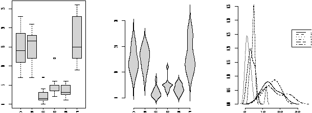
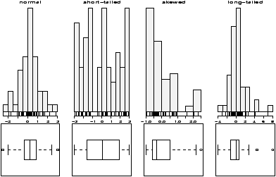
- violinplots and densityplots
- The functions simple.violinplot and simple.densityplot
can be used in place of side-by-side boxplots to compare
different distributions.
Both use the empirical density found by the density function to illustrate a variables distribution. The density may be thought of like a histogram, only there is much less ``chart junk'' (extra lines) so more can effectively be placed on the same graph.
A violinplot is very similar to a boxplot, only the box is replaced by a density which is given a mirror image for clarity. A densityplot plots several densities on the same scale. Multiple histograms would look really awful, but multiple densities are manageable.
As an illustration, we show for the same dataset all three in figure 20. The density plot looks a little crowded, but you can clearly see that there are two different types of distributions being considered here. Notice, that we use the functions in an identical manner to the boxplot.> par(mfrow=c(1,3)) # 3 graphs per page > data(InsectSprays) # load in the data > boxplot(count ~ spray, data = InsectSprays, col = "lightgray") > simple.violinplot(count ~ spray, data = InsectSprays, col = "lightgray") > simple.densityplot(count ~ spray, data = InsectSprays)
- scatterplots
- Suppose x is a predictor and both
y and z are response variables. If you want to plot
them on the same graph but with a different character you can do
so by setting the pch (plot character) command. Here is a
simple example
> plot(x,y)                     # simple scatterplot
> points(x,z,pch="2")           # plot these with a triangle
Notice, the second command is not plot but rather points which adds to the current plot unlike plot which draws a new plot.
Sometimes you have x and y data that is also broken down by a given factor. You may wish to plot a scatterplot of the x and y data, but use different plot characters for the different levels of the factors. This is usually pretty easy to do. We just need to use the levels of the factor to give the plotting character. These levels are store internally as numbers, and we use these for the value of pch
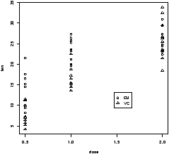
Example: Tooth growth
The built-in R dataset ToothGrowth has data from a study that measured tooth growth as a function of amount of Vitamin C. The source of the Vitamin C came from orange juice or a vitamin supplement. The scatterplot of dosage vs. length is given below. Notice the different plotting figures for the 2 levels of the factor of which type of vitamin C.> data("ToothGrowth") > attach(ToothGrowth) > plot(len ~ dose,pch=as.numeric(supp)) ## click mouse to add legend. > tmp = levels(supp) # store for a second > legend(locator(1),legend=tmp,pch=1:length(tmp)) > detach(ToothGrowth)
From the graph it appears that for all values of dose, the vitamin form (VC) was less effective.
Sometimes you want a to look at the distribution of x and the distribution of y and also look at their relationship with a scatterplot. (Not the case above, as the x distribution is trivial) This is easier if you can plot multiple graphs at once. This is implemented in the function simple.scatterplot (taken from the layout help page).
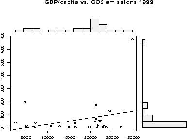
Example: GDP vs. CO2 emissions
The question of CO2 emissions is currently a ``hot'' topic due to their influence on the greenhouse effect. The dataset emissions contains data on the Gross Domestic Product and CO2 emissions for several European countries and the United States for the year 1999. A scatterplot of the data is interesting:> data(emissions) # or read in from dataset > attach(emissions) > simple.scatterplot(perCapita,CO2) > title("GDP/capita vs. CO2 emissions 1999") > detach(emissions)
Notice, with the additional information of this scatter plot, we can see that the distribution of GDP/capita is fairly spread out unlike the distribution of the CO2 emissions which has the lone outlier.
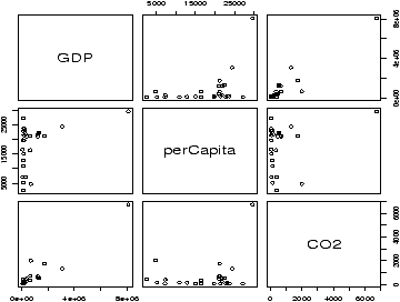
- paired scatterplots
- If the 3 variables hold numeric values,
then scatterplots are appropriate. The pairs command will
produce scatterplots for each possible pair. It can be used as
follows pairs(cbind(x,y,z)), pairs(df) or if in the
factor form pairs(data.frame(split(times,week))). Of these,
the easiest is if the data is in a data frame. If not, notice the
use of cbind which binds the variables together as columns.
(This is how data frames work.)
Figure 23 is an example using the same emissions data set. Can you spot the previous plot?> pairs(emissions)
The pairs command has many options to customize the graphs. The help page has two nice examples.
- others
- The Ggobi package and accompanying software, allows you to manipulate the data in the plot and do such things as brush data in one plot and have it highlighted in another.
5.6 The lattice package
The add-on package lattice implements the Trellis graphics concepts of Bill Cleveland. It and the accompanying grid package allow a different way to view multivariate data than described above. As of version 1.5.0 these are recommended packages but not part of the base version of R.Some useful graphs are easy to create and are shown below. Many other usages are possible. Both packages are well described in Volume 2/2 of the R News newsletter (http://cran.r-project.org/doc/Rnews)).
Let's use the data set Cars93 to illustrate. We assume this has been loaded, but not attached to illustrate the use of data = below.
The basic idea is that the graphic consists of a number of panels. Typically these correspond to some value of a conditioning variable. That is, a different graphic for each level of the factor used to condition, or if conditioning by a numeric variable for ``shingles'' which are ranges of the conditioning variable. The functions are called with the model formula notation. For univariate graphs such as histograms, the response variable, the left side, is empty. For bivariate graphs it is given. Notice below that the names for the functions are natural, yet different from the usual ones. For example, histogram is used instead of hist.
- histograms
- Histograms are univariate. The following command
shows a histogram of the maximum price conditioned on the number
of cylinders. Note the response variable is left blank.
> histogram( ~ Max.Price | Cylinders , data = Cars93) - Boxplots
- Boxplots are also univariate. Here is the same
information, only summarized using boxplots. The command is
bwplot.
> bwplot( ~ Max.Price | Cylinders , data = Cars93) - scatterplots
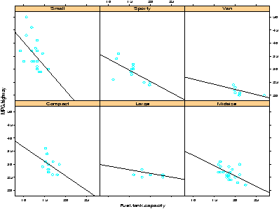
- Scatterplots are available as well. The function
is xyplot and not simply plot. As these are
bivariate a response variable is needed. The following will plot
the relationship between MPG and tank size. We expect that cars
with better mileage can have smaller tanks. This type of plot
allows us to check if it is the same for all types of cars.
> attach(Cars93)                 # don't need data = Cars93 now
> xyplot(MPG.highway ~ Fuel.tank.capacity | Type)
## plot with a regression line
## first define a regression line drawing function
> plot.regression = function(x,y) {
+ panel.xyplot(x,y)
+ panel.abline(lm(y~x))
+ }
> trellis.device(bg="white")    # set background to white.
> xyplot(MPG.highway ~ Fuel.tank.capacity | Type, panel = plot.regression)
This results in figure 24. Notice we can see some trends from the figure. The slope appears to become less steep as the size of the car increases.
Notice the trellis.device command setting the background color to white. The default colors are a bit dark. The figure drawn includes a regression line. This was achieved by specifying a function to create the panel. By default, the xyplot will use the panel.xyplot function to plot a scatterplot. To get more, we defined a function of x and y that plotted a scatterplot (again with panel.xyplot) and also added a regression line using panel.abline) and the lm function. Many more possibilities are possible.
5.7 Problems
- 5.1
- For the emissions dataset there is an outlier for the CO2 emissions. Find this value using identify and then redo the plot without this point.
- 5.2
- The Simple data set chips contains data on thickness of integrated chips. There are data for two chips, each measured at 4 different places. Create a side-by-side boxplot of the thickness for each place of measurement. (There should be 8 boxplots on the same graph). Do the means look the same? The variances?
- 5.3
- The Simple data set chicken contains weights of chickens who are given 1 of 3 different food rations. Create a boxplot of all 3 rations. Does there appear to be a difference in mean?
- 5.4
- The Simple data set
WeightData
contains information
on weights for children aged 0 to 144 months. Make a side-by-side
boxplot of the weights broken down by age in years. What kind of
trends do you see? (The variable age is in months. To
convert to years can be done using cut as follows
> age.yr = cut(age,seq(0,144,by=12),labels=0:11)
assuming the dataset has been attached.) - 5.5
- The Simple data set carbon contains carbon monoxide levels at 3 different industrial sites. The data has two variables: a carbon monoxide reading, and a factor variable to keep track of the site. Create side-by-side boxplots of the monoxide levels for each site. Does there appear to be a difference? How so?
- 5.6
- For the data set babies make a pairs plot (pairs(babies)) to investigate the relationships between the variables. Which variables seem to have a linear relationship? For the variables for birthweight and gestation make a scatter plot using different plotting characters (pch) depending on the level of the factor smoke.
Copyright © John Verzani, 2001-2. All rights reserved.