Folders
Files
DESCRIPTION
index.html
next_motif.gif
PACKAGES
previous_motif.gif
R-logo.gif
Simple_0.6.tar.gz
Simple_0.6.zip
simpleR.R
stat.html
stat001.gif
stat001.html
stat002.gif
stat002.html
stat003.gif
stat003.html
stat004.gif
stat004.html
stat005.gif
stat005.html
stat006.gif
stat006.html
stat007.gif
stat007.html
stat008.gif
stat008.html
stat009.gif
stat009.html
stat010.gif
stat010.html
stat011.gif
stat011.html
stat012.gif
stat012.html
stat013.gif
stat013.html
stat014.gif
stat014.html
stat015.gif
stat015.html
stat016.gif
stat016.html
stat017.gif
stat017.html
stat018.gif
stat018.html
stat019.gif
stat019.html
stat020.gif
stat020.html
stat021.gif
stat021.html
stat022.gif
stat022.html
stat023.gif
stat023.html
stat024.gif
stat024.html
stat025.gif
stat025.html
stat026.gif
stat026.html
stat027.gif
stat028.gif
stat029.gif
stat030.gif
stat031.gif
stat032.gif
stat033.gif
stat034.gif
stat035.gif
stat036.gif
stat037.gif
stat038.gif
stat039.gif
stat040.gif
stat041.gif
stat042.gif
stat043.gif
stat044.gif
stat045.gif
stat046.gif
stat047.gif
stat048.gif
stat049.gif
stat050.gif
stat051.gif
stat052.gif
stat053.gif
stat054.gif
stat055.gif
stat056.gif
stat057.gif
stat058.gif
stat059.gif


7 Simulations
The ability to simulate different types of random data allows the user to perform experiments and answer questions in a rapid manner. It is a very useful skill to have, but is admittedly hard to learn.As we have seen, R has many functions for generating random numbers. For these random numbers, we can view the distribution using histograms and other tools. What we want to do now, is generate new types of random numbers and investigate what distribution they have.
7.1 The central limit theorem
To start, the most important example is the central limit theorem (CLT). This states that if Xi are drawn independently from a population where � and s are known, then the standardized average
|
| ( | n | ) |
|
How can we check this? Simulation is an excellent way.
Let's first do this for the binomial distribution, the CLT translates into saying that if Sn has a binomial distribution with parameters n and p then
|
Let's investigate. How can we use R to create one of these random numbers?
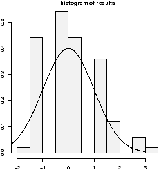
> n=10;p=.25;S= rbinom(1,n,p)
> (S - n*p)/sqrt(n*p*(1-p))
[1] -0.3651484
But that is only one of these random numbers. We really want lots of them to see their distribution. How can we create 100 of them? For this example, it is easy -- we just take more samples in the rbinom function
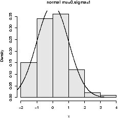
> n = 10;p = .25;S = rbinom(100,n,p)
> X = (S - n*p)/sqrt(n*p*(1-p)) # has 100 random numbers
The variable X has our results, and we can view the distribution of the random numbers in X with a histogram
> hist(X,prob=T)
The results look approximately normal (figure 31). That is, bell shaped, centered at 0 and with standard deviation of 1. (Of course, this data is discrete so it can't be perfect.)
7.2 For loops
In general, the mechanism to create the 100 random numbers, may not be so simple and we may need to create them one at a time. How to generate lots of these? We'll use ``for'' loops which may be familiar from a previous computer class, although other R users might use apply or other tricks. The R command for iterates over some specified set of values such as the numbers 1 through 100. We then need to store the results somewhere. This is done using a vector and assigning each of its values one at a time.Here is the same example using for loops:
> results =numeric(0)          # a place to store the results
> for (i in 1:100) {           # the for loop
+ S = rbinom(1,n,p)            # just 1 this time
+ results[i]=(S- n*p)/sqrt(n*p*(1-p)) # store the answer
+ }
We create a variable results which will store our answers. Then for
each i between 1 and 100, it creates a random number (a new one each
time!) and stores it in the vector results as the ith entry.
We can view the results with a histogram: hist(results).
R Basics: Syntax for for
A ``for'' loop has a simple syntax:
A ``for'' loop has a simple syntax:
for(variable in vector) { command(s) }The braces are optional if there is only one command. The variable changes for each loop. Here are some examples to try
> primes=c(2,3,5,7,11);
## loop over indices of primes with this
> for(i in 1:5) print(primes[i])
## or better, loop directly
> for(i in primes) print(i)
Example: CLT with normal data
The CLT also works for normals (where the distribution is actually normal). Let's see with an example. We will let the Xi be normal with mean �=5 and standard deviation s=5. Then we need a function to find the value of
As above a for loop may be used
The CLT also works for normals (where the distribution is actually normal). Let's see with an example. We will let the Xi be normal with mean �=5 and standard deviation s=5. Then we need a function to find the value of
|
= |
|
=(mean(X) - mu)/(sigma/sqrt(n)) |
As above a for loop may be used
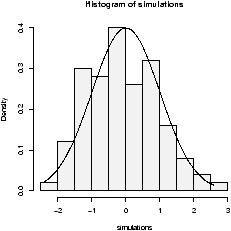
> results = c();
> mu = 0; sigma = 1
> for(i in 1:200) {
+ X = rnorm(100,mu,sigma)       # generate random data
+ results[i] = (mean(X) - mu)/(sigma/sqrt(100))
+ }
> hist(results,prob=T)
Notice the histogram indicates the data is approximately normal
(figure 32).
7.3 Normal plots
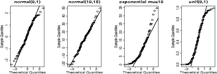
A better plot than the histogram for deciding if random data is approximately normal is the so called ``normal probability'' plot. The basic idea is to graph the quantiles of your data against the corresponding quantiles of the normal distribution. The quantiles of a data set are like the Median and Q1 and Q3 only more general. The q quantile is the value in the data where q*100% of the data is smaller. So the 0.25 quantile is Q1, the 0.5 quantile is the median and the 0.75 quantile is Q3. The quantiles for the theoretical distribution are similar, only instead of the number of data points less, it is the area to the left that is the specified amount. For example, the median splits the area beneath the density curve in half.The normal probability graph is easy to read -- if you know how. Essentially, if the graph looks like a straight line then the data is approximately normal. Any curve can tell you that the distribution has short or long tails. It is not a regression line. The line is drawn through points formed by the first and third quantiles.
R makes all this easy to do with the functions qqnorm (more generally qqplot) and qqline which draws a reference line (not a regression line).
This is what the graphs look like for some sample data (figure 33). Notice the first two should look like straight lines (and do), the second two shouldn't (and don't).
> x = rnorm(100,0,1);qqnorm(x,main='normal(0,1)');qqline(x)
> x = rnorm(100,10,15);qqnorm(x,main='normal(10,15)');qqline(x)
> x = rexp(100,1/10);qqnorm(x,main='exponential mu=10');qqline(x)
> x = runif(100,0,1);qqnorm(x,main='unif(0,1)');qqline(x)
7.4 Using simple.sim and functions
This section shows how to write functions and how to use them with simple.sim. This is a little more complicated than most of the material in these notes and can be avoided if desired.For purposes of simulation, it would be nice not to have to write a for loop each time. The function simple.sim is a function which does just that. You need to write a function that generates one of your random numbers, and then give it to simple.sim.
For example in checking the CLT for binomial data we needed to generate a single random number distributed as a standardized binomial number. A function to do so is:
> f = function () {
+ S = rbinom(1,n,p)
+ (S- n*p)/sqrt(n*p*(1-p))
+ }
With this function, we could use simple.sim like this:> x=simple.sim(100,f) > hist(x)This replaces the need to write a ``for loop'' and also makes the simulations consistent looking. Once you've written the function to create a single random number the rest is easy.
While we are at it, we should learn the "right" way to write functions. We should be able to modify n the number of trials and p the success probability in our function. So f is better defined as
> f = function(n=100,p=.5) {
+ S = rbinom(1,n,p)
+ (S- n*p)/sqrt(n*p*(1-p))
+ }
The format for the variable is n=100 this says that n
is the first variable given to the function, by default it is 100, p
is the second by default it is p=.5. Now we would call
simple.sim as> simple.sim(1000,f,100,.5)So the trick is to learn how to write functions to create a single number. The appendix contains more details on writing functions. For immediate purposes the important things to know are
-
Functions have a special keyword function as in
> the.range = function (x) max(x) - min(x)
which returns the range of the vector x. (Already available with range.) This tells R that the.range is a function, and its arguments are in the braces. In this case (x). - If a function is a little more complicated and requires multiple
commands you use braces (like a for loop). The
last value computed is returned. This example finds the IQR based
on the lower and upper hinges and not the quantiles.
It uses the results of the fivenum command to get the hinges
> find.IQR = function(x) {
+ five.num = fivenum(x)         # for Tukey's summary
+ five.num[4] - five.num[2]
+ }
The plus sign indicates a new line and is generated by R -- you do not need to type it. (The five number summary is 5 numbers: the minimum, the lower hinges, the median, the upper hinge, and the maximum. This function subtracts the second from the fourth.) - A function is called by its name and with
parentheses. For example
> x = rnorm(100)               # some sample data
> find.IQR                     # oops! no argument. Prints definition.
function(x) {
five.num = fivenum(x)
five.num[4] - five.num[2]
}
> find.IQR(x)                  # this is better
[1] 1.539286
Example: A function to sum normal numbers
To find the standardized sum of 100 normal(0,1) numbers we could use
To find the standardized sum of 100 normal(0,1) numbers we could use
> f = function(n=100,mu=0,sigma=1) {
+ nos = rnorm(n,mu,sigma)
+ (mean(nos)-mu)/(sigma/sqrt(n))
+ }
Then we could use simple.sim as follows
> simulations = simple.sim(100,f,100,5,5)
> hist(simulations,breaks=10,prob=TRUE)
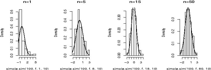
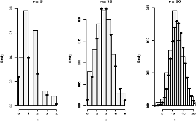
Example: CLT with exponential data
Let's do one more example. Suppose we start with a skewed distribution, the central limit theorem says that the average will eventually look normal. That is, it is approximately normal for large n. What does ``eventually'' mean? What does ``large'' mean? We can get an idea through simulation.
A example of a skewed distribution is the exponential. We need to know if it has mean 10, then the standard deviation is also 10, so we only need to specify the mean. Here is a function to create a single standardized average (note that the exponential distribution has theoretical standard deviation equal to its mean)
> f = function(n=100,mu=10) (mean(rexp(n,1/mu))-mu)/(mu/sqrt(n))Now we simulate for various values of n. For each of these m=100 (the number of random numbers generated), but n varies from 1,5,15 and 50 (the number of random numbers in each of our averages).
> xvals = seq(-3,3,.01) # for the density plot
> hist(simple.sim(100,f,1,10),probability=TRUE,main="n=1",col=gray(.95))
> points(xvals,dnorm(xvals,0,1),type="l") # plot normal curve
  ... repeat for n=5,15,50
The histogram becomes very bell shaped between n=15 and n=50, although even at n=50 it appears to still be a little skewed.
7.5 Problems
- 7.1
- Do two simulations of a binomial number with n=100 and p=.5. Do you get the same results each time? What is different? What is similar?
- 7.2
- Do a simulation of the normal two times. Once with n=10, �=10 and s=10, the other with n=10, � = 100 and s=100. How are they different? How are they similar? Are both approximately normal?
- 7.3
- The Bernoulli example is also skewed when p is not .5. Do an example with n=100 and p=.25, p=.05 and p=.01. Is the data approximately normal in each case? The rule of thumb is that it will be approximately normal when np�5 and n(1-p)�5. Does this hold?
- 7.4
- The normal plot is a fancy way of checking if the distribution
looks normal. A more primitive one is to check the rule of thumb
that 68% of the data is 1 standard deviation from the mean, 95% within 2
standard deviations and
99.8% within 3 standard deviations.
Create 100 random numbers when the Xi are normal with mean 0 and standard deviation 1. What percent are within 1 standard deviation of the the mean? Two standard deviations, 3 standard deviations? Is your data consistent with the normal?
(Hint: The data is supposed to have mean 0 and variance 1. To check for 1 standard deviation we can do
> k = 1;sigma = 1
> n = length(x)
> sum( -k*sigma <x & x< k*sigma)/n
Read the & as "and" and this reads as -- after simplification-- ``-1 less than x and x less than 1''. This is the same as P(-1<x<1).)
- 7.5
- It is interesting to graph the distribution of the standardized
average as n increases. Do
this when the Xi are uniform on [0,1].
Look at the histogram when n is 1, 5, 10 and 25. Do you see the
normal curve taking shape?
(A rule of thumb is that if the Xi are not too skewed, then n>25 should make the average approximately normal. You might want> f=function(n,a=0,b=1) { mu=(b+a)/2 sigma=(b-a)/sqrt(12) (mean(runif(n,a,b))-mu)/(sigma/sqrt(n)) }where the formulas for the mean and standard deviation are given. )
- 7.6
- A home movie can be made by automatically showing a sequence of
graphs. The system function System.sleep can insert a pause between
frames. This will show a histogram of the sampling distribution for
increasingly large n
> for (n in 1:50) {
+ results = c()
+ mu = 10;sigma = mu
+ for(i in 1:200) {
+ X = rexp(200,1/mu)
+ results[i] = (mean(X)-mu)/(sigma/sqrt(n))
+ }
+ hist(results)
+ Sys.sleep(.1)
+ }
Run this code and take a look at the movie. To rerun, you can save these lines into a function or simply use the up arrow to recall the previous set of lines. What do you see? - 7.7
- Make normal graphs for the following random distributions. Which of
them (if any) are approximately normal?
- rt(100,4)
- rt(100,50)
- rchisq(100,4)
- rchisq(100,50)
- 7.8
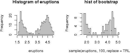
- The bootstrap technique simulates based on sampling from the
data. For example, the following function will find the median of a
bootstrap sample.
> bootstrap=function(data,n=length(data)) {
+  boot.sample=sample(data,n,replace=TRUE)
+  median(boot.sample)
+ }
Let the data be from the built in data set faithful. What does the distribution of the bootstrap for the median look like? Is it normal? Use the command:> simple.sim(100,bootstrap,faithful[['eruptions']])
- 7.9
- Depending on the type of data, there are advantages to the mean
or the median. Here is one way to compare the two when the data is
normally distributed
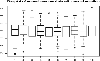
> res.median=c();res.mean=c() # initialize
> for(i in 1:200) {             # create 200 random samples
+ X = rnorm(200,0,1)
+ res.median[i] = median(X);res.mean[i] = mean(X)
+ }
> boxplot(res.mean,res.median)  # compare
Run this code. What are the differences? Try, the same experiment with a long tailed distribution such as X = rt(200,2). Is there a difference? Explain. - 7.10
- In mathematical statistics, there are many possible estimates
for the center of a data set. To choose between them, the one with
the smallest variance is often taken. This variance depends upon the
population distribution. Here we investigate the ratio of the
variances for the mean and the median for different distributions.
For normal(0,1) data we can check with
> median.normal = function(n=100) median(rnorm(100,0,1))
> mean.normal = function(n=100) mean(rnorm(100,0,1))
> var(simple.sim(100,mean.normal)) /
+ var(simple.sim(100,median.normal))
[1] 0.8630587
The answer is a random number which will usually be less than 1. This says that usually the variance of the mean is less than the variance of the median for normal data. Repeat using the exponential instead of the normal. For example:> mean.exp = function(n=100) mean(rexp(n,1/10)) > median.exp = function(n=100) median(rexp(n,1/10))
and the t-distribution with 2 degrees of freedom> mean.t = function(n=100) mean(rt(n,2)) > median.t = function(n=100) median(rt(n,2))
Is the mean always better than the median? You may also find that side-by-side boxplots of the results of simple.sim are informative.
Copyright © John Verzani, 2001-2. All rights reserved.