Folders
Files
DESCRIPTION
index.html
next_motif.gif
PACKAGES
previous_motif.gif
R-logo.gif
Simple_0.6.tar.gz
Simple_0.6.zip
simpleR.R
stat.html
stat001.gif
stat001.html
stat002.gif
stat002.html
stat003.gif
stat003.html
stat004.gif
stat004.html
stat005.gif
stat005.html
stat006.gif
stat006.html
stat007.gif
stat007.html
stat008.gif
stat008.html
stat009.gif
stat009.html
stat010.gif
stat010.html
stat011.gif
stat011.html
stat012.gif
stat012.html
stat013.gif
stat013.html
stat014.gif
stat014.html
stat015.gif
stat015.html
stat016.gif
stat016.html
stat017.gif
stat017.html
stat018.gif
stat018.html
stat019.gif
stat019.html
stat020.gif
stat020.html
stat021.gif
stat021.html
stat022.gif
stat022.html
stat023.gif
stat023.html
stat024.gif
stat024.html
stat025.gif
stat025.html
stat026.gif
stat026.html
stat027.gif
stat028.gif
stat029.gif
stat030.gif
stat031.gif
stat032.gif
stat033.gif
stat034.gif
stat035.gif
stat036.gif
stat037.gif
stat038.gif
stat039.gif
stat040.gif
stat041.gif
stat042.gif
stat043.gif
stat044.gif
stat045.gif
stat046.gif
stat047.gif
stat048.gif
stat049.gif
stat050.gif
stat051.gif
stat052.gif
stat053.gif
stat054.gif
stat055.gif
stat056.gif
stat057.gif
stat058.gif
stat059.gif


4 Bivariate Data
The relationship between 2 variables is often of interest. For example, are height and weight related? Are age and heart rate related? Are income and taxes paid related? Is a new drug better than an old drug? Does a batter hit better as a switch hitter or not? Does the weather depend on the previous days weather? Exploring and summarizing such relationships is the current goal.4.1 Handling bivariate categorical data
The table command will summarize bivariate data in a similar manner as it summarized univariate data.Suppose a student survey is done to evaluate if students who smoke study less. The data recorded is
We can handle this in R by creating two vectors to hold our data, and then using the table command.
Person Smokes amount of Studying 1 Y less than 5 hours 2 N 5 - 10 hours 3 N 5 - 10 hours 4 Y more than 10 hours 5 N more than 10 hours 6 Y less than 5 hours 7 Y 5 - 10 hours 8 Y less than 5 hours 9 N more than 5 hours 10 Y 5 - 10 hours
> smokes = c("Y","N","N","Y","N","Y","Y","Y","N","Y")
> amount = c(1,2,2,3,3,1,2,1,3,2)
> table(smokes,amount)
      amount
smokes 1 2 3
     N 0 2 2
     Y 3 2 1
We see that there may be some relationship7What would be nice to have are the marginal totals and the proportions. For example, what proportion of smokers study 5 hours or less. We know that this is 3 /(3+2+1) = 1/2, but how can we do this in R?
The command prop.table will compute this for us. It needs to be told the table to work on, and a number to indicate if you want the row proportions (a 1) or the column proportions (a 2) the default is to just find proportions.
> tmp=table(smokes,amount)      # store the table
> old.digits = options("digits") # store the number of digits
> options(digits=3)             # only print 3 decimal places
> prop.table(tmp,1)             # the rows sum to 1 now
      amount
smokes   1     2     3
     N 0.0 0.500 0.500
     Y 0.5 0.333 0.167
> prop.table(tmp,2)             # the columns sum to 1 now
      amount
smokes 1   2     3
     N 0 0.5 0.667
     Y 1 0.5 0.333
> prop.table(tmp)
      amount                    # all the numbers sum to 1
smokes   1   2   3
     N 0.0 0.2 0.2
     Y 0.3 0.2 0.1
> options(digits=old.digits)    # restore the number of digits
4.2 Plotting tabular data
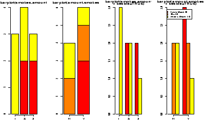
You might wish to graphically represent the data summarized in a table. For the smoking example, you could plot the amount variable for each of No or Yes, or the No and Yes variable for each level of smoking. In either case, you can use a barplot. We simply call it in the appropriate manner.
> barplot(table(smokes,amount))
> barplot(table(amount,smokes))
> smokes=factor(smokes)        # for names
> barplot(table(smokes,amount),
+ beside=TRUE,                  # put beside not stacked
+ legend.text=T)   # add legend
>
> barplot(table(amount,smokes),main="table(amount,smokes)",
+ beside=TRUE,
+ legend.text=c("less than 5","5-10","more than 10"))
Notice in figure 10 the importance of order when making the table. Essentially, barplot plots each row of data. It can do it in a stacked manner (the default), or besides (by setting beside=TRUE). The attribute legend.text adds the legend to the graph. You can change the names, but the default of legend.text=T is easiest if you have a factor labeling the rows of the table command.
Some Extra Insight: Conditional proportions
You may also want to know about the conditional proportions. For example, among the smokers what are the proportions. To answer this, we need to divide the second row by 6. One or two rows is easy to do by hand, but how do we automate the work? The function apply will apply a function to rows or columns of a matrix. In this case, we need a function to find the proportions of a vector. This is as easy as
You may also want to know about the conditional proportions. For example, among the smokers what are the proportions. To answer this, we need to divide the second row by 6. One or two rows is easy to do by hand, but how do we automate the work? The function apply will apply a function to rows or columns of a matrix. In this case, we need a function to find the proportions of a vector. This is as easy as
> prop = function(x) x/sum(x)To apply this function to the matrix x is easy. First the columns (index 2) are done by
> apply(x,2,prop)
   amount
    1   2         3
  N 0 0.5 0.6666667
  Y 1 0.5 0.3333333
Index 1 is for the rows, however, we need to
use the transpose function, t() to make the result look right.
> t(apply(x,1,prop))

smokes   1         2         3
     N 0.0 0.5000000 0.5000000
     Y 0.5 0.3333333 0.1666667
4.3 Handling bivariate data: categorical vs. numerical
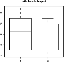
Suppose you have numerical data for several categories. A simple example might be in a drug test, where you have data (in suitable units) for an experimental group and for a control group.experimental: 5 5 5 13 7 11 11 9 8 9 control: 11 8 4 5 9 5 10 5 4 10You can summarize the data separately and compare, but how can you view the data together? A side by side boxplot is a good place to start. To generate one is simple:
> x = c(5, 5, 5, 13, 7, 11, 11, 9, 8, 9)
> y = c(11, 8, 4, 5, 9, 5, 10, 5, 4, 10)
> boxplot(x,y)
From this comparison (figure 11), we see that the y variable (the control group, labeled 2 on the graph) seems to be less than that of the x variable (the experimental group).
Of course, you may also receive this data in terms of the numbers and a variable indicating the category as follows
amount:   5 5 5 13 7 11 11 9 8 9 11 8 4 5 9 5 10 5 4 10
category: 1 1 1  1 1  1  1 1 1 1  2 2 2 2 2 2  2 2 2  2
To make a side by side boxplot is still easy, but only if you use the model syntax as follows
> amount = scan()
1: 5 5 5 13 7 11 11 9 8 9 11 8 4 5 9 5 10 5 4 10
21:
Read 20 items
>category = scan()
1: 1 1 1  1 1  1  1 1 1 1  2 2 2 2 2 2  2 2 2  2
21:
Read 20 items
> boxplot(amount ~ category)    # note the tilde ~
Read the part amount ~ category as breaking up the values in amount, by the categories in category and displaying each one. Verbally, you might read this as ``amount by category''. More on this syntax will appear in the section on multivariate data.
4.4 Bivariate data: numerical vs. numerical
Comparing two numerical variables can be done in different ways. If the two variables are thought to be independent samples you might like to compare their distributions in some manner. However, if you expect a relationship between the variables, you might like to look for that by plotting pairs of points.4.5 Comparing two distributions with plots
If we wish to compare two distributions, we can do so with side-by-side boxplots, However, we may wish to compare histograms or some other graphs to see more of the data. Here are several different ways to do so.- Side by side boxplots with rug
- By using the rug
command we can see all the data. It works best with smallish data
sets (otherwise use the jitter command to break ties).
> library("Simple");data(home)  # read in dataset home
> attach(home)
> names(home)
[1] "old" "new"
> boxplot(scale(old),scale(new)) #make boxplot after scaling each
> detach(home)
This example, introduced the scale function. This puts the two data sets on the same scale so they can sensibly be compared.
If you make this boxplot, you will see that the two distributions look quite a bit different. The full dataset homedata will show this even more. - Using stripcharts or dotplots
- The stripchart (a dotplot)
will plot all the data in a way that makes it relatively easy to
compare the distributions. For the data frame hd this is
done with
> stripchart(scale(old),scale(new)) - Comparing shapes of distributions
- Using the density
function allows us to compare a distributions shape on the same
graph. This is hard to do with histograms. The function
simple.violinplot compares densities by creating violin
plots. These are similar to boxplots, only instead of a box, the
density is drawn with it's mirror image.
Try this command to see what the graphs look like> simple.violinplot(scale(old),scale(new))
4.6 Using scatterplots to compare relationships
Often we wish to investigate one numerical variable against another. For example the height of a father compared to their sons height. The plot command will gladly display two variables in a scatterplot.
Example: Home data
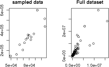
The home data example of the previous section shows old assessed value (1970) versus new assessed value (2000). There should be some relationship. Let's investigate with a scatterplot (figure 12).
The home data example of the previous section shows old assessed value (1970) versus new assessed value (2000). There should be some relationship. Let's investigate with a scatterplot (figure 12).
> data(home);attach(home)
> plot(old,new)
> detach(home)
The second graph is drawn from the entire data set. This should be available as a data set through the command data(). Here we plot it using attach:
> data(homedata)
> attach(homedata)
> plot(old,new)
> detach(homedata)
The graphs seem to illustrate a strong linear trend, which we will investigate later.
R Basics: What does attaching do?
You may have noticed that when we attached home and homedata we have the same variable names: old and new. What exactly does attaching do? When you ask R to use a value of a variable or a function it needs to find it. R searches through several ``enviroments'' for these variables. By attaching a data frame, you put the names into the second environment searched (the name of the dataframe is in the first). These are masked by any variables which already have the same name. There are consequences to this to be aware of. First, you might be confused about which variable you are using. And most importantly, you can't change the values of the variables in the data frame without referencing the data frame. For example, we create a data frame df below with variables x and y.
You may have noticed that when we attached home and homedata we have the same variable names: old and new. What exactly does attaching do? When you ask R to use a value of a variable or a function it needs to find it. R searches through several ``enviroments'' for these variables. By attaching a data frame, you put the names into the second environment searched (the name of the dataframe is in the first). These are masked by any variables which already have the same name. There are consequences to this to be aware of. First, you might be confused about which variable you are using. And most importantly, you can't change the values of the variables in the data frame without referencing the data frame. For example, we create a data frame df below with variables x and y.
> x = 1:2;y = c(2,4);df = data.frame(x=x,y=y)
> ls()                          # list all the varibles known
[1] "df" "x"  "y"
> rm(y)                         # delete the y variable
> attach(df)                    # attach the data frame
> ls()
[1] "df" "x"                    # y is visible, but doesn't show up
> ls(pos=2)                     # y is in position 2 from being attached
[1] "x" "y"
> y                             # y is visible because df is attached
[1] 2 4
> x                             # which x did we find, x or df[['x']]
[1] 1 2
> x=c(1,3)                      # assign to x
> df                            # not the x in df
  x y
1 1 2
2 2 4
> detach(df)
> x                             # assigned to real x variable
[1] 1 3
> y
Error: Object "y" not found
It is important to remember to detach the dataset
between uses of these variables, or you may forget which variable
you are referring to.
We see in these examples relationships between the data. Both were linear relationships. The modeling of such relationships is a common statistical practice. It allows us to make predictions of the y variable based on the value of the x variable.
4.7 Linear regression.
Linear regression is the name of a procedure that fits a straight line to the data. The idea is that the x value is something the experimenter controls, the y value one the experimenter measures. The line is used to predict the value of y for a known value of x. The variable x is the predictor variable and y the response variable.Suppose we write the equation of the line as
|
= b0 + b1 x. |
|
= b0 + b1 xi. |
But the measured value is yi, the difference is called the residual and is simply
| ei = yi - |
|
. |
The method of least squares is used to choose the values of b0 and b1 that minimize the sum or the squares of the residual errors. Mathematically this is
|
(yi - |
|
)2. |
Solving, gives
| b1 = |
|
= |
|
, b0 = |
|
- b1 |
|
. |
That is, a line with slope given by b1 going through the point (x--,y--).
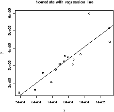
R plots these in 3 steps: plot the points, find the values of b0, b1, add a line to the graph:
> data(home);attach(home)
> x = old                       # use generic variable names
> y = new                       # for illustration only.
> plot(x,y)
> abline(lm(y ~ x))
> detach(home)
The abline command is a little tricky (and hard to remember). The abline function prints lines on the current graph window and is generally a useful function. The line it prints is coming from the lm functions. This is the function for a linear model. The funny syntax y ~ x tells R to model the y variable as a linear function of x. This is the model formula syntax of R which can be tricky, but is fairly straightforward in this situation.
As an alternative to the above, the function simple.lm, provided with these notes, will make this same plot and return the regression coefficients
> data(home);attach(home)
> x = old; y = new
> simple.lm(x,y)

Call:
lm(formula = y ~ x)

Coefficients:
(Intercept)            x
 -2.121e+05    6.879e+00
> detach(home)
You can also access the coefficients directly with the function coef. The above ones would be found with
> lm.res = simple.lm(x,y)      # store the answers in lm.res
> coef(lm.res)
Coefficients:
(Intercept)            x
 -2.121e+05    6.879e+00
> coef(lm.res)[1]               # first one, use [2] for second
(Intercept)
 -2.121e+05
4.8 Residual plots
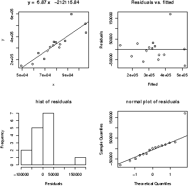
Another worthwhile plot is of the residuals. This can also be done with the simple.lm, but you need to ask. Continuing the above examplesimple.lm(x,y,show.residuals=TRUE)Which produces the plot shown in figure 14.
There are 3 new plots. The normal plot will be explained later. The upper right one is a plot of residuals versus the fitted values (y^'s). If the standard statistical model is to apply, then the residuals should be scattered about the line y=0 with ``normally'' distributed values. The lower left is a histogram of the residuals. If the standard model is applicable, then this should appear ``bell'' shaped.
For this data, we see a possible outlier that deserves attention. This data set has a few typos in it.
To access residuals directly, you can use the command resid on your lm result. This will make a plot of the residuals
> lm.res = simple.lm(x,y)
> the.residuals = resid(lm.res) # how to get residuals
> plot(the.residuals)
4.9 Correlation coefficients
A valuable numeric summary of the strength of the linear relationship is the Pearson correlation coefficient, R, defined by| R = |
|
This is a scaled version of the covariance between X and Y. This measures how one variable varies as the other does. The correlation is scaled to be in the range [-1,1]. Values or R2 close to 1 indicate a strong linear relationship, values close to 0 a weak one. (There still may be a relationship, just not a linear one.) In R the correlation coefficient is found with the cor function
> cor(x,y)                      # to find R
[1] 0.881
> cor(x,y)^2                    # to find R^2
[1] 0.776
This is also found by R when it does linear regression, but it doesn't print it by default. We just need to ask though using summary(lm(y ~ x)).
The Spearman rank correlation is the same thing only applied to the ranks of the data. The rank of a data set is simply another vector giving the relative rank in terms of size. An example might make it clearer
> rank(c(2,3,5,7,11))           # already in order
[1] 1 2 3 4 5
> rank(c(5,3,2,7,11))           # for example, 5 is 3rd largest
[1] 3 2 1 4 5
> rank(c(5,5,2,7,5))            # ties have ranks averaged (2+3+4)/3=3
[1] 3 3 1 5 3
To find the Spearman rank correlation, we simply apply cor() to the ranked data
> cor(rank(x),rank(y))
[1] 0.925
This number is close to 1 (or -1) if there is a strong increasing (decreasing) trend in the data. (The trend need not be linear.)
As a reminder, you can make a function to do this calculation for you. For example,
> cor.sp <- function(x,y) cor(rank(x),rank(y))Then you can use this as
> cor.sp(x,y)
[1] 0.925
4.10 Locating points
R currently has a few methods to interact with a graph. Some important ones allow us to identify and locate points on the graph.
Example: Presidential Elections: Florida
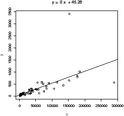
Consider this data set from the 2000 United States presidential election in the state of Florida. 8 It records the number of votes each candidate received by county. We wish to investigate the relationship between the number of votes for Bush against the number of votes for Buchanan.
One way is to search through the data to find these values. This works fine for smaller data sets, for larger ones, R provides a few useful functions: identify to find index of the closest (x,y) coordinates to the mouse click and locator to find the (x,y) coordinates of the mouse click.
To identify the outliers, we need their indices which are provided by identify:
County 50 is not surprisingly Miami-Dade county, the home of the infamous (well maybe) butterfly ballot that caused great confusion among the voters. The location of Buchanan on the ballot was in some sense where Gore's position should have been. How many votes did this give Buchanan that should have been Gore's? One way to answer this is to find the regression line for the data without this data point and then to use the number of Bush votes to predict the number of Buchanan votes.
To eliminate one point from a data vector can be done with fancy indexing, by using a minus sign (BUSH[50] is the 50th element, BUSH[-50] is all but the 50th element).
Consider this data set from the 2000 United States presidential election in the state of Florida. 8 It records the number of votes each candidate received by county. We wish to investigate the relationship between the number of votes for Bush against the number of votes for Buchanan.
> data("florida")              # or read.table on florida.txt
> names(florida)
 [1] "County"     "V2"         "GORE"       "BUSH"       "BUCHANAN"
 [6] "NADER"      "BROWNE"     "HAGELIN"    "HARRIS"     "MCREYNOLDS"
[11] "MOOREHEAD"  "PHILLIPS"   "Total"
> attach(florida)               # so we can get at the names BUSH, ...
> simple.lm(BUSH,BUCHANAN)
     ...
Coefficients:
(Intercept)            x
   45.28986      0.00492
> detach(florida)               # clean up
We see a strong linear relationship, except for two "outliers". How can we identify these points?
One way is to search through the data to find these values. This works fine for smaller data sets, for larger ones, R provides a few useful functions: identify to find index of the closest (x,y) coordinates to the mouse click and locator to find the (x,y) coordinates of the mouse click.
To identify the outliers, we need their indices which are provided by identify:
> identify(BUSH,BUCHANAN,n=2)   # n=2 gives two points
[1] 13 50
Click on the two outliers and find the corresponding indices are 13 and 50. The values would be found by taking the 13th or 50th value of the vectors:
> BUSH[50]
[1] 152846
> BUCHANAN[50]
[1] 3407
> florida[50,]
   County V2   GORE   BUSH BUCHANAN NADER BROWNE HAGELIN HARRIS MCREYNOLDS
50     50 39 268945 152846     3407  5564    743     143     45        302
   MOOREHEAD PHILLIPS  Total
50       103      188 432286
The latter shows the syntax to slice out the entire row for county 50.
County 50 is not surprisingly Miami-Dade county, the home of the infamous (well maybe) butterfly ballot that caused great confusion among the voters. The location of Buchanan on the ballot was in some sense where Gore's position should have been. How many votes did this give Buchanan that should have been Gore's? One way to answer this is to find the regression line for the data without this data point and then to use the number of Bush votes to predict the number of Buchanan votes.
To eliminate one point from a data vector can be done with fancy indexing, by using a minus sign (BUSH[50] is the 50th element, BUSH[-50] is all but the 50th element).
>  simple.lm(BUSH[-50],BUCHANAN[-50])
     ...
Coefficients:
(Intercept)            x
   65.57350      0.00348
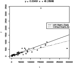
Notice the fit is much better. Also notice that the new regression
line is y^ = 65.57350 + 0.00348 x instead of y^=45.28986+ 0.00492
x. How much difference does this make? Well the regression line
predicts the value for a given x. If Bush received 152,846 votes
(BUSH[50]) then we expect Buchanan to have received
> 65.57350 + 0.00348 * BUSH[50]
[1] 597
and not 3407 (BUCHANAN[50]) as actually received. (This difference is much larger than the statewide difference that gave the 2000 U.S. presidential election to Bush over Gore.)
Some Extra Insight: Using simple.lm to predict
We could do this prediction with the simple.lm function which calls the R function predict appropriately. Here is how
We could do this prediction with the simple.lm function which calls the R function predict appropriately. Here is how
> simple.lm(BUSH[-50],BUCHANAN[-50],pred=BUSH[50])
[1] 597.7677
   ...
4.11 Resistant regression
This example also illustrates another important point. That is, like the mean and standard deviation the regression line is very sensitive to outliers. Let's see what the regression line looks like for the data with and without the points. Since we already have the equation for the line without the point, the simplest way to do so is to first draw the line for all the data, and then add in the line without Miami-Dade. This is done with the abline function.> simple.lm(BUSH,BUCHANAN) > abline(65.57350,0.00348) # numbers from aboveFigure 16 shows how sensitive the regression line is.
4.12 Using rlm or lqs for resistant regression
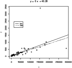
Resistance in statistics means the procedure is resistant to some percentage of arbitrarily large outliers, robustness means the procedure is not greatly affected by slight deviations in the assumptions. There are various ways to create a resistant regression line. In R there are two in the package MASS that are used in a manner similar to the lm function (but not the simple.lm function). The function lqs works with a simple principle (by default). Rather than minimize the sum of the squared residuals for all residuals, it does so for just a percentage of them. The rlm function uses something known as an M-estimator. Both give similar results, but not identical. In what follows, we will use rlm, but we could have used lqs provided we load the library first (library('lqs')).Let's apply rlm to the Florida election data. We will plot both the regular regression line and the resistant regression line (fig 17).
> library(MASS)                 # read in the external library
> attach(florida)
> plot(BUSH,BUCHANAN)           # a scatter plot
> abline(lm(BUCHANAN ~ BUSH),lty="1") # lty sets line type
> abline(rlm(BUCHANAN ~ BUSH),lty="2")
> legend(locator(1),legend=c('lm','rlm'),lty=1:2) # add legend
> detach(florida)               # tidy up
Notice a few things. First, we used the model formula notation
lm(y ~ x) as this is how rlm expects
the function to be called. We also illustrate how to change the line
type (lty) and how to include a legend with legend.
As well, you may plot the resistant regression line for the data, with and without the outliers as below, you will find as expected that the lines are the same.
> plot(BUSH,BUCHANAN)
> abline(rlm(BUCHANAN ~ BUSH),lty='1')
> abline(rlm(BUCHANAN[-50] ~ BUSH[-50]),lty='2')
This graph will show that removing one point makes no difference to the resistant regression line (as expected).
R Basics: Plotting graphs using R
In this section, we used the plot command to make a scatterplot and the abline command to add a line to it. There are other ways to manipulate plots using R that are useful to know.
It helps to know that R has different functions to create an initial graph and to add to an existing graph.
In this section, we used the plot command to make a scatterplot and the abline command to add a line to it. There are other ways to manipulate plots using R that are useful to know.
It helps to know that R has different functions to create an initial graph and to add to an existing graph.
- Creating new plots with plot and curve.
- The
plot function will plot points as already illustrated. In
addition, it can be told to plot the points and connect them with
straight lines. These commands will plot a parabola. Notice how we
need to first create the values on the x axis to plot
> x=seq(0,4,by=.1)              # create the x values
> plot(x,x^2,type="l")          # type="l" to make line
The convenient curve function will plot functions (of x) in an easier manner. The above plotted the function y=x2 over the interval [0,4]. This is done with curve all at once with> curve(x^2,0,4)Notice as illustrated, both plot and curve create new graph windows. - Adding to a graph with points, abline, lines and curve.
- We can add to the exiting graph
window the several different functions. To add points we use the
points command which is similar to the plot
command. We've seen that to add a straight line, the
abline function is available. The lines function
is used to add more general lines. It plots the points specified
and connects them with straight lines. Similar to adding
type=''l'' in the plot function.
Finally, curve will add to a graph if the additional
argument add=TRUE is given.
To illustrate, if we have the dataset
Then the regression line has intercept 360 and slope -7.3. Here are three ways to plot the data and the regression line:mileage 0 4 8 12 16 20 24 28 32 tread wear 394 329 291 255 229 204 179 163 150 > miles = (0:8)*4 # 0 4 8 ... 32 > tread = scan() 1: 394 329 291 255 229 204 179 163 150 10: Read 9 items > plot(miles,tread) # make the scatterplot abline(lm(tread ~ miles)) ## or as we know the intercept and slope > abline(360,-7.3) ## or using points > points(miles,360 - 7.3*miles,type="l") ## or using lines > lines(miles,360 - 7.3*miles) ## or using curve > curve(360 - 7.3*x,add=T) # add a function of x
4.13 Problems
- 4.1
- A student evaluation of a teacher is on a 1-5 Leichert scale. Suppose the
answers to the first 3 questions are given in this table
Enter in the data for question 1 and 2 using c(), scan(), read.table or data.entry()Student Ques. 1 Ques. 2 Ques. 3 1 3 5 1 2 3 2 3 3 3 5 1 4 4 5 1 5 3 2 1 6 4 2 3 7 3 5 1 8 4 5 1 9 3 4 1 10 4 2 1 - Make a table of the results of question 1 and question 2 separately.
- Make a contingency table of questions 1 and 2.
- Make a stacked barplot of questions 2 and 3.
- Make a side-by-side barplot of all 3 questions.
- 4.2
- In the library MASS is a dataset
UScereal which contains information about popular breakfast
cereals. Attach the data set as follows
> library('MASS')
> data('UScereal')
> attach(UScereal)
> names(UScereal)               # to see the names
Now, investigate the following relationships, and make comments on what you see. You can use tables, barplots, scatterplots etc. to do you investigation.- The relationship between manufacturer and shelf
- The relationship between fat and vitamins
- the relationship between fat and shelf
- the relationship between carbohydrates and sugars
- the relationship between fibre and manufacturer
- the relationship between sodium and sugars
- 4.3
- The built-in data set mammals contains data on body weight versus brain weight. Use the cor to find the Pearson and Spearman correlation coefficients. Are they similar? Plot the data using the plot command and see if you expect them to be similar. You should be unsatisfied with this plot. Next, plot the logarithm (log) of each variable and see if that makes a difference.
- 4.4
- For the data set on housing prices, homedata , investigate the relationship between old assessed value and new. Use old as the predictor variable. Does the data suggest a linear relationship?Are there any outliers? What may have caused these outliers? What is the predicted new assessed value for a $75,000 house in 1970.
- 4.5
- For the florida dataset of Bush vs. Buchanan, there is another obvious outlier that indicated Buchanan received fewer votes than expected. If you remove both the outliers, what is the predicted value for the number of votes Buchanan would get in Miami-Dade county based on the number of Bush votes?
- 4.6
- For the data set emissions plot the per-Capita GDP (gross domestic product) as a predictor for the response variable CO2 emissions. Identify the outlier and find the regression lines with this point, and without this point.
- 4.7
- Attach the data set
babies
:
> library("Simple")
> data("babies")
> attach(babies)
This data set contains much information about babies and their mothers for 1236 observations. Find the correlation coefficient (both Pearson and Spearman) between age and weight. Repeat for the relationship between height and weight. Make scatter plots of each pair and see if your answer makes sense. - 4.8
- Find a dataset that is a candidate for linear regression (you need two numeric variables, one a predictor and one a response.) Make a scatterplot with regression line using R.
- 4.9
- The built-in data set mtcars contains information
about cars from a 1974 Motor Trend issue. Load the data set
(data(mtcars)) and try to answer the following:
- What are the variable names? (Try names.)
- what is the maximum mpg
- Which car has this?
- What are the first 5 cars listed?
- What horsepower (hp) does the ``Valiant'' have?
- What are all the values for the Mercedes 450slc (Merc 450SLC)?
- Make a scatterplot of cylinders (cyl) vs. miles per gallon (mpg). Fit a regression line. Is this a good candidate for linear regression?
- 4.10
- Find a graphic of bivariate data from the newspaper or other media source. Use R to generate a similar figure.
Copyright © John Verzani, 2001-2. All rights reserved.


