Folders
Files
DESCRIPTION
index.html
next_motif.gif
PACKAGES
previous_motif.gif
R-logo.gif
Simple_0.6.tar.gz
Simple_0.6.zip
simpleR.R
stat.html
stat001.gif
stat001.html
stat002.gif
stat002.html
stat003.gif
stat003.html
stat004.gif
stat004.html
stat005.gif
stat005.html
stat006.gif
stat006.html
stat007.gif
stat007.html
stat008.gif
stat008.html
stat009.gif
stat009.html
stat010.gif
stat010.html
stat011.gif
stat011.html
stat012.gif
stat012.html
stat013.gif
stat013.html
stat014.gif
stat014.html
stat015.gif
stat015.html
stat016.gif
stat016.html
stat017.gif
stat017.html
stat018.gif
stat018.html
stat019.gif
stat019.html
stat020.gif
stat020.html
stat021.gif
stat021.html
stat022.gif
stat022.html
stat023.gif
stat023.html
stat024.gif
stat024.html
stat025.gif
stat025.html
stat026.gif
stat026.html
stat027.gif
stat028.gif
stat029.gif
stat030.gif
stat031.gif
stat032.gif
stat033.gif
stat034.gif
stat035.gif
stat036.gif
stat037.gif
stat038.gif
stat039.gif
stat040.gif
stat041.gif
stat042.gif
stat043.gif
stat044.gif
stat045.gif
stat046.gif
stat047.gif
stat048.gif
stat049.gif
stat050.gif
stat051.gif
stat052.gif
stat053.gif
stat054.gif
stat055.gif
stat056.gif
stat057.gif
stat058.gif
stat059.gif


18 A sample R session
18.1 A sample session involving regression
For illustrative purposes, a sample R session may look like the following. The graphs are not presented to save space and to encourage the reader to try the problems themself.Assignment: Explore mtcars.
Here are some things to do:
- Start R.
- First we need to start R. Under Windows this involves finding the icon and clicking it. Wait a few seconds and the R application takes over. If you are at a UNIX command prompt, then typing R will start the R program. If you are using XEmacs and ESS then you start XEmacs and then enter the command M-x R. (That is Alt and x at the same time, and then R and then enter. Other methods may be applicable to your case.
- Load the dataset mtcars.
- This dataset is built-in to
R. To access it, we need to tell R we want it. Here is how to do
so, and how to find out the names of the variables. Use
?mtcars to read the documentation on the data set.
> data(mtcars)
> names(mtcars)
 [1] "mpg"  "cyl"  "disp" "hp"   "drat" "wt"   "qsec" "vs"   "am"   "gear"
[11] "carb"
- Access the data.
- The data is in a data frame. This makes
it easy to access the data. As a summary, we could access the ``miles
per gallon data'' (mpg) lots of ways. Here are a few: Using
$ as with mtcars$mpg; as a list element as in mtcars[['mpg']]; or as the first column of data using
mtcars[,1]. However, the preferred method is to
attach the dataset to your environment. Then the data is
directly accessible as this illustrates
> mpg                           # not currently visible
Error: Object "mpg" not found
> attach(mtcars)                # attach the mtcars names
> mpg                           # now it is visible
 [1] 21.0 21.0 22.8 21.4 18.7 18.1 14.3 24.4 22.8 19.2 17.8 16.4 17.3 15.2 10.4
[16] 10.4 14.7 32.4 30.4 33.9 21.5 15.5 15.2 13.3 19.2 27.3 26.0 30.4 15.8 19.7
[31] 15.0 21.4
- Categorical Data.
- The value of cylinder is categorical. We can
use table to summarize, and barplot to view the
values. Here is how
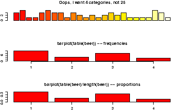
> table(cyl)
cyl
 4  6  8
11  7 14
> barplot(cyl)                  # not what you want
> barplot(table(cyl))
If you do so, you will see that for this data 8 cylinder cars are more common. (This is 1974 car data. Read more with the help command: help(mtcars) or ?mtcars.) - Numerical Data.
- The miles per gallon is numeric. What is the
general shape of the distribution? We can view this with a
stem and leaf chart, a histogram, or a boxplot. Here are commands to
do so
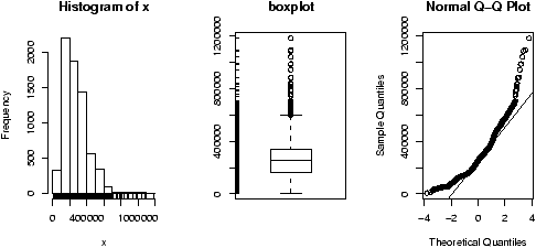
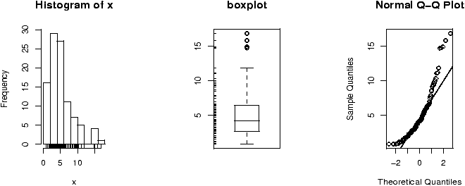
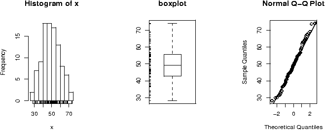
> stem(mpg)

  The decimal point is at the |

  10 | 44
  12 | 3
  14 | 3702258
  16 | 438
  18 | 17227
  20 | 00445
  22 | 88
  24 | 4
  26 | 03
  28 |
  30 | 44
  32 | 49

> hist(mpg)
> boxplot(mpg)
From the graphs (in particular the histogram) we can see the miles per gallon are pretty low. What are the summary statistics including the mean? (This stem graph is a bit confusing. 33.9, the max value, reads like 32.9. Using a different scale is better as in stem(mpg,scale=3).)> mean(mpg) [1] 20.09062 > mean(mpg,trim=.1) # trim off 10 percent from top, bottom [1] 19.69615 # for a more resistant measure > summary(mpg) Min. 1st Qu. Median Mean 3rd Qu. Max. 10.40 15.43 19.20 20.09 22.80 33.90
So half of the cars get 19.20 miles per gallon or less. What is the variability or spread? There are several ways to measure this: the standard deviation or the IQR or mad (the median absolute deviation). Here are all three> sd(mpg) [1] 6.026948 > IQR(mpg) [1] 7.375 > mad(mpg) [1] 5.41149
They are all different, but measure approximately the same thing -- spread. - Subsets of the data.
-
What about the average mpg for cars that have just 4 cylinders? This
can be answered with the mean function as well, but first we
need a subset of the mpg vector corresponding to just the 4
cylinder cars. There is an easy way to do so.
> mpg[cyl == 4]
 [1] 22.8 24.4 22.8 32.4 30.4 33.9 21.5 27.3 26.0 30.4 21.4
> mean(mpg[cyl == 4])
[1] 26.66364
Read this like a sentence -- ``the miles per gallon of the cars with cylinders equal to 4''. Just remember ``equals'' is == and not simply =, and functions use parentheses while accessing data uses square brackets.. - Bivariate relationships.
- The univariate data on miles per gallon
is interesting, but of course we expect there to be some
relationship with the size of the engine. The engine size is stored
in various ways: with the cylinder size, or the horsepower or even
the displacement. Let's view it two ways. First, cylinder size is a
discrete variable with just a few values, a scatterplot will produce an
interesting graph
> plot(cyl,mpg)
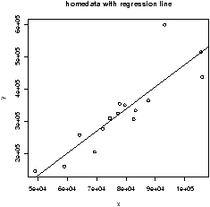
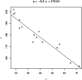
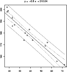
We see a decreasing trend as the number of cylinders increases, and lots of variation between the different cars. We might be tempted to fit a regression line. To do so is easy with the command simple.lm which is a convenient front end to the lm command. (You need to have loaded the Simple package prior to this.)> simple.lm(cyl,mpg) Call: lm(formula = y ~ x) Coefficients: (Intercept) x 37.885 -2.876Which says the slope of the line is -2.876 which in practical terms means if you step up to the next larger sized engine, your m.p.g. drops by 5.752 on average.
What are the means for each cylinder size? We did this above for 4 cylinders. If we wanted do this for the 6 and 8 cylinder cars we could simply replace the 4 in the line above with 6 or 8. If you wanted a fancy way to do so, you can use tapply which will apply a function (the mean) to a vector broken down by a factor:> tapply(mpg,cyl,mean) 4 6 8 26.66364 19.74286 15.10000Next, lets investigate the relationship between the numeric variable horsepower and miles per gallon. The same commands as above will work, but the scatterplot will look different as horsepower is essentially a continuous variable.> simple.lm(hp,mpg) Call: lm(formula = y ~ x) Coefficients: (Intercept) x 30.09886 -0.06823
The fit doesn't look quite as good. We can test this with the correlation function cor> cor(hp,mpg) [1] -0.7761684 > cor(cyl,mpg) [1] -0.852162
This is the Pearson correlation coefficient, R. Squaring it gives R2.> cor(hp,mpg)^2 [1] 0.6024373 > cor(cyl,mpg)^2 [1] 0.72618
The usual interpretation is that 72% of the variation is explained by the linear relationship for the relationship between the number of cylinders and the miles per gallon.
We can view all three variables together by using different plotting symbols based on the number of cylinders. The argument pch controls this as in> plot(hp,mpg,pch=cyl)
You can add a legend with the legend command to tell the reader what you did.> legend(250,30,pch=c(4,6,8), + legend=c("4 cylinders","6 cylinders","8 cylinders"))(Note the + indicates a continuation line.)
- Testing the regression assumptions.
-
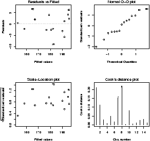
In order to make statistical inferences about the regression line,
we need to ensure that the assumptions behind the statistical model
are appropriate. In this case, we want to check that the residuals
have no trends, and are normallu distributed. We can do
so graphically once we get our hands on the residuals. These are
available through the resid method for the result of an
lm usage.
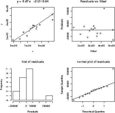
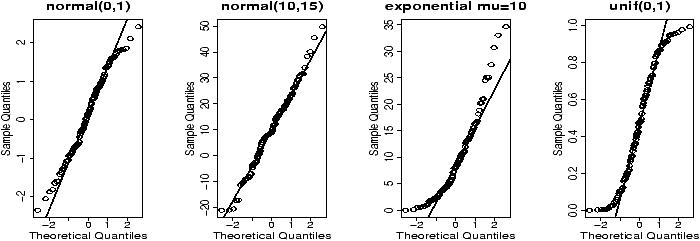
> lm.res = simple.lm(hp,mpg)
> lm.resids = resid(lm.res)     # the residuals as a vector
> plot(lm.resids)               # look for change in spread
> hist(lm.resids)               # is data bell shaped?
> qqnorm(lm.resids)             # is data on straight line?
From the first plot we see that the assumptions are suspicious as the residuals are basically negative for a while and then they are mostly positive. This is an indication that the straight line model is not a good one. - Clean up.
- There is certainly more to do with this, but not here.
Let's take a break. When leaving an example, you should detach any
data frames. As well, we will quit our R session. Notice you will
be prompted to save your session. If you choose yes, then the next
time you start R in this directory, your session (variables,
functions etc.) will be
restored.
> detach()                      # clear up namespace
> q()                           # Notice the parentheses!
18.2 t-tests
The t-tests are the standard test for making statistical inferences about the center of a dataset.Assignment: Explore chickwts using t-tests.
- Start up.
- We start up R as before. If you started in the same directory, your previous work has been saved. How can you tell? Try the ls() command to see what is available.
- Attach the data set.
- First we load in the data and attach the
data set
> data(chickwts) > attach(chickwts) > names(chickwts) [1] "weight" "feed" - EDA
- Let's see what we have. The data is stored in
two columns. The weight and the level of the factor feed
is given for each chick. A boxplot is a good place to look. For
data presented this way, the goal is to make a separate boxplot
for each level of the factor feed. This is done using the
model formula notation of R.
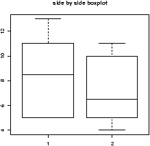
> boxplot(weight ~ feed)We see that ``casein'' appears to be better than the others. As a naive check, we can test its mean against the mean weight.> our.mu = mean(weight) > just.casein = weight[feed == 'casein'] > t.test(just.casein,mu = our.mu) One Sample t-test data: just.casein t = 3.348, df = 11, p-value = 0.006501 alternative hypothesis: true mean is not equal to 261.3099 95 percent confidence interval: 282.6440 364.5226 sample estimates: mean of x 323.5833The low p-value of 0.006501 indicates that the mean weight for the chicks fed 'casein' is more than the average weight.
The 'sunflower' feed also looks higher. Is it similar to the 'casein' feed? A two-sample t-test will tell us> t.test(weight[feed == 'casein'],weight[feed == 'sunflower']) Welch Two Sample t-test data: weight[feed == "casein"] and weight[feed == "sunflower"] t = -0.2285, df = 20.502, p-value = 0.8215 alternative hypothesis: true difference in means is not equal to 0 95 percent confidence interval: -53.94204 43.27538 sample estimates: mean of x mean of y 323.5833 328.9167Notice the p-value now is 0.8215 which indicates that the null hypothesis should be accepted. That is, there is no indication that the mean weights are not the same.
The feeds 'linseed' and 'soybean' appear to be the same, and have the same spread. We can test for the equivalence of the mean, and in addition use the pooled estimate for the standard deviation. This is done as follows using var.equal=TRUE> t.test(weight[feed == 'linseed'],weight[feed == 'soybean'], + var.equal=TRUE) Two Sample t-test data: weight[feed == "linseed"] and weight[feed == "soybean"] t = -1.3208, df = 24, p-value = 0.1990 alternative hypothesis: true difference in means is not equal to 0 95 percent confidence interval: -70.92996 15.57282 sample estimates: mean of x mean of y 218.7500 246.4286The null hypothesis of equal means is accepted as the p-value is not too small. - Close up.
- Again, lets close things down just for practice.
> detach()                      # clear up namespace
> q()                           # Notice the parentheses!
18.3 A simulation example
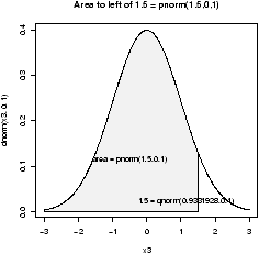
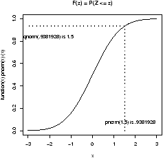
The t-statistic for a data sets X1,X2,...,Xn is| t = |
|
Assignment: How robust is the distribution of t to changes in the distribution of Xi?
This is the job of simulation. We use the computer to generate random data and investigate the results. Suppose our R session is already running and just want to get to work.
First, let's define a useful function to create the t statistic for a data set.
> make.t = function(x,mu) (mean(x)-mu)/( sqrt(var(x)/length(x)))Now, when we want to make the t-statistic we simply use this function.
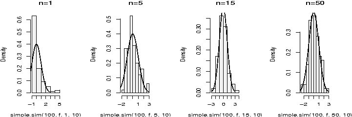
> mu = 1;x=rnorm(100,mu,1)
> make.t(x,mu)
[1] -1.552077
That shows the t statistic for one random sample of size 100 from the normal distribution with mean 1 and standard deviation 1.
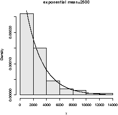
We need to use a different distribution, and create lots of random samples so that we can investigate the distribution of the t statistic. Here is how to create samples when the Xi are exponential
> mu = 10;x=rexp(100,1/mu);make.t(x,mu)
[1] 1.737937
Now, we need to create lots of such samples and store them somewhere. We use a for loop, but first we define a variable to store our data
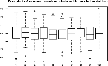
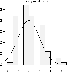
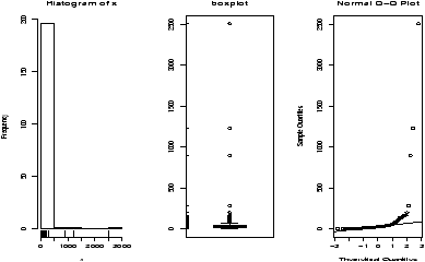
> results = c()                    # initialize the results vector
> for (i in 1:200) results[i] = make.t(rexp(100,1/mu),mu)
That's it. Our numbers are now stored in the variable results. We could have spread this out over a few lines, but instead we combined a few functions together. Now we can view the distribution using graphical tools such as histograms, boxplots and probability plots.
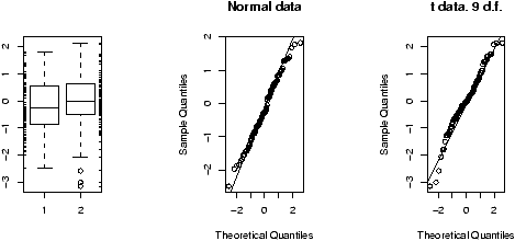
> hist(res)                     # histogram looks bell shaped
> boxplot(res)                  # symmetric, not long-tailed
> qqnorm(res)                   # looks normal
When n=100, the data looks approximately normal. Which is good as the t-distribution does too.
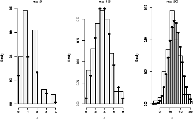
What about if n is small? Then the t-distribution has n-1 degrees of freedom and is long-tailed. Will this change things? Let's see with n=8.
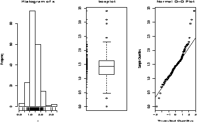
> for (i in 1:200) res[i] = make.t(rexp(8,1/mu),mu)
> hist(res)                     # histogram is not bell shaped
> boxplot(res)                  # asymmetric, long-tailed
> qqnorm(res)                   # not close to $t$ or normal.
We see a marked departure from a symmetric distribution. We conclude that the t is not this robust.
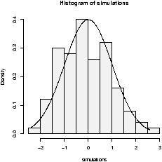
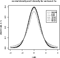
So, if the underlying distribution is skewed and n is small, the t distribution is not robust, what about if the underlying distribution is symmetric, but long-tailed? Let's think of a random distribution that is like this? Hmmm, how about the t distribution with a few degrees of freedom? Let's see. We will look at the shape of the t-statistic with n=8 (7 degrees of freedom) when the underlying distribution is the t-distribution with 5 degrees of freedom.
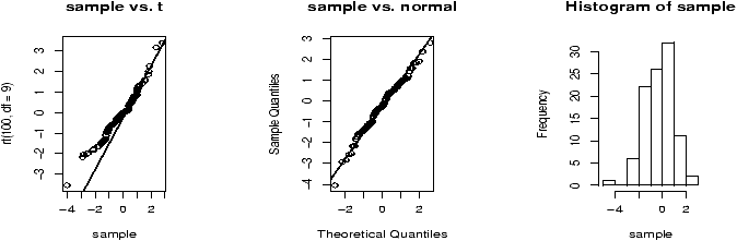
> for (i in 1:200) res[i] = make.t(rt(8,5),0)
> hist(res)                     # histogram is bell shaped
> boxplot(res)                  # symmetric, long-tailed
> qqnorm(res)                   # not close to  normal.
> qqplot(res,rt(200,7)          # close to t with 7 degrees of freedom
We see a symmetric, long-tailed distribution which is not normal, but is close to the t-distribution with 7 degrees of freedom. We conclude that the t-statistic is robust to this amount of change in the tails of the underlying population distribution.
Copyright © John Verzani, 2001-2. All rights reserved.