Folders
Files
DESCRIPTION
index.html
next_motif.gif
PACKAGES
previous_motif.gif
R-logo.gif
Simple_0.6.tar.gz
Simple_0.6.zip
simpleR.R
stat.html
stat001.gif
stat001.html
stat002.gif
stat002.html
stat003.gif
stat003.html
stat004.gif
stat004.html
stat005.gif
stat005.html
stat006.gif
stat006.html
stat007.gif
stat007.html
stat008.gif
stat008.html
stat009.gif
stat009.html
stat010.gif
stat010.html
stat011.gif
stat011.html
stat012.gif
stat012.html
stat013.gif
stat013.html
stat014.gif
stat014.html
stat015.gif
stat015.html
stat016.gif
stat016.html
stat017.gif
stat017.html
stat018.gif
stat018.html
stat019.gif
stat019.html
stat020.gif
stat020.html
stat021.gif
stat021.html
stat022.gif
stat022.html
stat023.gif
stat023.html
stat024.gif
stat024.html
stat025.gif
stat025.html
stat026.gif
stat026.html
stat027.gif
stat028.gif
stat029.gif
stat030.gif
stat031.gif
stat032.gif
stat033.gif
stat034.gif
stat035.gif
stat036.gif
stat037.gif
stat038.gif
stat039.gif
stat040.gif
stat041.gif
stat042.gif
stat043.gif
stat044.gif
stat045.gif
stat046.gif
stat047.gif
stat048.gif
stat049.gif
stat050.gif
stat051.gif
stat052.gif
stat053.gif
stat054.gif
stat055.gif
stat056.gif
stat057.gif
stat058.gif
stat059.gif


3 Univariate Data
There is a distinction between types of data in statistics and R knows about some of these differences. In particular, initially, data can be of three basic types: categorical, discrete numeric and continuous numeric. Methods for viewing and summarizing the data depend on the type, and so we need to be aware of how each is handled and what we can do with it.Categorical data is data that records categories. Examples could be, a survey that records whether a person is for or against a proposition. Or, a police force might keep track of the race of the individuals they pull over on the highway. The U.S. census, which takes place every 10 years, asks several different questions of a categorical nature. Again, there was one on race which in the year 2000 included 15 categories with write-in space for 3 more for this variable (you could mark yourself as multi-racial). Another example, might be a doctor's chart which records data on a patient. The gender or the history of illnesses might be treated as categories.
Continuing the doctor example, the age of a person and their weight are numeric quantities. The age is a discrete numeric quantity (typically) and the weight as well (most people don't say they are 4.673 years old). These numbers are usually reported as integers. If one really needed to know precisely, then they could in theory take on a continuum of values, and we would consider them to be continuous. Why the distinction? In data sets, and some tests it is important to know if the data can have ties (two or more data points with the same value). For discrete data it is true, for continuous data, it is generally not true that there can be ties.
A simple, intuitive way to keep track of these is to ask what is the mean (average)? If it doesn't make sense then the data is categorical (such as the average of a non-smoker and a smoker), if it makes sense, but might not be an answer (such as 18.5 for age when you only record integers integer) then the data is discrete otherwise it is likely to be continuous.
3.1 Categorical data
We often view categorical data with tables but we may also look at the data graphically with bar graphs or pie charts.3.2 Using tables
The table command allows us to look at tables. Its simplest usage looks like table(x) where x is a categorical variable.
Example: Smoking survey
A survey asks people if they smoke or not. The data is
A survey asks people if they smoke or not. The data is
Yes, No, No, Yes, Yes
We can enter this into R with the c() command, and
summarize with the table command as follows
> x=c("Yes","No","No","Yes","Yes")
> table(x)
x
 No Yes
  2   3
The table command simply adds up the frequency of each unique
value of the data.3.3 Factors
Categorical data is often used to classify data into various levels or factors. For example, the smoking data could be part of a broader survey on student health issues. R has a special class for working with factors which is occasionally important to know as R will automatically adapt itself when it knows it has a factor. To make a factor is easy with the command factor or as.factor. Notice the difference in how R treats factors with this example
> x=c("Yes","No","No","Yes","Yes")
> x                             # print out values in x
[1] "Yes" "No"  "No"  "Yes" "Yes"
> factor(x)                     # print out value in factor(x)
[1] Yes No  No  Yes Yes
Levels:  No Yes                 # notice levels are printed.
3.4 Bar charts
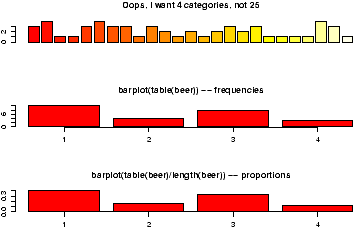
A bar chart draws a bar with a a height proportional to the count in the table. The height could be given by the frequency, or the proportion. The graph will look the same, but the scales may be different.Suppose, a group of 25 people are surveyed as to their beer-drinking preference. The categories were (1) Domestic can, (2) Domestic bottle, (3) Microbrew and (4) import. The raw data is
3 4 1 1 3 4 3 3 1 3 2 1 2 1 2 3 2 3 1 1 1 1 4 3 1Let's make a barplot of both frequencies and proportions. First, we use the scan function to read in the data then we plot (figure 1)
> beer = scan()
1: 3 4 1 1 3 4 3 3 1 3 2 1 2 1 2 3 2 3 1 1 1 1 4 3 1
26:
Read 25 items
> barplot(beer)                 # this isn't correct
> barplot(table(beer))          # Yes, call with summarized data
> barplot(table(beer)/length(beer)) # divide by n for proportion
Notice a few things:
- We used scan() to read in the data. This command is very useful for reading data from a file or by typing. Try ?scan for more information, but the basic usage is simple. You type in the data. It stops adding data when you enter a blank row.
- The color scheme is kinda ugly.
- We did 3 barplots. The first to show that we don't use barplot with the raw data.
- The second shows the use of the table command to create summarized data, and the result of this is sent to barplot creating the barplot of frequencies shown.
- Finally, the command
> table(beer)/length(beer)
   1    2    3    4
0.40 0.16 0.32 0.12
produces the proportions first. (We divided by the number of data points which is 25 or length(beer).) The result is then handed off to barplot to make a graph. Notice it has the same shape as the previous one, but the height axis is now between 0 and 1 as it measures the proportion and not the frequency.
3.5 Pie charts
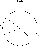
The same data can be studied with pie charts using the pie function.23 Here are some simple examples illustrating the usage (similar to barplot(), but with some added features.
> beer.counts = table(beer) # store the table result
> pie(beer.counts) # first pie -- kind of dull
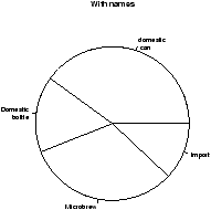
> names(beer.counts) = c("domestic\n can","Domestic\n bottle",
"Microbrew","Import") # give names
> pie(beer.counts) # prints out names
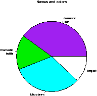
> pie(beer.counts,col=c("purple","green2","cyan","white"))
# now with colors
The first one was kind of boring so we added names. This is done with the names which allows us to specify names to the categories. The resulting piechart shows how the names are used. Finally, we added color to the piechart. This is done by setting the piechart attribute col. We set this equal to a vector of color names that was the same length as our beer.counts. The help command (?pie) gives some examples for automatically getting different colors, notably using rainbow and gray.
Notice we used additional arguments to the function pie The syntax for these is name=value. The ability to pass in named values to a function, makes it easy to have fewer functions as each one can have more functionality.
3.6 Numerical data
There are many options for viewing numerical data. First, we consider the common numerical summaries of center and spread.3.7 Numeric measures of center and spread
To describe a distribution we often want to know where is it centered and what is the spread. These are typically measured with mean and variance (or standard deviation), or the median and more generally the five-number summary. The R commands for these are mean, var, sd, median, fivenum and summary.
Example: CEO salaries
Suppose, CEO yearly compensations are sampled and the following are found (in millions). (This is before being indicted for cooking the books.)
Suppose, CEO yearly compensations are sampled and the following are found (in millions). (This is before being indicted for cooking the books.)
12 .4 5 2 50 8 3 1 4 0.25
> sals = scan()                # read in with scan
1: 12 .4 5 2 50 8 3 1 4 0.25
11:
Read 10 items
> mean(sals)                    # the average
[1] 8.565
> var(sals)                     # the variance
[1] 225.5145
> sd(sals)                      # the standard deviation
[1] 15.01714
> median(sals)                  # the median
[1] 3.5
> fivenum(sals)                 # min, lower hinge, Median, upper hinge, max
[1]  0.25  1.00  3.50  8.00 50.00
> summary(sals)
   Min. 1st Qu.  Median    Mean 3rd Qu.    Max.
  0.250   1.250   3.500   8.565   7.250  50.000
Notice the summary command. For a numeric variable it prints out the five number summary and the median. For other variables, it adapts itself in an intelligent manner.
Some Extra Insight: The difference between fivenum and the quantiles.
You may have noticed the slight difference between the fivenum and the summary command. In particular, one gives 1.00 for the lower hinge and the other 1.250 for the first quantile. What is the difference? The story is below.
The median is the point in the data that splits it into half. That is, half the data is above the data and half is below. For example, if our data in sorted order is
The idea of a quantile generalizes this median. The p quantile, (also known as the 100p%-percentile) is the point in the data where 100p% is less, and 100(1-p)% is larger. If there are n data points, then the p quantile occurs at the position 1+(n-1)p with weighted averaging if this is between integers. For example the .25 quantile of the numbers 10,17,18,25,28,28 occurs at the position 1+(6-1)(.25) = 2.25. That is 1/4 of the way between the second and third number which in this example is 17.25.
The .25 and .75 quantiles are denoted the quartiles. The first quartile is called Q1, and the third quartile is called Q3. (You'd think the second quartile would be called Q2, but use ``the median'' instead.) These values are in the R function
RCodesummary. More generally, there is a quantile function which will compute any quantile between 0 and 1. To find the quantiles mentioned above we can do
Here is an illustration with the sals data, which has n=10. From above we should have the median at (10+1)/2=5.5, the lower hinge at the 3rd value and the upper hinge at the 8th largest value. Whereas, the value of Q1 should be at the 1+(10-1)(1/4) = 3.25 value. We can check that this is the case by sorting the data
You may have noticed the slight difference between the fivenum and the summary command. In particular, one gives 1.00 for the lower hinge and the other 1.250 for the first quantile. What is the difference? The story is below.
The median is the point in the data that splits it into half. That is, half the data is above the data and half is below. For example, if our data in sorted order is
10, 17, 18, 25, 28then the midway number is clearly 18 as 2 values are less and 2 are more. Whereas, if the data had an additional point:
10, 17, 18, 25, 28, 28Then the midway point is somewhere between 18 and 25 as 3 are larger and 3 are smaller. For concreteness, we average the two values giving 21.5 for the median. Notice, the point where the data is split in half depends on the number of data points. If there are an odd number, then this point is the (n+1)/2 largest data point. If there is an even number of data points, then again we use the (n+1)/2 data point, but since this is a fractional number, we average the actual data to the left and the right.
The idea of a quantile generalizes this median. The p quantile, (also known as the 100p%-percentile) is the point in the data where 100p% is less, and 100(1-p)% is larger. If there are n data points, then the p quantile occurs at the position 1+(n-1)p with weighted averaging if this is between integers. For example the .25 quantile of the numbers 10,17,18,25,28,28 occurs at the position 1+(6-1)(.25) = 2.25. That is 1/4 of the way between the second and third number which in this example is 17.25.
The .25 and .75 quantiles are denoted the quartiles. The first quartile is called Q1, and the third quartile is called Q3. (You'd think the second quartile would be called Q2, but use ``the median'' instead.) These values are in the R function
RCodesummary. More generally, there is a quantile function which will compute any quantile between 0 and 1. To find the quantiles mentioned above we can do
> data=c(10, 17, 18, 25, 28, 28)
> summary(data)
   Min. 1st Qu.  Median    Mean 3rd Qu.    Max.
  10.00   17.25   21.50   21.00   27.25   28.00
> quantile(data,.25)
  25%
17.25
> quantile(data,c(.25,.75))     # two values of p at once
  25%   75%
17.25 27.25
There is a historically popular set of alternatives to the quartiles, called the hinges that are somewhat easier to compute by hand. The median is defined as above. The lower hinge is then the median of all the data to the left of the median, not counting this particular data point (if it is one.) The upper hinge is similarly defined. For example, if your data is again 10, 17, 18, 25, 28, 28, then the median is 21.5, and the lower hinge is the median of 10, 17, 18 (which is 17) and the upper hinge is the median of 25,28,28 which is 28. These are available in the function fivenum(), and later appear in the boxplot function.
Here is an illustration with the sals data, which has n=10. From above we should have the median at (10+1)/2=5.5, the lower hinge at the 3rd value and the upper hinge at the 8th largest value. Whereas, the value of Q1 should be at the 1+(10-1)(1/4) = 3.25 value. We can check that this is the case by sorting the data
> sort(sals)
 [1]  0.25  0.40  1.00  2.00  3.00  4.00  5.00  8.00 12.00 50.00
> fivenum(sals)         # note 1 is the 3rd value, 8 the 8th.
[1]  0.25  1.00  3.50  8.00 50.00
> summary(sals)         # note 3.25 value is 1/4 way between 1 and 2
   Min. 1st Qu.  Median    Mean 3rd Qu.    Max.
  0.250   1.250   3.500   8.565   7.250  50.000
3.8 Resistant measures of center and spread
The most used measures of center and spread are the mean and standard deviation due to their relationship with the normal distribution, but they suffer when the data has long tails, or many outliers. Various measures of center and spread have been developed to handle this. The median is just such a resistant measure. It is oblivious to a few arbitrarily large values. That is, is you make a measurement mistake and get 1,000,000 for the largest value instead of 10 the median will be indifferent.Other resistant measures are available. A common one for the center is the trimmed mean. This is useful if the data has many outliers (like the CEO compensation, although better if the data is symmetric). We trim off a certain percentage of the data from the top and the bottom and then take the average. To do this in R we need to tell the mean() how much to trim.
> mean(sals,trim=1/10)          # trim 1/10 off top and bottom
[1] 4.425
> mean(sals,trim=2/10)
[1] 3.833333
Notice as we trim more and more, the value of the mean gets closer to the median which is when trim=1/2. Again notice how we used a named argument to the mean function.
The variance and standard deviation are also sensitive to outliers. Resistant measures of spread include the IQR and the mad.
The IQR or interquartile range is the difference of the 3rd and 1st quartile. The function IQR calculates it for us
> IQR(sals)
[1] 6
The median average deviation (MAD) is also a useful, resistant measure of spread. It finds the median of the absolute differences from the median and then multiplies by a constant. (Huh?) Here is a formula
median | Xi - median(X) | (1.4826)
That is, find the median, then find all the differences from the
median. Take the absolute value and then find the median of this new
set of data. Finally, multiply by the constant. It is easier to do with R than to describe.
> mad(sals)
[1] 4.15128
And to see that we could do this ourself, we would do
> median(abs(sals - median(sals))) # without normalizing constant
[1] 2.8
> median(abs(sals - median(sals))) * 1.4826
[1] 4.15128
(The choice of 1.4826 makes the value comparable with the standard deviation for the normal distribution.)
3.9 Stem-and-leaf Charts
There are a range of graphical summaries of data. If the data set is relatively small, the stem-and-leaf diagram is very useful for seeing the shape of the distribution and the values. It takes a little getting used to. The number on the left of the bar is the stem, the number on the right the digit. You put them together to find the observation.Suppose you have the box score of a basketball game and find the following points per game for players on both teams
2 3 16 23 14 12 4 13 2 0 0 0 6 28 31 14 4 8 2 5To create a stem and leaf chart is simple
> scores = scan()
1: 2 3 16 23 14 12 4 13 2 0 0 0 6 28 31 14 4 8 2 5
21:
Read 20 items
> apropos("stem")               # What exactly is the name?
[1] "stem"        "system"      "system.file" "system.time"
> stem(scores)

  The decimal point is 1 digit(s) to the right of the |

  0 | 000222344568
  1 | 23446
  2 | 38
  3 | 1
R Basics: help, ? and apropos
Notice we use apropos() to help find the name for the function. It is stem() and not stemleaf(). The apropos() command is convenient when you think you know the function's name but aren't sure. The help command will help us find help on the given function or dataset once we know the name. For example help(stem) or the abbreviated ?stem will display the documentation on the stem function.
Notice we use apropos() to help find the name for the function. It is stem() and not stemleaf(). The apropos() command is convenient when you think you know the function's name but aren't sure. The help command will help us find help on the given function or dataset once we know the name. For example help(stem) or the abbreviated ?stem will display the documentation on the stem function.
Suppose we wanted to break up the categories into groups of 5. We can do so by setting the ``scale''
> stem(scores,scale=2)

  The decimal point is 1 digit(s) to the right of the |

  0 | 000222344
  0 | 568
  1 | 2344
  1 | 6
  2 | 3
  2 | 8
  3 | 1
Example: Making numeric data categorical
Categorical variables can come from numeric variables by aggregating values. For example. The salaries could be placed into broad categories of 0-1 million, 1-5 million and over 5 million. To do this using R one uses the cut() function and the table() function.
Suppose the salaries are again
Categorical variables can come from numeric variables by aggregating values. For example. The salaries could be placed into broad categories of 0-1 million, 1-5 million and over 5 million. To do this using R one uses the cut() function and the table() function.
Suppose the salaries are again
12 .4 5 2 50 8 3 1 4 .25And we want to break that data into the intervals
[0,1],(1,5],(5,50]
To use the cut command, we need to specify the cut points. In this
case 0,1,5 and 50 (=max(sals)). Here is the syntax
> sals = c(12, .4, 5, 2, 50, 8, 3, 1, 4, .25) # enter data
> cats = cut(sals,breaks=c(0,1,5,max(sals)))  # specify the breaks
> cats                          # view the values
 [1] (5,50] (0,1]  (1,5]  (1,5]  (5,50] (5,50] (1,5]  (0,1]  (1,5]  (0,1]
Levels:  (0,1] (1,5] (5,50]
> table(cats) # organize
cats
 (0,1]  (1,5] (5,50]
     3      4      3
> levels(cats) = c("poor","rich","rolling in it") # change labels
> table(cats)
cats
         poor          rich rolling in it
            3             4             3
Notice, cut() answers the question ``which interval is the
number in?''. The output is the interval (as a factor). This
is why the table command is used to summarize the result of
cut. Additionally, the names of the levels where changed as
an illustration of how to manipulate these.3.10 Histograms
If there is too much data, or your audience doesn't know how to read the stem-and-leaf, you might try other summaries. The most common is similar to the bar plot and is a histogram. The histogram defines a sequence of breaks and then counts the number of observation in the bins formed by the breaks. (This is identical to the features of the cut() function.) It plots these with a bar similar to the bar chart, but the bars are touching. The height can be the frequencies, or the proportions. In the latter case the areas sum to 1 -- a property that will be sound familiar when you study probability distributions. In either case the area is proportional to probability.Let's begin with a simple example. Suppose the top 25 ranked movies made the following gross receipts for a week 4
29.6 28.2 19.6 13.7 13.0  7.8  3.4  2.0  1.9  1.0  0.7  0.4  0.4  0.3
0.3 0.3  0.3  0.3  0.2  0.2  0.2  0.1  0.1  0.1  0.1  0.1
Let's visualize it (figure 3). First we scan it in then make some histograms
> x=scan()
1: 29.6 28.2 19.6 13.7 13.0  7.8  3.4  2.0  1.9  1.0  0.7  0.4  0.4  0.3  0.3
16: 0.3  0.3  0.3  0.2  0.2  0.2  0.1  0.1  0.1  0.1  0.1
27:
Read 26 items
> hist(x)                       # frequencies
> hist(x,probability=TRUE)      # proportions (or probabilities)
> rug(jitter(x))                # add tick marks
Two graphs are shown. The first is the default graph which makes a histogram of frequencies (total counts). The second does a histogram of proportions which makes the total area add to 1. This is preferred as it relates better to the concept of a probability density. Note the only difference is the scale on the y axis.
A nice addition to the histogram is to plot the points using the rug command. It was used above in the second graph to give the tick marks just above the x-axis. If your data is discrete and has ties, then the rug(jitter(x)) command will give a little jitter to the x values to eliminate ties.
Notice these commands opened up a graph window. The graph window in R has few options available using the mouse, but many using command line options. The GGobi package has more but requires an extra software installation.
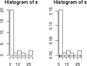
The basic histogram has a predefined set of break points for the bins. If you want, you can specify the number of breaks or your own break points (figure 4).
> hist(x,breaks=10)             # 10 breaks, or just hist(x,10)
> hist(x,breaks=c(0,1,2,3,4,5,10,20,max(x))) # specify break points
From the histogram, you can easily make guesses as to the values of the mean, the median, and the IQR. To do so, you need to know that the median divides the histogram into two equal area pieces, the mean would be the point where the histogram would balance if you tried to, and the IQR captures exactly the middle half of the data.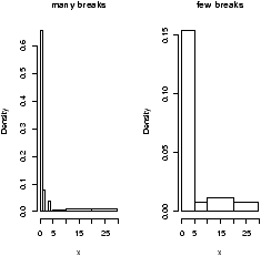
Figure 4: Histograms with breakpoints specified
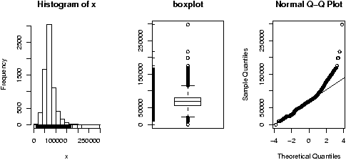
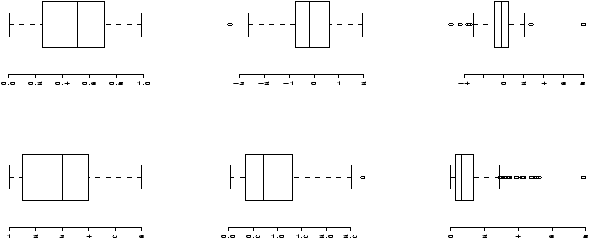
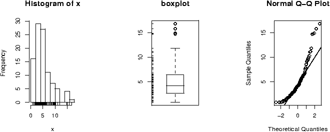
3.11 Boxplots
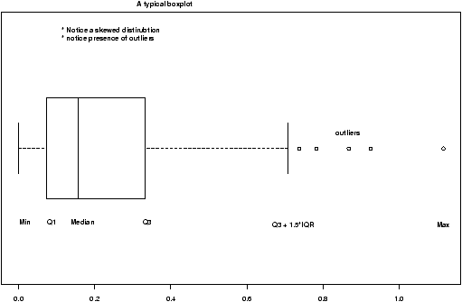
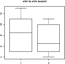
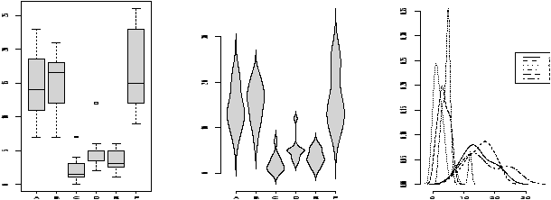
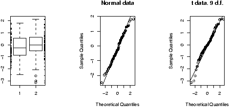
The boxplot (eg. figure 5) is used to summarize data succinctly, quickly displaying if the data is symmetric or has suspected outliers. It is based on the 5-number summary. In its simplest usage, the boxplot has a box with lines at the lower hinge (basically Q1), the Median, the upper hinge (basically Q3) and whiskers which extend to the min and max. To showcase possible outliers, a convention is adopted to shorten the whiskers to a length of 1.5 times the box length. Any points beyond that are plotted with points. These may further be marked differently if the data is more than 3 box lengths away. Thus the boxplots allows us to check quickly for symmetry (the shape looks unbalanced) and outliers (lots of data points beyond the whiskers). In figure 5 we see a skewed distribution with a long tail.
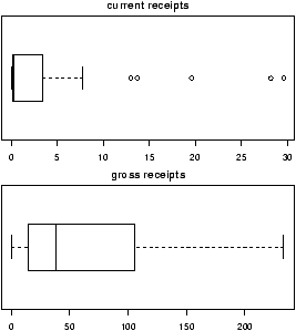
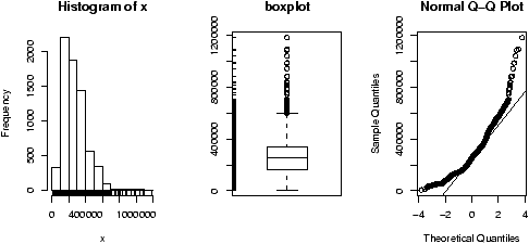
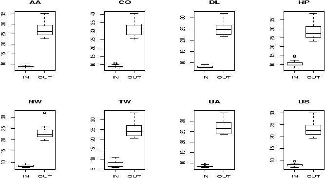
Example: Movie sales, reading in a dataset
In this example, we look at data on movie revenues for the 25 biggest movies of a given week. Along the way, we also introduce how to ``read-in'' a built-in data set. The data set here is from the data sets accompanying these notes.5
In this example, we look at data on movie revenues for the 25 biggest movies of a given week. Along the way, we also introduce how to ``read-in'' a built-in data set. The data set here is from the data sets accompanying these notes.5
> library("Simple")             # read in library for these notes
> data(movies)                  # read in data set for gross.
> names(movies)
[1] "title"    "current"  "previous" "gross"
> attach(movies)                # to access the names above
> boxplot(current,main="current receipts",horizontal=TRUE)
> boxplot(gross,main="gross receipts",horizontal=TRUE)
> detach(movies)                # tidy up
We plot both the current sales and the gross sales in a boxplot (figure 6).
Notice, both distributions are skewed, but the gross sales are less so. This shows why Hollywood is so interested in the ``big hit'', as a real big hit can generate a lot more revenue than quite a few medium sized hits.
R Basics: Reading in datasets with library and data
In the above example we read in a built-in dataset. Doing so is easy. Let's see how to read in a dataset from the package ts (time series functions). First we need to load the package, and then ask to load the data. Here is how
In the above example we read in a built-in dataset. Doing so is easy. Let's see how to read in a dataset from the package ts (time series functions). First we need to load the package, and then ask to load the data. Here is how
> library("ts")                 # load the library
> data("lynx")                  # load the data
> summary(lynx)                 # Just what is lynx?
   Min. 1st Qu.  Median    Mean 3rd Qu.    Max.
   39.0   348.3   771.0  1538.0  2567.0  6991.0
The library and data command can be used in
several different ways
- To list all available packages
- Use the command library().
- To list all available datasets
- Use the command data() without any arguments
- To list all data sets in a given package
- Use data(package='package name') for example data(package=ts).
- To read in a dataset
- Use data('dataset name'). As in the example data(lynx). You first need to load the package to access its datasets as in the command library(ts).
- To find out information about a dataset
- You can use the help command to see if there is documentation on the data set. For example help("lynx") or equivalently ?lynx.
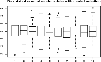
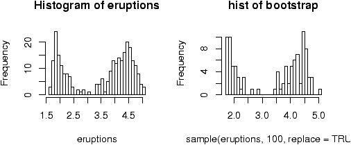
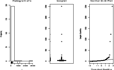
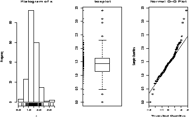
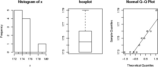
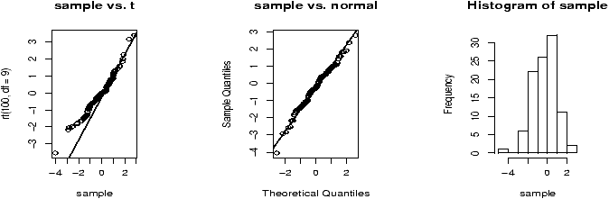
Example: Seeing both the histogram and boxplot
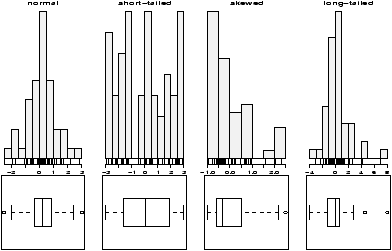
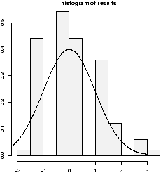
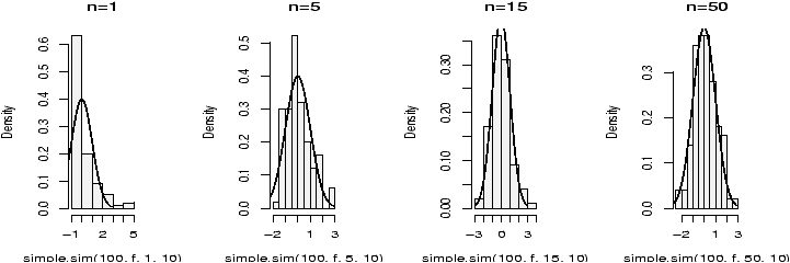
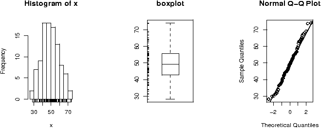
The function simple.hist.and.boxplot will plot both a histogram and a boxplot to show the relationship between the two graphs for the same dataset. The figure shows some examples on some randomly generated data. The data would be described as bell shaped (normal), short tailed, skewed and long tailed (figure 7).
The function simple.hist.and.boxplot will plot both a histogram and a boxplot to show the relationship between the two graphs for the same dataset. The figure shows some examples on some randomly generated data. The data would be described as bell shaped (normal), short tailed, skewed and long tailed (figure 7).
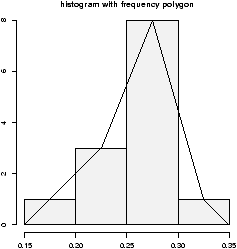
3.12 Frequency Polygons
Some times you will see the histogram information presented in a different way. Rather than draw a rectangle for each bin, put a point at the top of the rectangle and then connect these points with straight lines. This is called the frequency polygon. To generate it, we need to know the bins, and the heights. Here is a way to do so with R getting the necessary values from the hist command. Suppose the data is batting averages for the New York Yankees 6> x = c(.314,.289,.282,.279,.275,.267,.266,.265,.256,.250,.249,.211,.161) > tmp = hist(x) # store the results > lines(c(min(tmp$breaks),tmp$mids,max(tmp$breaks)),c(0,tmp$counts,0),type="l")
Ughh, this is just too much to type, so there is a function to do this for us simple.freqpoly.R. Notice though that the basic information was available to us with the values labeled breaks and counts.
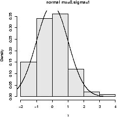
3.13 Densities
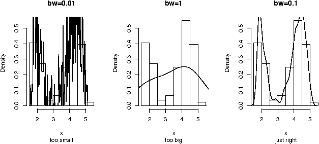
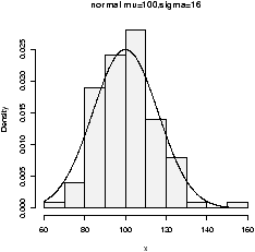
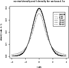
The point of doing the frequency polygon is to tie the histogram in with the probability density of the parent population. More sophisticated densities functions are available, and are much less work to use if you are just using a built-in function.The built-in data set faithful (help faithful) tracks the time between eruptions of the old-faithful geyser.The R command density can be used to give more sophisticated attempts to view the data with a curve (as the frequency polygon does). The density() function has means to do automatic selection of bandwidth. See the help page for the full description. If we use the default choice it is easy to add a density plot to a histogram. We just call the lines function with the result from density (or plot if it is the first graph). For example
    > data(faithful)
    > attach(faithful)              # make eruptions visible
    > hist(eruptions,15,prob=T)     # proportions, not frequencies
    > lines(density(eruptions))     # lines makes a curve, default bandwidth
    > lines(density(eruptions,bw="SJ"),col='red') # Use SJ bandwidth, in red
The basic idea is for each point to take some kind of
average for the points nearby and based on this give an estimate for
the density. The details of the averaging can be quite complicated,
but the main control for them is something called the bandwidth which
you can control if desired. For the last graph the ``SJ'' bandwidth
was selected. You can also set this to be a fixed number if
desired. In
figure 9 are 3 examples
with the bandwidth chosen to be 0.01, 1 and then 0.1. Notice, if the
bandwidth is too small, the result is too jagged, too big and the
result is too smooth.
3.14 Problems
- 3.1
- Enter in the data
60 85 72 59 37 75 93 7 98 63 41 90 5 17 97
Make a stem and leaf plot. - 3.2
- Read this stem and leaf plot, enter in the data and make a
histogram:
  The decimal point is 1 digit(s) to the right of the |

   8 | 028
   9 | 115578
  10 | 1669
  11 | 01
- 3.3
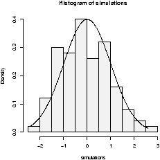
- One can generate random data with the ``r''-commands. For
example
> x = rnorm(100)
produces 100 random numbers with a normal distribution. Create two different histograms for two different times of defining x as above. Do you get the same histogram? - 3.4
- Make a histogram and boxplot of these data sets from these Simple
data sets: south, crime and aid. Which
of these data sets is skewed? Which has outliers, which is
symmetric.
- 3.5
- For the Simple data sets bumpers,
firstchi, math make a histogram. Try to
predict the mean, median and standard deviation. Check your guesses
with the appropriate R commands.
- 3.6
- The number of O-ring failures for the first 23 flights of the US
space shuttle Challenger were
0 1 0 NA 0 0 0 0 0 1 1 1 0 0 3 0 0 0 0 0 2 0 1(NA means not available -- the equipment was lost). Make a table of the possible categories. Try to find the mean. (You might need to try mean(x,na.rm=TRUE) to avoid the value NA, or look at x[!is.na(x)].)
- 3.7
- The Simple dataset
pi2000
contains the first 2000 digits of
p. Make a histogram. Is it surprising? Next, find the proportion
of 1's, 2's and 3's. Can you do it for all 10 digits 0-9?
- 3.8
- Fit a density estimate to the Simple dataset
pi2000
.
- 3.9
- Find a graphic in the newspaper or from the web. Try to use R to produce a similar figure.
Copyright © John Verzani, 2001-2. All rights reserved.