Folders
Files
DESCRIPTION
index.html
next_motif.gif
PACKAGES
previous_motif.gif
R-logo.gif
Simple_0.6.tar.gz
Simple_0.6.zip
simpleR.R
stat.html
stat001.gif
stat001.html
stat002.gif
stat002.html
stat003.gif
stat003.html
stat004.gif
stat004.html
stat005.gif
stat005.html
stat006.gif
stat006.html
stat007.gif
stat007.html
stat008.gif
stat008.html
stat009.gif
stat009.html
stat010.gif
stat010.html
stat011.gif
stat011.html
stat012.gif
stat012.html
stat013.gif
stat013.html
stat014.gif
stat014.html
stat015.gif
stat015.html
stat016.gif
stat016.html
stat017.gif
stat017.html
stat018.gif
stat018.html
stat019.gif
stat019.html
stat020.gif
stat020.html
stat021.gif
stat021.html
stat022.gif
stat022.html
stat023.gif
stat023.html
stat024.gif
stat024.html
stat025.gif
stat025.html
stat026.gif
stat026.html
stat027.gif
stat028.gif
stat029.gif
stat030.gif
stat031.gif
stat032.gif
stat033.gif
stat034.gif
stat035.gif
stat036.gif
stat037.gif
stat038.gif
stat039.gif
stat040.gif
stat041.gif
stat042.gif
stat043.gif
stat044.gif
stat045.gif
stat046.gif
stat047.gif
stat048.gif
stat049.gif
stat050.gif
stat051.gif
stat052.gif
stat053.gif
stat054.gif
stat055.gif
stat056.gif
stat057.gif
stat058.gif
stat059.gif


13 Regression Analysis
Regression analysis forms a major part of the statisticians tool box. This section discusses statistical inference for the regression coefficients.13.1 Simple linear regression model
R can be used to study the linear relationship between two numerical variables. Such a study is called linear regression for historical reasons.The basic model for linear regression is that pairs of data, (xi,yi), are related through the equation
yi = b0 + b1 xi + ei
The values of b0 and b1 are unknown and will
be estimated from the data. The value of ei is the amount
the y observation differs from the straight line model.In order to estimate b0 and b1 the method of least squares is employed. That is, one finds the values of (b0,b1) which make the differences b0 + b1 xi - yi as small as possible (in some sense). To streamline notation define yi^ = b0 + b1 xi and ei = yi^ - yi be the residual amount of difference for the ith observation. Then the method of least squares finds (b0,b1) to make �ei2 as small as possible. This mathematical problem can be solved and yields values of
| b1 = |
|
, |
|
= b0 + b1 |
|
In order to make statistical inference about these values, one needs to make assumptions about the errors ei. The standard assumptions are that these errors are independent, normals with mean 0 and common variance s2. If these assumptions are valid then various statistical tests can be made as will be illustrated below.
Example: Linear Regression with R
The maximum heart rate of a person is often said to be related to age by the equation
The maximum heart rate of a person is often said to be related to age by the equation
Max = 220- Age.
Suppose this is to be empirically proven and 15 people of varying
ages are tested for their maximum heart rate. The following
data14
is found:
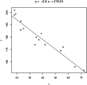
Age       18  23  25  35  65  54  34  56  72  19  23  42  18  39  37
Max Rate  202 186 187 180 156 169 174 172 153 199 193 174 198 183 178
In a previous section, it was shown how to use lm to do a
linear model, and the commands plot and abline to
plot the data and the regression line. Recall, this could also be
done with the simple.lm function. To review, we can plot the
regression line as follows
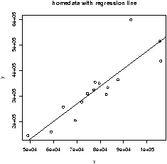
> x = c(18,23,25,35,65,54,34,56,72,19,23,42,18,39,37)
> y = c(202,186,187,180,156,169,174,172,153,199,193,174,198,183,178)
> plot(x,y)                     # make a plot
> abline(lm(y ~ x))             # plot the regression line
> lm(y ~ x)                     # the basic values of the regression analysis

Call:
lm(formula = y ~ x)

Coefficients:
(Intercept)            x
   210.0485      -0.7977
Or with,
> lm.result=simple.lm(x,y)
> summary(lm.result)

Call:
lm(formula = y ~ x)
          ...
Coefficients:
             Estimate Std. Error t value Pr(>|t|)
(Intercept) 210.04846    2.86694   73.27  < 2e-16 ***
x            -0.79773    0.06996  -11.40 3.85e-08 ***
          ...
The result of the lm function is of class lm and so the
plot and summary commands adapt themselves to
that. The variable lm.result contains the result. We
used summary to view the entire thing. To view parts of it,
you can call it like it is a list or better still use the
following methods: resid for residuals, coef for
coefficients and predict for prediction. Here are a few examples, the
former giving the coefficients b0 and b1, the latter
returning the residuals which are then summarized.
> coef(lm.result)             # or use lm.result[['coef']]
(Intercept)           x
210.0484584  -0.7977266
> lm.res = resid(lm.result)   # or lm.result[['resid']]
> summary(lm.res)
      Min.    1st Qu.     Median       Mean    3rd Qu.       Max.
-8.926e+00 -2.538e+00  3.879e-01 -1.628e-16  3.187e+00  6.624e+00
Once we know the model is appropriate for the data, we will begin to identify the meaning of the numbers.
13.2 Testing the assumptions of the model
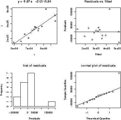
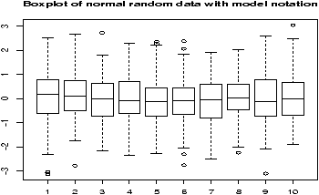
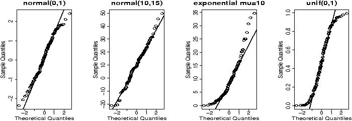
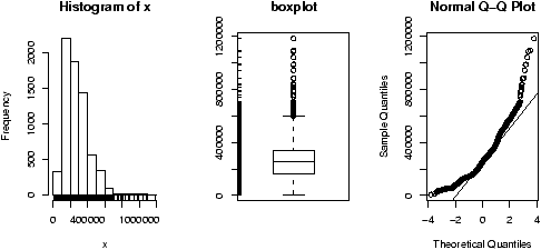
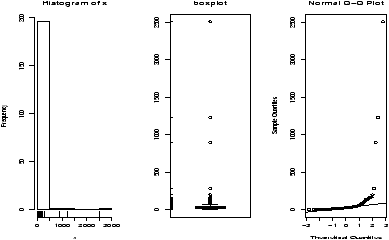
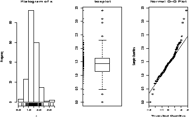
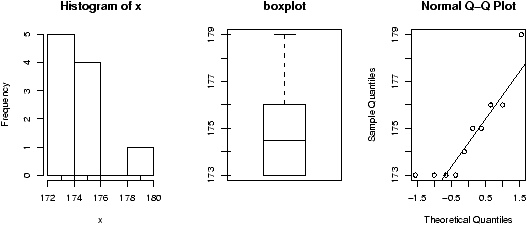
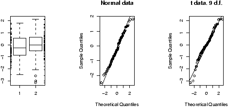
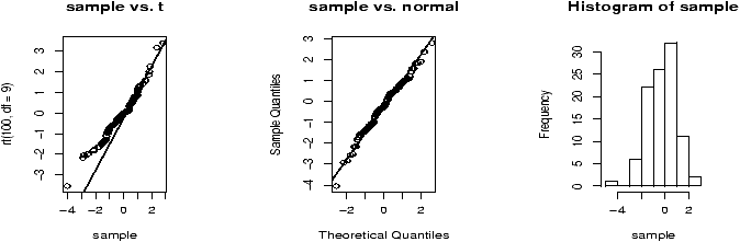
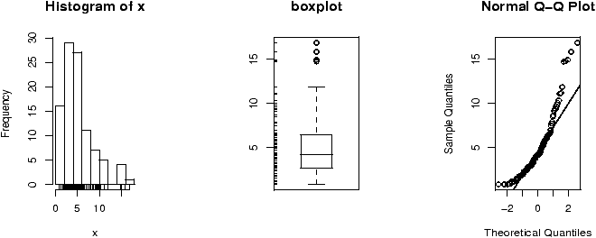
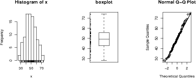
The validity of the model can be checked graphically via eda. The assumption on the errors being i.i.d. normal random variables translates into the residuals being normally distributed. They are not independent as they add to 0 and their variance is not uniform, but they should show no serial correlations.We can test for normality with eda tricks: histograms, boxplots and normal plots. We can test for correlations by looking if there are trends in the data. This can be done with plots of the residuals vs. time and order. We can test the assumption that the errors have the same variance with plots of residuals vs. time order and fitted values.
The plot command will do these tests for us if we give it the result of the regression
> plot(lm.result)(It will plot 4 separate graphs unless you first tell R to place 4 on one graph with the command par(mfrow=c(2,2)).
Note, this is different from plot(x,y) which produces a scatter plot. These plots have:
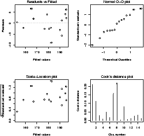
- Residuals vs. fitted
- This plots the fitted (y^) values against the residuals. Look for spread around the line y=0 and no obvious trend.
- Normal qqplot
- The residuals are normal if this graph falls close to a straight line.
- Scale-Location
- This plot shows the square root of the standardized residuals. The tallest points, are the largest residuals.
- Cook's distance
- This plot identifies points which have a lot of influence in the regression line.
13.3 Statistical inference
If you are satisfied that the model fits the data, then statistical inferences can be made. There are 3 parameters in the model: s, b0 and b1.13.4 About s
Recall, s is the standard deviation of the error terms. If we had the exact regression line, then the error terms and the residuals would be the same, so we expect the residuals to tell us about the value of s.What is true, is that
| s2 = |
|
�( |
|
- yi)2 = |
|
�ei2 . |
13.5 Inferences about b1
The estimator b1 for b1, the slope of the regression line, is also an unbiased estimator. The standard error is given by| SE(b1) = |
|
The distribution of the normalized value of b1 is
| t = |
|
If the null hypothesis is H0: b1 = a against the alternative hypothesis HA: b1 � a then one calculates the t statistic
| t = |
|
Example: Max heart rate (cont.)
Continuing our heart-rate example, we can do a test to see if the slope of -1 is correct. Let H0 be that b1=-1, and HA be that b1 � -1. Then we can create the test statistic and find the p-value by hand as follows:
Continuing our heart-rate example, we can do a test to see if the slope of -1 is correct. Let H0 be that b1=-1, and HA be that b1 � -1. Then we can create the test statistic and find the p-value by hand as follows:
> es = resid(lm.result)         # the residuals lm.result
> b1 =(coef(lm.result))[['x']]  # the x part of the coefficients
> s = sqrt( sum( es^2 ) / (n-2) )
> SE = s/sqrt(sum((x-mean(x))^2))
> t = (b1 - (-1) )/SE           # of course  - (-1) = +1
> pt(t,13,lower.tail=FALSE)     # find the right tail for this value of t
                                # and 15-2 d.f.
[1] 0.0023620
The actual p-value is twice this as the problem is two-sided.
We see that it is unlikely that for this data the slope is
-1. (Which is the slope predicted by the formula 220 - Age.)R will automatically do a hypothesis test for the assumption b1=0 which means no slope. See how the p-value is included in the output of the summary command in the column Pr(>|t|)
Coefficients:
             Estimate Std. Error t value Pr(>|t|)
(Intercept) 210.04846    2.86694   73.27  < 2e-16 ***
x            -0.79773    0.06996  -11.40 3.85e-08 ***
13.6 Inferences about b0
As well, a statistical test for b0 can be made (and is). Again, R includes the test for b0 = 0 which tests to see if the line goes through the origin. To do other tests, requires a familiarity with the details.The estimator b0 for b0 is also unbiased, and has standard error given by
| SE(b0) = s |
� � � � � � � |
|
� � � � � � � |
|
= s |
� � � � � � � |
|
+ |
|
� � � � � � � |
|
Given this, the statistic
| t = |
|
Example: Max heart rate (cont.)
Let's check if the data supports the intercept of 220. Formally, we will test H0: b0 = 220 against HA: b0 < 220. We need to compute the value of the test statistic and then look up the one-sided p-value. It is similar to the previous example and we use the previous value of s:
Let's check if the data supports the intercept of 220. Formally, we will test H0: b0 = 220 against HA: b0 < 220. We need to compute the value of the test statistic and then look up the one-sided p-value. It is similar to the previous example and we use the previous value of s:
> SE = s * sqrt( sum(x^2)/( n*sum((x-mean(x))^2)))
> b0 = 210.04846                # copy or use
> t = (b0 - 220)/SE             # (coef(lm.result))[['(Intercept)']]
> pt(t,13,lower.tail=TRUE)      # use lower tail (220 or less)
[1] 0.0002015734
We would reject the value of 220 based on this p-value as well.
13.7 Confidence intervals
Visually, one is interested in confidence intervals. The regression line is used to predict the value of y for a given x, or the average value of y for a given x and one would like to know how accurate this prediction is. This is the job of a confidence interval.There is a subtlety between the two points above. The mean value of y is subject to less variability than the value of y and so the confidence intervals will be different although, they are both of the same form:
b0 + b1 � t* SE.
The mean or average value of y for a given x is often denoted �y | x and has a standard error of
| SE = s |
� � � � � � � |
|
+ |
|
� � � � � � � |
|
If we are trying to predict a single value of y, then SE changes ever so slightly to
| SE = s |
� � � � � � � |
1+ |
|
+ |
|
� � � � � � � |
|
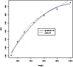
But this makes a big difference. The plotting of confidence intervals in R is aided with the predict function. For convenience, the function simple.lm will plot both confidence intervals if you ask it by setting show.ci=TRUE.
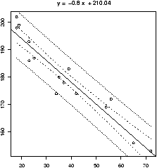
Example: Max heart rate (cont.)
Continuing, our example, to find simultaneous confidence intervals for the mean and an individual, we proceed as follows
Continuing, our example, to find simultaneous confidence intervals for the mean and an individual, we proceed as follows
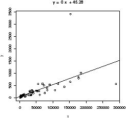
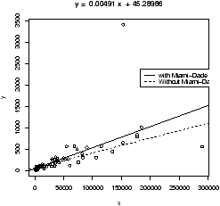
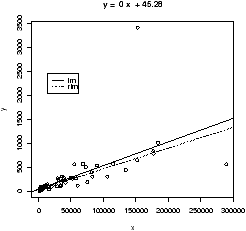
## call simple.lm again
> simple.lm(x,y,show.ci=TRUE,conf.level=0.90)
This produces this graph (figure 52) with both 90% confidence bands drawn. The wider set of bands is for the individual.
R Basics: The low-level R commands
The function simple.lm will do a lot of the work for you, but to really get at the regression model, you need to learn how to access the data found by the lm command. Here is a short list.
The function simple.lm will do a lot of the work for you, but to really get at the regression model, you need to learn how to access the data found by the lm command. Here is a short list.
- To make a lm object
- First, you need use the
lm function and store the results. Suppose x and
y are as above. Then
> lm.result = lm(y ~ x)will store the results into the variable lm.result. - To view the results
- As usual, the summary method will
show you most of the details.
> summary(lm.result) ... not shown ... - To plot the regression line
- You make a plot of the data, and
then add a line with the abline command
> plot(x,y) > abline(lm.result) - To access the residuals
- You can use the resid method
> resid(lm.result) ... output is not shown ... - To access the coefficients
- The coef function will
return a vector of coefficients.
> coef(lm.result)
(Intercept)           x
210.0484584  -0.7977266
To get at the individual ones, you can refer to them by number, or name as with:> coef(lm.result)[1] (Intercept) 210.0485 > coef(lm.result)['x'] x -0.7977266 - To get the fitted values
- That is to find yi^ = b0
+ b1 xi for each i, we use the fitted.values command
> fitted(lm.result) # you can abbreviate to just fitted ... output is not shown ... - To get the standard errors
- The values of s and SE(b0)
and SE(b1) appear in the output of summary. To access them
individually is possible with the right know how. The key is that
the coefficients method returns all the numbers in a
matrix if you use it on the results of summary
> coefficients(lm.result)
(Intercept)           x
210.0484584  -0.7977266
> coefficients(summary(lm.result))
               Estimate Std. Error   t value     Pr(>|t|)
(Intercept) 210.0484584 2.86693893  73.26576 0.000000e+00
x            -0.7977266 0.06996281 -11.40215 3.847987e-08
To get the standard error for x then is as easy as taking the 2nd row and 2nd column. We can do this by number or name:> coefficients(summary(lm.result))[2,2] [1] 0.06996281 > coefficients(summary(lm.result))['x','Std. Error'] [1] 0.06996281 - To get the predicted values
- We can use the predict
function to get predicted values, but it is a little clunky to
call. We need a data frame with column names matching the
predictor or explanatory variable. In this example this is
x so we can do the following to get a prediction for a 50
and 60 year old we have
> predict(lm.result,data.frame(x= c(50,60))) 1 2 170.1621 162.1849 - To find the confidence bands
- The confidence bands would be a
chore to compute by hand. Unfortunately, it is a bit of a chore to get
with the low-level commands as well. The predict method
also has an ability to find the confidence bands if we learn how
to ask. Generally speaking, for each value of x we want a point
to plot. This is done as before with a data frame containing all
the x values we want. In addition, we need to ask for the
interval. There are two types: confidence, or prediction. The
confidence will be for the mean, and the prediction for the
individual. Let's see the output, and then go from there. This is
for a 90% confidence level.
> predict(lm.result,data.frame(x=sort(x)), # as before
+  level=.9, interval="confidence") # what is new
        fit      lwr      upr
1  195.6894 192.5083 198.8705
2  195.6894 192.5083 198.8705
3  194.8917 191.8028 197.9805
... skipped ...
We see we get 3 numbers back for each value of x. (note we sorted x first to get the proper order for plotting.) To plot the lower band, we just need the second column which is accessed with [,2]. So the following will plot just the lower. Notice, we make a scatterplot with the plot command, but add the confidence band with points.> plot(x,y) > abline(lm.result) > ci.lwr = predict(lm.result,data.frame(x=sort(x)), + level=.9,interval="confidence")[,2] > points(sort(x), ci.lwr,type="l") # or use lines()
Alternatively, we could plot this with the curve function as follows> curve(predict(lm.result,data.frame(x=x), + interval="confidence")[,3],add=T)
This is conceptually easier, but harder to break up, as the curve function requires a function of x to plot.
13.8 Problems
- 13.1
- The cost of a home depends on the number of bedrooms in the
house. Suppose the following data is recorded for homes in a given
town
Make a scatterplot, and fit the data with a regression line. On the same graph, test the hypothesis that an extra bedroom costs $60,000 against the alternative that it costs more.price (in thousands) 300 250 400 550 317 389 425 289 389 559 No. bedrooms 3 3 4 5 4 3 6 3 4 5
- 13.2
- It is well known that the more beer you drink, the more your
blood alcohol level rises. Suppose we have the following data on
student beer consumption
Make a scatterplot and fit the data with a regression line. Test the hypothesis that another beer raises your BAL by 0.02 percent against the alternative that it is less.Student 1 2 3 4 5 6 7 8 9 10 Beers 5 2 9 8 3 7 3 5 3 5 BAL 0.10 0.03 0.19 0.12 0.04 0.095 0.07 0.06 0.02 0.05
- 13.3
- For the same Blood alcohol data, do a hypothesis test that the
intercept is 0 with a two-sided alternative.
- 13.4
- The lapse rate is the rate at which temperature drops as you
increase elevation. Some hardy students were interested in checking
empirically if the lapse rate of 9.8 degrees C/km was accurate for
their hiking. To investigate, they grabbed their thermometers and
their Suunto wrist altimeters and found the following data on their
hike
Draw a scatter plot with regression line, and investigate if the lapse rate is 9.8C/km. (First, it helps to convert to the rate of change in Fahrenheit per feet with is 5.34 degrees per 1000 feet.) Test the hypothesis that the lapse rate is 5.34 degrees per 1000 feet against the alternative that it is less than this.elevation (ft) 600 1000 1250 1600 1800 2100 2500 2900 temperature (F) 56 54 56 50 47 49 47 45
Copyright © John Verzani, 2001-2. All rights reserved.