Some parts of this course - especially the ones intended to familiarize you with the Bootstrap technique - may require a little bit of programming practice. To help with these parts, here is a very concise intro to just enough Python (with NumPy, SciPy, Pandas and Statsmodels) or R (with RStudio and Tidyverse) to get you through the exercises. There are plenty of tutorials and introductions to help you get acquainted with the whole programming language - this is intended as a cookbook style bare bones toolbox.
Download and install Anaconda to get access to the whole Python stack of tools.
Download and install JetBrains’ PyCharm or DataSpell for a good development environment to write Python scripts and notebooks in. Your student status and campus email will get you an educational license for these tools.
Anaconda and PyCharm and DataSpell all have good interfaces to package managers. Search for, and make sure you have downloaded and installed, the following packages: numpy, scipy, pandas, matplotlib, seaborn, statsmodels.
Most likely, Google Colaboratory already has everything you need. If every you run into a package you try to load but does not seem to exist, write the following on its own in a code cell and execute it:
!pip install <package-name>
After the package has installed you can remove the cell again, you will not need to rerun the command.
In the Console part of the RStudio window (bottom left), run the following command:
install.packages(c("tidyverse", "foreach"))
The command install.packages will help you add missing libraries to R installations when you need them.
There are some circumstances that generate very many errors when trying to install tidyverse. This is often due to missing software on the computer, and it might be easier to switch to the Cloud solution for R computations.
In the Console part of the RStudio window (bottom left), run the following command:
install.packages(c("tidyverse", "foreach"))
The command install.packages will help you add missing libraries to R installations when you need them.
Create a new project / new notebook. In this notebook you will collect code cells with executable code, and markdown cells that you can fill with text explaining what you are doing and why.
In the first code cell of the project, put the following:
%matplotlib inlineimport numpy as npimport scipy as spimport pandas as pdimport statsmodelsimport scipy.statsfrom matplotlib import pyplot
Make sure you execute this code cell before you continue with the rest of your code.
Create a new R script (if you want to just write code) or a new RMarkdown or Quarto document (if you want to write text with code elements interspersed, like the lecture slides are written).
In RMarkdown or Quarto, you create code cells that contain R code that does computations by writing
```{r}# R code goes here```
Whichever way you build your code (script or as a document with code-blocks), include the following lines of code at the very start of the script
(as well as a number of functions for computing population statistics, entropy, moments, and fitting the distribution to observed data)
Discrete Distributions:
scipy.stats.bernoulli(p) - the Bernoulli distribution
scipy.stats.binom(n,p) - the Binomial distribution
scipy.stats.geom(p) - the geometric distribution, ie # failures before first success
scipy.stats.hypergeom(M, n, N) - the hypergeometric distribution; In an urn with \(M\) balls, \(n\) white and \(M-n\) black, count how many white balls are drawn when drawing \(N\) without replacement
scipy.stats.nbinom(n,p) - the negative binomial distribution counting number of failures before \(n\) successes happen
scipy.stats.poisson(mu) - the Poisson distribution
scipy.stats.randint(low, high) - the discrete uniform distribution
Multivariate Discrete Distributions:
scipy.stats.multinomial(n, [p1,p2,...,pm]) - multinomial distribution with probabilities \(p_1,\dots,p_m\) for the \(m\) different categories
scipy.stats.multivariate_hypergeom([m1,m2,...,mk], n) - multivariate hypergeometric distribution where there are \(n\) samples taken from a population with \(m_i\) objects of the i:th type.
(as well as a number of functions for computing population statistics, entropy, moments, and fitting the distribution to observed data)
Each distribution defines functions:
r? - generate random numbers
d? - \(PDF\)
p? - \(CDF\)
q? - \(CDF^{-1}\)
Commonly used distributions include (replace ? with r/d/p/q and with the input [number of random values; x; x; p])
?binom(?, n, p) - Binomial and Bernoulli
?chisq(?, df) - Chi-square
?exp(?, lambda) - Exponential
?f(?, df1, df2) - F
?gamma(?, shape, scale=?) or ?gamma(?, shape, rate=?) - Gamma
?geom(?, p) - Geometric, ie # failures before first success
?hyper(?, m, n, k) - Hypergeometric, drawing \(k\) balls from \(m\) white and \(n\) black balls in an urn, and counting the number of white balls drawn
?lnorm(?, meanlog=mu, sdlog=sigma) - Log normal
rmultinom(n, size, c(p1, p2, ..., pm)), dmultinom(c(x1, x2, ..., xm), prob=c(p1, p2, ..., pm)) - random values and probability density for the multinomial (multivariate) distribution where the probability of drawing the i:th type of object is pi
?nbinom(?, n, p) - negative binomial
?norm(?, mean=mu, sd=sigma) - normal; note that it takes standard deviations and not variances
?pois(?, lambda) - Poisson
?t(?, df) - Student’s T
?t(?, df, ncp) - Non-central Student’s T; no random values, only available if abs(ncp) <= 37.62
We use the data.sample method from Pandas with a list comprehension to quickly compute a bootstrap sample:
bootstrap_samples = [data.sample(frac=1.0, replace=True).variable1.median() for i inrange(999)]
Replace .median to get a different statistic (Pandas provides kurtosis, mad (mean absolute deviation), max, mean, median, min, mode, product, quantile, rank, sem (standard error of the mean), skew, sum, std, var, nunique; std, var, skew and kurtosis are unbiased estimator)
Replace 999 with the number of samples you want to generate.
Alternatively, for some other function f, you can use:
bootstrap_samples = [f(data.sample(frac=1.0, replace=True).variable1) for i inrange(999)]
The result is a list (not a Pandas DataFrame), can be used with for instance np.quantile to compute bootstrap quantiles, np.mean and np.std for means and standard deviations, etc.
This code sample uses the foreach package for iteration; there are many other ways to do the same thing. It also extensively uses the tidyverse toolkit.
bootstrap_samples =foreach(i=1:999, .combine=rbind) %do% ( data %>%sample_frac(replace=TRUE) %>%summarise(stat=median(variable1)))
Replace median to get a different statistic.
Replace 999 with the number of samples you want to generate.
Bootstrap Using Utility Functions
These may require you to write small functions to fully specify the computation you need to perform.
If you want to change confidence level, method, or other additional tasks, you can also hand in a previously computed bootstrap_sample into the bootstrap function:
The library boot (install using install.packages if it is missing) provides a function for orchestrating bootstrap computations. You will need to write a function to perform the computation on a bootstrap sample, but the included code can be extensively re-used.
library(boot)stat =function(data, indices) { datasample = data[indices,] # pick out the elements chosen by the bootstrapreturn(median(datasample$variable))}bootstrap_output =boot(data, stat)
You can then query this bootstrap_output object for additional information: bootstrap$t0 is the (set of) statistics applied to the original data and bootstrap$t is a matrix where each row is a bootstrap replicate of all the statistics.
print(bootstrap_output) and plot(bootstrap_output) both produce helpful summary outputs.
To access confidence intervals, use the boot.ci function, which takes the output as well as conf=0.95 for the confidence level (default is 0.95) and type="all" for the confidence interval type (with options "norm", "basic", "stud", "perc", "bca", and "all")
Pivotting
To move between long format data sets and wide format data sets, there are functions that help with the conversion. In a long format data set, values are in one column while their corresponding labels live in a different column – whereas in a wide format data sets, each label becomes a column of its own carrying the values directly.
          value
variable barley maize oats wheat
0           NaN   NaN  NaN   5.2
1           NaN   NaN  NaN   4.5
2           NaN   NaN  NaN   6.0
3           NaN   NaN  NaN   6.1
4           NaN   NaN  NaN   6.7
5           NaN   NaN  NaN   5.8
6           6.5   NaN  NaN   NaN
7           8.0   NaN  NaN   NaN
8           6.1   NaN  NaN   NaN
9           7.5   NaN  NaN   NaN
10          5.9   NaN  NaN   NaN
11          5.6   NaN  NaN   NaN
12          NaN   5.8  NaN   NaN
13          NaN   4.7  NaN   NaN
14          NaN   6.4  NaN   NaN
15          NaN   4.9  NaN   NaN
16          NaN   6.0  NaN   NaN
17          NaN   5.2  NaN   NaN
18          NaN   NaN  8.3   NaN
19          NaN   NaN  6.1   NaN
20          NaN   NaN  7.8   NaN
21          NaN   NaN  7.0   NaN
22          NaN   NaN  5.5   NaN
23          NaN   NaN  7.2   NaN
For a more compact version, first add a row-number variable within each group:
pivot_longer moves us from wide to long. Tell pivot_longer which columns need to be recoded as a name column and as a value column. There are a number of helper functions in tidyverse to make these specifications much easier - such as everything() or starts_with("prefix") or ends_with("suffix") or contains("content"). You can also just list the columns that you want to rewrite.
pivot_wider moves us from long to wide. You need to tell the function where the names live with names_from and where the values live with values_from, and it will construct new column names from these. If you want control over how the column names get constructed, you may want to use the arguments names_prefix, names_sep or names_glue.
If you have any duplicate values, pivot_wider will struggle pivotting. The solution is to make sure you have an ID column, or by calling the unnest function to unwrap the lists pivot_wider creates.
One very useful way to use long-form data frames is to do the same computations for all groups simultaneously, and extracting either a transformed or a summarized data frame. Both pandas and tidyverse have extensive support for these operations through a group by operation.
With the function .agg (short for .aggregate), you can both apply several different summary functions at once, and also apply functions not implemented in pandas.
# A tibble: 4 × 2
  name   value
  <chr>  <dbl>
1 barley  7
2 maize   5.8
3 oats    7.75
4 wheat   5.5
Permutation Testing
For permutation testing we would permute group membership among the values, and then re-compute some quantity (like for instance group means and the group mean differences; or some energy function that captures some other behavior).
With pandas, this can be a little bit tricky, because pandas works hard to maintain the row index of your data. So you’ll need to use reset_index to avoid the index alignment.
Say that we want to find out if wheat or barley has a much higher median than the other.
Code
df_wb = df_long.query("variable in ['wheat','barley']")df_perm = pd.concat([df_wb.groupby("variable").value.median()] + [df_wb.apply(lambda x: x.sample(frac=1).values ).groupby("variable").value.median() for _ inrange(999)], axis=1).Tperm_diff = df_perm.barley-df_perm.wheatperm_diff.head(5)
value    0.40
value   -0.35
value    0.45
value    0.90
value   -0.50
dtype: float64
Once you have a sample like this one, you can compute .rank() to figure out how extreme each value is in its respective column, which you will need to compute a p-value for the permutation test.
By using .rank(method="max"), each rank counts how many elements (including the current one) have its value or less.
Now with these median differences from each permutation, we can use rank to compute a p-value. By using ties.method="min", each rank counts how many entries, itself excluded are that size or smaller. n() can be used to get the total number of observations.
R has extensive support for linear regression through lm and for ANOVA through aov. The command anova is used to print out ANOVA tables for many kinds of models (including linear regression and ANOVA).
Within a single species, are the body masses dependent on island? Only Adelie penguins were observed on all three islands. Let’s do an ANOVA.
model.adelie =aov(body_mass_g ~ island, penguins %>%filter(species =="Adelie"))model.adelie
Call:
   aov(formula = body_mass_g ~ island, data = penguins %>% filter(species ==
    "Adelie"))

Terms:
                  island Residuals
Sum of Squares     13655  31528779
Deg. of Freedom        2       148

Residual standard error: 461.5542
Estimated effects may be unbalanced
1 observation deleted due to missingness
summary(model.adelie)
             Df   Sum Sq Mean Sq F value Pr(>F)
island        2    13655    6827   0.032  0.968
Residuals   148 31528779  213032
1 observation deleted due to missingness
anova(model.adelie)
Analysis of Variance Table

Response: body_mass_g
           Df   Sum Sq Mean Sq F value Pr(>F)
island      2    13655    6827   0.032 0.9685
Residuals 148 31528779  213032
How about the three different species, do they have different bill sizes?
Call:
   aov(formula = bill_length_mm ~ species, data = penguins)

Terms:
                 species Residuals
Sum of Squares  7194.317  2969.888
Deg. of Freedom        2       339

Residual standard error: 2.959853
Estimated effects may be unbalanced
2 observations deleted due to missingness
summary(model.bill)
             Df Sum Sq Mean Sq F value Pr(>F)
species       2   7194    3597   410.6 <2e-16 ***
Residuals   339   2970       9
---
Signif. codes:  0 '***' 0.001 '**' 0.01 '*' 0.05 '.' 0.1 ' ' 1
2 observations deleted due to missingness
anova(model.bill)
Analysis of Variance Table

Response: bill_length_mm
           Df Sum Sq Mean Sq F value    Pr(>F)
species     2 7194.3  3597.2   410.6 < 2.2e-16 ***
Residuals 339 2969.9     8.8
---
Signif. codes:  0 '***' 0.001 '**' 0.01 '*' 0.05 '.' 0.1 ' ' 1
Chi-square testing in SciPy is unfortunately almost as much work as doing the entire test by hand. There is the function scipy.stats.chisquare, but it requires you to input the expected frequencies (unless they are all equal) and an adjustement value to the degrees of freedom (if it is anything other than \(k-1\)).
As a result, this test works comfortably for testing Goodness of Fit against equally likely categories, but in very few other situations.
Uniform Distribution Goodness of Fit
The homework question 13.4 asks whether 120 released homing pigeons indicate a preference in flight direction. The data given is:
Exercise 13.6 asks about the distribution of sorghum cultivars and their seed colors. From genetic theory, red/yellow/white should occur in the ratios 9:3:4.
An experiment has counted 195 red, 73 yellow and 100 white. Does this data confirm or contradict the theory?
This exercise calls for a little bit more work on using scipy.stats.chisquare: we need to provide expected counts. So we sum up the total number, figure out the proportions indicated by the given ratios, and multiply them together. Since no quantities were estimated, we do not need to adjust the degrees of freedom here.
import numpy as np# data givenratios = np.array([9, 3, 4])observed = np.array([195, 73, 100])# computed dataprops = ratios/ratios.sum()expected = observed.sum()*propsprint(tabulate([props]))
Independence of rows and columns in a contingency table
For independence tests in contingency tables, the module scipy.stats.contingency has several useful functions available: chi2_contingency for the chi-square test, and crosstab to create two-way tables from observations.
We might, for instance, ask whether the Palmer penguins’ species and island assignments are independent variables:
We can simply feed this table straight into scipy.stats.contingency.chi2_contingency:
stat, p, df, Eij = scipy.stats.contingency.chi2_contingency(mice)print(f"X^2 statistic: {stat:.2f}, {df} Degrees of Freedom yield a p-value of {p:.2e}")
X^2 statistic: 27.66, 9 Degrees of Freedom yield a p-value of 1.09e-03
In R, the function chisq.test does a lot of work to figure out what kind of a chi-square test you might be trying to do, and to do the computations for you as far as possible.
Uniform Distribution Goodness of Fit
The homework question 13.4 asks whether 120 released homing pigeons indicate a preference in flight direction. The data given is:
Just giving the frequencies as-is to chisq.test will make R assume that you want a uniform goodness of fit test, and perform just that.
chisq.test(pigeons)
    Chi-squared test for given probabilities

data:  pigeons
X-squared = 4.8, df = 7, p-value = 0.6844
Goodness of Fit
Exercise 13.6 asks about the distribution of sorghum cultivars and their seed colors. From genetic theory, red/yellow/white should occur in the ratios 9:3:4.
An experiment has counted 195 red, 73 yellow and 100 white. Does this data confirm or contradict the theory?
By additionally giving the p argument with a sequence of probabilities, or adding rescale.p=TRUE to make R rescale to probabilities for you, you can make a goodness of fit test against any other (finite) distribution.
    Chi-squared test for given probabilities

data:  observed
X-squared = 1.6232, df = 2, p-value = 0.4441
Independence of rows and columns in a contingency table
R makes it easy to create contingency tables using either the table command if you have a matrix of frequencies, or xtab if you have a dataframe with key pairs and frequencies.
We might, for instance, ask whether the Palmer penguins’ species and island assignments are independent variables.
In R, you can perform this test by simply giving both a vector for x and for y, the two first positional arguments to chisq.test. It will then compute the contingency table for you and perform the independence chi-square test.
Alternatively, if you have a contingency table already, you can feed it directly into chisq.test and it will do the same thing: perform an independence test.
chisq.test(penguins$species, penguins$island)
    Pearson's Chi-squared test

data:  penguins$species and penguins$island
X-squared = 299.55, df = 4, p-value < 2.2e-16
Or, using the xtabs function to count co-occurrences for us:
In Python, the standard plotting package is matplotlib, with several useful addon-packages and extensions - including seaborn and probscale. In matplotlib there is a comfortable set of commands to do almost everything you might need in the module pyplot.
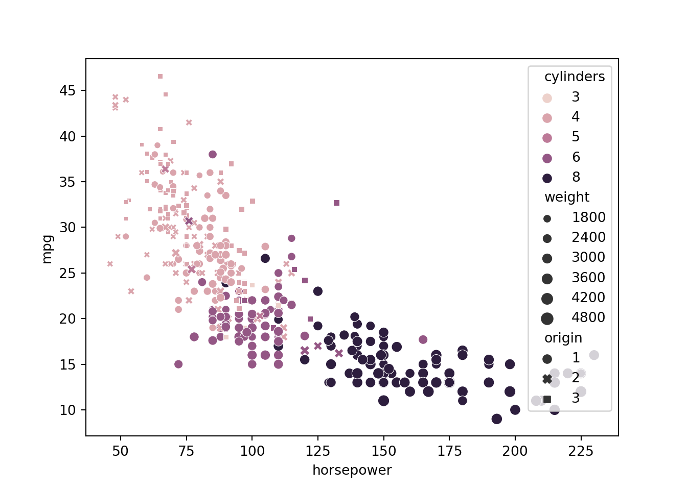
For seaborn plot commands, give a pandas DataFrame as the data argument, and give x, y as the strings corresponding to the column names. You can also usually give hue for colors, and sometimes size and style - in each case the system will take the data in the corresponding variable and encode it as either x-position, y-position, color, size or style of the thing you draw.
For the examples in this section, we will be using the auto-mpg dataset (included among other places in scikit-learn, the main machine learning library for Python)
print(mpg.head(5).to_markdown())
mpg
cylinders
displacement
horsepower
weight
acceleration
model year
origin
car name
0
18
8
307
130
3504
12
70
1
chevrolet chevelle malibu
1
15
8
350
165
3693
11.5
70
1
buick skylark 320
2
18
8
318
150
3436
11
70
1
plymouth satellite
3
16
8
304
150
3433
12
70
1
amc rebel sst
4
17
8
302
140
3449
10.5
70
1
ford torino
Single variable (categorical)
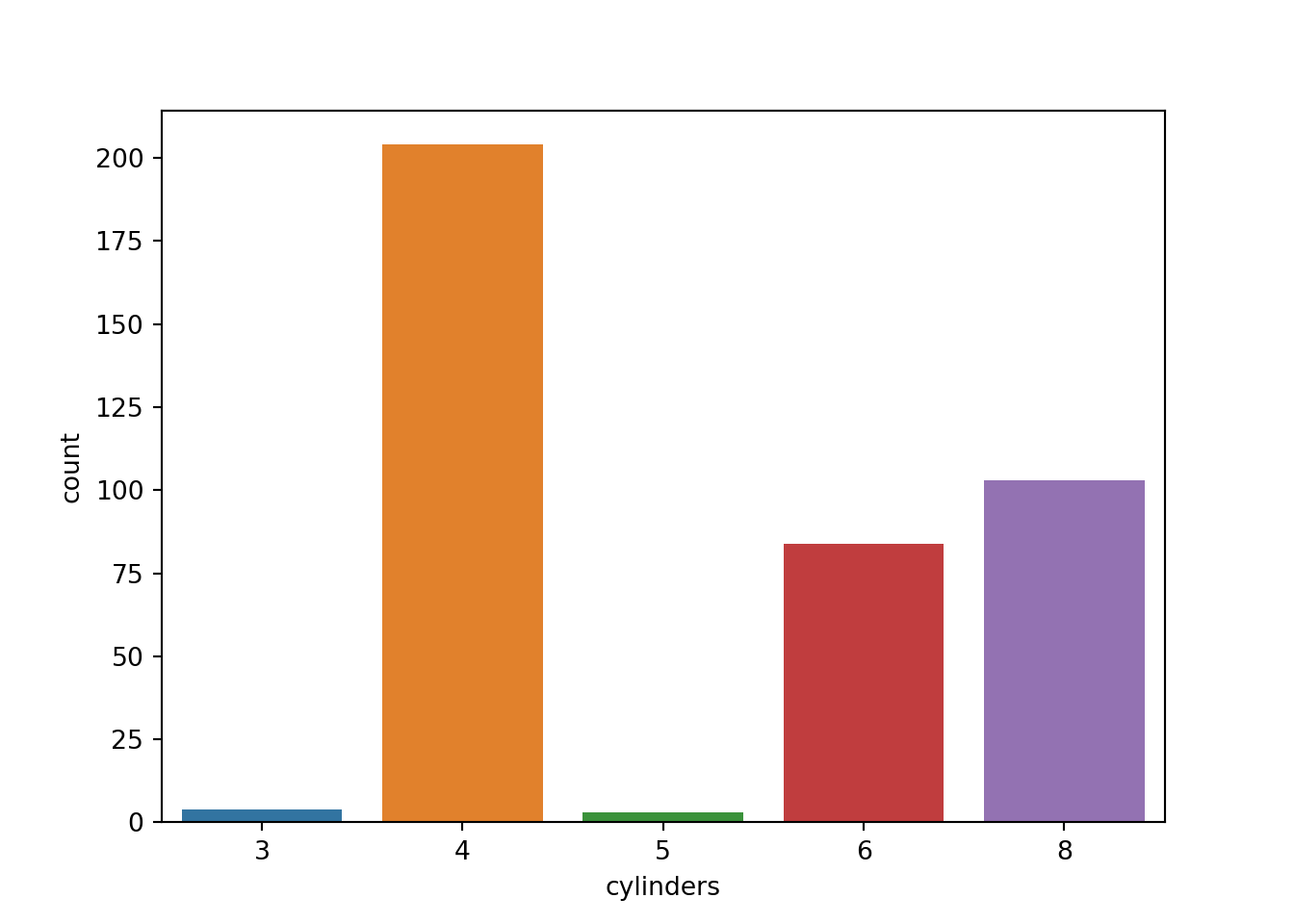
To visualize the distribution of a single categorical variable, we usually end up using some version of a bar diagram.
from matplotlib import pyplotimport seabornpyplot.figure()seaborn.countplot(x="cylinders", data=mpg)pyplot.show()
Single variable (continuous)
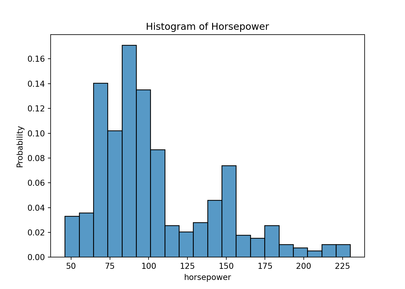
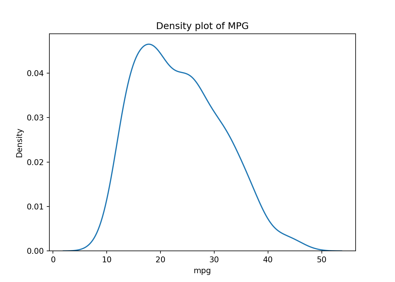
For a single continuous variable, density plots or histograms are often used to show their distributions:
# Try also stats # - "count" - number in each bin# - "frequency" - number / bin-width# - "probability" - bar-heights sum to 1# - "density" - total area sums to 1pyplot.figure()seaborn.histplot(x="horsepower", data=mpg, bins=20, stat="probability")pyplot.title("Histogram of Horsepower")pyplot.show()pyplot.figure()seaborn.kdeplot(x="mpg", data=mpg)pyplot.title("Density plot of MPG")pyplot.show()
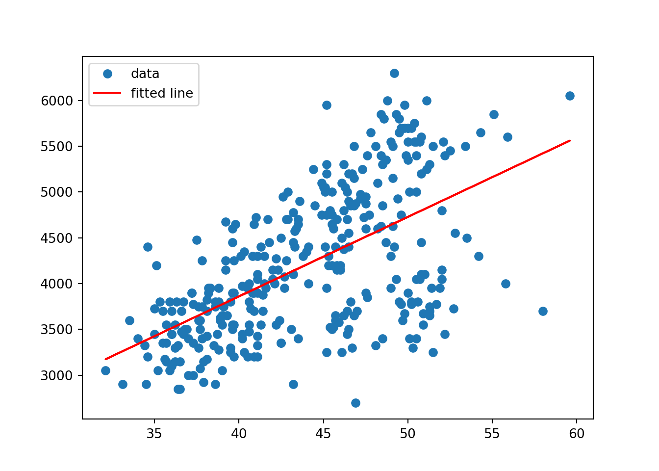
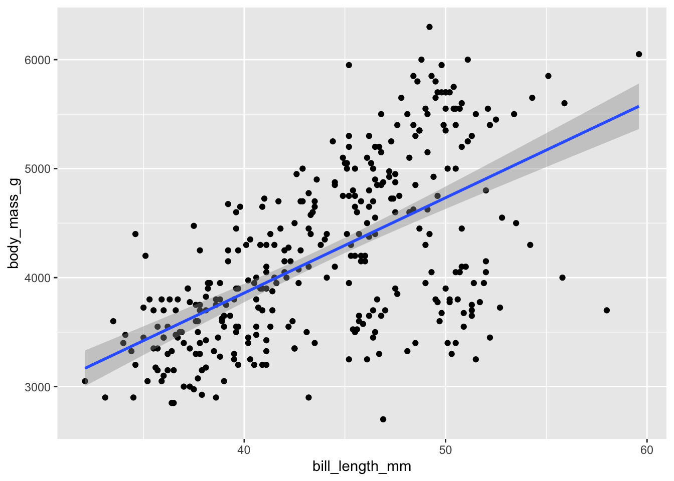
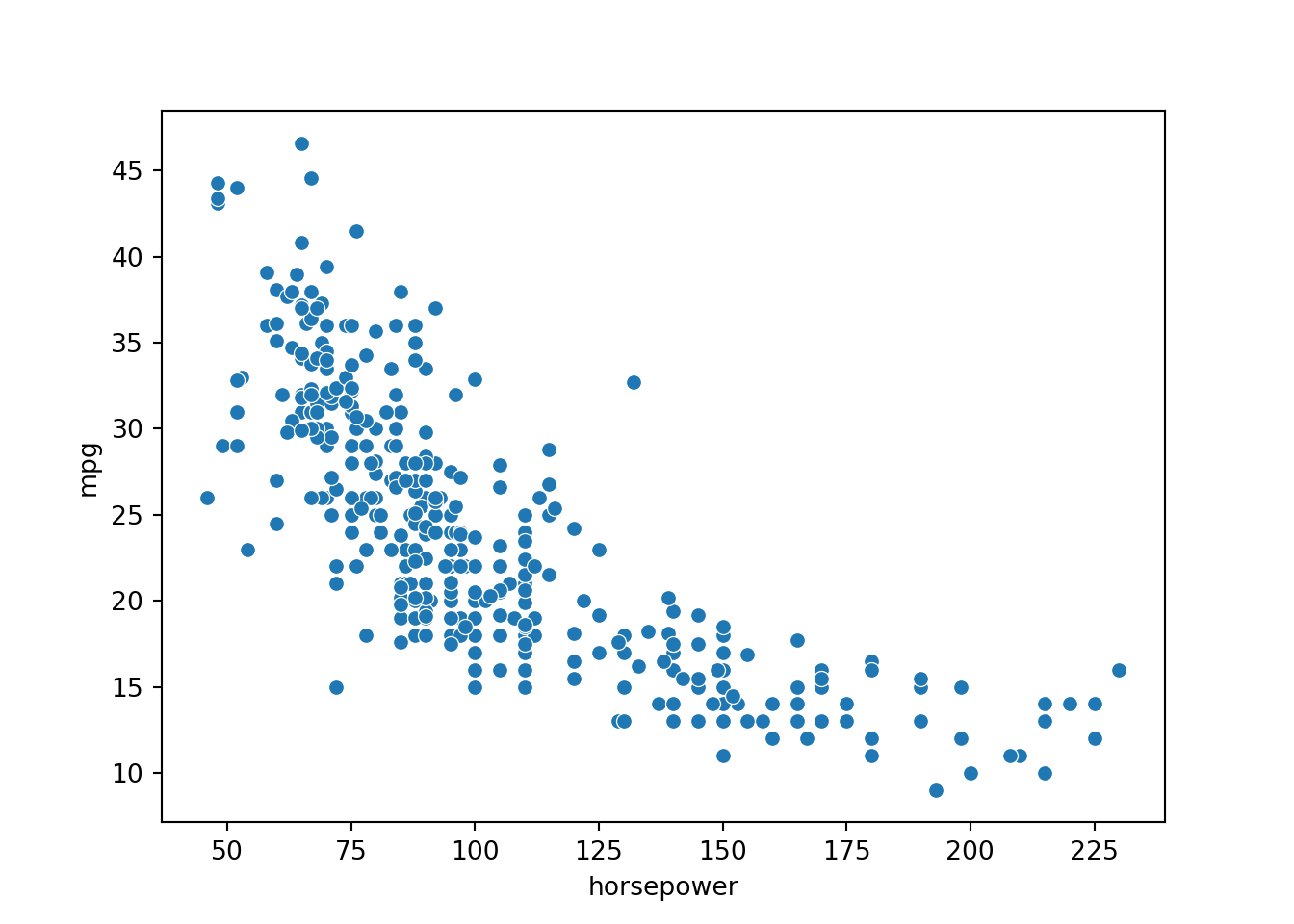
Continuous vs. continuous
The gold standard for visualizing the relationship for paired continuous variables is the scatter plot.
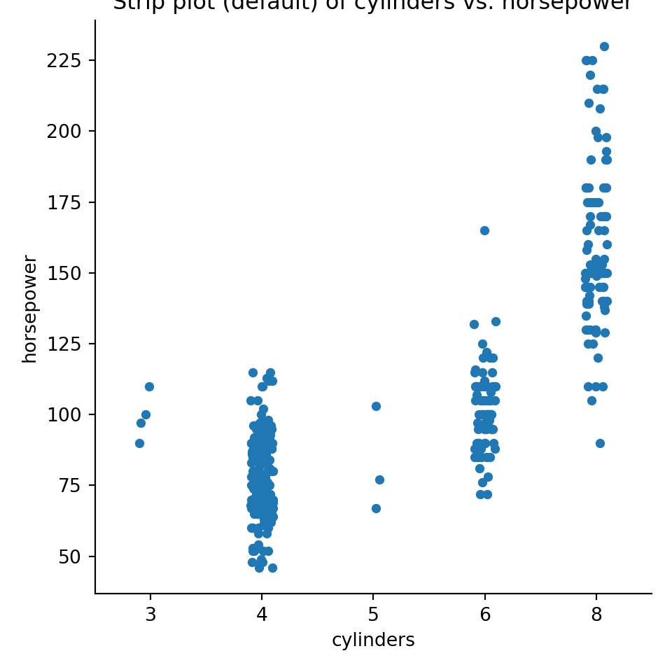
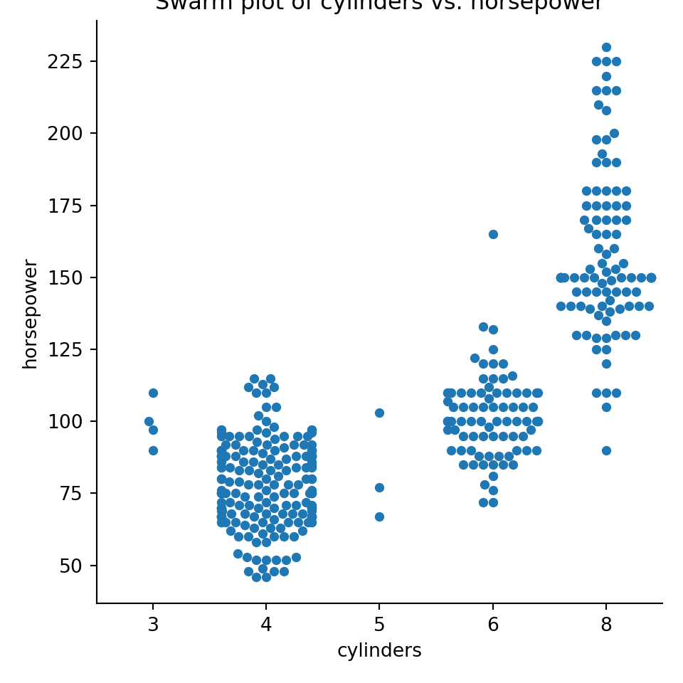
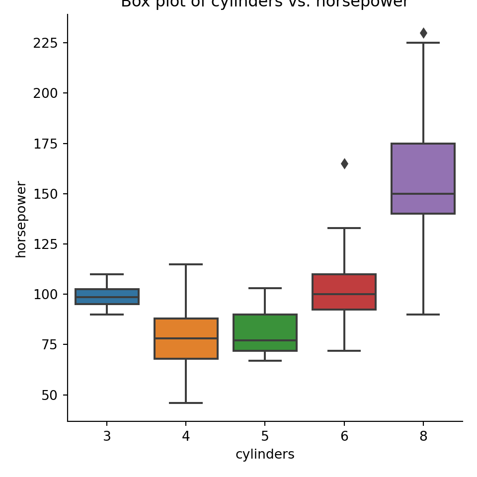
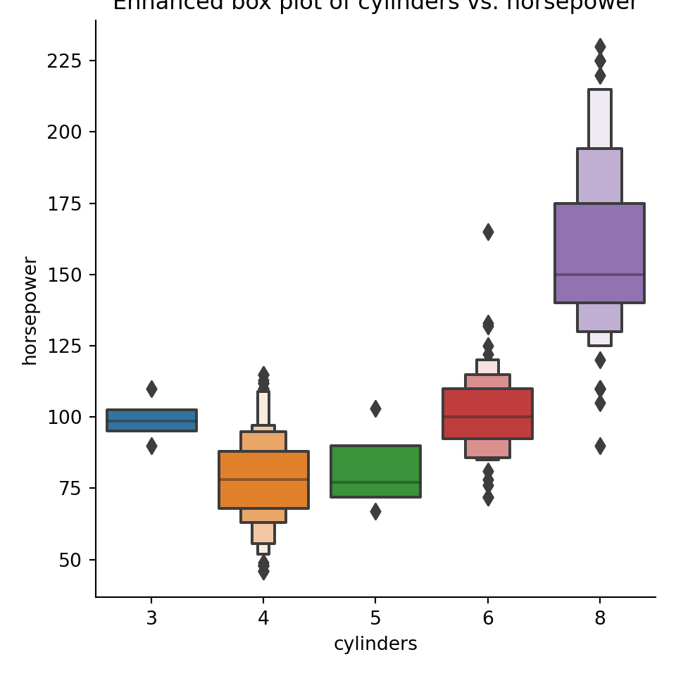
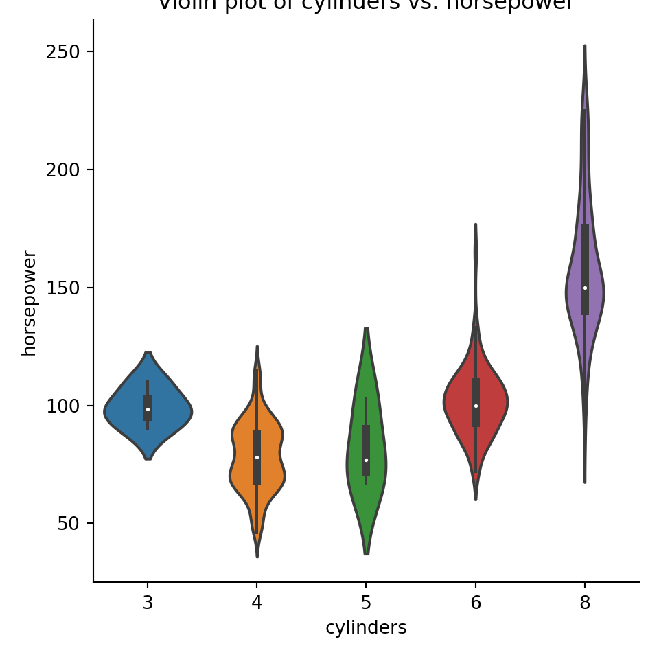
The interactions between continuous and categorical variables is most often shown with side-by-side distribution plots of different kinds. Some very useful ones include the boxplot, the violinplot, density plots, strip plots and swarm plots. Most of these can be accessed through the seaborn.catplot function for plotting categorical data.
pyplot.figure(figsize=(4,6));seaborn.catplot(x="cylinders",y="horsepower",data=mpg);pyplot.title("Strip plot (default) of cylinders vs. horsepower");pyplot.show()
pyplot.title("Swarm plot of cylinders vs. horsepower");pyplot.show()
pyplot.figure(figsize=(4,6));seaborn.catplot(x="cylinders",y="horsepower",data=mpg, kind="box");pyplot.title("Box plot of cylinders vs. horsepower");pyplot.show()
pyplot.figure(figsize=(4,6));seaborn.catplot(x="cylinders",y="horsepower",data=mpg, kind="boxen");pyplot.title("Enhanced box plot of cylinders vs. horsepower");pyplot.show()
pyplot.title("Violin plot of cylinders vs. horsepower");pyplot.show()
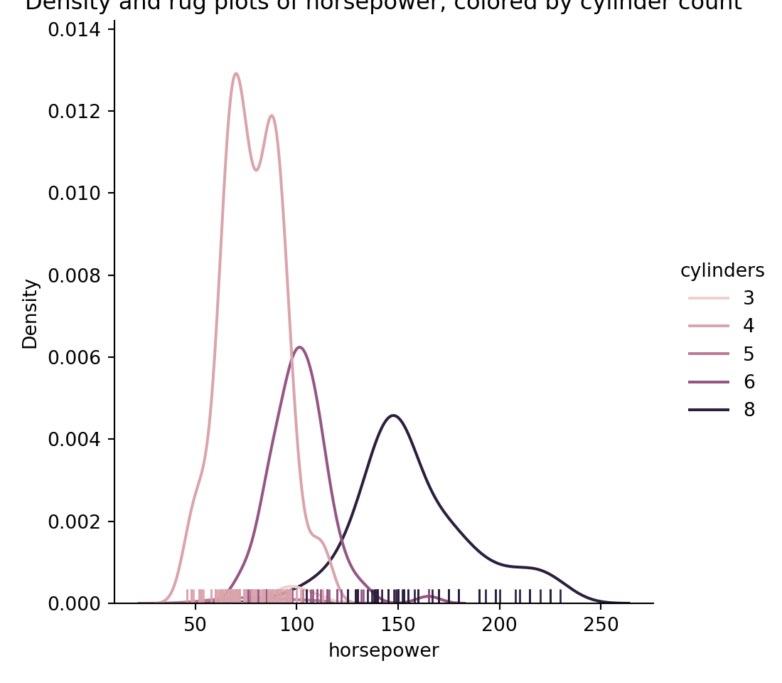
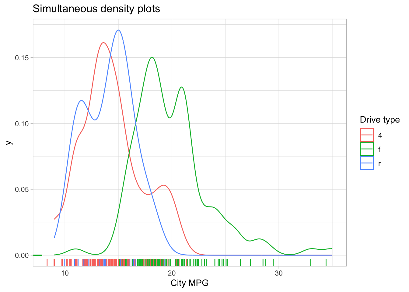
pyplot.figure(figsize=(4,6));seaborn.displot(hue="cylinders",x="horsepower",data=mpg, kind="kde", rug=True);pyplot.title("Density and rug plots of horsepower, colored by cylinder count");pyplot.show()
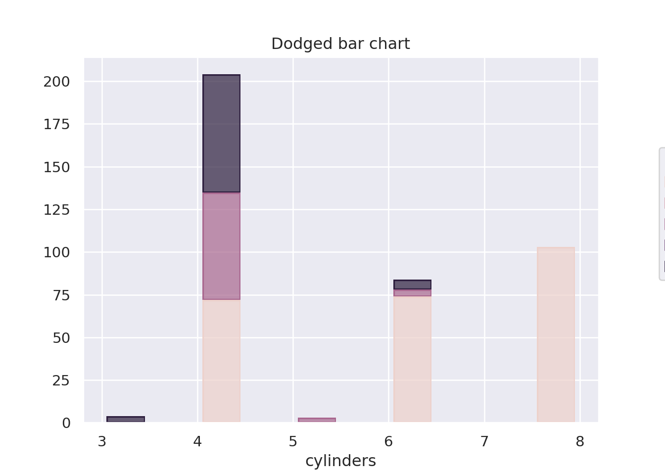
Categorical vs. categorical
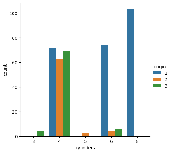
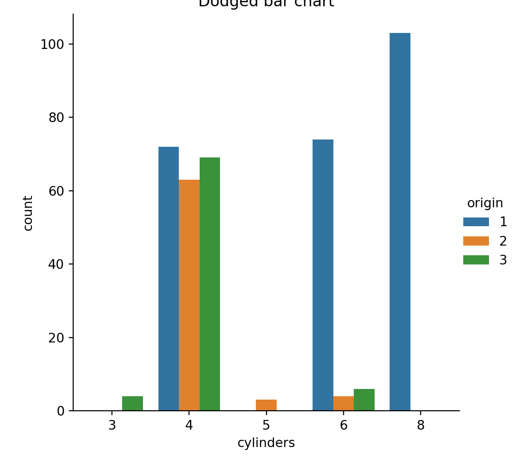
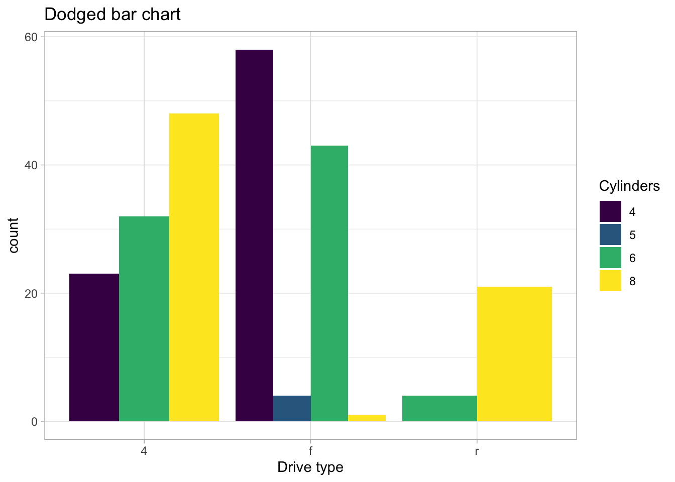
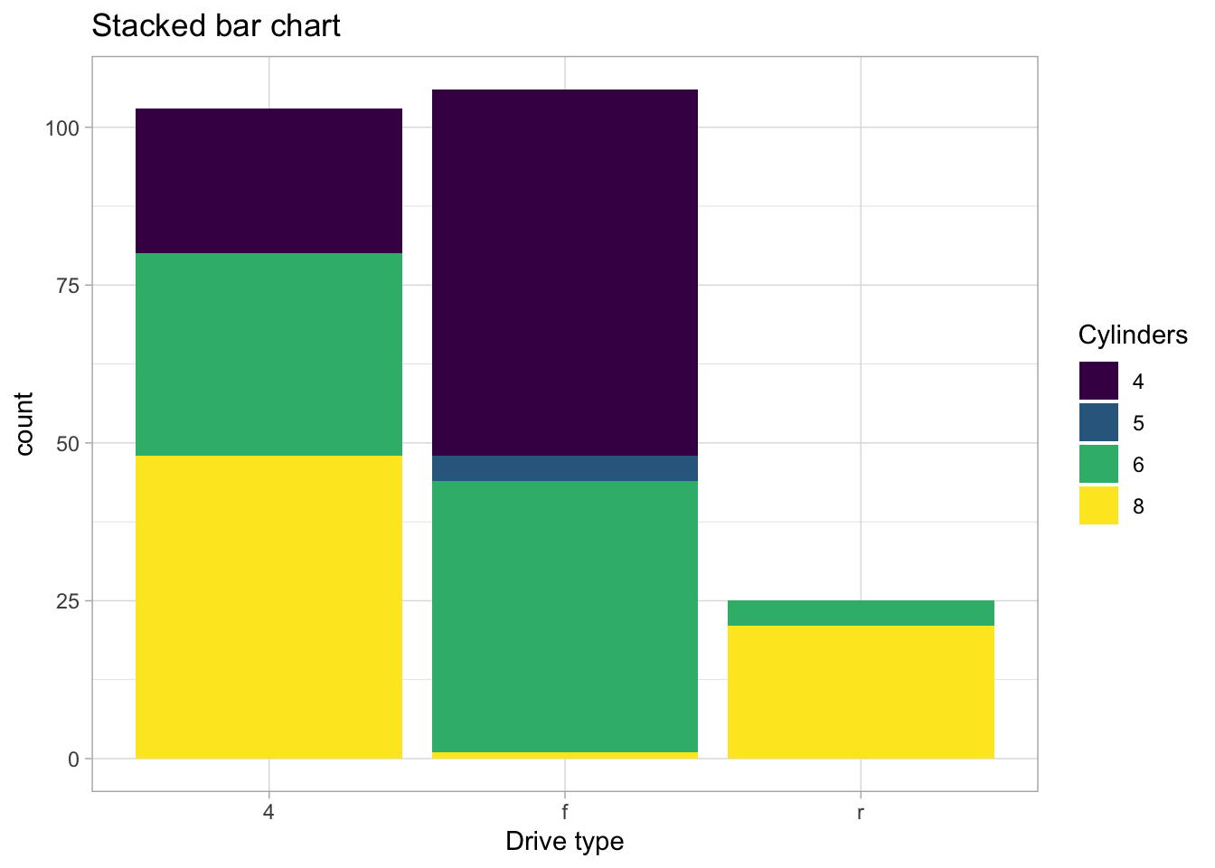
For these kinds of plots, the most common choice is for something like a dodged bar plot or a stacked bar plot. Something like this:
import seaborn.objects as sopyplot.figure()seaborn.catplot(x="cylinders", hue="origin", data=mpg, kind="count")pyplot.title("Dodged bar chart")pyplot.show()pyplot.figure()so.Plot(mpg, x="cylinders", color="origin").add( so.Bar(), so.Hist(), so.Stack()).on(pyplot.gcf()).plot()pyplot.title("Dodged bar chart")pyplot.show()
<seaborn._core.plot.Plotter object at 0x29a075e10>
Checking assumptions
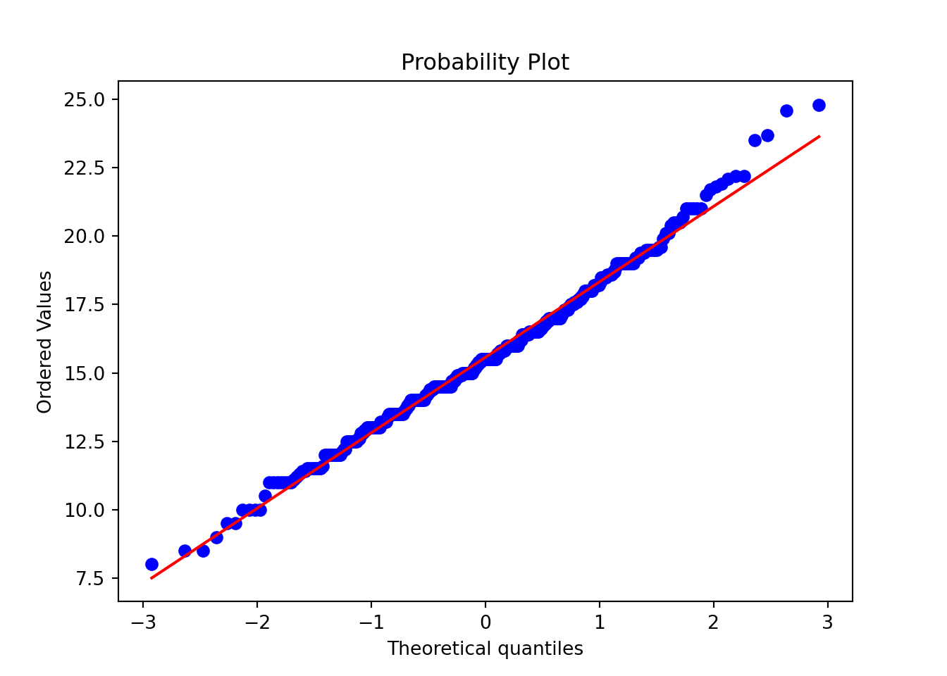
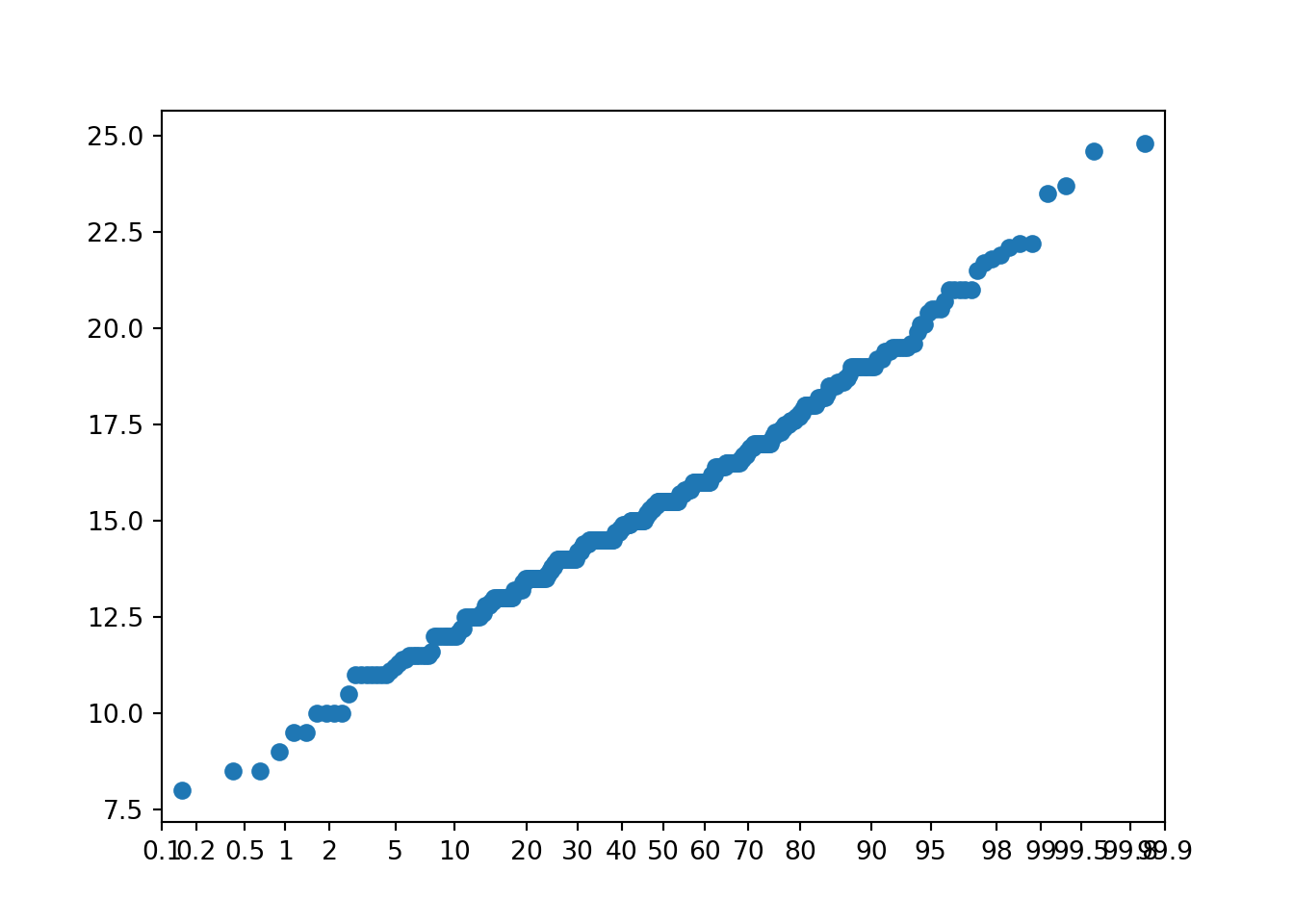
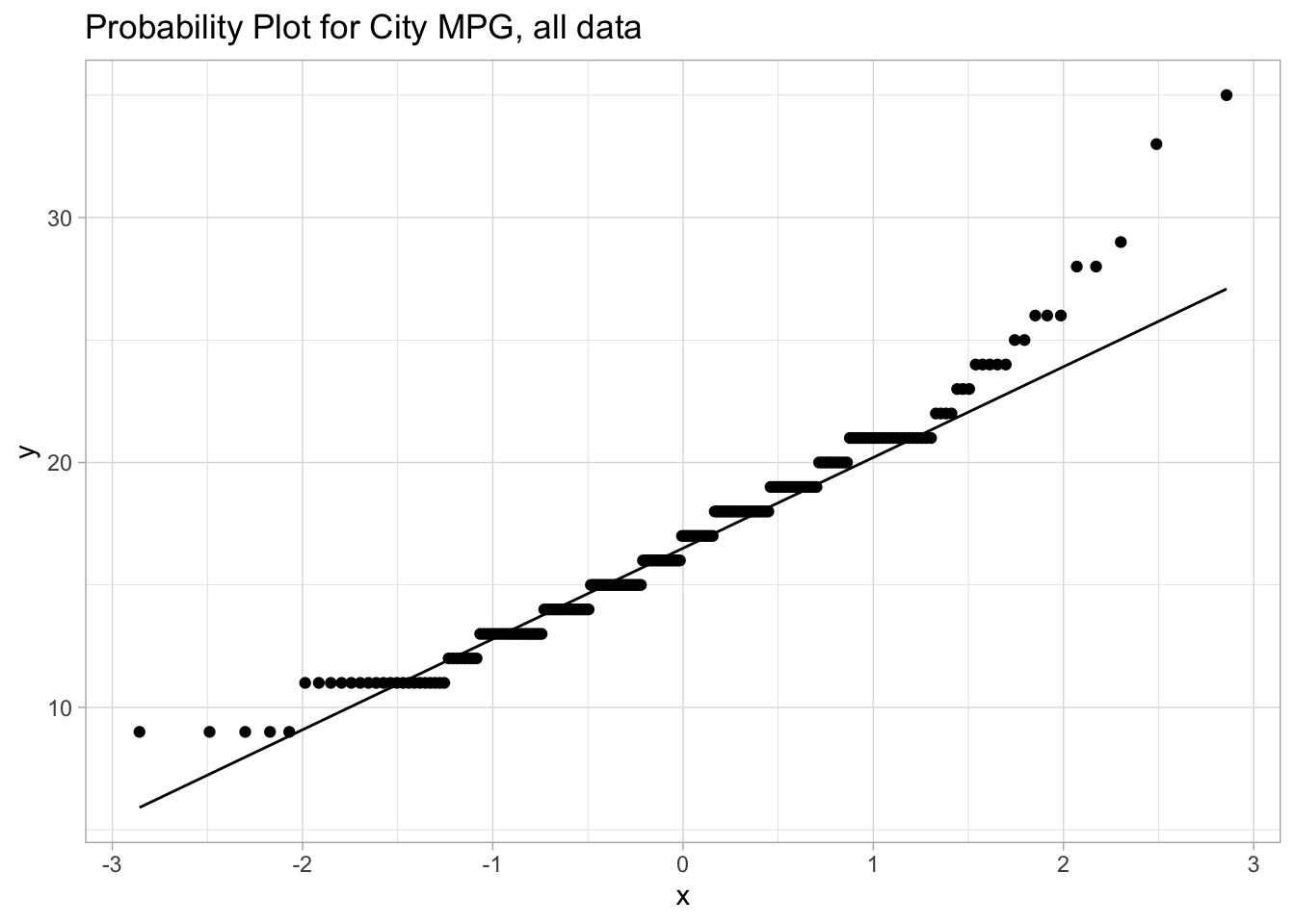
The most common assumption we need to check with appropriate plots is the normality assumption - we do this with a probability plot or a quantile plot.
scipy.stats.probplot does the job for us, as does probscale.probplot:
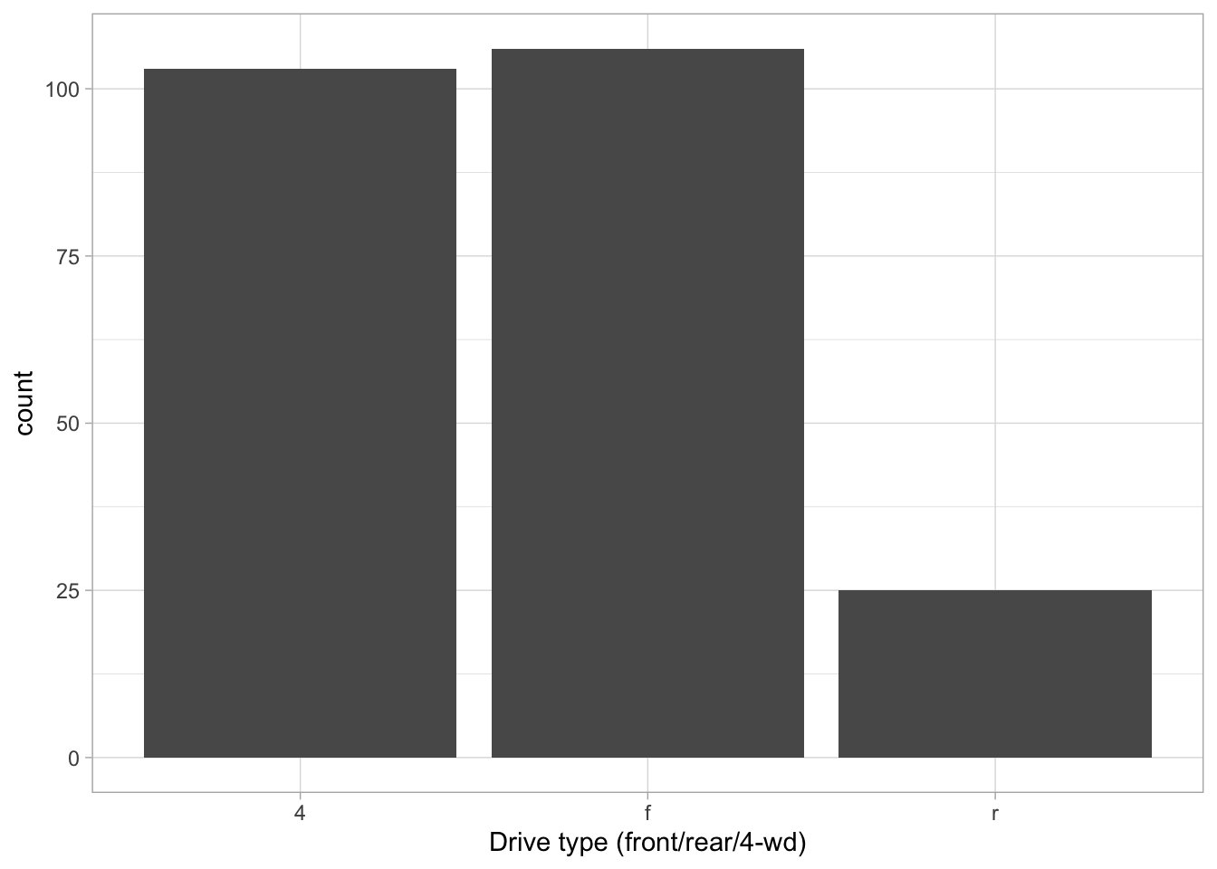
To visualize the distribution of a single categorical variable, we usually end up using some version of a bar diagram.
ggplot(mpg, aes(x=drv)) +geom_bar() +xlab("Drive type (front/rear/4-wd)")
Single variable (continuous)
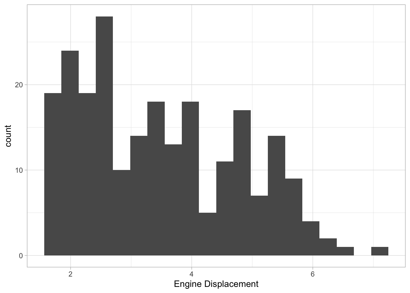
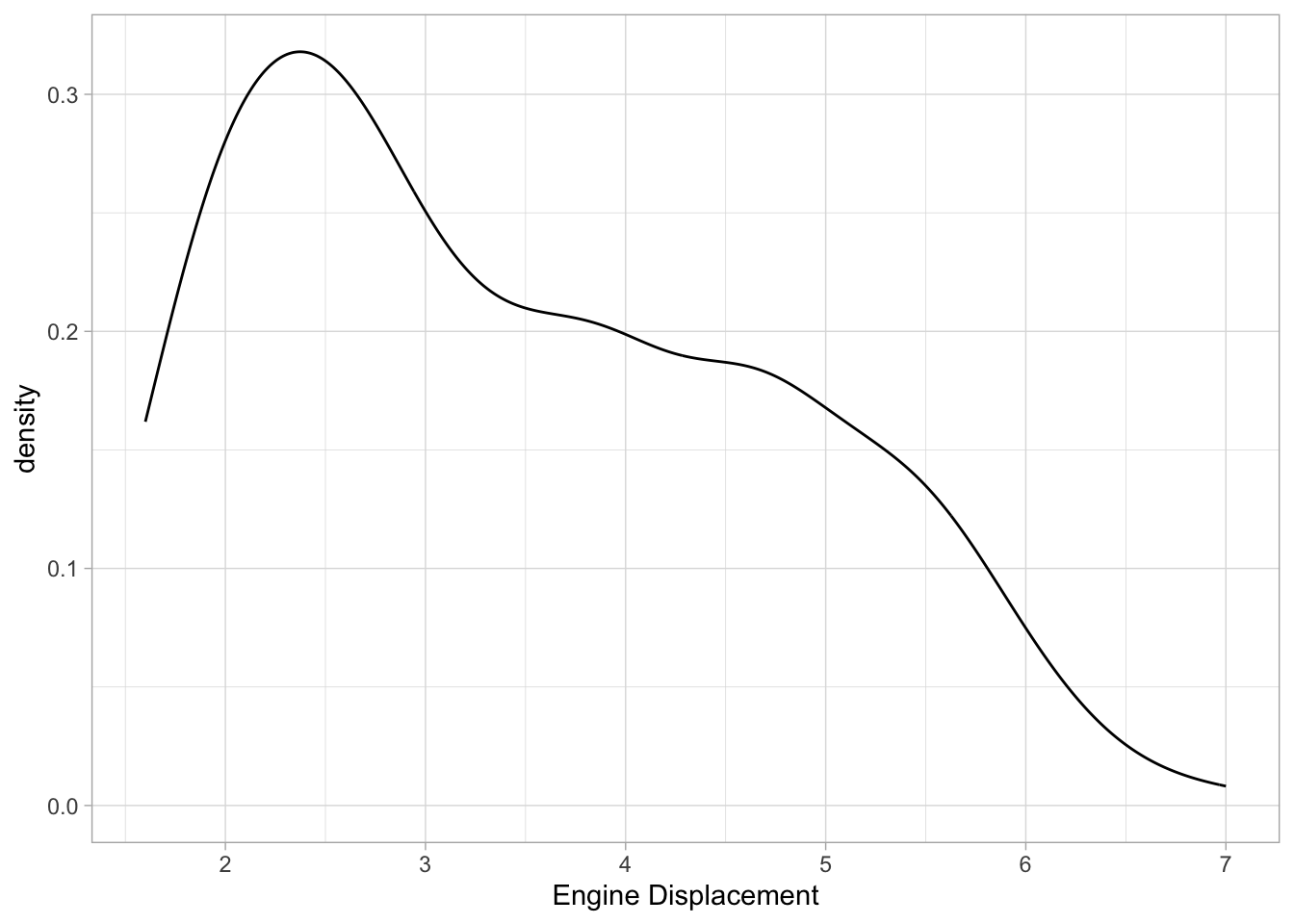
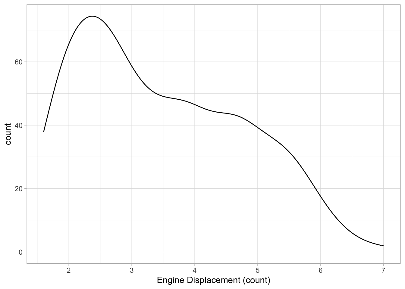
For a single continuous variable, density plots or histograms are often used to show their distributions. Count (the default for histogram) counts how many observations are in each “bin”, density rescales everything to integrate to 1 (default for density):
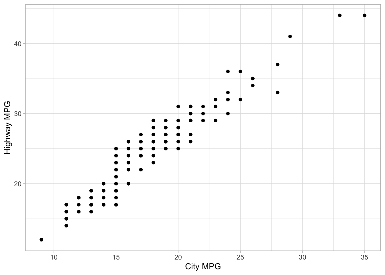
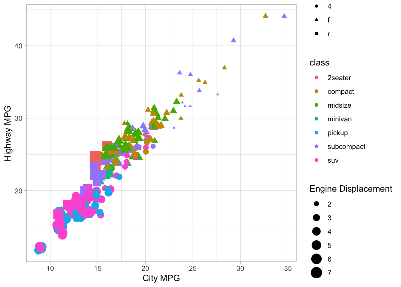
The gold standard for visualizing the relationship for paired continuous variables is the scatter plot. In ggplot2, this is done with geom_point marks:
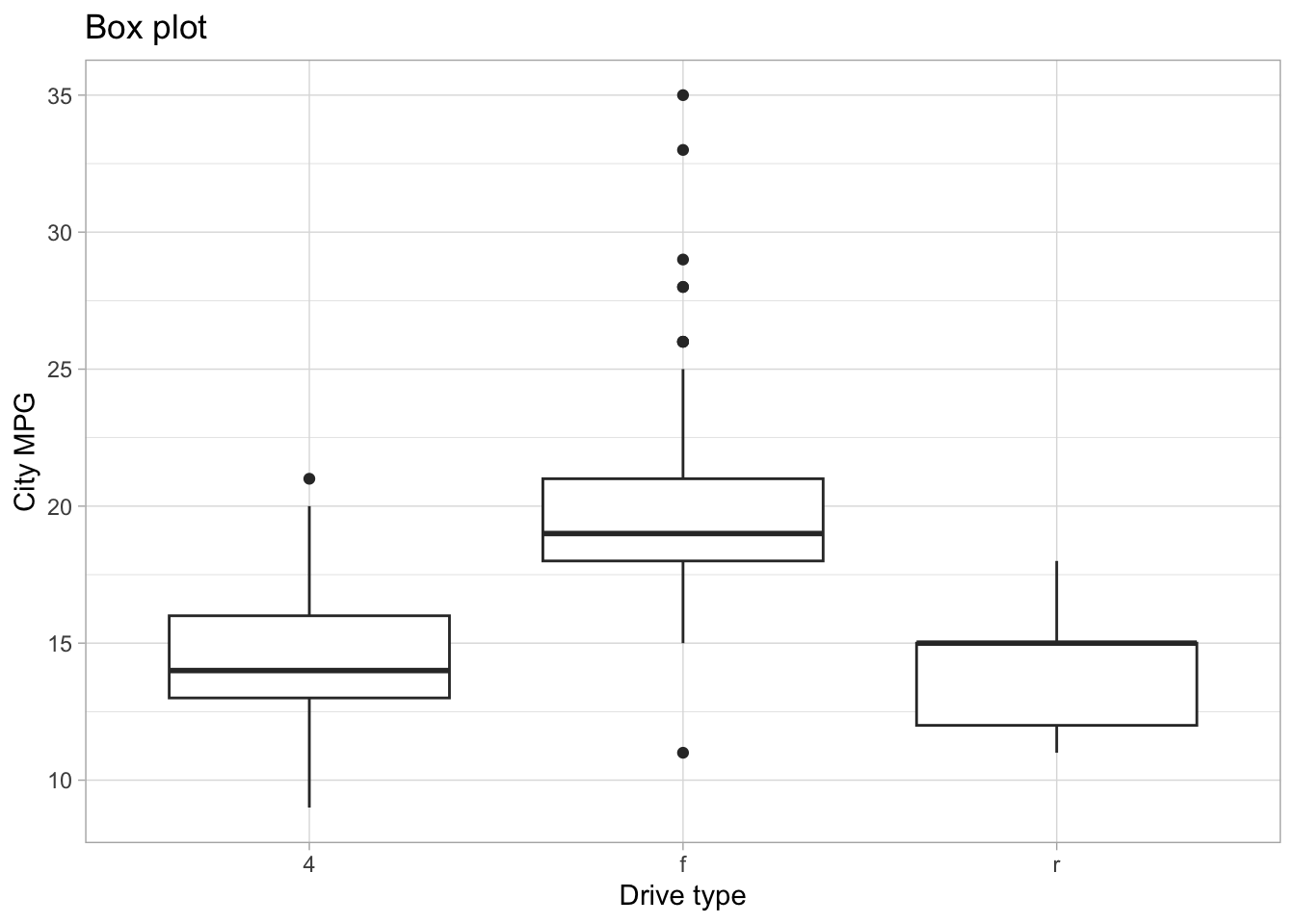
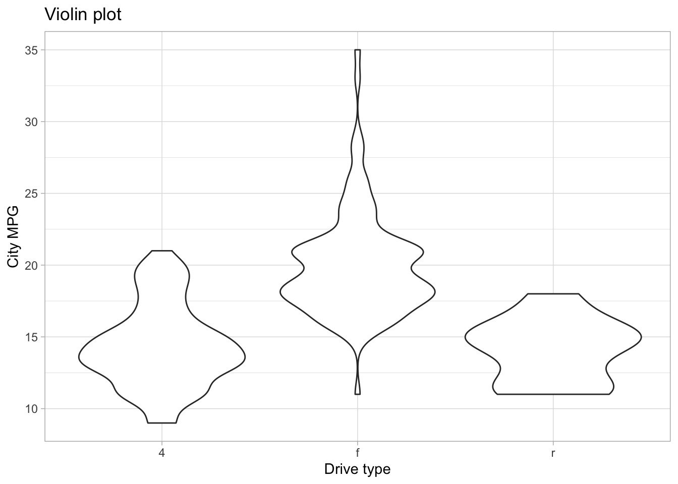
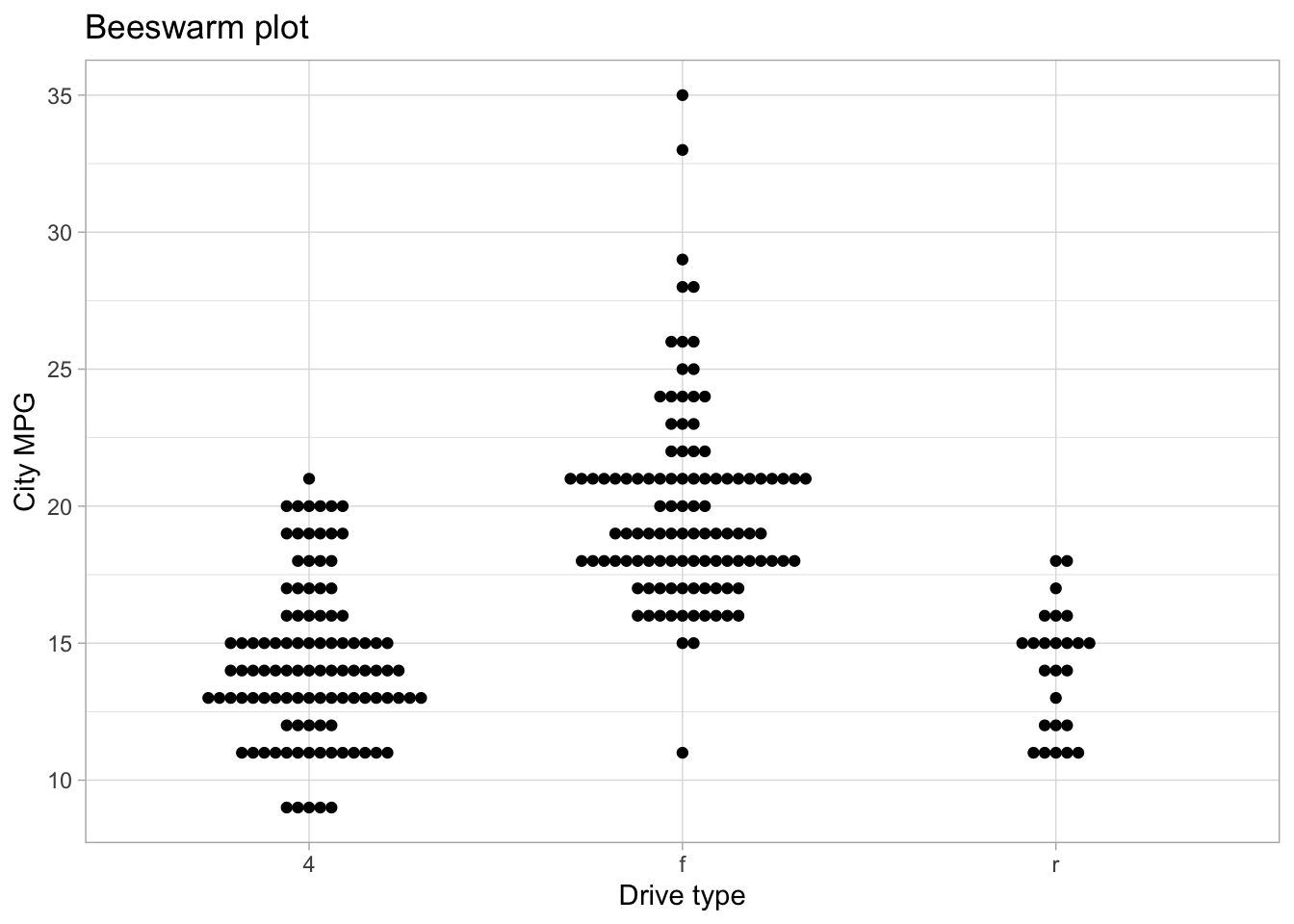
The interactions between continuous and categorical variables is most often shown with side-by-side distribution plots of different kinds. Some very useful ones include the boxplot, the violinplot, density plots, strip plots and swarm plots.
For these kinds of plots, the most common choice is for something like a dodged bar plot or a stacked bar plot. Something like this:
ggplot(mpg, aes(x=drv, fill=ordered(cyl))) +geom_bar(position="dodge") +labs(x="Drive type", fill="Cylinders", title="Dodged bar chart")
ggplot(mpg, aes(x=drv, fill=ordered(cyl))) +geom_bar() +labs(x="Drive type", fill="Cylinders", title="Stacked bar chart")
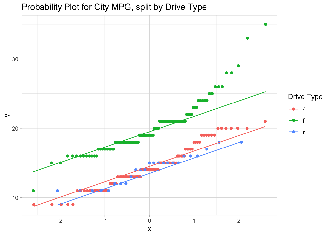
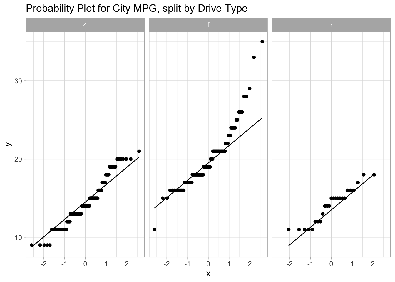
Checking assumptions
The most common assumption we need to check with appropriate plots is the normality assumption - we do this with a probability plot or a quantile plot. In ggplot2, this is done with the geom_qq and geom_qq_line marks. These require, instead of connecting data to x or y, that data connects to sample.
Setting a color is automatically splitting the data into groups, so simultaneous probability plots can be done by setting a color. Alternatively, one could use facetting to get side-by-side probability-plots.
ggplot(mpg, aes(sample=cty)) +geom_qq() +geom_qq_line() +labs(title="Probability Plot for City MPG, all data")
ggplot(mpg, aes(sample=cty, color=drv)) +geom_qq() +geom_qq_line() +labs(title="Probability Plot for City MPG, split by Drive Type", color="Drive Type")
ggplot(mpg, aes(sample=cty)) +geom_qq() +geom_qq_line() +facet_wrap(~drv) +labs(title="Probability Plot for City MPG, split by Drive Type")