Lecture 9: Color
Color as a visual channel
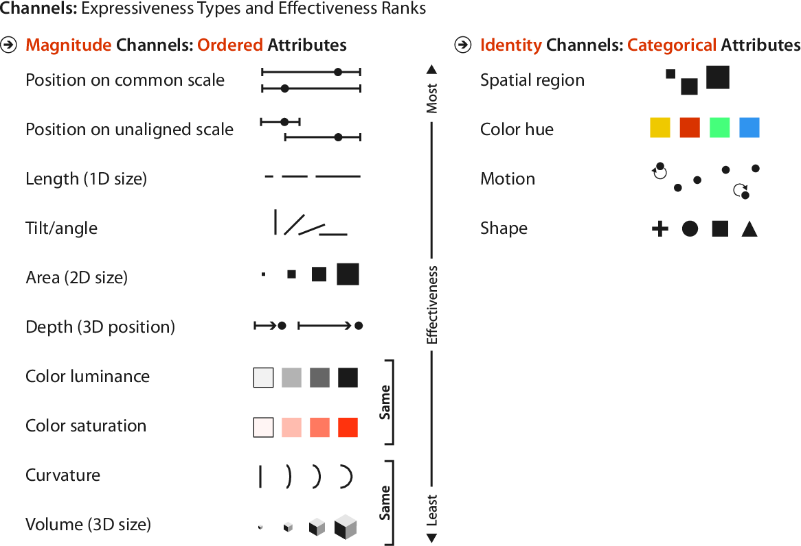
Recall Munzner’s rankings of visual channels
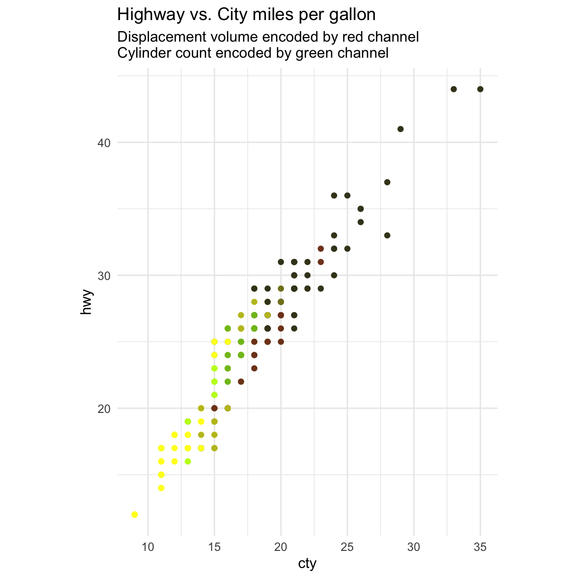
Decomposing color
Different channels have different properties - what they convey directly, and how much they can convey.
- Human perception is built on relative comparisons.
- Works great if color is contiguous.
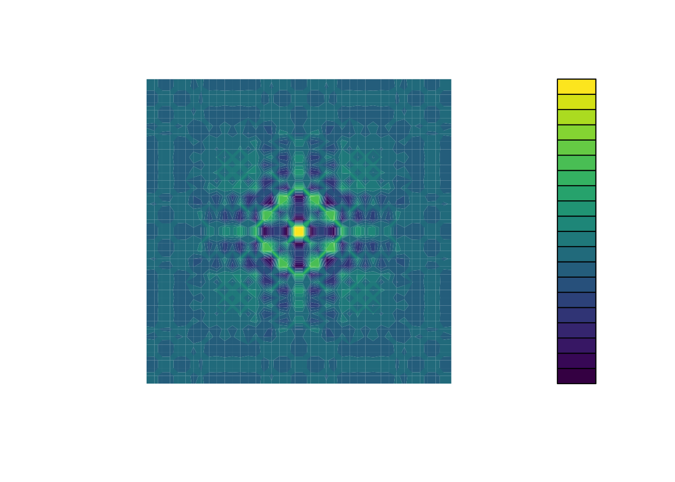
- Surprisingly bad for absolute comparisons
- Non-contiguous small regions of color
- Fewer bins than you want
- Rule of thumb: 6-12 bins including background and highlights
Ordered Color
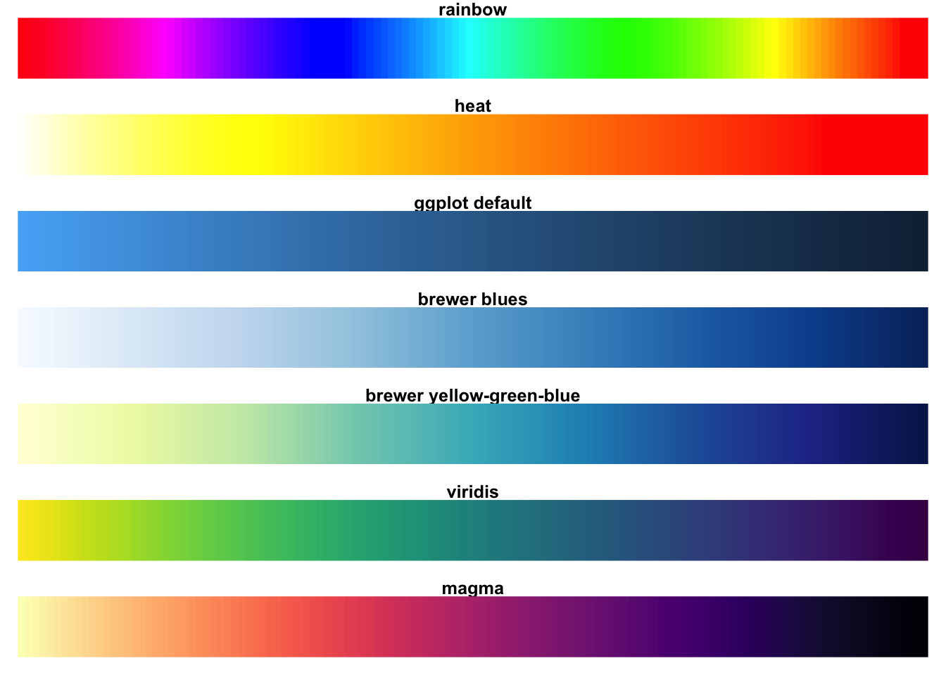
Rainbow is a poor default
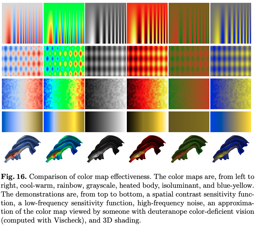
http://www.kennethmoreland.com/color-maps/ColorMapsExpanded.pdf
Ordered Color
Rainbow is a poor default
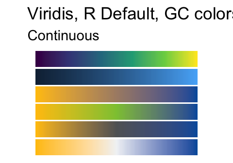
Most platforms moved away from rainbow color maps around 2015:
- Matplotlib 2.0 (2017) introduces Viridis as new default color map (used to be
jet) -
![]()
- Matlab R2014b (2014) introduces Parula as new default color map (used to be
jet) -
![]()
On Matplotlib’s color map change, and the process for constructing new colormaps
Viridis / Magma
Modern Sequential Colormaps
- Monotonically increasing luminance
- Perceptually uniform
- Colorful scales
- Colorblind-safe
- Readily available:
- R/ggplot2:
scale_color_orscale_fill_-
scale_color_viridis_c- continuous -
scale_color_viridis_b- binned -
scale_color_viridis_d- discrete
-
- Python/matplotlib: default as of matplotlib 2.0
- d3.js:
d3.interpolateViridis
- R/ggplot2:
Interaction between visual channels
Color channels are not fully separable
Color channel interactions:
- Size affects salience
- Small regions need high saturation
- Large regions need low saturation
Saturation and Luminance:
- Not separable from each other
- Not separable from use of transparency
- Small separated regions: 2 bins(3-4 max), 1 channel
- Contiguous regions: many bins, 1 channel
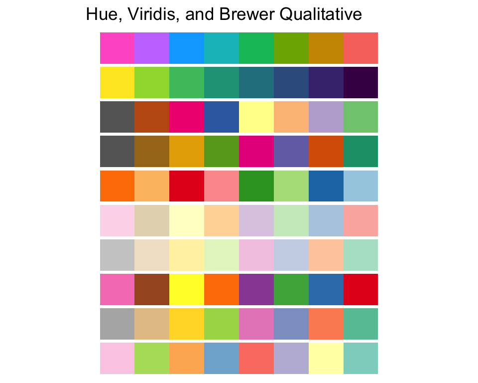
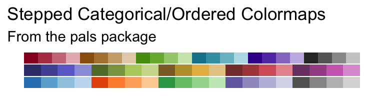
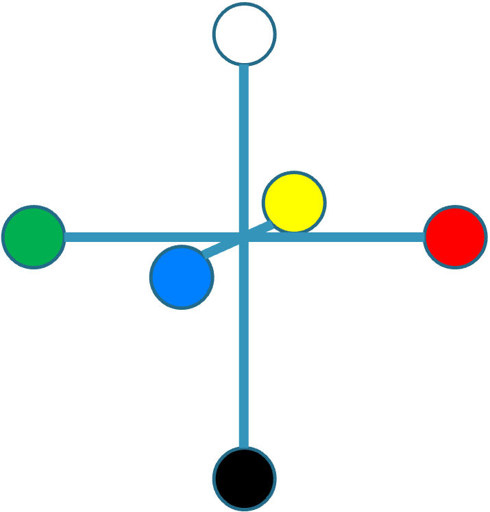
Univariate Categorical
Aim for maximum distinguishability
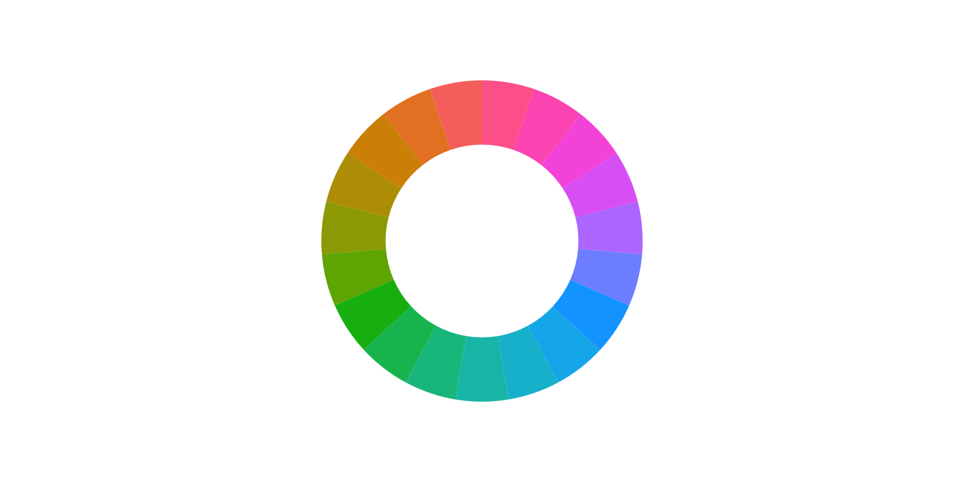
Use hue as primary color channel
- even spreads around the hue circle to maximize perceptual distance and produce harmonious color combinations
- color design guidelines:
- complementary: primary hue, secondary with opposite hue (add 180º) 1 2
- split-complementary: add 150º and 210º for the secondary colors 1 2 3
- triadic (1 2 3), tetradic (1 2 3 4), pentadic (1 2 3 4 5), …: evenly distribute hue angles
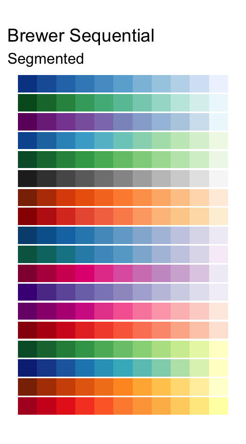
Univariate Ordered
- Distinguish on two axes:
- ordinal (use segmented) vs. quantitative (use continuous)
- sequential vs. diverging
- Sequential (one direction)
- Ramp up luminance or saturation
- Single- or multi-hue (see cubehelix for linear luminance response multi-hue scheme)
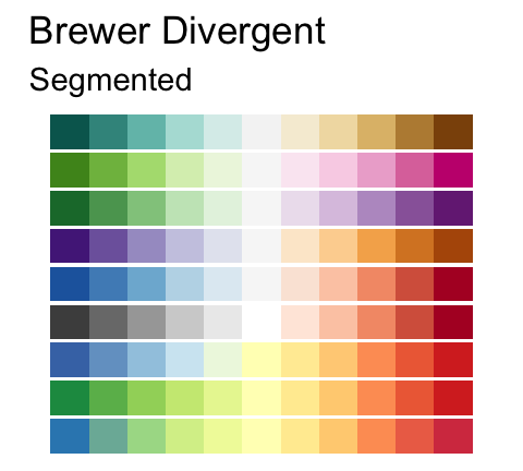
- Diverging (two directions)
- Use when there is a meaningful “midpoint”
- Neutral color for midpoint
- Saturated colors for endpoints
- Distinguish endpoints with hue differences
Univariate Cyclic

There are a few options available if a cyclic colormap is needed.
- I use these in my own research:
- To visualize topologically generated angle-valued coordinate maps
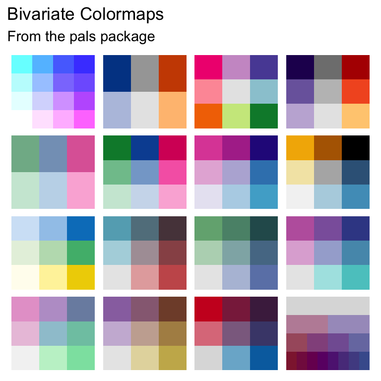
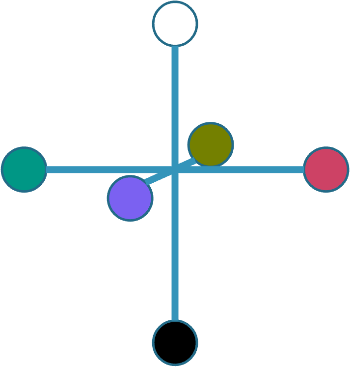
Bivariate
Now it gets complex.
- Best Case
- Binary in one direction: paired categorical color scheme
- Visual channels: saturation, hue
- More complex cases
- Combine desaturation with appropriate scale choices
- Combine several scale choices with one another
- use with care!
- visual channels are not independent, interpretation can get very difficult
- But sometimes showing one large graph (chart, map, …) shows more details than several side-by-side graphs would
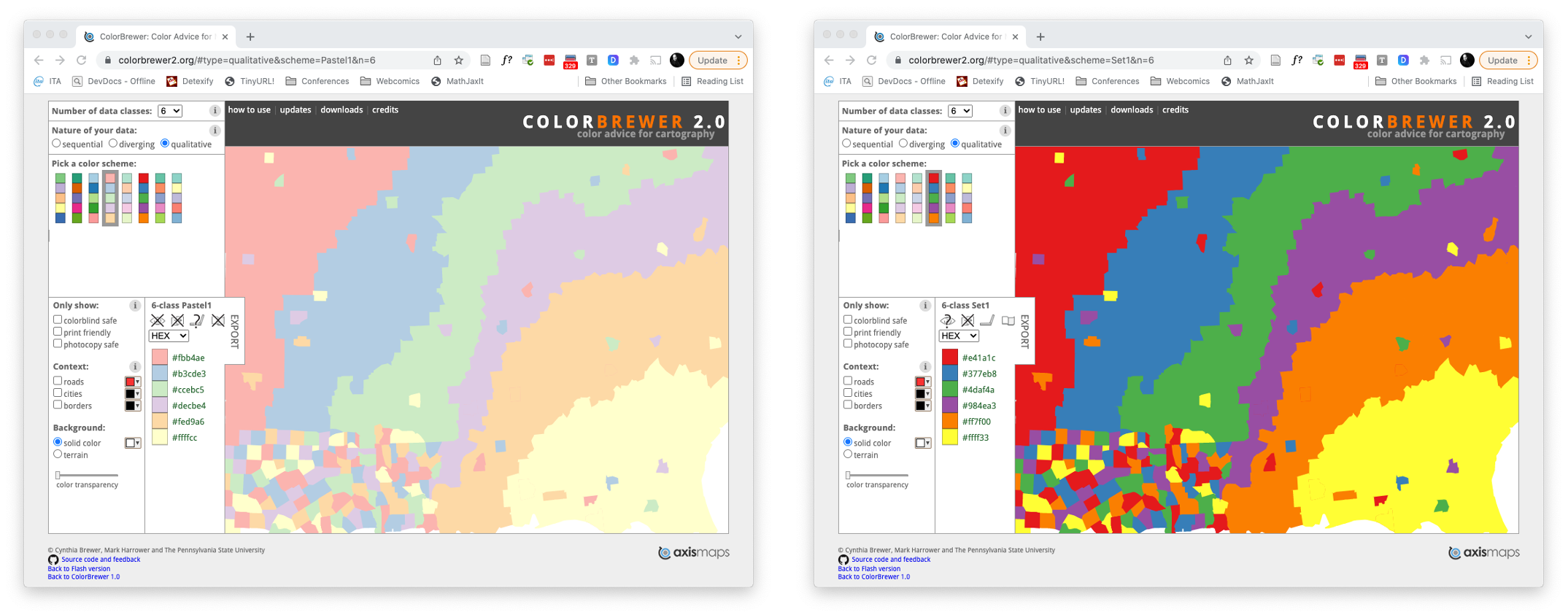
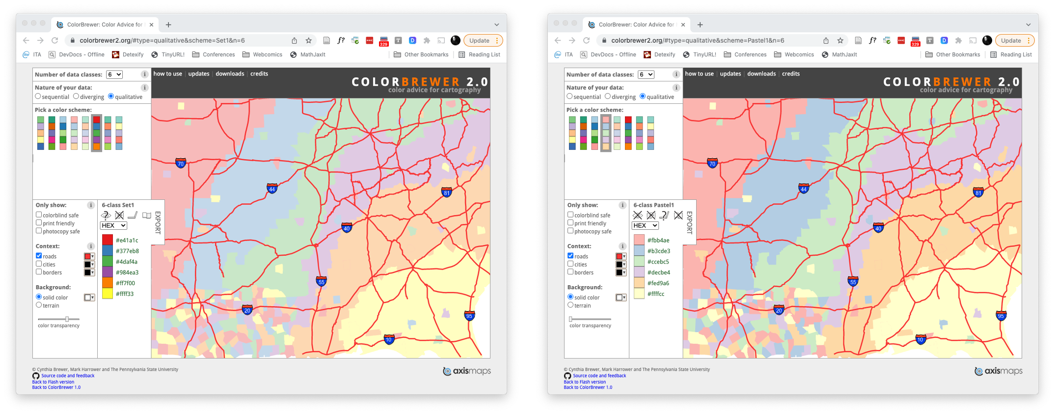
Cynthia Brewer’s Color Scheme Chooser

Opponent Color Theory
The retina has 4 types of photo-sensitive cells: Cone cells (L/M/S) and rod cells (brightness detection)
- Opponent Color Theory (Hering, 1892)
- First layer of processing records differences between responses, producing three opposing color pairs
- red vs green
- blue vs yellow
- black vs white
- Suggestive evidence for the opponent color theory include
- Phantom after-images as result from attenuation
- Opposing colors never perceived together: no greenish red, no yellowish blue
Deviations from trichromacy
Some people have different cone cells
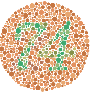
Tetrachromacy has been observed in humans, seems to lead to increased ability to distinguish color.
But a lot of human vision happens in subsequent processing, and perception seems connected to cultural color systems.
- Monochromacy
- rod monochromacy (achromatopsia) - absent or non-functioning cone cells, associated with photophobia and poor vision, very rare
- cone monochromacy - more than one type of cone cell non-functioning
Oliver Sacks’ The island of the colorblind describes a culture with very high hereditary rates of monochromacy, where color naming focuses on texture more than hue.
Deviations from trichromacy
Some people have different cone cells
- Anomalous trichromacy
- protanomaly - L-cones malfunctioning, poor red/green discrimination, 1% males.
- deuteranomaly - M-cones malfunctioning, poor red/green discrimination, 5% European males.
- tritanomaly - S-cones malfunctioning, poor blue/green and yellow/red discrimination.
- Dichromacy
- protanopia - complete absence of L-cones, very poor blue/green and red/green discrimination, limited frequency bands, 1% males.
- deuteranopia - absence of M-cones, similar effects to protanopia, but with less dimming of vision, 1% males.
- tritanopia - absence of S-cones, blues look green, yellow/orange look pink, purple looks deep red
Decomposing Images
Color Channels from Opponent Theory


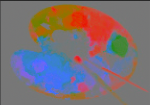


Color-blindness simulator


Design for Accessibility
Some Guidelines
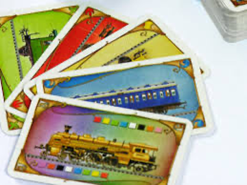
- Do not encode information purely with hue
- Do encode color information with luminance
- Do encode information with shapes
Redundant visual channels admit information even if perception of the visual channels is imperfect or lacking
- Blue vs. Orange distinction visible under all conditions
- …hence the design of e.g. Viridis

Color is 3-dimensional
…or at least human color perception is 3-dimensional.
Color is perceived by cone cells in the retina. Incoming photons have an associated wavelength, producing some combination of stimulations.
- L-cells
- Peak stimulus 546-580nm
- M-cells
- Peak stimulus 534-545nm
- S-cells
- Peak stimulus 420-440nm

This implies any complete color representation needs to be 3-dimensional.
Combinations of wavelengths crucial for color mixing, either additively (with different colored light) or subtractively (with different reflective inks or dyes)
RGB
Additive color space, standard for digital displays.
Three color channels: red/green/blue
HTML hex codes are structured as #RRGGBB, with each hexadecimal 2-digit portion encoding an intensity value 0-255.

Poor for encoding (major interference between channels)
Poor for interpolation (middle of cube is grey)
CMYK
Subtractive color space.
Standard for printing.
- Cyan + Magenta + Yellow (CMY) can express full color gamut
- but a LOT of ink needed for dark colors, usually “ink” (K) is added for black

CIE XYZ, LAB, LUV
Repeated attempts at perceptually linear spaces
- CIE - Commission Internationale de l’Éclairage (International Commission on Illumination)
- Standardization organization and international authority on light, illumination, color and color spaces
- CIE 1931 RGB and XYZ
- RGB based on human experiments
- XYZ linear transformation of RGB: Y measures luminance, Z \(\approx\) blue, X chosen to have a positive defining curve
- CIE 1976 L*a*b*
- Based on human experiments to make distances perceptually uniform
- L*: Lightness, a*: green-red axis, b*: blue-yellow axis
- Also common: polar coordinates LCh (L*, C* (chroma) and hº (hue angle))
- CIE 1976 L*u*v*
- Updated version of the intermediate CIE 1964 UVW
- Different choice of white point adaptation from L*a*b*

HSV, HSL
Hue, Saturation, and either Lightness or Brightness
- Hue
- Angle-valued color coordinate
- Red at 0º, Green at 120º, Blue at 240º
- Chroma and Saturation
- Chroma is \(\max(R,G,B)-\min(R,G,B)\)
- Saturation is chroma, rescaled to fit in [0,1]
- HSV - Hue, Saturation, Value
- Single cone model
- Value = \(\max(R,G,B)\)
- HSL - Hue, Saturation, Lightness
- Double cone model
- Lightness = \(\frac{1}{2}(\max(R,G,B)+\min(R,G,B))\)


LSM
Color coordinates based directly on cone cell responses
Entire light spectrum convoluted with each response curve to form coordinate values L, M, S.
Color conversion usually goes through CIE XYZ and a subsequent linear transform.
Can be used to simulate color blindness.
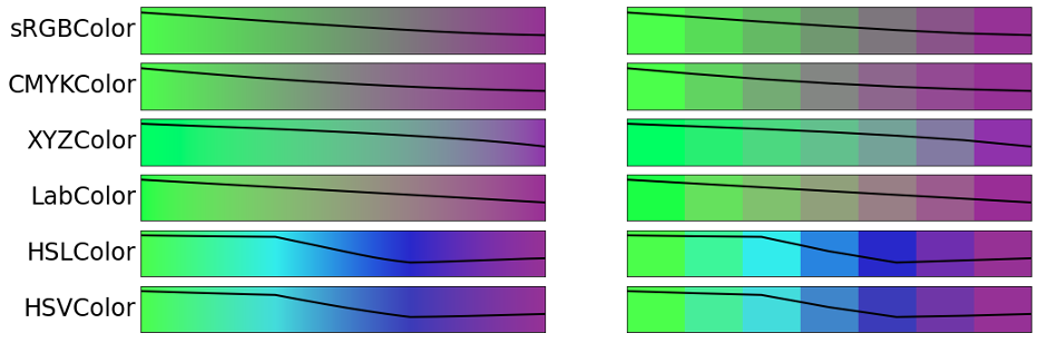
Interpolating colors
Equidistance concerns
Linear Interpolation is an attractive option for magnitude-representing color schemes.
Choice of coordinate systems can dramatically influence results.
Distinguishability of steps is perceptually connected to lightness, and gets muddled when the lightness progression is not linear.
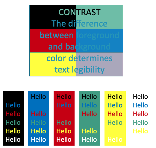
Interaction with the background
Impact of Illumination
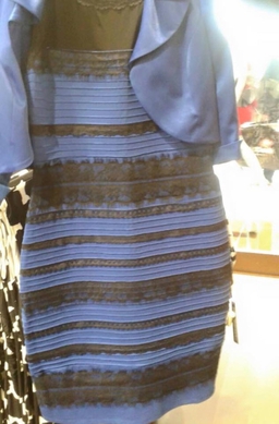

Impact of Illumination

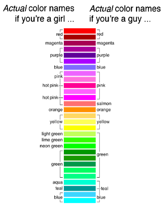
Color Naming and Perception
Different languages divide the color spectrum differently
Discriminability depends on language (Witzel-Gegenfurtner (2015) - barely discernable colors recognized faster if they straddle a color word boundary)
xkcd and linguists/psychologists study color with very different methods
- Linguists
- Define basic color word by:
- peeling away modifiers (no light blue)
- requiring universal applicability (no blonde)
- requiring universal recognizability (no fuchsia)
- controlled experiments with attention to lighting, neural attenuation, …
- XKCD
- Massive crowdsourced free-form data collection