import altair, pandassexbibleURL ="L6-figures/sexbiblecounts.csv"bibledtype = pandas.api.types.CategoricalDtype(categories=['(1) WORD OF GOD', '(2) INSPIRED WORD', '(3) BOOK OF FABLES', '(4) OTHER'], ordered=True)partnersdtype = pandas.api.types.CategoricalDtype(categories=['0', '1', '2', '3', '4', '5-10', '11-20', '21-100'], ordered=True)sexbible = pandas.read_csv(sexbibleURL)sexbible["bible"] = sexbible["bible"].astype(bibledtype)sexbible["partners"] = sexbible["partners"].astype(partnersdtype)
Reconstructing a Wilkinson plot - ggplot2
Code
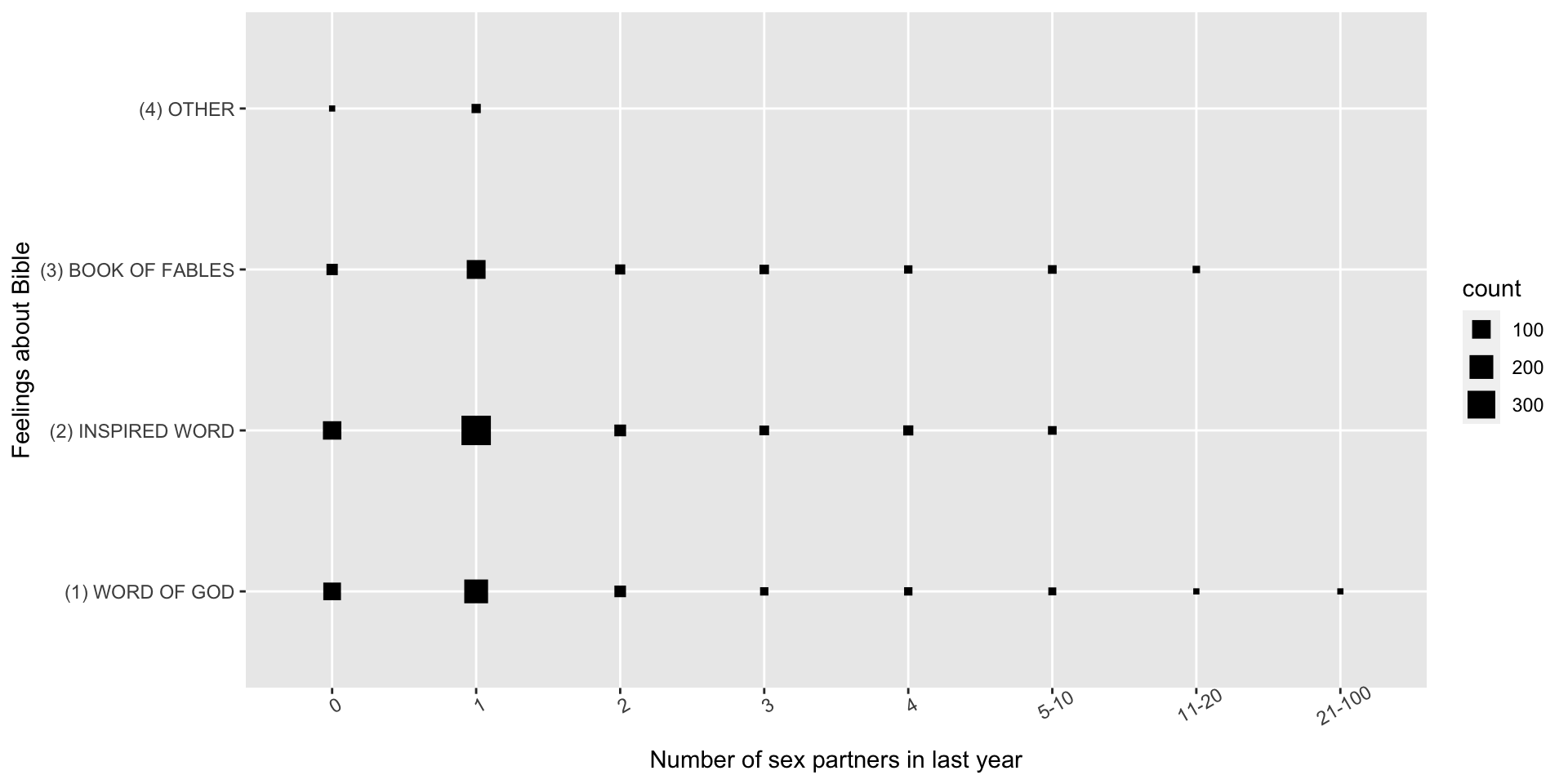
ggplot(sexbible) +geom_point(aes(x=partners, y=bible, size=count), shape=15) +xlab("Number of sex partners in last year") +ylab("Feelings about Bible") +theme(axis.text.x =element_text(angle=30))
Reconstructing a Wilkinson plot - Altair
Code
altair.Chart(sexbible).mark_point(shape="square", fill="DarkBlue", stroke="DarkBlue").encode( x=altair.X("partners:O", scale=altair.Scale(domain=sexbible["partners"].cat.categories.to_list()), axis=altair.Axis(title="Number of sex partners in last year")), y=altair.Y("bible:O", scale=altair.Scale(domain=sexbible["bible"].cat.categories.to_list(), reverse=True), axis=altair.Axis(title="Feelings about Bible")), size=altair.Size("count:Q"), tooltip="count:Q").properties( width=600, height=300)
Reconstructing a Wilkinson plot - ggplot2
Code
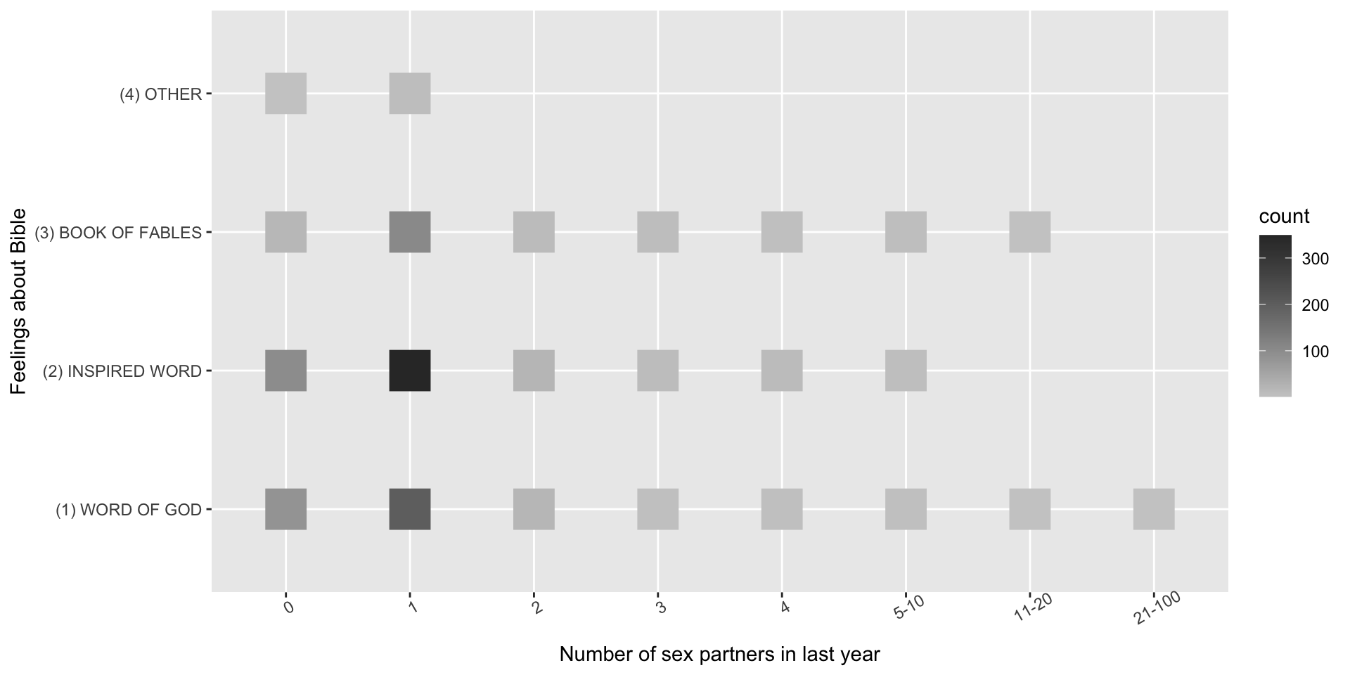
ggplot(sexbible) +geom_point(aes(x=partners, y=bible, color=count), shape=15, size=10) +xlab("Number of sex partners in last year") +ylab("Feelings about Bible") +scale_color_gradient(low="grey80", high="grey20") +theme(axis.text.x =element_text(angle=30))
Reconstructing a Wilkinson plot - Altair
Code
altair.Chart(sexbible).mark_point( shape="square", size=2500).encode( x=altair.X("partners:O", scale=altair.Scale(domain=sexbible["partners"].cat.categories.to_list()), axis=altair.Axis(title="Number of sex partners in last year")), y=altair.Y("bible:O", scale=altair.Scale(domain=sexbible["bible"].cat.categories.to_list(), reverse=True), axis=altair.Axis(title="Feelings about Bible")), color=altair.Color("count:Q", scale=altair.Scale(scheme="warmgreys")), fill=altair.Color("count:Q", scale=altair.Scale(scheme="warmgreys")), tooltip="count:Q").properties( width=600, height=300)
Reconstructing a Wilkinson plot - ggplot2
Code
ggplot(sexbible) +geom_point(aes(x=partners, y=bible, color=count), shape=15, size=10) +xlab("Number of sex partners in last year") +ylab("Feelings about Bible") +scale_color_gradientn(colors=c("darkblue", "cyan", "green", "orange")) +theme(axis.text.x =element_text(angle=30))
Reconstructing a Wilkinson plot - Altair
Code
altair.Chart(sexbible).mark_point( shape="square", size=2500).encode( x=altair.X("partners:O", scale=altair.Scale(domain=sexbible["partners"].cat.categories.to_list()), axis=altair.Axis(title="Number of sex partners in last year")), y=altair.Y("bible:O", scale=altair.Scale(domain=sexbible["bible"].cat.categories.to_list(), reverse=True), axis=altair.Axis(title="Feelings about Bible")), color=altair.Color("count:Q", scale=altair.Scale(domain=[0,400], range=["darkblue", "cyan", "green", "orange", "red"])), fill=altair.Color("count:Q", scale=altair.Scale(domain=[0,400], range=["darkblue", "cyan", "green", "orange", "red"])), tooltip="count:Q").properties( width=600, height=300)
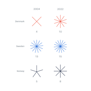
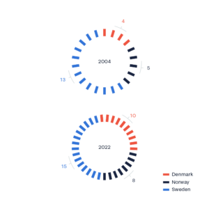
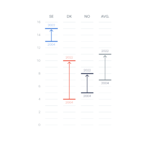
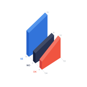
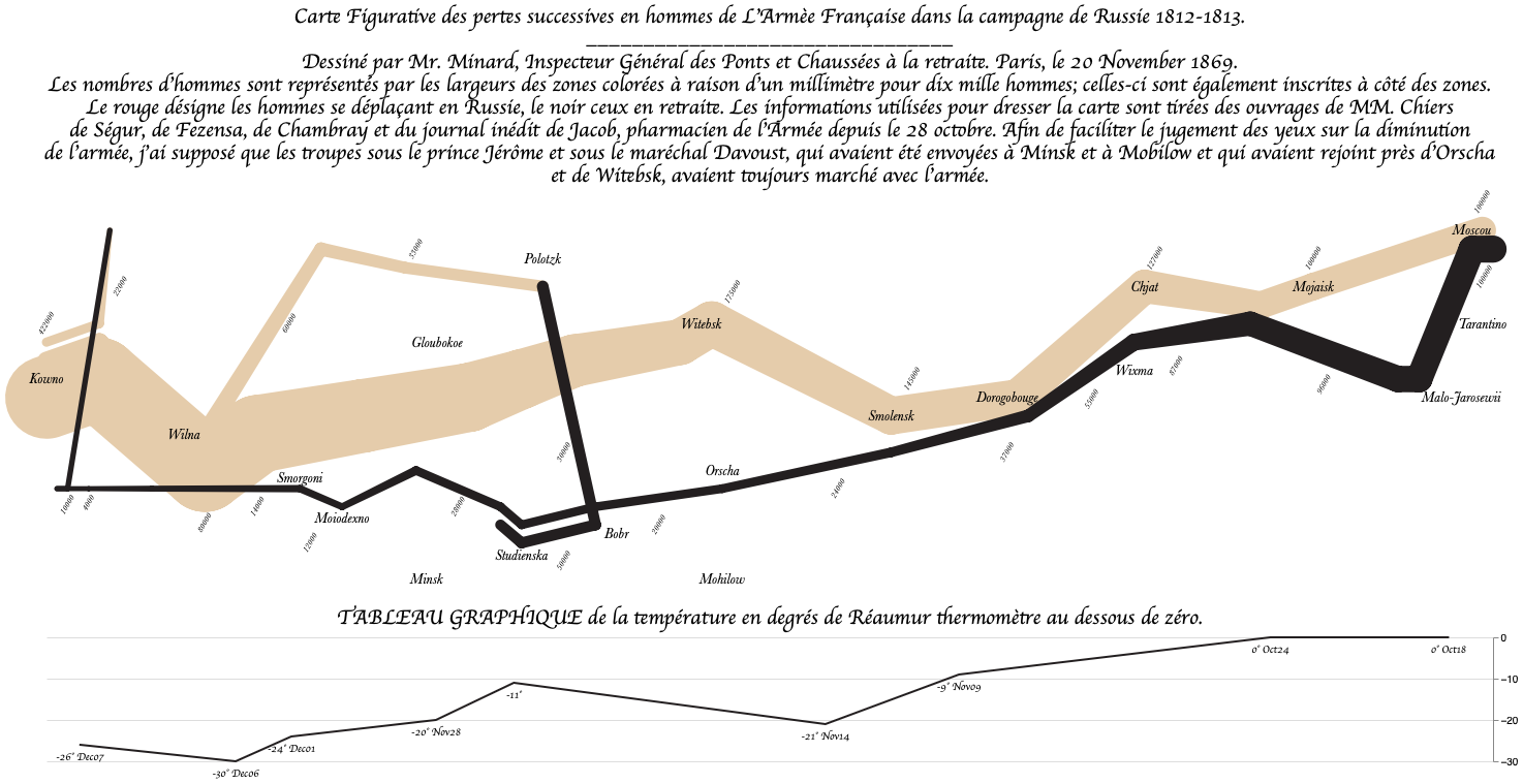
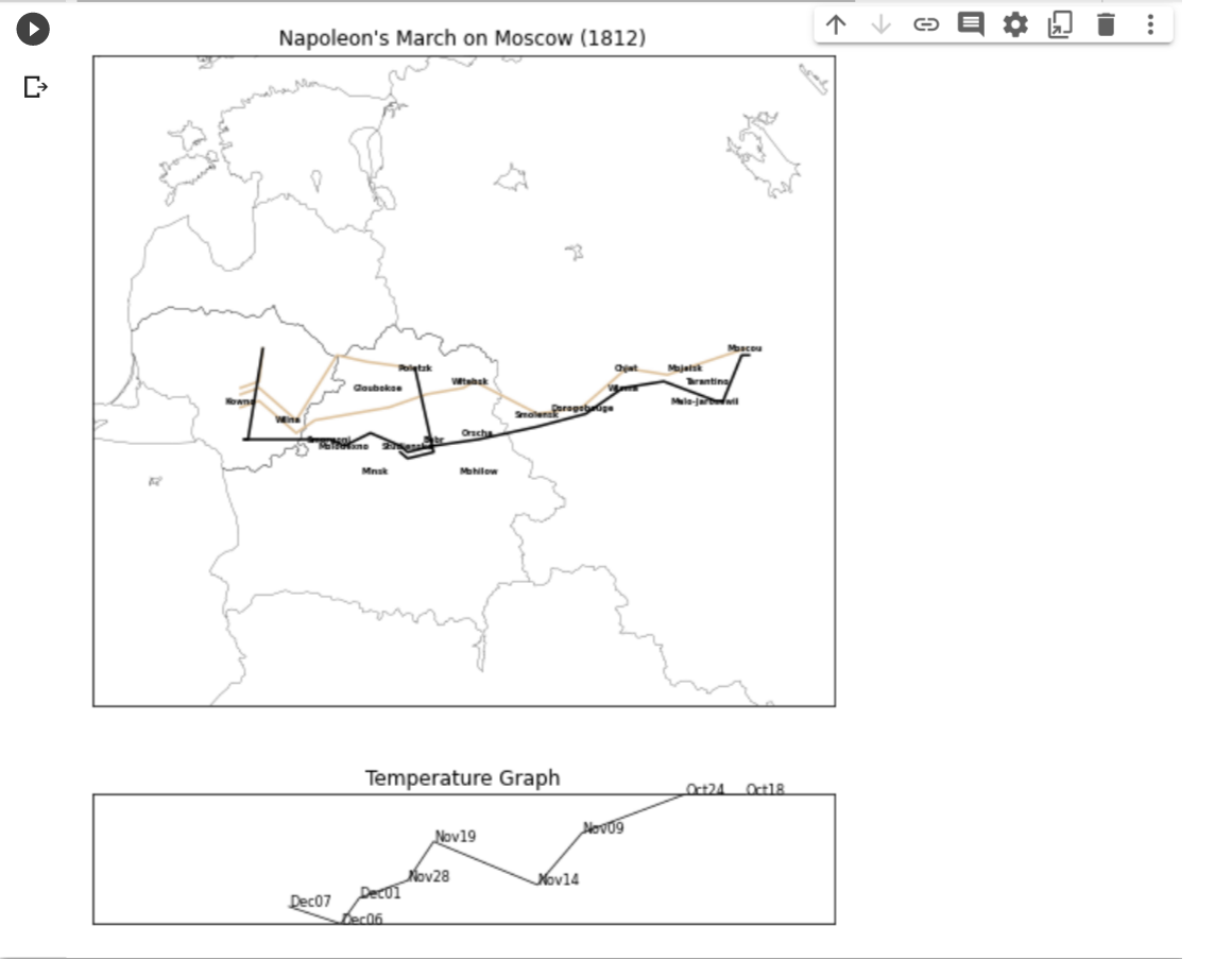
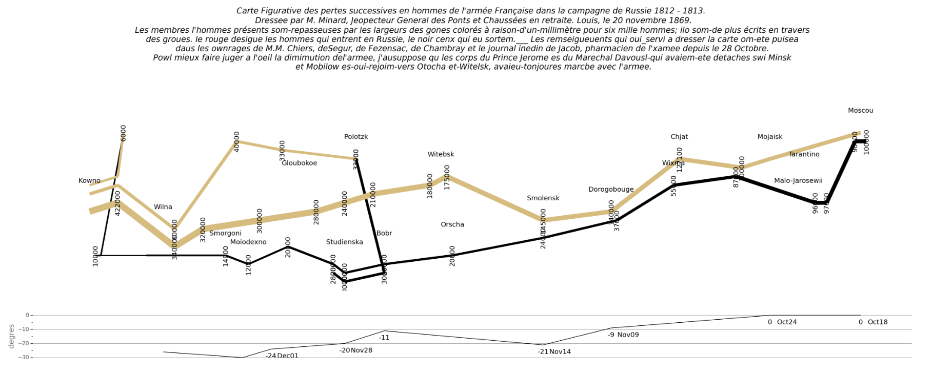
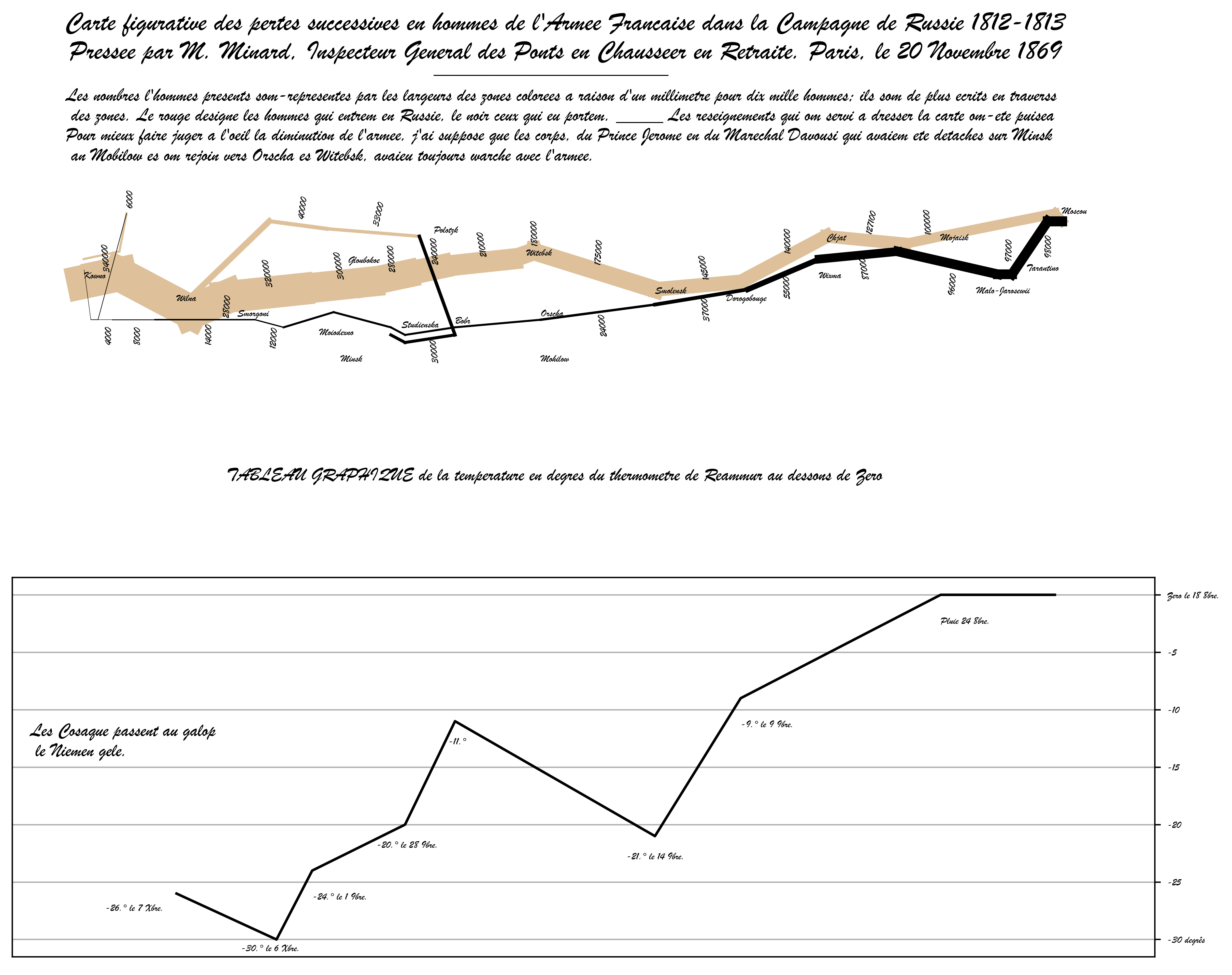
Redesigning a Wilkinson Plot
Now it’s your turn:
Homework: Use either the raw data or the summarized data to display your own version of this plot.
Wilkinson’s examples can be seen in Figures 8.25, 10.36, 10.51.
Together with your submitted redesign, you also need to submit a Design document, in which you state:
What tasks you envision your design with enable.
What affordances (definition to come later in this lecture) you have deliberately built.
What concrete design choices you have made, and why you have made those specific design choices.
You are encouraged to refer to the information you have on effective visual channels, on Stevens work, Cleveland’s or Munzner’s hierarchies.
Affordances and Signifiers
Affordance
James J Gibson, in The Senses Considered as Perceptual Systems (1966), and in The Ecological Approach to Visual Perception (1979):
The affordances of the environment are what it offers the animal, what it provides or furnishes, either for good or ill. The verb to afford is found in the dictionary, the noun affordance is not. I have made it up. I mean by it something that refers to both the environment and the animal in a way that no existing term does. It implies the complementarity of the animal and the environment.
Developed further by Donald Norman in The Design of Everyday Things (1988), who shifts the definition to action possibilities that are readily perceivable by an actor.
As such, affordances are culturally dependent, often learned, and often key to interaction design.
Hidden and False Affordances
William Gaver further subdivides affordances into categories:
False Affordance
An apparent affordance that does not have any real function, such as placebo buttons (door close button in elevator, road crossing button for pedestrians - when these buttons have no effect on the doors or traffic lights themselves)
Hidden Affordance
A possibility for action not perceived by the actor, such as how the shoe trick to opening a wine bottle means that a shoe affords opening wine bottle, but this would not be apparent from looking at a shoe.
Perceptible Affordance
A possibility for action described by available information so that an actor perceived the possibility and can act on the affordance.
Signifiers
In his revision to The Design of Everyday Things, Norman introduced the notion of signifier. In digital UI design (especially smartphone design), affordances had been picked up by the design community in ways not originally intended - to mean the means through which a designer communicates possible actions.
Examples of signifiers include many tutorial annotations in software, especially in games.
Some early categories of computer games were very focused on affordances and signifiers:
Point and Click games (ie Lucasarts; Police Quest, Space Quest, Leisure Suit Larry, Grim Fandango, Monkey Island, Maniac Mansion, Day of the Tentacle, Sam&Max, etc.)
Text games (ie Infocom; Zork, The Hitchhiker’s Guide to the Galaxy, Leather Goddesses of Phobos, )
Rules of Thumb
Munzner’s Rules of Thumb
No Unjustified 3D
No Unjustified 2D
Eyes Beat Memory
Resolution over Immersion
Overview First, Zoom and Filter, Detail on Demand
Responsiveness Is Required
Get It Right in Black and White
Function First, Form Next
No Unjustified 3D
Stevens power law has exponent 1.0 for planar position (left/right; up/down), but 0.67 for depth perception.
We are significantly less accurate at perceiving 3 dimensions. We see the world, not as much in 3 dimensions, as in \(2+\epsilon\) dimensions.
Depth cues are communicated by occlusion, foreshortening, cast shadows, stereoscopy, atmospheric perspective.
These techniques all remove information or interfere with additional visual channels.
That said, 3D is very powerful when the task is directly related to perceiving 3-dimensional shapes.
No Unjustified 3D - what instead?
Powerful replacement design is to introduce several linked views of the same data. This is how many CAD and 3D design tools work.
Code
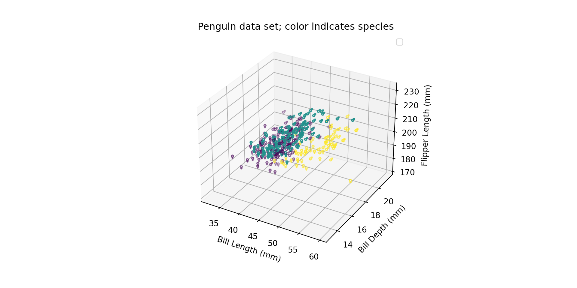
from palmerpenguins import load_penguinsimport pandaspenguins = load_penguins()
Code
from matplotlib import pyplotfig = pyplot.figure()ax = fig.add_subplot(projection="3d")speciesmapping = {"Adelie": 0,"Gentoo": 1,"Chinstrap": 2}ax.scatter("bill_length_mm", "bill_depth_mm", "flipper_length_mm", data=penguins.query("sex == 'male'"), marker="$\u2642$", c=[speciesmapping[p] for p in penguins.query("sex == 'male'")["species"]])ax.scatter("bill_length_mm", "bill_depth_mm", "flipper_length_mm", data=penguins.query("sex == 'female'"), marker="$\u2640$", c=[speciesmapping[p] for p in penguins.query("sex == 'female'")["species"]])ax.set_xlabel("Bill Length (mm)")ax.set_ylabel("Bill Depth (mm)")ax.set_zlabel("Flipper Length (mm)")ax.set_title("Penguin data set; color indicates species")ax.legend()pyplot.show()
Matplotlib 3d scatter plot.
No Unjustified 3D - what instead?
Powerful replacement design is to introduce several linked views of the same data. This is how many CAD and 3D design tools work.
Is the 2D layout really better than showing the data in a list?
1D layouts minimize space, and are very efficient at lookup tasks.
This may even remain true when the data has spatial or network roots. See, for instance, the shop directories that usually accompany mall floor plans.
Eyes Beat Memory
Eyes Beat Memory
Eyes Beat Memory
Complications are due to the limited size of working memory and human attention.
The key to cutting through these complications:
Simultaneous, or close, displays of information under the user’s control. Scrobbling, or repeated stepping between frames are useful ways to make changes pop out.
Small Multiples also builds on simultaneous display.
There are a whole bunch of ways people have tried to produce immersive experiences in visualizations.
They tend to
Require specialized equipment
Lag behind in display technology
So even if you can use the specialized equipments and platforms, you end up with a lower resolution display.
So immersion is a very expensive design feature. It might be useful, but make sure you know why you are paying the price.
Overview First, Zoom and Filter, Detail on Demand
Remember when I tried to find a design guideline and couldn’t remember what it was? This is it.
The guideline is most applicable to medium sized data sets:
Very Small Data Sets
Show in a list
Small-Medium Data Sets
Overview First
Zoom and Filter (to allow exploration)
Detail on Demand (to allow inspection)
Large Data Sets
Search
Show Context
Expand on Demand
Very Large Data Sets
…be Google…
Responsiveness Is Required
Time Scales of human-computer interactions:
<0.1 seconds
First Impressions of visual appeal.
Users feel like their actions is directly causing something to happen.
<1 seconds
Users feel like the computer is causing the result to appear. Train of thought uninterrupted.
10 seconds
At this threshold, most attention spans are maxed out. The flow of a user’s process gets interrupted.
Responsiveness Is Required
Already for the span of 1-10 seconds, you may want visual indicators of progress, and for any process taking longer than 10 seconds you need to assume that the user may task-switch - which means you need to indicate progress, indicate successful/unsuccessful finish state, and make it easy to re-establish their activities.
Some methods include:
Clearly indicate progress completed and time or steps remaining
Contextualize success-dialogs with additional details
Enable user-generated notes and comments
Provide access to historical content (without re-computing)
Allow processes to run in the background
Responsiveness Is Required
Even with a responsive system, interaction is cognitively expensive.
In the extreme, interactive systems break down to requiring a user to exhaustively search the visualization for the information they need - at which point the system could have been more automated.
Get It Right in Black and White
Both for handling color blindness issues, and for different presentation media, Get It Right in Black And White as a design slogan and design guideline advocates literally rendering in black/white (and grayscales) using a printer or image processing to check legibility.
This guideline suggests that luminance be preferred as a primary color based visual channel over hue and saturation that are better used to convey secondary information.
Good simulator for color blindness on a system-wide level: Color Oracle
Good simulator on a browser level: Let’s get color blind Chrome, Firefox