simpleR Using R for Introductory
Statistics.
By
John Verzani
Version 0.4 (August 22, 2002).
printable versions
Skip to the table of contents.
[If the math symbols do not show up properly, you may need to
configure your browser. Instructions are given at
HEVEA's homepage or
tth's homepage.]
Preface
These notes are an introduction to using the statistical software
package R for an introductory statistics course. They are meant to
accompany an introductory statistics book such as Kitchens
``Exploring Statistics''. The goals are not to show all the
features of R, or to replace a standard textbook, but rather to be
used with a textbook to illustrate the features of R that can be
learned in a one-semester, introductory statistics course.
These notes were written to take advantage of R version 1.5.0 or
later. For pedagogical reasons the equals sign, =, is used as
an assignment operator and not the traditional arrow combination
<-. This was added to R in version 1.4.0. If only an older
version is available the reader will have to make the minor
adjustment.
There are several references to data and functions in this text that
need to be installed prior to their use. To install the data is easy,
but the instructions vary depending on your system. For Windows
users, you need to download the ``zip'' file , and then install from the
``packages'' menu. In UNIX, one uses the command R CMD INSTALL
packagename.tar.gz. Some of the datasets are borrowed from other
authors notably Kitchens. Credit is given in the help files for the
datasets. This material is available as an R package from:
http://www.math.csi.cuny.edu/Statistics/R/simpleR/Simple_0.4.zip for Windows users.
http://www.math.csi.cuny.edu/Statistics/R/simpleR/Simple_0.4.tar.gz for UNIX users.
If necessary, the file can sent in an email. As well, the individual
data sets can be found online in the directory
http://www.math.csi.cuny.edu/Statistics/R/simpleR/Simple.
This is version 0.4 of these notes and were last
generated on August 22, 2002. Before printing these notes, you should check
for the most recent version available from
the CSI Math department.
Copyright © John Verzani
(verzani@math.csi.cuny.edu), 2001-2. All rights reserved.
Table of Contents
1 Introduction
1.1 What is R
These notes describe how to use R while learning introductory
statistics. The purpose is to allow this fine software to be used in
"lower-level" courses where often MINITAB, SPSS, Excel, etc. are
used. It is expected that the reader has had at least a pre-calculus
course. It is the hope, that students shown how to
use R at this early level will better understand the statistical
issues and will ultimately benefit from the more sophisticated
program despite its steeper ``learning curve''.
The benefits of R for an introductory student are
-
R is free. R is open-source and runs on UNIX, Windows
and Macintosh.
- R has an excellent built-in help system.
- R has excellent graphing capabilities.
- Students can easily migrate to the commercially supported S-Plus
program if commercial software is desired.
- R's language has a powerful, easy to learn syntax with many
built-in statistical functions.
- The language is easy to extend with user-written
functions.
- R is a computer programming language. For
programmers it will feel more familiar than others and for new
computer users, the next leap to programming will not be so large.
What is R lacking compared to other software solutions?
-
It has a limited graphical interface (S-Plus has a good
one). This means, it can be harder to learn at the outset.
- There is no commercial support. (Although one can argue the
international mailing list is even better)
- The command language is a programming language
so students must learn to appreciate syntax issues etc.
R is an open-source (GPL) statistical environment modeled after S
and S-Plus
(http://www.insightful.com). The
S language was developed in the late 1980s at AT&T labs.
The R project was started by Robert Gentleman and Ross Ihaka of
the Statistics Department of the University of Auckland in 1995. It has
quickly gained a widespread audience. It is currently maintained by
the R core-development team, a hard-working, international team
of volunteer developers. The R project web page
http://www.r-project.org
is the main site for information on R. At this site are directions
for obtaining the software, accompanying packages and other sources
of documentation.
1.2 A note on notation
A few typographical conventions are used in these notes. These
include different fonts for urls, R commands,
dataset names and
different typesetting for
longer sequences of R commands.
and for
Data sets.
2 Data
Statistics is the study of data. After learning how to start R, the
first thing we need to be able to do is learn how to enter data
into R and how to manipulate the data once there.
2.1 Starting R
R is most easily used in an interactive manner. You ask it a
question and R gives you an answer. Questions are asked and
answered on the command line. To start up R's command line you can
do the following: in Windows find the R icon and double click,
on Unix, from the command line type R. Other operating
systems may have different ways. Once R is started, you should be
greeted with a command similar to
R : Copyright 2001, The R Development Core Team
Version 1.4.0  (2001-12-19)

R is free software and comes with ABSOLUTELY NO WARRANTY.
You are welcome to redistribute it under certain conditions.
Type `license()' or `licence()' for distribution details.

R is a collaborative project with many contributors.
Type `contributors()' for more information.

Type `demo()' for some demos, `help()' for on-line help, or
`help.start()' for a HTML browser interface to help.
Type `q()' to quit R.

[Previously saved workspace restored]

>
The > is called the prompt. In what follows below it
is not typed, but is used to indicate where you are to type if you
follow the examples. If a command is too long to fit on a line, a
+ is used for the continuation prompt.
2.2 Entering data with c
The most useful R command for quickly entering in small data sets
is the c function. This function combines, or
concatenates terms together. As an example, suppose we have
the following count of the number of typos per page of these
notes:
2 3 0 3 1 0 0 1
To enter this into an R session we do so with
> typos = c(2,3,0,3,1,0,0,1)
> typos
[1] 2 3 0 3 1 0 0 1
Notice a few things
-
We assigned the values to a variable called typos
- The assignment operator is a =. This is valid as of
R version 1.4.0. Previously it was (and still can be) a
<-. Both will be used, although, you should learn one and
stick with it.
- The value of the typos doesn't automatically print
out. It does when we type just the name though as the last input
line indicates
- The value of typos is prefaced with a funny looking [1]. This
indicates that the value is a vector. More on that later.
2.3 Typing less
For many implementations of R you can save yourself a lot of typing if
you learn that the arrow keys can be used to retrieve your
previous commands. In particular, each command is stored in a
history and the up arrow will traverse backwards along this
history and the down arrow forwards. The left and right arrow keys
will work as expected. This combined with a mouse can make it
quite easy to do simple editing of your previous commands.
2.4 Applying a function
R comes with many built in functions that one can apply to data
such as typos. One of them is the mean function for
finding the mean or average of the data. To use it is easy
> mean(typos)
[1] 1.25
As well, we could call the median, or var to find
the median or sample variance. The syntax is the same -- the
function name followed by parentheses to contain the argument(s):
> median(typos)
[1] 1
> var(typos)
[1] 1.642857
2.5 Data is a vector
The data is stored in R as a vector. This means simply
that it keeps track of the order that the data is entered in. In
particular there is a first element, a second element up to a last
element. This is a good thing for several reasons:
-
Our simple data vector typos has a natural order --
page 1, page 2 etc. We wouldn't want to mix these up.
- We would like to be able to make changes to the data item by
item instead of having to enter in the entire data set again.
- Vectors are also a mathematical object. There are natural
extensions of mathematical concepts such as addition and
multiplication that make it easy to work with
data when they are vectors.
Let's see how these apply to our typos example. First, suppose these
are the typos for the first draft of section 1 of these notes. We
might want to keep track of our various drafts as the typos
change. This could be done by the following:
> typos.draft1 = c(2,3,0,3,1,0,0,1)
> typos.draft2 = c(0,3,0,3,1,0,0,1)
That is, the two typos on the first page were fixed. Notice the two
different variable names. Unlike many other languages, the period is
only used as punctuation. You can't use an _ (underscore) to
punctuate names as you might in other programming languages so it is
quite useful. 1
Now, you might say, that is a lot of work to type in the data a
second time. Can't I just tell R to change the first page? The
answer of course is ``yes''. Here is how
> typos.draft1 = c(2,3,0,3,1,0,0,1)
> typos.draft2 = typos.draft1  # make a copy
> typos.draft2[1] = 0          # assign the first page 0 typos
Now notice a few things. First, the comment character, #, is
used to make comments. Basically anything after the comment
character is ignored (by R, hopefully not the reader). More
importantly, the assignment to the first entry in the vector
typos.draft2 is done by referencing the first entry in the
vector. This is done with square brackets []. It is
important to keep this in mind: parentheses () are for
functions, and square brackets [] are for vectors (and later
arrays and lists). In particular, we have the following values
currently in typos.draft2
> typos.draft2                  # print out the value
[1] 0 3 0 3 1 0 0 1
> typos.draft2[2]               # print 2nd pages' value
[1] 3
> typos.draft2[4]               # 4th page
[1] 3
> typos.draft2[-4]              # all but the 4th page
[1] 0 3 0 1 0 0 1
> typos.draft2[c(1,2,3)]        # fancy, print 1st, 2nd and 3rd.
[1] 0 3 0
Notice negative indices give everything except these indices.
The last example is very important. You can take more than one value
at a time by using another vector of index numbers. This is called
slicing.
Okay, we need to work these notes into shape, let's find the real bad
pages. By inspection, we can notice that pages 2 and 4 are a
problem. Can we do this with R in a more systematic manner?
> max(typos.draft2)             # what are worst pages?
[1] 3                           # 3 typos per page
> typos.draft2 == 3             # Where are they?
[1] FALSE  TRUE FALSE  TRUE FALSE FALSE FALSE FALSE
Notice, the usage of double equals signs (==). This tests all
the values of typos.draft2 to see if they are equal to 3. The
2nd and 4th answer yes (TRUE) the others no.
Think of this as asking R a question. Is the value equal to 3?
R/ answers all at once with a long vector of TRUE's and FALSE's.
Now the question is -- how can we get the indices (pages)
corresponding to the TRUE values? Let's rephrase,
which indices have 3 typos? If you guessed that the command
which will work, you are on your way to R mastery:
> which(typos.draft2 == 3)
[1] 2 4
Now, what if you didn't think of the command which? You are
not out of luck -- but you will need to work harder. The basic idea is
to create a new vector 1 2 3 ... keeping track of the page
numbers, and then slicing off just the ones for which
typos.draft2==3:
> n = length(typos.draft2)      # how many pages
> pages = 1:n                   # how we get the page numbers
> pages                         # pages is simply 1 to number of pages
[1] 1 2 3 4 5 6 7 8
> pages[typos.draft2 == 3]      # logical extraction. Very useful
[1] 2 4
To create the vector 1 2 3 ... we used the simple : colon
operator. We could have typed this in, but this is a useful thing to know. The command a:b is
simply a, a+1, a+2, ..., b if a,b are integers and
intuitively defined if not. A more general R function is
seq() which is a bit more typing. Try ?seq to see it's
options. To produce the above try seq(a,b,1).
The use of extracting elements of a vector using another vector of the
same size which is comprised of TRUEs and FALSEs is
referred to as extraction by a logical vector. Notice this is
different from extracting by page numbers by slicing as we did
before. Knowing how to use slicing and logical vectors gives you the
ability to easily access your data as you desire.
Of course, we could have done all the above at once with this command (but
why?)
> (1:length(typos.draft2))[typos.draft2 == max(typos.draft2)]
[1] 2 4
This looks awful and is prone to typos and confusion, but does
illustrate how things can be combined into short powerful statements.
This is an important point. To appreciate the use of R you need to
understand how one composes the output of one function or
operation with the input of another. In mathematics we call this
composition.
Finally, we might want to know how many typos we have, or how many
pages still have typos to fix or what the difference is between
drafts? These can all be answered with mathematical functions. For
these three questions we have
> sum(typos.draft2)             # How many typos?
[1] 8
> sum(typos.draft2>0)           # How many pages with typos?
[1] 4
> typos.draft1 - typos.draft2   # difference between the two
[1] 2 0 0 0 0 0 0 0
Example: Keeping track of a stock; adding to the data
Suppose the daily closing price of your favorite stock for two weeks
is
45,43,46,48,51,46,50,47,46,45
We can again keep track of this with
R using a vector:
> x = c(45,43,46,48,51,46,50,47,46,45)
> mean(x)                       # the mean
[1] 46.7
> median(x)                     # the median
[1] 46
> max(x)                        # the maximum or largest value
[1] 51
> min(x)                        # the minimum value
[1] 43
This illustrates that many interesting functions can be found
easily. Let's see how we can do some others. First, lets add the next
two weeks worth of data to
x. This was
48,49,51,50,49,41,40,38,35,40
We can add this several ways.
> x = c(x,48,49,51,50,49)        # append values to x
> length(x)                      # how long is x now (it was 10)
[1] 15
> x[16] = 41                     # add to a specified index
> x[17:20] = c(40,38,35,40)      # add to many specified indices
Notice, we did three different things to add to a vector. All are
useful, so lets explain. First we used the
c (combine) operator
to combine the previous value of
x with the next week's
numbers. Then we assigned directly to the 16th index. At the time of
the assignment,
x had only 15 indices, this automatically
created another one. Finally, we assigned to a slice of indices. This
latter make some things very simple to do.
R Basics: Graphical Data Entry Interfaces
There are some other ways to edit data that use a spreadsheet
interface. These may be preferable to some students. Here are examples
with annotations
> data.entry(x)                # Pops up spreadsheet to edit data
> x = de(x)                    # same only, doesn't save changes
> x = edit(x)                  # uses editor to edit x.
All are easy to use. The main confusion is that the variable
x
needs to be defined previously. For example
> data.entry(x)                 # fails. x not defined
Error in de(..., Modes = Modes, Names = Names) :
    Object "x" not found
> data.entry(x=c(NA))           # works, x is defined as we go.
Other data entry methods are discussed in the appendix on entering data.
Before we leave this example, lets see how we can do some other
functions of the data. Here are a few examples.
The moving average simply means to average over some previous number
of days. Suppose we want the 5 day moving average (50-day or 100-day
is more often used). Here is one way to do so. We can do this for days
5 through 20 as the other days don't have enough data.
>  day = 5;
> mean(x[day:(day+4)])
[1] 48
The trick is the slice takes out days 5,6,7,8,9
> day:(day+4)
[1] 5 6 7 8 9
and the mean takes just those values of
x.
What is the maximum value of the stock? This is easy to answer with
max(x). However, you may be interested in a running maximum or
the largest value to date. This too is easy -- if you
know that
R had a built-in function to handle this. It is called
cummax which will take the cumulative maximum. Here is the
result for our 4 weeks worth of data along with the similar
cummin:
> cummax(x)                     # running maximum
 [1] 45 45 46 48 51 51 51 51 51 51 51 51 51 51 51 51 51 51 51 51
> cummin(x)                     # running minimum
 [1] 45 43 43 43 43 43 43 43 43 43 43 43 43 43 43 41 40 38 35 35
Example: Working with mathematics
R makes it easy to translate mathematics in a natural way once
your data is read in. For example, suppose the yearly number of whales
beached in Texas during the period 1990 to 1999 is
74 122 235 111 292 111 211 133 156 79
What is the mean, the variance, the standard deviation? Again,
R makes
these easy to answer:
> whale = c(74, 122, 235, 111, 292, 111, 211, 133, 156, 79)
> mean(whale)
[1] 152.4
> var(whale)
[1] 5113.378
> std(whale)
Error: couldn't find function "std"
> sqrt(var(whale))
[1] 71.50789
> sqrt( sum( (whale - mean(whale))^2 /(length(whale)-1)))
[1] 71.50789
Well, almost! First, one needs to remember the names of the
functions. In this case
mean is easy to guess,
var is
kind of obvious but less so,
std is also kind of obvious, but
guess what? It isn't there! So some other things were tried. First,
we remember that the standard deviation
is the square of the
variance
. Finally, the last line
illustrates that
R can almost exactly mimic the mathematical
formula for the standard deviation:
|
SD(X) = |
æ
ç
ç
è |
|
|
(Xi - |
|
)2 |
ö
÷
÷
ø |
|
.
|
Notice the sum is now
sum,
X-- is
mean(whale) and
length(x) is used instead of
n.
Of course, it might be nice to have this available as a built-in
function. Since this example is so easy, lets see how it is done:
> std = function(x) sqrt(var(x))
> std(whale)
[1] 71.50789
The ease of defining your own functions is a very appealing feature of
R we will return to.
Finally, if we had thought a little harder we might have found the
actual built-in
sd() command. Which gives
> sd(whale)
[1] 71.50789
R Basics: Accessing Data
There are several ways to extract data from a vector. Here is a
summary using both slicing and extraction by a logical vector.
Suppose
x is the data vector, for example
x=1:10.
| how many elements? |
length(x) |
| ith element |
x[2] (i=2) |
| all but ith element |
x[-2] (i=2) |
| first k elements |
x[1:5] (k=5) |
| last k elements |
x[(length(x)-5):length(x)] (k=5) |
| specific elements. |
x[c(1,3,5)] (First, 3rd and 5th) |
| all greater than some value |
x[x>3] (the value is 3) |
| bigger than or less than some values |
x[ x< -2 | x >
2] |
| which indices are largest |
which(x == max(x)) |
2.6 Problems
-
2.1
- Suppose you keep track of your mileage each time you fill
up. At your last 6 fill-ups the mileage was
65311 65624 65908 66219 66499 66821 67145 67447
Enter these numbers into R. Use the function diff on the
data. What does it give?
> miles = c(65311, 65624, 65908, 66219, 66499, 66821, 67145, 67447)
> x = diff(miles)
You should see the number of miles between fill-ups. Use the
max to find the maximum number of miles between fill-ups, the mean
function to find the average number of miles and the min
to get the minimum number of miles.
- 2.2
- Suppose you track your commute times for two weeks (10 days) and
you find the following times in minutes
17 16 20 24 22 15 21 15 17 22
Enter this into R. Use the function max to find the
longest commute time, the function mean to find the average
and the function min to find the minimum.
Oops, the 24 was a mistake. It should have been 18. How can you fix
this? Do so, and then find the new average.
How many times was your commute 20 minutes or more? To answer this
one can try (if you called your numbers commutes)
> sum( commutes >= 20)
What do you get? What percent of your commutes are less than 17
minutes? How can you answer this with R?
- 2.3
- Your cell phone bill varies from month to month. Suppose your
year has the following monthly amounts
46 33 39 37 46 30 48 32 49 35 30 48
Enter this data into a variable called bill. Use the
sum command to find the amount you spent this year on the
cell phone. What is the smallest amount you spent in a month? What
is the largest? How many months was the amount greater than $40?
What percentage was this?
- 2.4
- You want to buy a used car and find that over 3 months of
watching the classifieds you see the following prices (suppose the
cars are all similar)
9000 9500 9400 9400 10000 9500 10300 10200
Use R to find the average value and compare it to
Edmund's estimate of $9500. Use R to find the
minimum value and the maximum value. Which price would you like to
pay?
- 2.5
- Try to guess the results of these R commands. Remember, the
way to access entries in a vector is with []. Suppose we
assume
> x = c(1,3,5,7,9)
> y = c(2,3,5,7,11,13)
-
x+1
- y*2
- length(x) and length(y)
- x + y
- sum(x>5) and sum(x[x>5])
- sum(x>5 | x< 3) # read | as 'or', & and 'and'
- y[3]
- y[-3]
- y[x] (What is NA?)
- y[y>=7]
- 2.6
- Let the data x be given by
> x = c(1, 8, 2, 6, 3, 8, 5, 5, 5, 5)
Use R to compute the following functions. Note, we use X1 to
denote the first element of x (which is 0) etc.
-
(X1 + X2 + ··· + X10)/10 (use sum)
- Find log10(Xi) for each i. (Use the log
function which by default is base e)
- Find (Xi - 4.4)/2.875 for each i. (Do it all at once)
- Find the difference between the largest and smallest values of
x. (This is the range. You can use max and
min or guess a built in command.)
3 Univariate Data
There is a distinction between types of data in statistics and R
knows about some of these differences. In particular, initially, data
can be of three basic types: categorical, discrete numeric and
continuous numeric. Methods for viewing and summarizing the data
depend on the type, and so we need to be aware of how each is handled
and what we can do with it.
Categorical data is data that records categories. Examples could be, a
survey that records whether a person is for or against a proposition.
Or, a police force might
keep track of the race of the individuals they pull over on the
highway. The
U.S. census, which takes
place every 10 years, asks several different questions of a
categorical nature. Again, there was one on race which in the year
2000 included 15 categories with write-in space for 3 more for this
variable (you could mark yourself as multi-racial). Another example,
might be a doctor's chart which records data on a patient. The gender or the
history of illnesses might be treated as categories.
Continuing the doctor example, the age of a person and their weight
are numeric quantities. The age is a discrete numeric quantity
(typically) and the weight as well (most people don't say they are 4.673
years old). These numbers are usually reported as integers.
If one really needed to know precisely, then they could in theory take
on a continuum of values, and we would consider them to be continuous.
Why the distinction? In data sets, and some tests it is important to
know if the data can have ties (two or more data points with the same value). For discrete data it is true, for
continuous data, it is generally not true that there can be ties.
A simple, intuitive way to keep track of these is to ask what is the mean
(average)? If it doesn't make sense then the data is categorical (such
as the average of a non-smoker and a smoker), if it
makes sense, but might not be an answer (such as 18.5 for age when you
only record integers integer) then the data is discrete otherwise it
is likely to be continuous.
3.1 Categorical data
We often view categorical data with tables but we may also look at
the data graphically with bar
graphs or pie charts.
3.2 Using tables
The table command allows us to look at tables.
Its simplest usage looks like table(x) where x is a
categorical variable.
Example: Smoking survey
A survey asks people if they smoke or not. The data is
Yes, No, No, Yes, Yes
We can enter this into
R with the
c() command, and
summarize with the
table command as follows
> x=c("Yes","No","No","Yes","Yes")
> table(x)
x
 No Yes
  2   3
The
table command simply adds up the frequency of each unique
value of the data.
3.3 Factors
Categorical data is often used to classify data into various
levels or factors. For example, the smoking data could be part of a
broader survey on student health issues. R has a special
class for working with factors which is occasionally important to know
as R will automatically adapt itself when it knows it has a factor. To make a
factor is easy with the command factor or as.factor. Notice the difference
in how R treats factors with this example
> x=c("Yes","No","No","Yes","Yes")
> x                             # print out values in x
[1] "Yes" "No"  "No"  "Yes" "Yes"
> factor(x)                     # print out value in factor(x)
[1] Yes No  No  Yes Yes
Levels:  No Yes                 # notice levels are printed.
3.4 Bar charts
A bar chart draws a bar with a a height proportional to the count in
the table. The height could be given by the frequency, or the
proportion. The graph will look the same, but the scales may be
different.
Suppose, a group of 25 people are surveyed as to their beer-drinking
preference. The categories were (1) Domestic can, (2) Domestic
bottle, (3) Microbrew and (4) import. The raw data is
3 4 1 1 3 4 3 3 1 3 2 1 2 1 2 3 2 3 1 1 1 1 4 3 1
Let's make a barplot of both frequencies and proportions. First, we
use the scan function to read in the data then we plot (figure 1)
> beer = scan()
1: 3 4 1 1 3 4 3 3 1 3 2 1 2 1 2 3 2 3 1 1 1 1 4 3 1
26:
Read 25 items
> barplot(beer)                 # this isn't correct
> barplot(table(beer))          # Yes, call with summarized data
> barplot(table(beer)/length(beer)) # divide by n for proportion
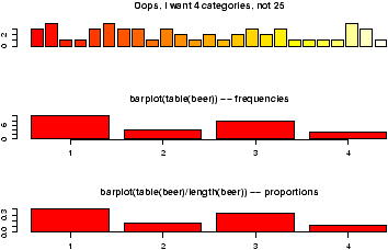
Figure 1: Sample barplots
Notice a few things:
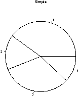
3.5 Pie charts
The same data can be studied with pie charts using the pie
function.23 Here are some simple examples illustrating the usage
(similar to barplot(), but with some added features.
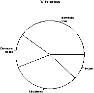
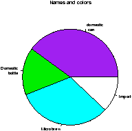
> beer.counts = table(beer)     # store the table result
> pie(beer.counts)              # first pie -- kind of dull
> names(beer.counts) = c("domestic\n can","Domestic\n bottle",
                          "Microbrew","Import") # give names
> pie(beer.counts)              # prints out names
> pie(beer.counts,col=c("purple","green2","cyan","white"))
                                # now with colors
The first one was kind of boring so we added names. This is done with
the names which allows us to specify names to the
categories. The resulting piechart shows how the names are
used. Finally, we added color to the piechart. This is done by setting
the piechart attribute col. We set this equal to a vector of
color names that was the same length as our beer.counts. The
help command (?pie) gives some examples for automatically
getting different colors, notably using rainbow and gray.
Notice we used additional arguments to the function
pie The syntax for these is name=value. The ability
to pass in named values to a function, makes it easy to have fewer
functions as each one can have more functionality.
3.6 Numerical data
There are many options for viewing numerical data. First, we
consider the common numerical summaries of center and spread.
3.7 Numeric measures of center and spread
To describe a distribution we often want to know where is it
centered and what is the spread. These are typically measured with
mean and variance (or standard deviation), or the median and more generally the
five-number summary. The R commands for these are mean,
var, sd, median, fivenum and
summary.
Example: CEO salaries
Suppose, CEO yearly compensations are sampled and the following are
found (in millions). (This is before being indicted for cooking
the books.)
12 .4 5 2 50 8 3 1 4 0.25
> sals = scan()                # read in with scan
1: 12 .4 5 2 50 8 3 1 4 0.25
11:
Read 10 items
> mean(sals)                    # the average
[1] 8.565
> var(sals)                     # the variance
[1] 225.5145
> sd(sals)                      # the standard deviation
[1] 15.01714
> median(sals)                  # the median
[1] 3.5
> fivenum(sals)                 # min, lower hinge, Median, upper hinge, max
[1]  0.25  1.00  3.50  8.00 50.00
> summary(sals)
   Min. 1st Qu.  Median    Mean 3rd Qu.    Max.
  0.250   1.250   3.500   8.565   7.250  50.000
Notice the
summary command. For a numeric variable it prints
out the five number summary and the median. For other variables, it adapts
itself in an intelligent manner.
Some Extra Insight: The difference between fivenum and the quantiles.
You may have noticed the slight difference between the
fivenum and the
summary command. In particular, one gives 1.00 for the lower
hinge and the other 1.250 for the first quantile. What is the
difference? The story is below.
The median is the point in the data that splits it into half. That is,
half the data is above the data and half is below. For example, if our
data in sorted order is
10, 17, 18, 25, 28
then the midway number is clearly 18 as 2 values are less and 2 are
more. Whereas, if the data had an additional point:
10, 17, 18, 25, 28, 28
Then the midway point is somewhere between 18 and 25 as 3 are larger
and 3 are smaller. For concreteness, we average the two values giving
21.5 for the median. Notice, the
point where the data is split in half depends on the number of data
points. If there are an odd number, then this point is the
(
n+1)/2 largest data point. If there is an even number of data
points, then again we use the (
n+1)/2 data point, but since this is
a fractional number, we average the actual data to the left and the
right.
The idea of a quantile generalizes this median. The
p quantile,
(also known as the 100p%-percentile) is the point in the data where
100p% is less, and 100(1-p)% is larger. If there are
n data points,
then the
p quantile occurs at the position 1+(
n-1)
p with weighted
averaging if this is between integers. For example the .25 quantile of
the numbers 10,17,18,25,28,28 occurs at the position 1+(6-1)(.25) =
2.25. That is 1/4 of the way between the second and third number which
in this example is 17.25.
The .25 and .75 quantiles are denoted the
quartiles. The
first quartile is called
Q1, and the third quartile is called
Q3. (You'd think the second quartile would be called
Q2, but use
``the median'' instead.) These values are in the
R function
RCodesummary. More generally, there is a
quantile
function which will compute any quantile between 0 and 1. To find the
quantiles mentioned above we can do
> data=c(10, 17, 18, 25, 28, 28)
> summary(data)
   Min. 1st Qu.  Median    Mean 3rd Qu.    Max.
  10.00   17.25   21.50   21.00   27.25   28.00
> quantile(data,.25)
  25%
17.25
> quantile(data,c(.25,.75))     # two values of p at once
  25%   75%
17.25 27.25
There is a historically popular set of alternatives to the quartiles,
called the hinges that are somewhat easier to compute by hand. The
median is defined as above. The lower hinge is then the median of all
the data to the left of the median, not counting this particular data
point (if it is one.) The upper hinge is similarly defined. For
example, if your data is again 10, 17, 18, 25, 28, 28, then the median is 21.5, and the
lower hinge is the median of 10, 17, 18 (which is 17) and the upper hinge is
the median of 25,28,28 which is 28. These are available in the function
fivenum(), and later appear in the boxplot function.
Here is an illustration with the
sals data, which has
n=10. From above we should have the median at (10+1)/2=5.5, the
lower hinge at the 3rd value and the upper hinge at the 8th largest
value. Whereas, the value of
Q1 should be at the 1+(10-1)(1/4) =
3.25 value. We can check that this is the case by sorting the data
> sort(sals)
 [1]  0.25  0.40  1.00  2.00  3.00  4.00  5.00  8.00 12.00 50.00
> fivenum(sals)         # note 1 is the 3rd value, 8 the 8th.
[1]  0.25  1.00  3.50  8.00 50.00
> summary(sals)         # note 3.25 value is 1/4 way between 1 and 2
   Min. 1st Qu.  Median    Mean 3rd Qu.    Max.
  0.250   1.250   3.500   8.565   7.250  50.000
3.8 Resistant measures of center and spread
The most used measures of center and spread are the mean and standard deviation
due to their relationship with the normal distribution, but they
suffer when the data has long tails, or many outliers. Various
measures of center and spread have been developed to handle this.
The median is just such a resistant measure. It is oblivious
to a few arbitrarily large values. That is, is you make a measurement
mistake and get 1,000,000 for the largest value instead of 10 the
median will be indifferent.
Other resistant measures are available. A common one for the center
is the trimmed mean. This is useful if the data has many
outliers (like the CEO compensation, although better if the data is symmetric). We trim off a certain
percentage of the data from the top and the bottom and then take the
average. To do this in R we need to tell the mean() how
much to trim.
> mean(sals,trim=1/10)          # trim 1/10 off top and bottom
[1] 4.425
> mean(sals,trim=2/10)
[1] 3.833333
Notice as we trim more and more, the value of the mean gets closer to
the median which is when trim=1/2. Again notice how we used a named argument to the
mean function.
The variance and standard deviation are also sensitive to outliers.
Resistant measures of spread include the IQR and the mad.
The IQR or interquartile range is the difference of the 3rd
and 1st quartile. The function IQR calculates it
for us
> IQR(sals)
[1] 6
The median average deviation (MAD) is also a useful, resistant measure of
spread. It finds the median of the absolute differences from the
median and then multiplies by a constant. (Huh?) Here is a formula
median | Xi - median(X) | (1.4826)
That is, find the median, then find all the differences from the
median. Take the absolute value and then find the median of this new
set of data. Finally, multiply by the constant. It is easier to do with R than to describe.
> mad(sals)
[1] 4.15128
And to see that we could do this ourself, we would do
> median(abs(sals - median(sals))) # without normalizing constant
[1] 2.8
> median(abs(sals - median(sals))) * 1.4826
[1] 4.15128
(The choice of 1.4826 makes the value comparable with the standard
deviation for the normal distribution.)
3.9 Stem-and-leaf Charts
There are a range of graphical summaries of data. If the data set is
relatively small, the stem-and-leaf diagram is very useful for
seeing the shape of the distribution and the values. It takes a
little getting used to. The number on the left of the bar is the
stem, the number on the right the digit. You put them together to
find the observation.
Suppose you have the box score of a basketball game and find the
following points per game for players on both teams
2 3 16 23 14 12 4 13 2 0 0 0 6 28 31 14 4 8 2 5
To create a stem and leaf chart is simple
> scores = scan()
1: 2 3 16 23 14 12 4 13 2 0 0 0 6 28 31 14 4 8 2 5
21:
Read 20 items
> apropos("stem")               # What exactly is the name?
[1] "stem"        "system"      "system.file" "system.time"
> stem(scores)

  The decimal point is 1 digit(s) to the right of the |

  0 | 000222344568
  1 | 23446
  2 | 38
  3 | 1
R Basics: help, ? and apropos
Notice we use
apropos() to help find the name for the
function. It is
stem() and not
stemleaf(). The
apropos() command is convenient when you think you know the
function's name but aren't sure. The
help command will help us
find help on the given function or dataset once we know the name. For
example
help(stem) or the abbreviated
?stem will
display the documentation on the
stem function.
Suppose we wanted to break up the
categories into groups of 5. We can do so by setting the ``scale''
> stem(scores,scale=2)

  The decimal point is 1 digit(s) to the right of the |

  0 | 000222344
  0 | 568
  1 | 2344
  1 | 6
  2 | 3
  2 | 8
  3 | 1
Example: Making numeric data categorical
Categorical variables can come from numeric variables by aggregating
values. For example. The salaries could be placed into broad
categories of 0-1 million, 1-5 million and over 5 million. To do
this using
R one uses the
cut() function and the
table() function.
Suppose the salaries are again
12 .4 5 2 50 8 3 1 4 .25
And we want to break that data into the intervals
[0,1],(1,5],(5,50]
To use the cut command, we need to specify the cut points. In this
case 0,1,5 and 50 (=
max(sals)). Here is the syntax
> sals = c(12, .4, 5, 2, 50, 8, 3, 1, 4, .25) # enter data
> cats = cut(sals,breaks=c(0,1,5,max(sals)))  # specify the breaks
> cats                          # view the values
 [1] (5,50] (0,1]  (1,5]  (1,5]  (5,50] (5,50] (1,5]  (0,1]  (1,5]  (0,1]
Levels:  (0,1] (1,5] (5,50]
> table(cats) # organize
cats
 (0,1]  (1,5] (5,50]
     3      4      3
> levels(cats) = c("poor","rich","rolling in it") # change labels
> table(cats)
cats
         poor          rich rolling in it
            3             4             3
Notice,
cut() answers the question ``which interval is the
number in?''. The output is the interval (as a
factor). This
is why the
table command is used to summarize the result of
cut. Additionally, the names of the levels where changed as
an illustration of how to manipulate these.
3.10 Histograms
If there is too much data, or your audience doesn't know how to read
the stem-and-leaf, you might try other summaries. The most common is
similar to the bar plot and is a histogram. The histogram defines a
sequence of breaks and then counts the number of observation in the
bins formed by the breaks. (This is identical to the features of the
cut() function.) It plots these with a bar similar to the
bar chart, but the bars are touching. The height can be the
frequencies, or the proportions. In the latter case the areas sum to
1 -- a property that will be sound familiar when you study
probability distributions. In either case the area is proportional
to probability.
Let's begin with a simple example. Suppose the top 25 ranked movies
made the following gross receipts for a week 4
29.6 28.2 19.6 13.7 13.0  7.8  3.4  2.0  1.9  1.0  0.7  0.4  0.4  0.3
0.3 0.3  0.3  0.3  0.2  0.2  0.2  0.1  0.1  0.1  0.1  0.1
Let's visualize it
(figure 3). First we scan it
in then make some histograms
> x=scan()
1: 29.6 28.2 19.6 13.7 13.0  7.8  3.4  2.0  1.9  1.0  0.7  0.4  0.4  0.3  0.3
16: 0.3  0.3  0.3  0.2  0.2  0.2  0.1  0.1  0.1  0.1  0.1
27:
Read 26 items
> hist(x)                       # frequencies
> hist(x,probability=TRUE)      # proportions (or probabilities)
> rug(jitter(x))                # add tick marks
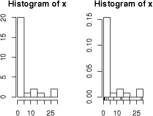
Figure 3: Histograms using frequencies and proportions
Two graphs are shown. The first is the default graph which makes a
histogram of frequencies (total counts). The second does a histogram
of proportions which makes the total area add to 1. This is preferred
as it relates better to the concept of a probability density. Note
the only difference is the scale on the y axis.
A nice addition to the histogram is to plot the points using the
rug command. It was used above in the second graph to give the
tick marks just above the x-axis. If your data is discrete and has ties,
then the rug(jitter(x)) command will give a little jitter to
the x values to eliminate ties.
Notice these commands opened up a graph window. The graph window in
R has few options available using the mouse, but many using command
line options. The GGobi package
has more but requires an extra software
installation.
The basic histogram has a predefined set of break points for the
bins. If you want, you can specify the number of breaks or your own
break points (figure 4).
> hist(x,breaks=10)             # 10 breaks, or just hist(x,10)
> hist(x,breaks=c(0,1,2,3,4,5,10,20,max(x))) # specify break points
Figure 4: Histograms with breakpoints specified
From the histogram, you can easily make guesses as to the values of
the mean, the median, and the IQR. To do so, you need
to know that the median divides the histogram into two
equal area pieces, the mean would be the point where the histogram
would balance if you tried to, and the IQR captures exactly the middle
half of the data.
3.11 Boxplots
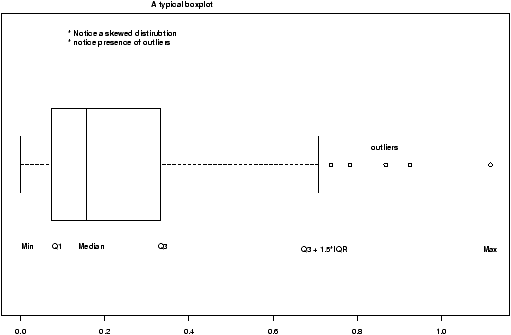
Figure 5: A typical boxplot
The boxplot (eg. figure 5) is used to summarize data
succinctly, quickly displaying if the data is symmetric or has
suspected outliers. It is based on the 5-number summary. In its
simplest usage, the boxplot has a box with lines at the lower hinge
(basically Q1), the Median, the upper hinge (basically Q3) and
whiskers which extend to the min and max. To showcase possible
outliers, a convention is adopted to shorten the whiskers to a length
of 1.5 times the box length. Any points beyond that are plotted with
points. These may further be marked differently if the data is more
than 3 box lengths away. Thus the boxplots allows us to check
quickly for symmetry (the shape looks unbalanced) and outliers (lots
of data points beyond the whiskers). In figure 5 we see a
skewed distribution with a long tail.
Example: Movie sales, reading in a dataset
In this example, we look at data on movie revenues for the 25
biggest movies of a given week. Along the way, we also introduce
how to ``read-in'' a built-in data set. The data set here is from
the data sets accompanying these notes.
5
> library("Simple")             # read in library for these notes
> data(movies)                  # read in data set for gross.
> names(movies)
[1] "title"    "current"  "previous" "gross"
> attach(movies)                # to access the names above
> boxplot(current,main="current receipts",horizontal=TRUE)
> boxplot(gross,main="gross receipts",horizontal=TRUE)
> detach(movies)                # tidy up
We plot both the current sales and the gross sales in a boxplot (figure
6).
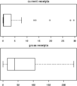
Figure 6: Current and gross movie sales
Notice, both distributions are skewed, but the gross sales are less so.
This shows why Hollywood is so interested in the ``big hit'', as a
real big hit can generate a lot more revenue than quite a few
medium sized hits.
R Basics: Reading in datasets with library and data
In the above example we read in a built-in dataset. Doing so is
easy. Let's see how to read in a dataset from the package
ts (time series functions). First we need to load the
package, and then ask to load the data. Here is how
> library("ts")                 # load the library
> data("lynx")                  # load the data
> summary(lynx)                 # Just what is lynx?
   Min. 1st Qu.  Median    Mean 3rd Qu.    Max.
   39.0   348.3   771.0  1538.0  2567.0  6991.0
The
library and
data command can be used in
several different ways
-
To list all available packages
- Use the command library().
- To list all available datasets
- Use the command
data() without any arguments
- To list all data sets in a given package
- Use
data(package='package name') for example
data(package=ts).
- To read in a dataset
- Use data('dataset name'). As
in the example data(lynx). You first need to load the
package to access its datasets as in the command library(ts).
- To find out information about a dataset
-
You can use the help command to see if
there is documentation on the data set. For example
help("lynx") or equivalently ?lynx.
Example: Seeing both the histogram and boxplot
The function
simple.hist.and.boxplot will
plot both a histogram and a boxplot to show the relationship
between the two graphs for the same dataset.
The figure shows some
examples on some randomly generated data. The data would be
described as bell shaped (normal), short tailed, skewed and long
tailed (figure
7).
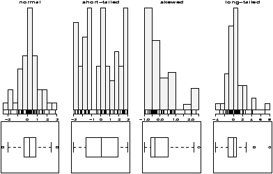
Figure 7: Random distributions with both a histogram and the boxplot
3.12 Frequency Polygons
Some times you will see the histogram information presented in a different way.
Rather than draw a rectangle for each bin, put a point at the top of
the rectangle and then connect these points with straight lines. This is
called the frequency polygon. To generate it, we need to know the
bins, and the heights. Here is a way to do so with R getting the
necessary values from the hist command. Suppose
the data is batting averages for the New York Yankees
6
> x = c(.314,.289,.282,.279,.275,.267,.266,.265,.256,.250,.249,.211,.161)
> tmp = hist(x)                  # store the results
> lines(c(min(tmp$breaks),tmp$mids,max(tmp$breaks)),c(0,tmp$counts,0),type="l")
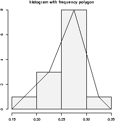
Figure 8: Histogram with frequency polygon
Ughh, this is just too much to type, so there is a function to do this
for us
simple.freqpoly.R. Notice though that the basic
information was available to us with the values labeled
breaks and counts.
3.13 Densities
The point of doing the frequency polygon is to tie the histogram in
with the probability density of the parent population. More
sophisticated densities functions are available, and are much less
work to use if you are just using a built-in function.The built-in
data set faithful (help faithful) tracks the time
between eruptions of the old-faithful geyser.
The R command density can be used to give more
sophisticated attempts to view the data with a curve (as the
frequency polygon does). The density() function has means
to do automatic selection of bandwidth. See the help page for the
full description. If we use the default choice it is easy to add a
density plot to a histogram. We just call the lines function
with the result from density (or plot if it is the first
graph). For example
    > data(faithful)
    > attach(faithful)              # make eruptions visible
    > hist(eruptions,15,prob=T)     # proportions, not frequencies
    > lines(density(eruptions))     # lines makes a curve, default bandwidth
    > lines(density(eruptions,bw="SJ"),col='red') # Use SJ bandwidth, in red
The basic idea is for each point to take some kind of
average for the points nearby and based on this give an estimate for
the density. The details of the averaging can be quite complicated,
but the main control for them is something called the bandwidth which
you can control if desired. For the last graph the ``SJ'' bandwidth
was selected. You can also set this to be a fixed number if
desired. In
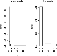
figure 9 are 3 examples
with the bandwidth chosen to be 0.01, 1 and then 0.1. Notice, if the
bandwidth is too small, the result is too jagged, too big and the
result is too smooth.
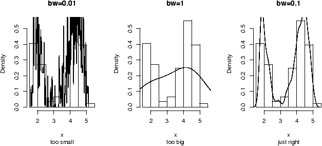
Figure 9: Histogram and density estimates. Notice choice of bandwidth
is very important.
3.14 Problems
-
3.1
- Enter in the data
60 85 72 59 37 75 93 7 98 63 41 90 5 17 97
Make a stem and leaf plot.
- 3.2
- Read this stem and leaf plot, enter in the data and make a
histogram:
  The decimal point is 1 digit(s) to the right of the |

   8 | 028
   9 | 115578
  10 | 1669
  11 | 01
- 3.3
- One can generate random data with the ``r''-commands. For
example
> x = rnorm(100)
produces 100 random numbers with a normal distribution. Create two
different histograms for two different times of defining x as
above. Do you get the same histogram?
- 3.4
- Make a histogram and boxplot of these data sets from these Simple
data sets: south, crime and aid. Which
of these data sets is skewed? Which has outliers, which is
symmetric.
- 3.5
- For the Simple data sets bumpers,
firstchi, math make a histogram. Try to
predict the mean, median and standard deviation. Check your guesses
with the appropriate R commands.
- 3.6
- The number of O-ring failures for the first 23 flights of the US
space shuttle Challenger were
0 1 0 NA 0 0 0 0 0 1 1 1 0 0 3 0 0 0 0 0 2 0 1
(NA means not available -- the equipment was lost). Make a table of
the possible categories.
Try to find the mean. (You might need to try
mean(x,na.rm=TRUE) to avoid the value NA, or look at x[!is.na(x)].)
- 3.7
- The Simple dataset
pi2000
contains the first 2000 digits of
p. Make a histogram. Is it surprising? Next, find the proportion
of 1's, 2's and 3's. Can you do it for all 10 digits 0-9?
- 3.8
- Fit a density estimate to the Simple dataset
pi2000
.
- 3.9
- Find a graphic in the newspaper or from the web. Try to use
R to produce a similar figure.
4 Bivariate Data
The relationship between 2 variables is often of interest. For
example, are height and weight related? Are age and heart rate
related? Are income and taxes paid related? Is a new drug better than
an old drug? Does a batter hit
better as a switch hitter or not? Does the weather depend on the
previous days weather? Exploring and summarizing such
relationships is the current goal.
4.1 Handling bivariate categorical data
The table command will summarize bivariate data in a similar manner
as it summarized univariate data.
Suppose a student survey is done to evaluate if students who smoke
study less. The data recorded is
| Person |
Smokes |
amount of Studying |
| 1 |
Y |
less than 5 hours |
| 2 |
N |
5 - 10 hours |
| 3 |
N |
5 - 10 hours |
| 4 |
Y |
more than 10 hours |
| 5 |
N |
more than 10 hours |
| 6 |
Y |
less than 5 hours |
| 7 |
Y |
5 - 10 hours |
| 8 |
Y |
less than 5 hours |
| 9 |
N |
more than 5 hours |
| 10 |
Y |
5 - 10 hours |
We can handle this in R by creating two vectors to hold
our data, and then using the table command.
> smokes = c("Y","N","N","Y","N","Y","Y","Y","N","Y")
> amount = c(1,2,2,3,3,1,2,1,3,2)
> table(smokes,amount)
      amount
smokes 1 2 3
     N 0 2 2
     Y 3 2 1
We see that there may be some relationship7
What would be nice to have are the marginal totals and the
proportions. For example, what proportion of smokers study 5 hours or
less. We know that this is 3 /(3+2+1) = 1/2, but how can we do this
in R?
The command prop.table will compute this for us. It needs to
be told the table to work on, and a number to indicate if you want
the row proportions (a 1) or the column proportions (a 2) the default
is to just find proportions.
> tmp=table(smokes,amount)      # store the table
> old.digits = options("digits") # store the number of digits
> options(digits=3)             # only print 3 decimal places
> prop.table(tmp,1)             # the rows sum to 1 now
      amount
smokes   1     2     3
     N 0.0 0.500 0.500
     Y 0.5 0.333 0.167
> prop.table(tmp,2)             # the columns sum to 1 now
      amount
smokes 1   2     3
     N 0 0.5 0.667
     Y 1 0.5 0.333
> prop.table(tmp)
      amount                    # all the numbers sum to 1
smokes   1   2   3
     N 0.0 0.2 0.2
     Y 0.3 0.2 0.1
> options(digits=old.digits)    # restore the number of digits
4.2 Plotting tabular data
You might wish to graphically represent the data summarized in a
table. For the smoking example, you could plot the amount variable
for each of No or Yes, or the No and Yes variable for each level of
smoking. In either case, you can use a barplot. We simply
call it in the appropriate manner.
> barplot(table(smokes,amount))
> barplot(table(amount,smokes))
> smokes=factor(smokes)        # for names
> barplot(table(smokes,amount),
+ beside=TRUE,                  # put beside not stacked
+ legend.text=T)   # add legend
>
> barplot(table(amount,smokes),main="table(amount,smokes)",
+ beside=TRUE,
+ legend.text=c("less than 5","5-10","more than 10"))
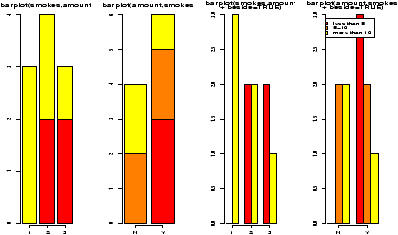
Figure 10: 4 barplots of same data
Notice in figure 10 the
importance of order when making the table. Essentially, barplot
plots each row of data. It can do it in a stacked manner (the
default), or besides (by setting beside=TRUE). The attribute
legend.text adds the legend to the graph. You can change the
names, but the default of legend.text=T is easiest if you
have a factor labeling the rows of the table command.
Some Extra Insight: Conditional proportions
You may also want to know about the conditional proportions. For
example, among the smokers what are the proportions. To answer
this, we need to divide the second row by 6. One or two rows is
easy to do by hand, but how do we automate the work? The function
apply will apply a function to rows or columns of a
matrix. In this case, we need a function to find the proportions of
a vector. This is as easy as
> prop = function(x) x/sum(x)
To apply this function to the matrix x is easy. First the columns
(index 2) are done by
> apply(x,2,prop)
   amount
    1   2         3
  N 0 0.5 0.6666667
  Y 1 0.5 0.3333333
Index 1 is for the rows, however, we need to
use the transpose function,
t() to make the result look right.
> t(apply(x,1,prop))

smokes   1         2         3
     N 0.0 0.5000000 0.5000000
     Y 0.5 0.3333333 0.1666667
4.3 Handling bivariate data: categorical vs. numerical
Suppose you have numerical data for several categories. A simple
example might be in a drug test, where you have data (in suitable
units) for an experimental group and for a control group.
experimental:  5 5  5 13 7 11 11 9 8  9
control:      11 8  4  5 9  5 10 5 4 10
You can summarize the data separately and compare, but how can you
view the data together? A side by side boxplot is a good place to
start. To generate one is simple:
> x = c(5, 5, 5, 13, 7, 11, 11, 9, 8, 9)
> y = c(11, 8, 4, 5, 9, 5, 10, 5, 4, 10)
> boxplot(x,y)
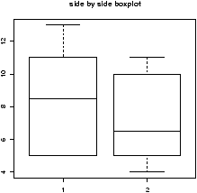
Figure 11: Side-by-side boxplots
From this comparison
(figure 11), we see that
the y variable (the control group, labeled 2 on the graph) seems to be
less than that of the x variable (the experimental group).
Of course, you may also receive this data in terms of the numbers and a
variable indicating the category as follows
amount:   5 5 5 13 7 11 11 9 8 9 11 8 4 5 9 5 10 5 4 10
category: 1 1 1  1 1  1  1 1 1 1  2 2 2 2 2 2  2 2 2  2
To make a side by side boxplot is still easy, but only if you use the
model syntax as follows
> amount = scan()
1: 5 5 5 13 7 11 11 9 8 9 11 8 4 5 9 5 10 5 4 10
21:
Read 20 items
>category = scan()
1: 1 1 1  1 1  1  1 1 1 1  2 2 2 2 2 2  2 2 2  2
21:
Read 20 items
> boxplot(amount ~ category)    # note the tilde ~
Read the part amount ~ category as breaking up the values
in amount, by the categories in category and displaying each
one. Verbally, you might read this as ``amount by category''. More on
this syntax will appear in the section on multivariate data.
4.4 Bivariate data: numerical vs. numerical
Comparing two numerical variables can be done in different ways. If
the two variables are thought to be independent samples you might
like to compare their distributions in some manner. However, if you
expect a relationship between the variables, you might like to look
for that by plotting pairs of points.
4.5 Comparing two distributions with plots
If we wish to compare two distributions, we can do so with
side-by-side boxplots, However, we may wish to compare histograms
or some other graphs to see more of the data. Here are several
different ways to do so.
-
Side by side boxplots with rug
- By using the rug
command we can see all the data. It works best with smallish data
sets (otherwise use the jitter command to break ties).
> library("Simple");data(home)  # read in dataset home
> attach(home)
> names(home)
[1] "old" "new"
> boxplot(scale(old),scale(new)) #make boxplot after scaling each
> detach(home)
This example, introduced the scale function. This puts the
two data sets on the same scale so they can sensibly be
compared.
If you make this boxplot, you will see that the two distributions
look quite a bit different. The full dataset homedata will
show this even more.
- Using stripcharts or dotplots
- The stripchart (a dotplot)
will plot all the data in a way that makes it relatively easy to
compare the distributions. For the data frame hd this is
done with
> stripchart(scale(old),scale(new))
- Comparing shapes of distributions
- Using the density
function allows us to compare a distributions shape on the same
graph. This is hard to do with histograms. The function
simple.violinplot compares densities by creating violin
plots. These are similar to boxplots, only instead of a box, the
density is drawn with it's mirror image.
Try this command to see what the graphs look like
> simple.violinplot(scale(old),scale(new))
4.6 Using scatterplots to compare relationships
Often we wish to investigate one numerical variable against
another. For example the height of a father compared to their sons
height. The plot command will gladly display two variables
in a scatterplot.
Example: Home data
The home data example of the previous section shows old assessed
value (1970) versus new assessed value (2000). There should be
some relationship. Let's investigate with a scatterplot
(figure
12).
> data(home);attach(home)
> plot(old,new)
> detach(home)
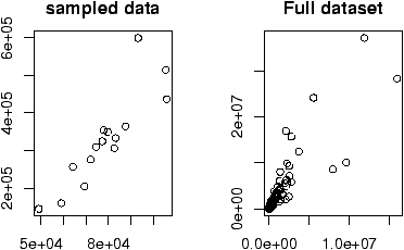
Figure 12: Scatterplot of home data with a sample and full dataset
The second graph is drawn from the entire data set. This should be
available as a data set through the command
data(). Here we
plot it using
attach:
> data(homedata)
> attach(homedata)
> plot(old,new)
> detach(homedata)
The graphs seem to illustrate a strong linear trend, which we will
investigate later.
R Basics: What does attaching do?
You may have noticed that when we attached
home and
homedata we have the same variable names: old and new.
What exactly does attaching do? When you ask
R to use a value
of a variable or a function it needs to find it.
R searches
through several ``enviroments'' for these variables. By attaching
a data frame, you put the names into the second environment
searched (the name of the dataframe is in the first). These are
masked by any variables which already have the same name. There
are consequences to this to be aware of. First, you might be
confused about which variable you are using. And most importantly,
you can't change the values of the variables in the data frame
without referencing the data frame. For example, we create a data
frame
df below with variables
x and
y.
> x = 1:2;y = c(2,4);df = data.frame(x=x,y=y)
> ls()                          # list all the varibles known
[1] "df" "x"  "y"
> rm(y)                         # delete the y variable
> attach(df)                    # attach the data frame
> ls()
[1] "df" "x"                    # y is visible, but doesn't show up
> ls(pos=2)                     # y is in position 2 from being attached
[1] "x" "y"
> y                             # y is visible because df is attached
[1] 2 4
> x                             # which x did we find, x or df[['x']]
[1] 1 2
> x=c(1,3)                      # assign to x
> df                            # not the x in df
  x y
1 1 2
2 2 4
> detach(df)
> x                             # assigned to real x variable
[1] 1 3
> y
Error: Object "y" not found
It is important to remember to
detach the dataset
between uses of these variables, or you may forget which variable
you are referring to.
We see in these examples relationships between the data. Both were
linear relationships. The modeling of such relationships is a common
statistical practice. It allows us to make predictions of the y
variable based on the value of the x variable.
4.7 Linear regression.
Linear regression is the name of a procedure that fits a straight line to
the data. The idea is that the x value is something the
experimenter controls, the y value one the experimenter measures.
The line is used to predict the value of y for a known value of
x. The variable x is the predictor variable and y the
response variable.
Suppose we write the equation of the line as
Then, for each xi the predicted value would be
But the measured value is yi, the difference is called the residual
and is simply
The method of least squares is used to choose the values of b0 and
b1 that minimize the sum or the squares of the residual errors.
Mathematically this is
Solving, gives
That is, a line with slope given by b1 going through the point
(x--,y--).
R plots these in 3 steps: plot the points, find the values of
b0, b1, add a line to the graph:
> data(home);attach(home)
> x = old                       # use generic variable names
> y = new                       # for illustration only.
> plot(x,y)
> abline(lm(y ~ x))
> detach(home)
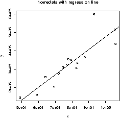
Figure 13: Home data with regression line
The abline command is a little tricky (and hard to remember). The
abline function prints lines on the current graph window and
is generally a useful function. The line it prints is coming from the
lm functions. This is the function for a linear model. The
funny syntax y ~ x tells R to model the y variable as a
linear function of x. This is the model formula syntax of R which
can be tricky, but is fairly straightforward in this situation.
As an alternative to the above, the function simple.lm,
provided with these notes, will make this same plot and return the
regression coefficients
> data(home);attach(home)
> x = old; y = new
> simple.lm(x,y)

Call:
lm(formula = y ~ x)

Coefficients:
(Intercept)            x
 -2.121e+05    6.879e+00
> detach(home)
You can also access the coefficients directly with the function
coef. The above ones would be found with
> lm.res = simple.lm(x,y)      # store the answers in lm.res
> coef(lm.res)
Coefficients:
(Intercept)            x
 -2.121e+05    6.879e+00
> coef(lm.res)[1]               # first one, use [2] for second
(Intercept)
 -2.121e+05
4.8 Residual plots
Another worthwhile plot is of the residuals. This can also be done
with the simple.lm, but you need to ask. Continuing the
above example
simple.lm(x,y,show.residuals=TRUE)
Which produces the plot shown in figure 14.
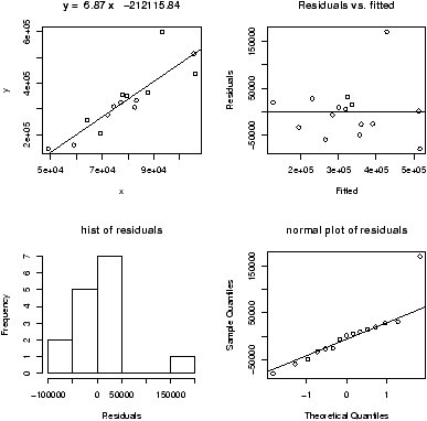
Figure 14: Plot of residuals for regression model
There are 3 new plots. The normal plot will be explained later. The
upper right one is a plot of residuals versus the fitted values
(y^'s). If
the standard statistical model is to apply, then the residuals should
be scattered about the line y=0 with ``normally'' distributed
values. The lower left is a histogram of the residuals. If the
standard model is applicable, then this should appear ``bell'' shaped.
For this data, we see a possible outlier that deserves attention. This
data set has a few typos in it.
To access residuals directly, you can use the command resid on
your lm result. This will make a plot of the residuals
> lm.res = simple.lm(x,y)
> the.residuals = resid(lm.res) # how to get residuals
> plot(the.residuals)
4.9 Correlation coefficients
A valuable numeric summary of the strength of the linear
relationship is the Pearson correlation coefficient, R, defined by
|
R = |
|
|
|
|
æ
ç
ç
è |
å(Xi- |
|
)2 å(Yi- |
|
)2 |
ö
÷
÷
ø |
|
|
|
This is a scaled version of the covariance between X and
Y. This measures how one variable varies as the other does. The
correlation is scaled to be in the range [-1,1].
Values or R2 close to 1 indicate a strong linear relationship,
values close to 0 a weak one. (There still may be a relationship,
just not a linear one.) In R the correlation coefficient is found with
the cor function
> cor(x,y)                      # to find R
[1] 0.881
> cor(x,y)^2                    # to find R^2
[1] 0.776
This is also found
by R when it does linear regression, but it doesn't print it by
default. We just need to ask though using
summary(lm(y ~ x)).
The Spearman rank correlation is the same thing
only applied to the ranks of the data. The rank of a data set is
simply another vector giving the relative rank in terms of size. An
example might make it clearer
> rank(c(2,3,5,7,11))           # already in order
[1] 1 2 3 4 5
> rank(c(5,3,2,7,11))           # for example, 5 is 3rd largest
[1] 3 2 1 4 5
> rank(c(5,5,2,7,5))            # ties have ranks averaged (2+3+4)/3=3
[1] 3 3 1 5 3
To find the Spearman rank correlation, we simply apply cor()
to the ranked data
> cor(rank(x),rank(y))
[1] 0.925
This number is close to 1 (or -1) if there is a strong increasing
(decreasing) trend in the data. (The trend need not be linear.)
As a reminder, you can make a function to do this calculation for
you. For example,
> cor.sp <- function(x,y) cor(rank(x),rank(y))
Then you can use this as
> cor.sp(x,y)
[1] 0.925
4.10 Locating points
R currently has a few methods to interact with a graph. Some
important ones allow us to identify and locate points on the graph.
Example: Presidential Elections: Florida
Consider this data set from the 2000 United States presidential
election in the state of Florida.
8 It records the number of
votes each candidate received by county. We wish to investigate
the relationship between the number of votes for Bush against the
number of votes for Buchanan.
> data("florida")              # or read.table on florida.txt
> names(florida)
 [1] "County"     "V2"         "GORE"       "BUSH"       "BUCHANAN"
 [6] "NADER"      "BROWNE"     "HAGELIN"    "HARRIS"     "MCREYNOLDS"
[11] "MOOREHEAD"  "PHILLIPS"   "Total"
> attach(florida)               # so we can get at the names BUSH, ...
> simple.lm(BUSH,BUCHANAN)
     ...
Coefficients:
(Intercept)            x
   45.28986      0.00492
> detach(florida)               # clean up
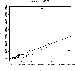
Figure 15: Scatterplot of Buchanan votes based on Bush votes
We see a strong linear relationship, except for two "outliers". How
can we
identify these points?
One way is to search through the data to find these values. This works
fine for smaller data sets, for larger ones,
R provides a few
useful functions:
identify to find index of the closest (
x,
y)
coordinates to the mouse click and
locator to find the (
x,
y)
coordinates of the mouse click.
To identify the outliers, we need their indices which are provided by
identify:
> identify(BUSH,BUCHANAN,n=2)   # n=2 gives two points
[1] 13 50
Click on the two outliers and find the corresponding indices are
13 and 50. The values would be found by taking the 13th or 50th value
of the vectors:
> BUSH[50]
[1] 152846
> BUCHANAN[50]
[1] 3407
> florida[50,]
   County V2   GORE   BUSH BUCHANAN NADER BROWNE HAGELIN HARRIS MCREYNOLDS
50     50 39 268945 152846     3407  5564    743     143     45        302
   MOOREHEAD PHILLIPS  Total
50       103      188 432286
The latter shows the syntax to slice out the entire row for county
50.
County 50 is not surprisingly Miami-Dade county, the home of the
infamous (well maybe) butterfly ballot that caused great confusion
among the voters. The location of Buchanan on the ballot was in
some sense where Gore's position should have been. How many votes
did this give Buchanan that should have been Gore's? One way to
answer this is to find the regression line for the data without this
data point and then to use the number of Bush votes to predict the
number of Buchanan votes.
To eliminate one point from a data vector can be done with fancy
indexing, by using a minus sign (
BUSH[50] is the 50th
element,
BUSH[-50] is all
but the 50th element).
>  simple.lm(BUSH[-50],BUCHANAN[-50])
     ...
Coefficients:
(Intercept)            x
   65.57350      0.00348
Notice the fit is much better. Also notice that the new regression
line is
y^ = 65.57350 + 0.00348
x instead of
y^=45.28986+ 0.00492
x. How much difference does this make? Well the regression line
predicts the value for a given
x. If Bush received 152,846 votes
(
BUSH[50]) then we expect Buchanan to have received
> 65.57350 + 0.00348 * BUSH[50]
[1] 597
and not 3407 (
BUCHANAN[50]) as actually received. (This
difference is much larger than the statewide difference that gave the
2000 U.S. presidential election to Bush over Gore.)
Some Extra Insight: Using simple.lm to predict
We could do this prediction with the
simple.lm function
which calls the
R function
predict appropriately. Here is
how
> simple.lm(BUSH[-50],BUCHANAN[-50],pred=BUSH[50])
[1] 597.7677
   ...
4.11 Resistant regression
This example also illustrates another important point. That is, like
the mean and standard deviation the
regression line is very sensitive to outliers. Let's see what the
regression line looks like for the data with and without the points.
Since we already have the equation for the line without the point,
the simplest way to do so is to first draw the line for all the
data, and then add in the line without Miami-Dade. This is done with
the abline function.
> simple.lm(BUSH,BUCHANAN)
> abline(65.57350,0.00348)      # numbers from above
Figure 16 shows how sensitive the regression line is.
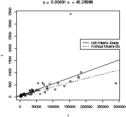
Figure 16: Regression lines for data with and without Miami-Dade
outlier
4.12 Using rlm or lqs for resistant
regression
Resistance in statistics means the procedure is resistant to some
percentage of arbitrarily large outliers, robustness means the
procedure is not greatly affected by slight deviations in the
assumptions. There are various ways to create a resistant regression
line. In R there are two in the package MASS that are
used in a manner similar to the lm function (but not the
simple.lm function). The function
lqs works with a simple principle (by default). Rather than
minimize the sum of the squared residuals for all residuals, it does
so for just a percentage of them. The rlm function uses
something known as an M-estimator. Both give similar results, but
not identical. In what follows, we will use rlm, but we
could have used lqs provided we load the library first (library('lqs')).
Let's apply rlm to the Florida election data. We will plot both the
regular regression line and the resistant regression line (fig 17).
> library(MASS)                 # read in the external library
> attach(florida)
> plot(BUSH,BUCHANAN)           # a scatter plot
> abline(lm(BUCHANAN ~ BUSH),lty="1") # lty sets line type
> abline(rlm(BUCHANAN ~ BUSH),lty="2")
> legend(locator(1),legend=c('lm','rlm'),lty=1:2) # add legend
> detach(florida)               # tidy up
Notice a few things. First, we used the model formula notation
lm(y ~ x) as this is how rlm expects
the function to be called. We also illustrate how to change the line
type (lty) and how to include a legend with legend.
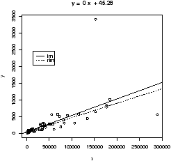
Figure 17: Voting data with resistant regression line
As well, you may plot the resistant regression line for the data, with
and without the outliers as below, you will find as expected that
the lines are the same.
> plot(BUSH,BUCHANAN)
> abline(rlm(BUCHANAN ~ BUSH),lty='1')
> abline(rlm(BUCHANAN[-50] ~ BUSH[-50]),lty='2')
This graph will show that removing one point makes no difference to
the resistant regression line (as expected).
R Basics: Plotting graphs using R
In this section, we used the
plot command to make a
scatterplot and the
abline command to add a line to
it. There are other ways to manipulate plots using
R that are useful to
know.
It helps to know that
R has different functions to create an
initial graph and to add to an existing graph.
-
Creating new plots with plot and curve.
- The
plot function will plot points as already illustrated. In
addition, it can be told to plot the points and connect them with
straight lines. These commands will plot a parabola. Notice how we
need to first create the values on the x axis to plot
> x=seq(0,4,by=.1)              # create the x values
> plot(x,x^2,type="l")          # type="l" to make line
The convenient curve function will plot functions (of x) in an
easier manner. The above plotted the function y=x2 over the
interval [0,4]. This is done with curve all at once with
> curve(x^2,0,4)
Notice as illustrated, both plot and curve create
new graph windows.
- Adding to a graph with points, abline,
lines and curve.
- We can add to the exiting graph
window the several different functions. To add points we use the
points command which is similar to the plot
command. We've seen that to add a straight line, the
abline function is available. The lines function
is used to add more general lines. It plots the points specified
and connects them with straight lines. Similar to adding
type=''l'' in the plot function.
Finally, curve will add to a graph if the additional
argument add=TRUE is given.
To illustrate, if we have the dataset
| mileage |
0 |
4 |
8 |
12 |
16 |
20 |
24 |
28 |
32 |
| tread wear |
394 |
329 |
291 |
255 |
229 |
204 |
179 |
163 |
150 |
Then the regression line has intercept 360 and slope -7.3. Here
are three ways to plot the data and the regression line:
> miles = (0:8)*4               # 0 4 8 ... 32
> tread = scan()
1: 394 329 291 255 229 204 179 163 150
10:
Read 9 items
> plot(miles,tread)             # make the scatterplot
 abline(lm(tread ~ miles))
## or as we know the intercept and slope
> abline(360,-7.3)
## or using points
> points(miles,360 - 7.3*miles,type="l")
## or using lines
> lines(miles,360 - 7.3*miles)
## or using curve
> curve(360 - 7.3*x,add=T)      # add a function of x
4.13 Problems
-
4.1
- A student evaluation of a teacher is on a 1-5 Leichert scale. Suppose the
answers to the first 3 questions are given in this table
| Student |
Ques. 1 |
Ques. 2 |
Ques. 3 |
| 1 |
3 |
5 |
1 |
| 2 |
3 |
2 |
3 |
| 3 |
3 |
5 |
1 |
| 4 |
4 |
5 |
1 |
| 5 |
3 |
2 |
1 |
| 6 |
4 |
2 |
3 |
| 7 |
3 |
5 |
1 |
| 8 |
4 |
5 |
1 |
| 9 |
3 |
4 |
1 |
| 10 |
4 |
2 |
1 |
Enter in the data for question 1 and 2 using c(),
scan(), read.table or data.entry()
-
Make a table of the results of question 1 and question 2 separately.
- Make a contingency table of questions 1 and 2.
- Make a stacked barplot of questions 2 and 3.
- Make a side-by-side barplot of all 3 questions.
- 4.2
- In the library MASS is a dataset
UScereal which contains information about popular breakfast
cereals. Attach the data set as follows
> library('MASS')
> data('UScereal')
> attach(UScereal)
> names(UScereal)               # to see the names
Now, investigate the following relationships, and make comments on
what you see. You can use tables, barplots, scatterplots etc. to do
you investigation.
-
The relationship between manufacturer and shelf
- The relationship between fat and vitamins
- the relationship between fat and shelf
- the relationship between carbohydrates and sugars
- the relationship between fibre and manufacturer
- the relationship between sodium and sugars
Are there other relationships you can predict and investigate?
- 4.3
- The built-in data set mammals contains data on body
weight versus brain weight. Use the cor to find the Pearson
and Spearman correlation coefficients. Are they similar? Plot the
data using the plot command and see if you expect them to be
similar.
You should be unsatisfied with this plot. Next, plot the logarithm
(log) of each variable and see if that makes a difference.
- 4.4
- For the data set on housing prices,
homedata
,
investigate the relationship between old
assessed value and new. Use old as the predictor variable. Does the
data suggest a linear relationship?Are there any outliers? What may
have caused these outliers? What is the predicted new assessed value
for a $75,000 house in 1970.
- 4.5
- For the
florida
dataset of Bush vs. Buchanan, there
is another obvious outlier that indicated Buchanan received fewer
votes than expected. If you remove both the outliers, what is the
predicted value for the number of votes Buchanan would get in
Miami-Dade county based on the number of Bush votes?
- 4.6
- For the data set
emissions
plot the per-Capita GDP
(gross domestic product) as a predictor for the response variable
CO2 emissions. Identify the outlier and find the regression lines
with this point, and without this point.
- 4.7
- Attach the data set
babies
:
> library("Simple")
> data("babies")
> attach(babies)
This data set contains much information about babies and their
mothers for 1236 observations. Find the correlation coefficient (both
Pearson and Spearman)
between age and weight. Repeat for the relationship between height and
weight. Make scatter plots of each pair and see if your answer makes
sense.
- 4.8
- Find a dataset that is a candidate for linear regression (you
need two numeric variables, one a predictor and one a response.)
Make a scatterplot with regression line using R.
- 4.9
- The built-in data set mtcars contains information
about cars from a 1974 Motor Trend issue. Load the data set
(data(mtcars)) and try to answer the following:
-
What are the variable names? (Try names.)
- what is the maximum mpg
- Which car has this?
- What are the first 5 cars listed?
- What horsepower (hp) does the ``Valiant'' have?
- What are all the values for the Mercedes 450slc (Merc
450SLC)?
- Make a scatterplot of cylinders (cyl) vs. miles per
gallon (mpg). Fit a regression line. Is this a good
candidate for linear regression?
- 4.10
- Find a graphic of bivariate data from the newspaper or other
media source. Use R to generate a similar figure.
5 Multivariate Data
Getting comfortable with viewing and manipulating multivariate data
forces you to be organized about your data. R uses data frames to
help organize big data sets and you should learn how to as well.
5.1 Storing multivariate data in data frames
Often in statistics, data is presented in a tabular format similar
to a spreadsheet. The columns are for different variables, and each
row is a different measurement or variable for the same person or
thing. For example, the dataset home which accompanies these
notes contains two columns, the 1970 assessed value of a home and
the year 2000 assessed value for the same home.
R uses data frames to store these variables together and
R has many shortcuts for using data stored this way.
If you are using a dataset which is
built-in to R or comes from a spreadsheet or other data source,
then chances are the data is available already as a data frame. To
learn about importing outside data into R look at the
``Entering Data into R'' appendix and the
document R Data Import/Export which accompanies the R
software.
You can make your own data frames of course and may need to.
To make data into a data frame you first need a data set that is
an appropriate candidate: it will fit into a rectangular array. If
so, then the data.frame command will do the work for
you. As an example, suppose 4 people are asked three questions:
their weight, height and gender and the data is entered into R
as separate variables as follows:
> weight = c(150, 135, 210, 140)
> height = c(65, 61, 70, 65)
> gender = c("Fe","Fe","M","Fe")
> study = data.frame(weight,height,gender) # make the data frame
> study
  weight height gender
1    150     65     Fe
2    135     61     Fe
3    210     70      M
4    140     65     Fe
Notice, the columns inherit the variable names. Different names
are possible if desired. Try
> study = data.frame(w=weight,h=height,g=gender)
for example to shorten them.
You can give the rows names as well. Suppose the subjects were Mary, Alice,
Bob and Judy, then the row.names command will either list
the row names or set them. Here is how to set them
> row.names(study)<-c("Mary","Alice","Bob","Judy")
The names command will give the column names and you can
also use this to adjust them.
5.2 Accessing data in data frames
The study data frame has three variables. As before, these can be
accessed individually after attaching the data frame to your R
session with the attach command:
> study
  weight height gender
1    150     65     Fe
2    135     61     Fe
3    210     70      M
4    140     65     Fe
> rm(weight)                    # clean out an old copy
> weight
Error: Object "weight" not found
> attach(study)
> weight
[1] 150 135 210 140
However, attaching and detaching the data frame can be a chore if
you want to access the data only once. Besides, if you attach the
data frame, you can't readily make changes to the original data frame.
To access the data it helps to know that data frames can be thought
of as lists or as arrays and accessed accordingly.
-
To access as an array
-
An array is a way of storing data so that it can be accessed with a
row and column. Like a spreadsheet, only technically the entries
must all be of the same type and one can have more than rows and
columns.
Data frames are arrays as they have columns which are the
variables and rows which are for the experimental unit. Thus we
can access the data by specifying a row and a column. To access
an array we use single brackets ([row,column]). In
general there is a row and column we can access. By letting one
be blank, we get the entire row or column. As an example these
will get the weight variable
> study[,'weight']              # all rows, just the weight column
[1] 150 135 210 140
> study[,1]                     # all rows, just the first column
Array access allows us much more flexibility though. We can get
both the weight and height by taking the first and second
columns at once
> study[,1:2]
      weight height
Mary     150     65
Alice    135     61
Bob      210     70
Judy     140     65
Or, we can get all of Mary's info by looking just at her row or
just her weight if desired
> study['Mary',]
     weight height gender
Mary    150     65     Fe
> study['Mary','weight']
[1] 150
- To access as a list
-
A list is a more general storage concept than a data frame. A
list is a set of objects, each of which can be any other
object. A data frame is a list, where the objects are the
columns as vectors.
To access a list, one uses either a dollar sign, $, or double
brackets and a number or name. So for our study variable
we can access the weight (the first column) as a list all of
these ways
> study$weight                  # using $
[1] 150 135 210 140
> study[['weight']]             # using the name.
> study[['w']]                  # unambiguous shortcuts are okay
> study[[1]]                    # by position
These two can be combined as in this example. To get just the
females information. These are the rows where gender is 'Fe' so we
can do this
> study[study$gender == 'Fe', ]  # use $ to access gender via a list
      weight height gender
Mary     150     65     Fe
Alice    135     61     Fe
Judy     140     65     Fe
5.3 Manipulating data frames: stack and unstack
In some instances, there are two different ways to store data. The
data set PlantGrowth looks like
> data(PlantGrowth)
> PlantGrowth
   weight group
1    4.17  ctrl
2    5.58  ctrl
3    5.18  ctrl
4    6.11  ctrl
...
There are 3 groups a control and two treatments. For each group,
weights are recorded. The data is generated this way, by recording a
weight and group for each plant. However, you may want to plot
boxplots for the data broken down by their group. How to do this?
A brute force way is do as follows for each value of group
> attach(PlantGrowth)
> weight.ctrl = weight[group == "ctrl"]
This quickly grows tiresome. The unstack function will do this
all at once for us. If the data is structured correctly, it will
create a data frame with variables corresponding to the levels of the
factor.
> unstack(PlantGrowth)
   ctrl trt1 trt2
1  4.17 4.81 6.31
2  5.58 4.17 5.12
3  5.18 4.41 5.54
4  6.11 3.59 5.50
...
Thus, to do a boxplot of the three groups, one could use this command
> boxplot(unstack(PlantGrowth))
5.4 Using R's model formula notation
The model formula notation that R uses allows this to be done in a systematic
manner. It is a bit confusing to learn, but this flexible notation is used by
most of R's more advanced functions.
To illustrate, the above could be done by (if the data frame
PlantGrowth is attached)
> boxplot(weight ~ group)
What does this do? It breaks the weight variable down by values of
the group factor and hands this off to the boxplot command. One
should read the line weight ~ group as ``model weight
by the variable group''. That is, break weight down by
the values of group.
When there are two variables involved things are pretty
straightforward. The response variable is on the left hand side and
the predictor on the right:
response ~ predictor (when two variables).
When there are more than two predictor variables things get a little
confusing. In particular, the usual mathematical operators do not do
what you may think. Here are a few different possibilities that will
suffice for these notes.9
Suppose the variables are generically named Y, X1, X2
| formula |
meaning |
| Y ~ X1 |
Y is modeled by X1 |
| Y ~ X1 + X2 |
Y is modeled by X1 and
X2 as in multiple regression |
| Y ~ X1 * X2 |
Y is modeled by X1,
X2 and X1*X2 |
| (Y ~ (X1 + X2)^2) |
Two-way interactions. Note usual powers |
| Y ~ X1+ I((X2^2) |
Y is modeled by X1 and X22 |
| Y ~ X1 | X2 |
Y is modeled by X1
conditioned on X2 |
The exact interpretation of ``modeled by'' varies depending upon the
usage. For the boxplot command it is different than the
lm command. Also notice that usual mathematical meanings are
available, but need to be included inside the I function.
5.5 Ways to view multivariate data
Now that we can store and access multivariate data, it is time to see
the large number of ways to visualize the datasets.
-
n-way contingency tables
-
Two-way contingency tables were formed with the table
command and higher order ones are no exception. If w,x,y,z
are 4 variables, then the command table(x,y) creates a
two-way table, table(x,y,z) creates two-way tables x
versus y for each value of z. Finally
x,y,z,w will do the same for each combination of values of
z and w. If the variables are stored in a data frame,
say df then the command table(df) will behave as
above with each variable corresponding to a column in the given order.
To illustrate let's look at some relationships in the dataset
Cars93 found in the MASS library.
> library(MASS);data(Cars93);attach(Cars93)
## make some categorical variables using cut
> price = cut(Price,c(0,12,20,max(Price)))
> levels(price)=c("cheap","okay","expensive"))
> mpg = cut(MPG.highway,c(0,20,30,max(MPG.highway)))
> levels(mpg) = c("gas guzzler","okay","miser"))
## now look at the relationships
> table(Type)
Type
Compact   Large Midsize   Small  Sporty     Van
     16      11      22      21      14       9
> table(price,Type)
           Type
price       Compact Large Midsize Small Sporty Van
  cheap           3     0       0    18      1   0
  okay            9     3       8     3      9   8
  expensive       4     8      14     0      4   1
> table(price,Type,mpg)
, , mpg = gas guzzler

           Type
price       Compact Large Midsize Small Sporty Van
  cheap           0     0       0     0      0   0
  okay            0     0       0     0      0   2
  expensive       0     0       0     0      0   0
...
See the commands xtabs and ftable for more
sophisticated usages.
- barplots
- Recall, barplots work on summarized data. First you
need to run your data through the table command or something
similar. The barplot command plots each column as a variable
just like a data frame. The output of table when called with
two variables uses the first variable for the row. As before
barplots are stacked by default: use the argument
beside=TRUE to get side-by-side barplots.
> barplot(table(price,Type),beside=T) # the price by different types
> barplot(table(Type,price),beside=T) # type by different prices
- boxplots
- The boxplot command is easily used for all the
types of data storage. The command boxplot(x,y,z) will
produce the side by side boxplots seen previously. As well, the
simpler usages boxplot(df) and boxplot(y ~ x)
will also work. The latter using the model formula notation.
Example: Boxplot of samples of random data
Here is an example, which will print out 10 boxplots of normal data
with mean 0 and standard deviation 1. This uses the
rnorm
function to produce the random data.
> y=rnorm(1000)                # 1000 random numbers
> f=factor(rep(1:10,100))      # the number 1,2...10 100 times
> boxplot(y ~ f,main="Boxplot of normal random data with model notation")
Note the construction of
f. It looks like 1 through 10
repeated 100 times to make a
factor of the same length of
x. When the model notation is used, the boxplot of the
y data is done for each level
of the factor
f. That is, for each value of
y when
f is 1
and then 2 etc. until 10.
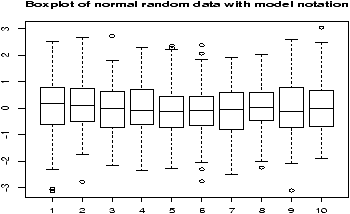
Figure 18: Boxplot made with boxplot(y ~ f)
- stripcharts
- The side-by-side boxplots are useful for displaying
similar distributions for comparison -- especially if there is a lot
of data in each variable. The stripchart can do a similar
thing, and is useful if there isn't too much data. It plots the
actual data in a manner similar to rug which is used with
histograms. Both stripchart(df) and
stripchart(y ~ x) will work, but not
stripchart(x,y,z).
For example, as above, we will generate 10 sets of random normal
numbers. Only this time each will contain only 10 random numbers.
> x = rnorm(100)
> y = factor(rep(1:10,10))
> stripchart(x ~ y)
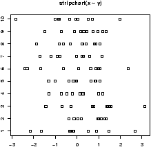
Figure 19: A stripchart
- violinplots and densityplots
- The functions simple.violinplot and simple.densityplot
can be used in place of side-by-side boxplots to compare
different distributions.
Both use the empirical density found by the density function
to illustrate a variables distribution. The density may be thought
of like a histogram, only there is much less ``chart junk'' (extra
lines) so more can effectively be placed on the same graph.
A violinplot is very similar to a boxplot, only the box is replaced
by a density which is given a mirror image for clarity. A
densityplot plots several densities on the same scale. Multiple
histograms would look really awful, but multiple densities are
manageable.
As an illustration, we show for the same dataset all three in
figure 20. The density plot
looks a little crowded, but you can clearly see that there are two
different types of distributions being considered here. Notice,
that we use the functions in an identical manner to the boxplot.
> par(mfrow=c(1,3))             # 3 graphs per page
> data(InsectSprays)            # load in the data
> boxplot(count ~ spray, data = InsectSprays, col = "lightgray")
> simple.violinplot(count ~ spray, data = InsectSprays, col = "lightgray")
> simple.densityplot(count ~ spray, data = InsectSprays)
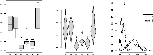
Figure 20: Compare boxplot, violinplot, densityplot for same data
- scatterplots
- Suppose x is a predictor and both
y and z are response variables. If you want to plot
them on the same graph but with a different character you can do
so by setting the pch (plot character) command. Here is a
simple example
> plot(x,y)                     # simple scatterplot
> points(x,z,pch="2")           # plot these with a triangle
Notice, the second command is not plot but rather
points which adds to the current plot unlike plot which
draws a new plot.
Sometimes you have x and y data that is also broken down by a
given factor. You may wish to plot a scatterplot of the x and y
data, but use different plot characters for the different levels of
the factors. This is usually pretty easy to do. We just need to use
the levels of the factor to give the plotting character. These levels are
store internally as numbers, and we use these for the value of pch
Example: Tooth growth
The built-in
R dataset
ToothGrowth has data from a
study that measured tooth growth as a function of amount of Vitamin
C. The source of the Vitamin C came from orange juice or a vitamin
supplement. The scatterplot of dosage vs. length is given
below. Notice the different plotting figures for the 2 levels of
the factor of which type of vitamin C.
> data("ToothGrowth")
> attach(ToothGrowth)
> plot(len ~ dose,pch=as.numeric(supp))
## click mouse to add legend.
> tmp = levels(supp)          # store for a second
> legend(locator(1),legend=tmp,pch=1:length(tmp))
> detach(ToothGrowth)
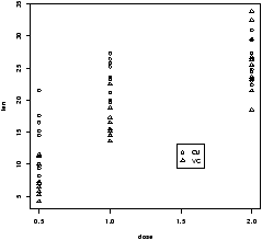
Figure 21: Tooth growth as a function of vitamin C dosage
From the graph it
appears that for all values of dose, the vitamin form (VC) was less
effective.
Sometimes you want a to look at the distribution of x and the
distribution of y and also look at their relationship
with a scatterplot. (Not the case above, as the x distribution is
trivial) This is easier if you can plot multiple graphs
at once. This is implemented in the function
simple.scatterplot (taken from the
layout help page).
Example: GDP vs. CO2 emissions
The question of CO
2 emissions is currently a ``hot'' topic due
to their influence on the greenhouse effect. The dataset
emissions
contains data on the Gross Domestic Product and
CO
2 emissions for several European countries and the United
States for the year 1999. A scatterplot of the data
is
interesting:
> data(emissions)               # or read in from dataset
> attach(emissions)
> simple.scatterplot(perCapita,CO2)
> title("GDP/capita vs. CO2 emissions 1999")
> detach(emissions)
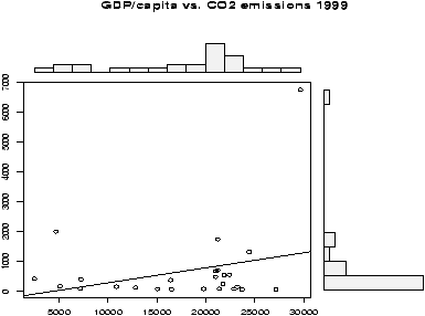
Figure 22: Per capita GDP vs. CO2 emissions
Notice, with the additional information of this scatter plot, we can
see that the distribution of GDP/capita is fairly spread out unlike
the distribution of the CO
2 emissions which has the lone outlier.
- paired scatterplots
- If the 3 variables hold numeric values,
then scatterplots are appropriate. The pairs command will
produce scatterplots for each possible pair. It can be used as
follows pairs(cbind(x,y,z)), pairs(df) or if in the
factor form pairs(data.frame(split(times,week))). Of these,
the easiest is if the data is in a data frame. If not, notice the
use of cbind which binds the variables together as columns.
(This is how data frames work.)
Figure 23 is an example using
the same
emissions
data set. Can you spot the previous
plot?
> pairs(emissions)
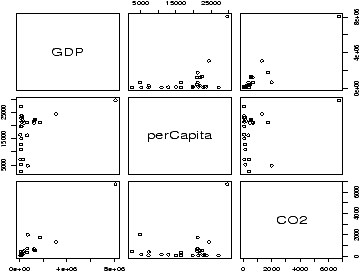
Figure 23: Using pairs with emissions data
The pairs command has many options to customize the
graphs. The help page has two nice examples.
- others
- The
Ggobi package and
accompanying software, allows you to manipulate the data in the plot
and do such things as brush data in one plot and have it highlighted
in another.
5.6 The lattice package
The add-on package lattice implements the Trellis graphics
concepts of Bill Cleveland. It and the accompanying grid
package allow a different way to view multivariate data than
described above. As of version 1.5.0 these are recommended packages
but not part of the base version of R.
Some useful graphs are easy to create and are shown below. Many
other usages are possible. Both packages are well described in
Volume 2/2 of the R News newsletter
(http://cran.r-project.org/doc/Rnews)).
Let's use the data set Cars93 to illustrate. We assume
this has been loaded, but not attached to illustrate the use of
data = below.
The basic idea is that the graphic consists of a number of panels.
Typically these correspond to some value of a conditioning variable.
That is, a different graphic for each level of the factor used to
condition, or if conditioning by a numeric variable for ``shingles''
which are ranges of the conditioning variable. The functions are
called with the model formula notation. For univariate graphs such
as histograms, the response variable, the left side, is empty. For
bivariate graphs it is given. Notice below that the names for the
functions are natural, yet different from the usual ones. For
example, histogram is used instead of hist.
-
histograms
- Histograms are univariate. The following command
shows a histogram of the maximum price conditioned on the number
of cylinders. Note the response variable is left blank.
> histogram( ~ Max.Price | Cylinders , data = Cars93)
- Boxplots
- Boxplots are also univariate. Here is the same
information, only summarized using boxplots. The command is
bwplot.
> bwplot( ~ Max.Price | Cylinders , data = Cars93)
- scatterplots
- Scatterplots are available as well. The function
is xyplot and not simply plot. As these are
bivariate a response variable is needed. The following will plot
the relationship between MPG and tank size. We expect that cars
with better mileage can have smaller tanks. This type of plot
allows us to check if it is the same for all types of cars.
> attach(Cars93)                 # don't need data = Cars93 now
> xyplot(MPG.highway ~ Fuel.tank.capacity | Type)
## plot with a regression line
## first define a regression line drawing function
> plot.regression = function(x,y) {
+ panel.xyplot(x,y)
+ panel.abline(lm(y~x))
+ }
> trellis.device(bg="white")    # set background to white.
> xyplot(MPG.highway ~ Fuel.tank.capacity | Type, panel = plot.regression)
This results in figure 24.
Notice we can see some trends from the figure. The slope appears
to become less steep as the size of the car increases.
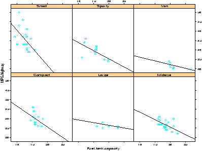
Figure 24: Example of lattice graphics: relation of m.p.g. and fuel tank size.
Notice the trellis.device command setting the background
color to white. The default colors are a bit dark. The figure
drawn includes a regression line. This was achieved by specifying
a function to create the panel. By default, the xyplot
will use the panel.xyplot function to plot a scatterplot.
To get more, we defined a function of x and y that
plotted a scatterplot (again with panel.xyplot) and also
added a regression line using panel.abline) and the
lm function. Many more possibilities are possible.
5.7 Problems
-
5.1
- For the
emissions
dataset there is an outlier for the CO2
emissions. Find this value using identify and then redo the
plot without this point.
- 5.2
- The Simple data set chips contains data on
thickness of integrated chips. There are data for two chips, each
measured at 4 different places. Create a side-by-side boxplot of the
thickness for each place of measurement. (There should be 8 boxplots
on the same graph). Do the means look the same? The variances?
- 5.3
- The Simple data set chicken contains weights of
chickens who are given 1 of 3 different food rations. Create a
boxplot of all 3 rations. Does there appear to be a difference in
mean?
- 5.4
- The Simple data set
WeightData
contains information
on weights for children aged 0 to 144 months. Make a side-by-side
boxplot of the weights broken down by age in years. What kind of
trends do you see? (The variable age is in months. To
convert to years can be done using cut as follows
> age.yr = cut(age,seq(0,144,by=12),labels=0:11)
assuming the dataset has been attached.)
- 5.5
- The Simple data set carbon contains carbon monoxide
levels at 3 different industrial sites. The data has two variables: a
carbon monoxide reading, and a factor variable to keep track of the site.
Create side-by-side boxplots of the monoxide
levels for each site. Does there appear to be a difference? How so?
- 5.6
- For the data set
babies
make a pairs plot
(pairs(babies)) to investigate the relationships between the
variables. Which variables seem to have a linear relationship? For
the variables for birthweight and gestation make a scatter plot
using different plotting characters (pch) depending on the
level of the factor smoke.
6 Random Data
Although Einstein said that god does not play dice, R can. For example
> sample(1:6,10,replace=T)
 [1] 6 4 4 3 5 2 3 3 5 4
or with a function
> RollDie = function(n) sample(1:6,n,replace=T)
> RollDie(5)
[1] 3 6 1 2 2
In fact, R can create lots of different types of random
numbers ranging from familiar families of distributions to specialized
ones.
6.1 Random number generators in R-- the ``r'' functions.
As we know, random numbers are described by a distribution. That is,
some function which specifies the probability that a random number
is in some range. For example P(a < X £ b). Often this is
given by a probability density (in the continuous case) or by a
function P(X=k) = f(k) in the discrete case. R will give
numbers drawn from lots of different distributions. In order to use
them, you only need familiarize yourselves with the parameters that
are given to the functions such as a mean, or a rate. Here are
examples of the most common ones. For each, a histogram is given
for a random sample of size 100, and density (using the ``d''
functions) is superimposed as appropriate.
-
Uniform.
- Uniform numbers are ones that are "equally likely" to
be in the specified range. Often these numbers are in [0,1] for
computers, but in practice can be between [a,b] where a,b depend
upon the problem. An example might be the time you wait at a traffic
light. This might be uniform on [0,2].
> runif(1,0,2)                  # time at light
[1] 1.490857                    # also runif(1,min=0,max=2)
> runif(5,0,2)                  # time at 5 lights
[1] 0.07076444 0.01870595 0.50100158 0.61309213 0.77972391
> runif(5)                      # 5 random numbers in [0,1]
[1] 0.1705696 0.8001335 0.9218580 0.1200221 0.1836119
The general form is runif(n,min=0,max=1) which allows you to
decide how many uniform random numbers you want (n), and the
range they are chosen from ([min,max])
To see the distribution with min=0 and max=1 (the
default) we have
> x=runif(100)                 # get the random numbers
> hist(x,probability=TRUE,col=gray(.9),main="uniform on [0,1]")
> curve(dunif(x,0,1),add=T)
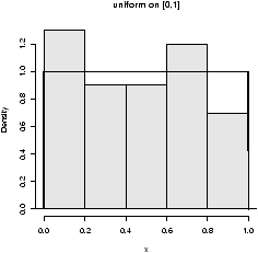
Figure 25: 100 uniformly random numbers on [0,1]
The only tricky thing was plotting the histogram with a background
``color''. Notice how the dunif function was used with the
curve function.
- Normal.
- Normal numbers are the backbone of classical statistical theory
due to the central limit theorem The normal
distribution has two parameters a mean µ and a standard deviation
s. These are the location and spread parameters. For example,
IQs may be normally distributed with mean 100 and standard deviation
16, Human gestation may be normal with mean 280 and
standard deviation about 10 (approximately). The family of normals can be standardized
to normal with mean 0 (centered) and variance 1. This is achieved by
"standardizing" the numbers, i.e. Z=(X-µ)/s.
Here are some examples
> rnorm(1,100,16)               # an IQ score
[1] 94.1719
> rnorm(1,mean=280,sd=10)
[1] 270.4325                    # how long for a baby (10 days early)
Here the function is called as rnorm(n,mean=0,sd=1) where
one specifies the mean and the standard deviation.
To see the shape for the defaults (mean 0, standard deviation 1) we
have (figure 26)
> x=rnorm(100)
> hist(x,probability=TRUE,col=gray(.9),main="normal mu=0,sigma=1")
> curve(dnorm(x),add=T)
## also for IQs using rnorm(100,mean=100,sd=16)
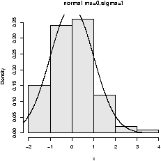
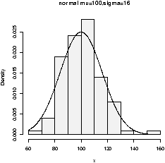
Figure 26: Normal(0,1) and normal(100,16)
- Binomial.
- The binomial random numbers are discrete random
numbers. They have the distribution of the number of successes in
n independent Bernoulli trials where a Bernoulli trial results in
success or failure, success with probability p.
A single Bernoulli trial is given with n=1 in the binomial
> n=1, p=.5                     # set the probability
> rbinom(1,n,p)                 # different each time
[1] 1
> rbinom(10,n,p)                # 10 different such numbers
 [1] 0 1 1 0 1 0 1 0 1 0
A binomially distributed number is the same as the number of 1's in
n such Bernoulli numbers. For the last example, this would be 5.
There are then two parameters n (the number of Bernoulli trials) and
p (the success probability).
To generate binomial numbers, we simply change the value of n
from 1 to the desired number of trials. For example, with 10 trials:
> n = 10; p=.5
> rbinom(1,n,p)                 # 6 successes in 10 trials
[1] 6
> rbinom(5,n,p)                 # 5 binomial number
[1] 6 6 4 5 4
The number of successes is of course discrete, but as n gets large,
the number starts to look quite normal. This is a case of the central limit theorem
which states in general that (X-- - µ)/s is normal in the
limit (note this is standardized as above) and in our specific case
that
is approximately normal, where p^ = (number of successes)/n.
The graphs (figure 27) show 100
binomially distributed random numbers for 3 values of n and for
p=.25. Notice in the graph, as n increases the shape becomes more
and more bell-shaped. These graphs were made with the commands
> n=5;p=.25                    # change as appropriate
> x=rbinom(100,n,p)            # 100 random numbers
> hist(x,probability=TRUE,)
## use points, not curve as dbinom wants integers only for x
> xvals=0:n;points(xvals,dbinom(xvals,n,p),type="h",lwd=3)
> points(xvals,dbinom(xvals,n,p),type="p",lwd=3)
...    repeat with n=15, n=50
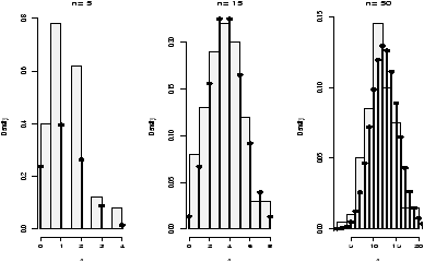
Figure 27: Random binomial data with the theoretical distribution
- Exponential
- The exponential distribution is important for
theoretical work. It is used to describe lifetimes of
electrical components (to first order). For example, if the mean
life of a light bulb is 2500 hours one may think its lifetime is
random with exponential distribution having mean 2500. The one
parameter is the rate = 1/mean. We specify it as follows
rexp(n,rate=1). Here is an example with the rate being
1/2500 (figure 28).
> x=rexp(100,1/2500)
> hist(x,probability=TRUE,col=gray(.9),main="exponential mean=2500")
> curve(dexp(x,1/2500),add=T)
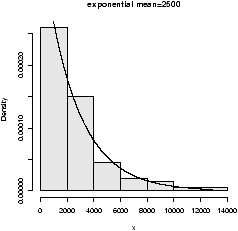
Figure 28: Random exponential data with theoretical density
There are others of interest in statistics. Common ones are the Poisson, the
Student t-distribution, the F distribution, the beta distribution and the c2 (chi
squared) distribution.
6.2 Sampling with and without replacement using
sample
R has the ability to sample with and without replacement. That
is, choose at random from a collection of things such as the numbers
1 through 6 in the dice rolling example. The sampling can be done
with replacement (like dice rolling) or without replacement (like a
lottery). By default sample samples without replacement each object
having equal chance of being picked. You need to specify
replace=TRUE if you want to sample with
replacement. Furthermore, you can specify separate probabilities for each if desired.
Here are some examples
## Roll a die
> sample(1:6,10,replace=TRUE)
 [1] 5 1 5 3 3 4 5 4 2 1        # no sixes!
## toss a coin
> sample(c("H","T"),10,replace=TRUE)
 [1] "H" "H" "T" "T" "T" "T" "H" "H" "T" "T"
## pick 6 of 54 (a lottery)
> sample(1:54,6)                # no replacement
[1]  6 39 23 35 25 26
## pick a card. (Fancy! Uses paste, rep)
> cards = paste(rep(c("A",2:10,"J","Q","K"),4),c("H","D","S","C"))
> sample(cards,5)               # a pair of jacks, no replacement
[1] "J D" "5 C" "A S" "2 D" "J H"
## roll 2 die. Even fancier
> dice = as.vector(outer(1:6,1:6,paste))
> sample(dice,5,replace=TRUE)   # replace when rolling dice
[1] "1 1" "4 1" "6 3" "4 4" "2 6"
The last two illustrate things that can be done with a little typing
and a lot of thinking using the fun commands paste for pasting
together strings, rep for repeating things and outer for
generating all possible products.
6.3 A bootstrap sample
Bootstrapping is a method of sampling from a data set to make
statistical inference. The intuitive idea is that by sampling, one
can get an idea of the variability in the data. The process involves
repeatedly selecting samples and then forming a statistic. Here is a
simple illustration on obtaining a sample.
The built in data set faithful has a variable ``eruptions''
that measures the time between eruptions at Old Faithful. It has an
unusual distribution. A bootstrap sample is just a sample with
replacement from the given values. It can be found as follows
> data(faithful)                # part of R's base
> names(faithful)               # find the names for faithful
 [1] "eruptions" "waiting"
> eruptions = faithful[['eruptions']] # or attach and detach faithful
> sample(eruptions,10,replace=TRUE)
 [1] 2.03 4.37 4.80 1.98 4.32 2.18 4.80 4.90 4.03 4.70
> hist(eruptions,breaks=25)     # the dataset
## the bootstrap sample
> hist(sample(eruptions,100,replace=TRUE),breaks=25)
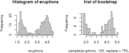
Figure 29: Bootstrap sample
Notice that the bootstrap sample
has a similar histogram, but
it is different (figure 29).
6.4 d, p and q functions
The d functions were used to plot the theoretical densities above.
As with the ``r'' functions, you need to specify the parameters, but
differently, you need to specify the x values (not the number of
random numbers n).
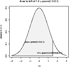
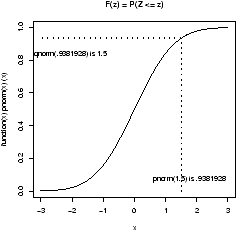
Figure 30: Illustration of 'p' and 'q' functions
The p and q functions are for the cumulative
distribution functions and the quantiles. As mentioned, the
distribution of a random number is specified by the probability that
the number is between a and b for arbitrary a and b, P(a <
X £ b). In fact, the value F(x) = P(X £ b) is enough.
The p functions answer what is the probability that a random
variable is less than x. Such as for a standard normal, what is the
probability it is less than .7?
> pnorm(.7)                     # standard normal
[1] 0.7580363
> pnorm(.7,1,1)                 # normal mean 1, std 1
[1] 0.3820886
Notationally, these answer P(Z £ .7) where Z is a standard normal
or normal(1,1). To answer P(Z > .7) is also easy. You can do the
work by noting this is 1 - P(Z £ .7) or let R do the work,
by specifying lower.tail=F as in:
> pnorm(.7,lower.tail=F)
[1] 0.2419637
The q function are inverse to this. They ask, what value corresponds
to a given probability. This the quantile or point in the data that
splits it accordingly. For example, what value of z has .75 of the
area to the right for a standard normal? (This is Q3)
> qnorm(.75)
[1] 0.6744898
Notationally, this is finding z which solves 0.75 = P(Z £ z).
6.5 Standardizing, scale and z scores
To standardize a random variable you subtract the mean and then
divide by the standard deviation. That is
To do so requires knowledge of the mean and standard deviation.
You can also standardize a sample. There is a convenient function
scale that will do this for you. This will make your
sample have mean 0 and standard deviation 1. This is useful for comparing
random variables which live on different scales.
Normal random variables are often standardized as the distribution
of the standardized normal variable is again normal with mean 0 and
variance 1. (The ``standard'' normal.) The z-score of a normal
number is the value of it after standardizing.
If we have normal data with mean 100 and standard deviation 16 then the
following will find the z-scores
> x = rnorm(5,100,16)
>
> x
[1] 93.45616 83.20455 64.07261 90.85523 63.55869
> z = (x-100)/16
> z
[1] -0.4089897 -1.0497155 -2.2454620 -0.5715479 -2.2775819
The z-score is used to look up the probability of being to the
right of the value of x for the given random variable. This way
only one table of normal numbers is needed. With R, this is not
necessary. We can use the pnorm function directly
> pnorm(z)
[1] 0.34127360 0.14692447 0.01236925 0.28381416 0.01137575
> pnorm(x,100,16)               # enter in parameters
[1] 0.34127360 0.14692447 0.01236925 0.28381416 0.01137575
6.6 Problems
-
6.1
- Generate 10 random numbers from a uniform distribution on [0,10].
Use R to find the maximum and minimum values.x
- 6.2
- Generate 10 random normal numbers with mean 5 and standard deviation
5 (normal(5,5)). How many are less than 0? (Use R)
- 6.3
- Generate 100 random normal numbers with mean 100 and standard
deviation 10. How many are 2 standard deviations from the mean
(smaller than 80 or bigger than 120)?
- 6.4
- Toss a fair coin 50 times (using R). How many heads do you have?
- 6.5
- Roll a ``die'' 100 times. How many 6's did you see?
- 6.6
- Select 6 numbers from a lottery containing 49 balls. What is the
largest number? What is the smallest? Answer these using R.
- 6.7
- For normal(0,1), find a number z* solving P(Z £ z*) =
.05 (use qnorm).
- 6.8
- For normal(0,1), find a number z* solving P(-z* £ Z £ z*) =
.05 (use qnorm and symmetry).
- 6.9
- How much area (probability) is to the right of 1.5 for a
normal(0,2)?
- 6.10
- Make a histogram of 100 exponential numbers with mean 10.
Estimate the median. Is it more or less than the mean?
- 6.11
- Can you figure out what this R command does?
> rnorm(5,mean=0,sd=1:5)
- 6.12
- Use R to pick 5 cards from a deck of 52. Did you get a pair
or better? Repeat until you do. How long did it take?
7 Simulations
The ability to simulate different types of random data allows the user
to perform experiments and answer questions in a rapid manner. It is a
very useful skill to have, but is admittedly hard to learn.
As we have seen, R has many functions for generating random
numbers. For these random numbers, we can view the distribution using
histograms and other tools. What we want to do now, is generate new
types of random numbers and investigate what distribution they have.
7.1 The central limit theorem
To start, the most important example is the central limit theorem
(CLT). This states that if Xi are drawn independently from a
population where µ and s are known, then the standardized
average
is asymptotically normal with mean 0 and variance 1 (often called
normal(0,1)). That is, if n is large enough the average is
approximately normal with mean µ and standard deviation s/.
How can we check this? Simulation is an excellent way.
Let's first do this for the binomial distribution, the CLT
translates into saying that if Sn has a binomial distribution with
parameters n and p then
is approximately normal(0,1)
Let's investigate. How can we use R to create one of these random
numbers?
> n=10;p=.25;S= rbinom(1,n,p)
> (S - n*p)/sqrt(n*p*(1-p))
[1] -0.3651484
But that is only one of these random numbers. We really want lots
of them to see their distribution. How can we create 100 of them?
For this example, it is easy -- we just take more samples in the
rbinom function
> n = 10;p = .25;S = rbinom(100,n,p)
> X = (S - n*p)/sqrt(n*p*(1-p)) # has 100 random numbers
The variable X has our results, and we can view the distribution
of the random numbers in X with a histogram
> hist(X,prob=T)
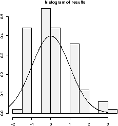
Figure 31: Scaled binomial data is approximately normal(0,1)
The results look approximately normal (figure 31). That is, bell shaped, centered
at 0 and with standard deviation of 1. (Of course, this data is discrete so it
can't be perfect.)
7.2 For loops
In general, the mechanism to create the 100 random numbers, may not
be so simple and we may need to create them one at a time. How to
generate lots of these? We'll use ``for'' loops which may be
familiar from a previous computer class, although other R users
might use apply or other tricks. The R command for
iterates over some specified set of values such as the numbers 1
through 100. We then need to store the results somewhere. This is
done using a vector and assigning each of its values one at a time.
Here is the same example using for loops:
> results =numeric(0)          # a place to store the results
> for (i in 1:100) {           # the for loop
+ S = rbinom(1,n,p)            # just 1 this time
+ results[i]=(S- n*p)/sqrt(n*p*(1-p)) # store the answer
+ }
We create a variable results which will store our answers. Then for
each i between 1 and 100, it creates a random number (a new one each
time!) and stores it in the vector results as the ith entry.
We can view the results with a histogram: hist(results).
R Basics: Syntax for for
A ``for'' loop has a simple syntax:
for(variable in vector) { command(s) }
The braces are optional if there is only one command. The
variable changes for each loop. Here are some examples to
try
> primes=c(2,3,5,7,11);
## loop over indices of primes with this
> for(i in 1:5) print(primes[i])
## or better, loop directly
> for(i in primes) print(i)
Example: CLT with normal data
The CLT also works for normals (where the distribution is actually
normal). Let's see with an example. We will let the
Xi be normal
with mean µ=5 and standard deviation
s=5. Then we need a function to
find the value of
|
|
|
=
|
|
=(mean(X) - mu)/(sigma/sqrt(n))
|
As above a
for loop may be used
> results = c();
> mu = 0; sigma = 1
> for(i in 1:200) {
+ X = rnorm(100,mu,sigma)       # generate random data
+ results[i] = (mean(X) - mu)/(sigma/sqrt(100))
+ }
> hist(results,prob=T)
Notice the histogram indicates the data is approximately normal
(figure
32).
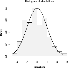
Figure 32: Simulation of CLT with normal data. Notice it is bell shaped.
7.3 Normal plots
A better plot than the histogram for deciding if random data is
approximately normal is the so called ``normal probability'' plot.
The basic idea is to graph the quantiles of your data against the
corresponding quantiles of the normal distribution. The quantiles of
a data set are like the Median and Q1 and Q3 only more
general. The q quantile is the value in the data where q*100%
of the data is smaller. So the 0.25 quantile is Q1, the 0.5
quantile is the median and the 0.75 quantile is Q3. The quantiles
for the theoretical distribution are similar, only instead of the
number of data points less, it is the area to the left that is the
specified amount. For example, the median splits the area beneath the
density curve in half.
The normal probability graph is easy to read -- if you know how.
Essentially, if the graph looks like a straight line then the data
is approximately normal. Any curve can tell you that the
distribution has short or long tails. It is not a regression
line. The line is drawn through points formed by the first and third
quantiles.
R makes all this easy to do with the functions qqnorm
(more generally qqplot) and qqline which draws a
reference line (not a regression line).
This is what the graphs look like for some sample data
(figure 33). Notice the first two
should look like straight lines (and do), the second two shouldn't
(and don't).
> x = rnorm(100,0,1);qqnorm(x,main='normal(0,1)');qqline(x)
> x = rnorm(100,10,15);qqnorm(x,main='normal(10,15)');qqline(x)
> x = rexp(100,1/10);qqnorm(x,main='exponential mu=10');qqline(x)
> x = runif(100,0,1);qqnorm(x,main='unif(0,1)');qqline(x)
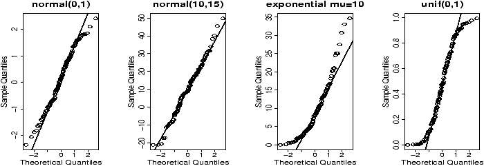
Figure 33: Some normal plots
7.4 Using simple.sim and functions
This section shows how to write functions and how to use them with
simple.sim. This is a little more complicated
than most of the material in these notes and can be avoided if desired.
For purposes of simulation, it would be nice not to have to write a
for loop each time. The function simple.sim
is a function which does just that. You need to write a function that
generates one of your random numbers, and then give it to simple.sim.
For example in checking the CLT for binomial data we needed to
generate a single random number distributed as a standardized binomial
number. A function to do so is:
> f = function () {
+ S = rbinom(1,n,p)
+ (S- n*p)/sqrt(n*p*(1-p))
+ }
With this function, we could use simple.sim like this:
> x=simple.sim(100,f)
> hist(x)
This replaces the need to write a ``for loop'' and also makes the
simulations consistent looking. Once you've written the function to
create a single random number the rest is easy.
While we are at it, we should learn the "right" way to write functions. We
should be able to modify n the number of trials and p the success
probability in our function. So f is better defined as
> f = function(n=100,p=.5) {
+ S = rbinom(1,n,p)
+ (S- n*p)/sqrt(n*p*(1-p))
+ }
The format for the variable is n=100 this says that n
is the first variable given to the function, by default it is 100, p
is the second by default it is p=.5. Now we would call
simple.sim as
> simple.sim(1000,f,100,.5)
So the trick is to learn how to write functions to create a single
number. The appendix contains more details on writing functions. For
immediate purposes the important things to know are
-
Functions have a special keyword function as in
> the.range = function (x) max(x) - min(x)
which returns the range of the vector x. (Already available
with range.) This tells R that the.range is a
function, and its arguments are in the braces. In this case (x).
- If a function is a little more complicated and requires multiple
commands you use braces (like a for loop). The
last value computed is returned. This example finds the IQR based
on the lower and upper hinges and not the quantiles.
It uses the results of the fivenum command to get the hinges
> find.IQR = function(x) {
+ five.num = fivenum(x)         # for Tukey's summary
+ five.num[4] - five.num[2]
+ }
The plus sign indicates a new line and is generated by R -- you
do not need to type it. (The five number summary is 5 numbers: the
minimum, the lower hinges, the median, the upper hinge, and the
maximum. This function subtracts the second from the fourth.)
- A function is called by its name and with
parentheses. For example
> x = rnorm(100)               # some sample data
> find.IQR                     # oops! no argument. Prints definition.
function(x) {
five.num = fivenum(x)
five.num[4] - five.num[2]
}
> find.IQR(x)                  # this is better
[1] 1.539286
Here are some more examples.
Example: A function to sum normal numbers
To find the standardized sum
of 100 normal(0,1) numbers we could use
> f = function(n=100,mu=0,sigma=1) {
+ nos = rnorm(n,mu,sigma)
+ (mean(nos)-mu)/(sigma/sqrt(n))
+ }
Then we could use
simple.sim as follows
> simulations = simple.sim(100,f,100,5,5)
> hist(simulations,breaks=10,prob=TRUE)
Example: CLT with exponential data
Let's do one more example. Suppose we start with a skewed
distribution, the central limit theorem says that the average will
eventually look normal. That is, it is approximately normal
for
large n. What does ``eventually'' mean? What does
``large'' mean? We can get an idea through simulation.
A example of a skewed distribution is the exponential. We need to
know if it has mean 10, then the standard deviation is also 10, so we only need to
specify the mean. Here is a function to create a single
standardized average (note that the exponential distribution has
theoretical standard deviation equal to its mean)
> f = function(n=100,mu=10) (mean(rexp(n,1/mu))-mu)/(mu/sqrt(n))
Now we simulate for various values of
n. For each of these
m=100
(the number of random numbers generated),
but
n varies from 1,5,15 and 50 (the number of random numbers in
each of our averages).
> xvals = seq(-3,3,.01) # for the density plot
> hist(simple.sim(100,f,1,10),probability=TRUE,main="n=1",col=gray(.95))
> points(xvals,dnorm(xvals,0,1),type="l") # plot normal curve
  ... repeat for n=5,15,50
Figure 34: Simulation of CLT with exponential data. Note it is not
perfectly bell shaped.
The histogram becomes very bell shaped between
n=15 and
n=50, although even at
n=50 it appears to still be a little
skewed.
7.5 Problems
-
7.1
- Do two simulations of a binomial number with n=100 and p=.5.
Do you get the same results each time? What is different? What is
similar?
- 7.2
- Do a simulation of the normal two times. Once with n=10,
µ=10 and s=10, the other with n=10, µ = 100 and
s=100. How are they different? How are they similar? Are both
approximately normal?
- 7.3
- The Bernoulli example is also skewed when p is not .5. Do an
example with n=100 and p=.25, p=.05 and p=.01. Is the data
approximately normal in each case? The rule of thumb is that it will
be approximately normal when np³5 and n(1-p)³5. Does this hold?
- 7.4
- The normal plot is a fancy way of checking if the distribution
looks normal. A more primitive one is to check the rule of thumb
that 68% of the data is 1 standard deviation from the mean, 95% within 2
standard deviations and
99.8% within 3 standard deviations.
Create 100 random numbers when the Xi are normal with mean 0 and
standard deviation 1. What percent are within 1 standard deviation of the the mean? Two
standard deviations, 3 standard deviations? Is your data consistent
with the normal?
(Hint: The data is supposed to have mean 0 and variance 1.
To check for 1 standard deviation we can do
> k = 1;sigma = 1
> n = length(x)
> sum( -k*sigma <x & x< k*sigma)/n
Read the & as "and" and this reads as -- after
simplification-- ``-1 less than x and
x less than 1''. This is the same as P(-1<x<1).)
- 7.5
- It is interesting to graph the distribution of the standardized
average as n increases. Do
this when the Xi are uniform on [0,1].
Look at the histogram when n is 1, 5, 10 and 25. Do you see the
normal curve taking shape?
(A rule of thumb is that if the Xi are not too skewed, then
n>25 should make the average approximately normal. You might want
> f=function(n,a=0,b=1) {
    mu=(b+a)/2
    sigma=(b-a)/sqrt(12)
    (mean(runif(n,a,b))-mu)/(sigma/sqrt(n))
}
where the formulas for the mean and standard deviation are given.
)
- 7.6
- A home movie can be made by automatically showing a sequence of
graphs. The system function System.sleep can insert a pause between
frames. This will show a histogram of the sampling distribution for
increasingly large n
> for (n in 1:50) {
+ results = c()
+ mu = 10;sigma = mu
+ for(i in 1:200) {
+ X = rexp(200,1/mu)
+ results[i] = (mean(X)-mu)/(sigma/sqrt(n))
+ }
+ hist(results)
+ Sys.sleep(.1)
+ }
Run this code and take a look at the movie. To rerun, you can save
these lines into a function or simply use the up arrow to recall the
previous set of lines. What do you see?
- 7.7
- Make normal graphs for the following random distributions. Which of
them (if any) are approximately normal?
-
rt(100,4)
- rt(100,50)
- rchisq(100,4)
- rchisq(100,50)
- 7.8
- The bootstrap technique simulates based on sampling from the
data. For example, the following function will find the median of a
bootstrap sample.
> bootstrap=function(data,n=length(data)) {
+  boot.sample=sample(data,n,replace=TRUE)
+  median(boot.sample)
+ }
Let the data be from the built in data set faithful. What does
the distribution of the bootstrap for the median look like? Is it
normal? Use the command:
> simple.sim(100,bootstrap,faithful[['eruptions']])
- 7.9
- Depending on the type of data, there are advantages to the mean
or the median. Here is one way to compare the two when the data is
normally distributed
> res.median=c();res.mean=c() # initialize
> for(i in 1:200) {             # create 200 random samples
+ X = rnorm(200,0,1)
+ res.median[i] = median(X);res.mean[i] = mean(X)
+ }
> boxplot(res.mean,res.median)  # compare
Run this code. What are the differences? Try, the same experiment
with a long tailed distribution such as X = rt(200,2). Is
there a difference? Explain.
- 7.10
- In mathematical statistics, there are many possible estimates
for the center of a data set. To choose between them, the one with
the smallest variance is often taken. This variance depends upon the
population distribution. Here we investigate the ratio of the
variances for the mean and the median for different distributions.
For normal(0,1) data we can check with
> median.normal = function(n=100) median(rnorm(100,0,1))
> mean.normal = function(n=100) mean(rnorm(100,0,1))
> var(simple.sim(100,mean.normal)) /
+ var(simple.sim(100,median.normal))
[1] 0.8630587
The answer is a random number which will usually be less than
1. This says that usually the variance of the mean is less than the
variance of the median for normal data. Repeat using the exponential instead of the
normal. For example:
> mean.exp  =  function(n=100) mean(rexp(n,1/10))
> median.exp = function(n=100) median(rexp(n,1/10))
and the t-distribution with 2 degrees of freedom
> mean.t = function(n=100) mean(rt(n,2))
> median.t = function(n=100) median(rt(n,2))
Is the mean always better than the median? You may also find that
side-by-side boxplots of the results of simple.sim are informative.
8 Exploratory Data Analysis
Experimental Data Analysis (eda) is the process of looking at a data
set to see what are the appropriate statistical inferences that can
possibly be learned. For univariate data, we can ask if the
data is approximately normal, longer tailed, or shorter tailed? Does
it have symmetry, or is it skewed? Is it unimodal, bimodal or
multi-modal? The main tool is the proper use of computer graphics.
8.1 Our toolbox
Our toolbox for eda consists of graphical representations of the data
and our interpretation. Here is a summary of graphical methods
covered so far:
-
barplots
- for categorical data
- histogram, dot plots, stem and leaf plots
- to see the shape of
numerical distributions
- boxplots
- to see summaries of a numerical distribution, useful
in comparing distributions and identifying long and short-tailed
distributions.
- normal probability plots
- To see if data is approximately normal
It is useful to have many of these available with one easy
function. The function simple.eda does exactly that.
Here are some examples of distributions with different shapes.
8.2 Examples
Example: Homedata
The dataset
homedata
contains assessed values for
Maplewood, NJ for the year 1970 and the year 2000. What is the shape
of the distribution?
> data(homedata)                # from simple package
> attach(homedata)
> hist(y1970);hist(y2000)       # make two histograms
> detach(homedata)              # clean up
On first appearances (figure
35), the 1970
data looks more normal, the year 2000 data has a heavier tail. Let's
see using our
simple.eda function.
> attach(homedata)
> simple.eda(y1970);simple.eda(y2000)
> detach(homedata)              # clean up
The 1970 and year 2000 data are shown (figures 36 and 37).
Figure 35: Histograms of Maplewood homes in 1970 and 2000
Figure 36: 1970 Maplewood home data
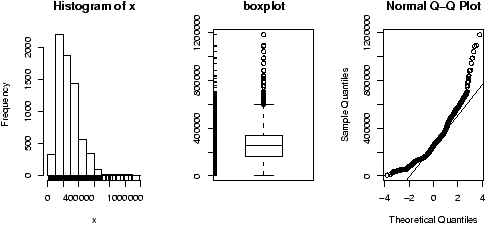
Figure 37: 2000 Maplewood N.J. home data
Neither looks particularly normal -- both are heavy tailed and
skewed. Any analysis will want to consider the medians or a transformation.
Example: CEO salaries
The data set
exec.pay
gives the total direct
compensation for CEO's at 200 large publicly traded companies in the
U.S for the year 2000 (in units of $100,000). What can we say about
this distribution besides it looks like good work if you can get it?
Using
simple.eda yields
> data(exec.pay)                # or read in from file
> simple.eda(exec.pay)
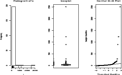
Figure 38: Executive pay data
we see a heavily skewed distribution as we might expect. A
transformation is called for, let's try the logarithmic
transformation (base 10). Since some values are 0 (these CEO's are
directly compensated less than $100,000 or perhaps were forced to return
all profits in a plea arrangement to stay out of jail), we ask not to include
these.
> log.exec.pay = log(exec.pay[exec.pay >0])/log(10) # 0 is a problem
> simple.eda(log.exec.pay)
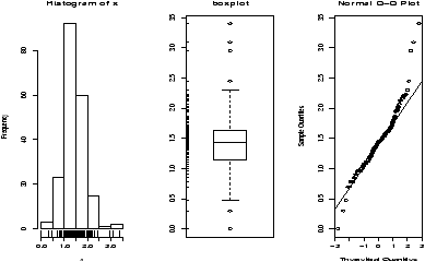
Figure 39: Executive pay after log transform
This is now very symmetric and gives good insight into the actual
distribution. (Almost log normal, which says that after taking a
logarithm, it looks like a normal.) Any analysis will want to use
resistant measures such as the median or a transform prior to analysis.
Example: Taxi time at EWR
The dataset
ewr
contains taxi in and taxi out times at
Newark airport (EWR). Let's see what the trends are.
> data(ewr)
> names(ewr)                    # only 3-10 are raw data
 [1] "Year"    "Month"   "AA"      "CO"      "DL"      "HP"      "NW"
 [8] "TW"      "UA"      "US"      "inorout"
> airnames = names(ewr)         # store them for later
> ewr.actual = ewr[,3:10]       # get the important columns
> boxplot(ewr.actual)
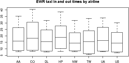
Figure 40: Taxi in and out times at Newark Airport (EWR)
All of them look skewed. Let's see if there is a
difference between taxi in and out times.
> par(mfrow=c(2,4))             # 2 rows 4 columns
> attach(ewr)
> for(i in 3:10) boxplot(ewr[,i] ~ as.factor(inorout),main=airnames[i])
> detach(ewr)
> par(mfrow=c(1,1))             # return graphics as is (or close window)
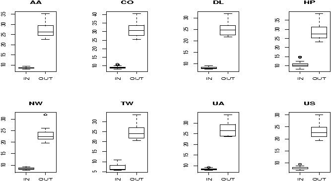
Figure 41: Taxi in and taxi out by airline at EWR
(The third line is the only important one. Here we used the
boxplot command with the model notation -- of the type
boxplot(y ~ x) -- which when
x is a factor, does
separate boxplots for each level. The command
as.factor ensures
that the variable
inorout is a factor. Also note, we used
a
for loop to show all 8 plots.
Notice the taxi in times are more or less symmetric with little
variation (except for HP -- America West -- with a 10 minute plus
average). The taxi out times have a heavy tail. At EWR, when the
airport is busy, the planes can really backup and the 30 minute wait
is not unusual. The data for Northwest (NW) seems to be less. We can
compare this using statistical tests. Since the distributions are skewed,
we may wish to compare the medians. (In general, be careful when applying
statistical tests to summarized data.)
Example: Symmetric or skewed, Long or short?
For unimodal data, there are 6 basic possibilities as it is
symmetric or skewed, and the tails are short, regular or long. Here
are some examples with random data from known distributions
(figure
42).
## symmetric: short, regular then long
> X=runif(100);boxplot(X,horizontal=T,bty=n)
> X=rnorm(100);boxplot(X,horizontal=T,bty=n)
> X=rt(100,2);boxplot(X,horizontal=T,bty=n)
## skewed:  short, regular then long
# triangle distribution
> X=sample(1:6,100,p=7-(1:6),replace=T);boxplot(X,horizontal=T,bty=n)
> X=abs(rnorm(200));boxplot(X,horizontal=T,bty=n)
> X=rexp(200);boxplot(X,horizontal=T,bty=n)
Figure 42: Symmetric or skewed; short, regular or long
8.3 Problems
-
8.1
- Attach the data set
babies
. Describe the
distributions of the variables birth weight (bwt), gestation,
age, height and weight.
- 8.2
- The Simple data set iq contains simulated scores on
a hypothetical IQ test. What analysis is appropriate for measuring
the center of the distribution? Why? (Note: the data reads in as a
list.)
- 8.3
- The Simple data set slc contains data on red
blood cell sodium-lithium countertransport activity for 190
individuals. Describe the shape of the distribution, estimate the
center, state what is an appropriate measure of center for this
data.
- 8.4
- The t distribution will be important later. It depends on a
parameter called the degrees of freedom. Use the rt(n,df)
function to investigate the t-distribution for n=100 and
df=2, 10 and 25.
- 8.5
- The c2 distribution also depends on a parameter called the
degrees of freedom. Use the rchisq(n,df) function to
investigate the c2 distribution with n=100 and
df=2,10 and 25.
- 8.6
- The R dataset trees contains girth (diameter),
height and volume (of boardfeet) measurements for several trees of a
species of cherry tree. Describe the distributions of each of these 3
variables. Are any long tailed, short-tailed, skewed?
- 8.7
- The Simple dataset
dowdata
contains the Dow Jones
numbers from January 1999 to October 2000. The Black-Scholes theory
is modeled on the assumption that the changes in the data within a
day should be log normal. In particular, if Xn is the value on
day n then log(Xn/Xn-1) should be normal. Investigate this
as follows
> data(dowdata)
> x = dowdata[['Close']]        # look at daily closes
> n = length(x)                 # how big is x?
> z = log(x[2:n]/x[1:(n-1))     # This does X_n/X_(n-1)
Now check if z is normal. What do you see?
- 8.8
- The children's game of Chutes and Ladders can be simulated easily
in R. The time it takes for a player to make it to the end has an
interesting distribution. To simulate the game, you can use the
Simple function simple.chutes as follows.
> results=c()
> for(i in 1:200) results[i]=length(simple.chutes(sim=TRUE))
> hist(results)
Describe the resulting distribution in words. What percentage of the
time did it take more than 100 turns? What is the median and compare
it to the mean of your sample.
To view a trajectory (the actual dice rolls), you can just plot as
follows
> plot(simple.chutes(1))
9 Confidence Interval Estimation
In statistics one often would like to estimate unknown parameters for
a known distribution. For example, you may think that your parent
population is normal, but the mean is unknown, or both the
mean and standard deviation are unknown. From a
data set you can't hope to know the exact values of the parameters,
but the data should give you a good idea what they are. For the mean,
we expect that the sample mean or average of our data will be a good
choice for the population mean, and intuitively, we understand that
the more data we have the better this should be. How do we quantify
this?
Statistical theory is based on knowing the sampling distribution of
some statistic such as the mean. This allows us to make
probability statements about the value of the
parameters. Such as we are 95 percent certain the parameter is in some
range of values.
In this section, we describe the R functions
prop.test, t.test, and wilcox.test used to
facilitate the calculations.
9.1 Population proportion theory
The most widely seen use of confidence intervals is the estimation
of population proportion through surveys or polls. For example,
suppose it is reported that 100 people were surveyed and 42 of them
liked brand X. How do you see this in the media?
Depending on the sophistication of the reporter, you might see the
claim that 42% of the population reports they like brand X. Or, you
might see a statement like ``the survey indicates that 42% of
people like brand X, this has a margin of error of 9
percentage points.'' Or, if you find an extra careful reporter you will see a
summary such as ``the survey indicates that 42% of
people like brand X, this has a margin of error of 9
percentage points. This is a 95% confidence level.''
Why all the different answers? Well, the idea that we can infer
anything about the population based on a survey of just 100 people is
founded on probability theory. If the sample is a random
sample then we know the sampling distribution of p^ the sample
proportion. It is approximately normal.
Let's fix the notation. Suppose we
let p be the true population proportion, which is of course
|
p = |
| Number who agree |
|
| Size of population |
|
|
|
|
= |
| Number surveyed who agree |
|
| size of survey |
|
.
|
We could say more. If the sampled answers are recorded as Xi where
Xi = 1 if it was ``yes'' and Xi = 0 if ``no'', then our sample
is {X1,X2,...,Xn} where n is the size of the sample and
we get
Which looks quite a lot like an average (X--).
Now if we satisfy the assumptions that each Xi is i.i.d.
then p^ has a known distribution, and if n is
large enough we can say the following is approximately normal with
mean 0 and variance 1:
If we know this, then we can say how close z is to zero by
specifying a confidence. For example, from the known properties of
the normal, we know that
-
z is in (-1,1) with probability approximately 0.68
- z is in (-2,2) with probability approximately 0.95
- z is in (-3,3) with probability approximately 0.998
We can solve algebraically for p as it is quadratic, but the
discussion is simplified and still quite accurate if we approximate
the denominator by SE= (about 0.049 in our
example) then we have
|
P(-1 < |
|
< 1) = .68,
P(-2 < |
|
< 2) = .95,
P(-3 < |
|
< 3) = .998,
|
Or in particular, on average 95% of the time the interval (p^ -
2SE,p^+2SE) contains the true value of p. In the words of a reporter
this would be a 95% confidence level, an ``answer'' of
p^=.42 with a margin of error of 9 percentage points (2*SE in
percents).
More generally, we can find the values for any confidence level.
This is usually denoted in reverse by calling it a (1-a)100%
confidence level. Where for any a in (0,1) we can find a
z* with
P(-z* < z < z*) = 1-a
Often such a z* is called z1-a/2 from how it is
found. For R this can be found with the qnorm function
> alpha = c(0.2,0.1,0.05,0.001)
> zstar = qnorm(1 - alpha/2)
> zstar
[1] 1.281552 1.644854 1.959964 3.290527
Notice the value z* = 1.96 corresponds to a=.05 or a 95%
confidence interval. The reverse is done with the pnorm
function:
> 2*(1-pnorm(zstar))
[1] 0.200 0.100 0.050 0.001
In general then, a (1-a)100% confidence interval is then
given by
Does this agree with intuition? We should expect that as n gets
bigger we have more confidence. This is so because as n gets
bigger, the SE gets smaller as there is a in its
denominator. As well, we expect if we want more confidence in our
answer, we will need to have a bigger interval. Again this is so, as
a smaller a leads to a bigger z*.
Some Extra Insight: Confidence interval isn't always right
The fact that not all confidence intervals contain the true value of
the parameter is often illustrated by plotting a number of random
confidence intervals at once and observing. This is done in
figure
43.
Figure 43: How many 80% confidence intervals contain p?
This was quite simply generated using the command
matplot
> m = 50; n=20; p = .5;         # toss 20 coins 50 times
> phat = rbinom(m,n,p)/n        # divide by n for proportions
> SE = sqrt(phat*(1-phat)/n)    # compute SE
> alpha = 0.10;zstar = qnorm(1-alpha/2)
> matplot(rbind(phat - zstar*SE, phat + zstar*SE),
+ rbind(1:m,1:m),type="l",lty=1)
> abline(v=p)                  # draw line for p=0.5
Many other tests follow a similar pattern:
-
One finds a ``good'' statistic that involves the unknown
parameter (a pivotal quantity).
- One uses the known distribution of the statistic to make a
probabilistic statement.
- One unwraps things to form a confidence interval. This is
often of the form the statistic plus or minus a multiple of the
standard error although this depends on the ``good'' statistic.
As a user the important thing is to become knowledgeable about the
assumptions that are made to ``know'' the distribution of
the statistic. In the example above we need the individual Xi to
be i.i.d. This is assured if we take care to
randomly sample the data from the target population.
9.2 Proportion test
Let's use R to find the above confidence level10. The main R command for this is prop.test
(proportion test). To use it to find the 95% confidence interval we
do
> prop.test(42,100)

     1-sample proportions test with continuity correction

data:  42 out of 100, null probability 0.5
X-squared = 2.25, df = 1, p-value = 0.1336
alternative hypothesis: true p is not equal to 0.5
95 percent confidence interval:
 0.3233236 0.5228954
sample estimates:
   p
0.42
Notice, in particular, we get the 95% confidence interval
(0.32,0.52) by default.
If we want a 90% confidence interval we need to ask for it:
>  prop.test(42,100,conf.level=0.90)

     1-sample proportions test with continuity correction

data:  42 out of 100, null probability 0.5
X-squared = 2.25, df = 1, p-value = 0.1336
alternative hypothesis: true p is not equal to 0.5
90 percent confidence interval:
 0.3372368 0.5072341
sample estimates:
   p
0.42
Which gives the interval (0.33,0.50). Notice this is smaller as we
are now less confident.
Some Extra Insight: prop.test is more accurate
The results of
prop.test will differ slightly than the
results found as described previously. The
prop.test
function actually starts from
and then solves for an interval for
p. This is more complicated
algebraically, but more correct, as the central limit theorem
approximation for the binomial is better for this expression.
9.3 The z-test
As above, we can test for the mean in a similar way, provided the
statistic
is normally distributed. This can happen if either
-
s is known, and the Xi's are normally distributed.
- s is known, and n is large enough to apply the CLT.
Suppose a person weighs himself on a regular basis and
finds his weight to be
175 176 173 175 174 173 173 176 173 179
Suppose that s=1.5 and the error in weighing is normally
distributed. (That is Xi = µ + ei where ei is
normal with mean 0 and standard deviation 1.5). Rather
than use a built-in test, we illustrate how we can create our own:
## define a function
> simple.z.test = function(x,sigma,conf.level=0.95) {
+ n = length(x);xbar=mean(x)
+ alpha = 1 - conf.level
+ zstar = qnorm(1-alpha/2)
+ SE = sigma/sqrt(n)
+ xbar + c(-zstar*SE,zstar*SE)
+ }
## now try it
> simple.z.test(x,1.5)
[1] 173.7703 175.6297
Notice we get the 95% confidence interval of (173.7703, 175.6297)
9.4 The t-test
More realistically, you may not know the standard
deviation. To work around this we use the t-statistic, which is
given by
where s, the sample standard deviation, replaces s, the
population standard deviation. One needs to know that
the distribution of t is known if
-
The Xi are normal and n is small then this has the t-distribution with n-1 degrees of freedom.
- If n is large then the CLT applies and it is
approximately normal. (In most cases.)
(Actually, the t-test is more forgiving (robust) than this implies.)
Lets suppose in our weight example, we don't assume the
standard deviation is 1.5, but rather let the data decide
it for us. We then would use the t-test provided the data
is normal (Or approximately normal.). To quickly investigate this
assumption we look at the qqnorm plot and others
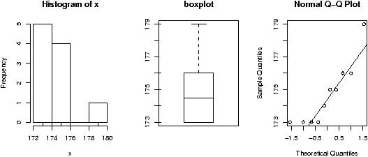
Figure 44: Plot of weights to assess normality
Things pass for normal (although they look a bit truncated on the
left end) so we apply the t-test. To compare, we will
do a 95% confidence interval (the default)
> t.test(x)

     One Sample t-test

data:  x
t = 283.8161, df = 9, p-value = < 2.2e-16
alternative hypothesis: true mean is not equal to 0
95 percent confidence interval:
 173.3076 176.0924
sample estimates:
mean of x
    174.7
Notice we get a different confidence interval.
Some Extra Insight: Comparing p-values from t and z
One may be tempted to think that the confidence interval based on
the
t statistic would always be larger than that based on the
z statistic as always
t* >
z* . However, the standard error
SE for the
t also depends on
s which is variable and can
sometimes be small enough to offset the difference.
To see why
t* is always larger than
z*, we can compare
side-by-side boxplots of two random sets of data with these
distributions.
> x=rnorm(100);y=rt(100,9)
> boxplot(x,y)
> qqnorm(x);qqline(x)
> qqnorm(y);qqline(y)
which gives (notice the symmetry of both, but the larger variance of
the
t distribution).
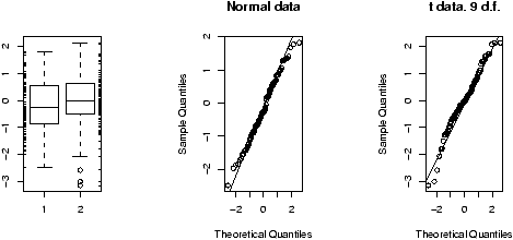
Figure 45: Plot of random normal data and random t-distributed data
And for completeness,
this creates a graph with
several theoretical densities.
> xvals=seq(-4,4,.01)
> plot(xvals,dnorm(xvals),type="l")
> for(i in c(2,5,10,20,50)) points(xvals,dt(xvals,df=i),type="l",lty=i)
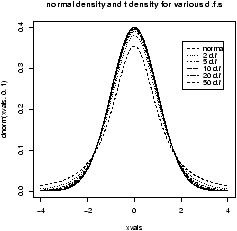
Figure 46: Normal density and the t-density for several degrees of
freedom
9.5 Confidence interval for the median
Confidence intervals for the median are important too. They are
different mathematically than the ones above, but in R these
differences aren't noticed. The R function wilcox.test
performs a non-parametric test for the median.
Suppose the following data is pay of
CEO's in America in 2001 dollars11, then the following creates a test
for the median
> x = c(110, 12, 2.5, 98, 1017, 540, 54, 4.3, 150, 432)
> wilcox.test(x,conf.int=TRUE)

     Wilcoxon signed rank test

data:  x
V = 55, p-value = 0.001953
alternative hypothesis: true mu is not equal to 0
95 percent confidence interval:
  33.0 514.5
Notice a few things:
-
Unlike prop.test and t.test, we needed to
specify that we wanted a confidence interval computed.
- For this data, the confidence interval is
enormous as the size of the sample is small and the range is huge.
- We couldn't have used a t-test as the data isn't even close
to normal.
9.6 Problems
-
9.1
- Create 15 random numbers that are normally distributed
with mean 10 and s.d. 5. Find a 1-sample z-test at
the 95% level. Did it get it right?
- 9.2
- Do the above 100 times. Compute what percentage is in a 95%
confidence interval. Hint: The following might prove useful
> f=function () mean(rnorm(15,mean=10,sd=5))
> SE = 5/sqrt(15)
> xbar = simple.sim(100,f)
> alpha = 0.1;zstar = qnorm(1-alpha/2);sum(abs(xbar-10) < zstar*SE)
[1] 87
> alpha = 0.05;zstar = qnorm(1-alpha/2);sum(abs(xbar-10) < zstar*SE)
[1] 92
> alpha = 0.01;zstar = qnorm(1-alpha/2);sum(abs(xbar-10) < zstar*SE)
[1] 98
- 9.3
- The t-test is just as easy to do. Do a t-test on the
same data. Is it correct now? Comment on the relationship between
the confidence intervals.
- 9.4
- Find an 80% and 95% confidence interval for the median for the
exec.pay
dataset.
- 9.5
- For the Simple data set rat do a t-test for mean if
the data suggests it is appropriate. If not, say why not. (This
records survival times for rats.)
- 9.6
- Repeat the previous for the Simple data set puerto
(weekly incomes of Puerto Ricans in Miami.).
- 9.7
- The median may be the appropriate measure of center. If so, you
might want to have a confidence interval for it too. Find a 90%
confidence interval for the median for
the Simple data set malpract (on the size of malpractice
awards). Comment why this distribution doesn't lend itself to the
z-test or t-test.
- 9.8
- The t-statistic has the t-distribution if the Xi's are
normally distributed. What if they are not? Investigate the
distribution of the t-statistic if the Xi's have different
distributions. Try short-tailed ones (uniform), long-tailed ones
(t-distributed to begin with), Uniform (exponential or log-normal).
(For example, If the Xi are nearly normal, but there is a chance
of some errors introducing outliers. This can be modeled with
Xi = z(µ + s Z) + (1-z)Y
where z is 1 with high probability and 0 otherwise and Y is
of a different distribution. For concreteness, suppose µ=0,
s=1 and Y is normal with mean 0, but standard deviation 10
and P(z=1) = .9. Here is some R code to simulate and
investigate. (Please note, the simulations for the suggested
distributions should be much simpler.)
> f =  function(n=10,p=0.95) {
+    y = rnorm(n,mean=0,sd=1+9*rbinom(n,1,1-p))
+    t = (mean(y) - 0) / (sqrt(var(y))/sqrt(n))
+ }
> sample = simple.sim(100,f)
> qqplot(sample,rt(100,df=9),main="sample vs. t");qqline(sample)
> qqnorm(sample,main="sample vs. normal");qqline(sample)
> hist(sample)
The resulting graphs are shown. First, the graph shows the sample
against the t-quantiles. A bad, fit. The normal plot is better
but we still see a skew in the histogram due to a single large outlier.)
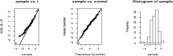
Figure 47: t-statistic for contaminated normal data
10 Hypothesis Testing
Hypothesis testing is mathematically related to the problem of finding
confidence intervals. However, the approach is different. For one, you
use the data to tell you where the unknown parameters should lie, for
hypothesis testing, you make a hypothesis about the value of the
unknown parameter and then calculate how likely it is that you
observed the data or worse.
However, with R you will not notice much difference as the
same functions are used for both. The way you use them is slightly
different though.
10.1 Testing a population parameter
Consider a simple survey. You ask 100 people (randomly chosen) and
42 say ``yes'' to your question. Does this support the hypothesis
that the true proportion is 50%?
To answer this, we set up a test of hypothesis. The null
hypothesis, denoted H0 is that p=.5, the alternative
hypothesis, denoted HA, in this example would be p ¹
0.5. This is a so called ``two-sided'' alternative. To test the
assumptions, we use the function prop.test as with the confidence
interval calculation. Here are the commands
> prop.test(42,100,p=.5)

     1-sample proportions test with continuity correction

data:  42 out of 100, null probability 0.5
X-squared = 2.25, df = 1, p-value = 0.1336
alternative hypothesis: true p is not equal to 0.5
95 percent confidence interval:
 0.3233236 0.5228954
sample estimates:
   p
0.42
Note the p-value of 0.1336. The p-value reports how likely we
are to see this data or worse assuming the null hypothesis.
The notion of worse, is implied by the alternative hypothesis. In
this example, the alternative is two-sided as too small a value or
too large a value or the test statistic is consistent with HA. In
particular, the p-value is the probability of 42 or fewer
or 58 or more answer ``yes'' when the chance a person will
answer ``yes'' is fifty-fifty.
Now, the p-value is not so small as to make an observation of 42
seem unreasonable in 100 samples assuming the null hypothesis. Thus,
one would ``accept'' the null hypothesis.
Next, we repeat, only suppose we ask 1000 people and 420 say
yes. Does this still support the null hypothesis that p=0.5?
> prop.test(420,1000,p=.5)

     1-sample proportions test with continuity correction

data:  420 out of 1000, null probability 0.5
X-squared = 25.281, df = 1, p-value = 4.956e-07
alternative hypothesis: true p is not equal to 0.5
95 percent confidence interval:
 0.3892796 0.4513427
sample estimates:
   p
0.42
Now the p-value is tiny (that's 0.0000004956!) and the null
hypothesis is not supported. That is, we ``reject'' the null
hypothesis. This illustrates the the p value depends not just on the
ratio, but also n. In particular, it is because the standard error
of the sample average
gets smaller as n gets larger.
10.2 Testing a mean
Suppose a car manufacturer claims a model gets 25 mpg. A consumer
group asks 10 owners of this model to calculate their mpg and the
mean value was 22 with a standard deviation of 1.5. Is the
manufacturer's claim supported? 12
In this case H0: µ = 25 against the one-sided alternative hypothesis
that µ<25. To test using R we simply need to tell R about
the type of test. (As well, we need to convince ourselves that the
t-test is appropriate for the underlying parent population.) For
this example, the built-in R function t.test isn't going
to work -- the data is already summarized -- so we are on our
own. We need to calculate the test statistic and then find the p-value.
## Compute the t statistic. Note we assume mu=25 under H_0
> xbar=22;s=1.5;n=10
> t = (xbar-25)/(s/sqrt(n))
> t
[1] -6.324555
## use pt to get the distribution function of t
> pt(t,df=n-1)
[1] 6.846828e-05
This is a small p-value (0.000068). The manufacturer's claim is suspicious.
10.3 Tests for the median
Suppose a study of cell-phone usage for a user gives the following
lengths for the calls
12.8 3.5 2.9 9.4 8.7 .7 .2
2.8 1.9 2.8 3.1 15.8
What is an appropriate test for center?
First, look at a stem and leaf plot
x = c(12.8,3.5,2.9,9.4,8.7,.7,.2,2.8,1.9,2.8,3.1,15.8)
> stem(x)
  ...
  0 | 01233334
  0 | 99
  1 | 3
  1 | 6
The distribution looks skewed with a possibly heavy tail. A t-test is
ruled out. Instead, a test for the median is done. Suppose H0 is
that the median is 5, and the alternative is the median is bigger than
5. To test this with R we can use the wilcox.test as follows
> wilcox.test(x,mu=5,alt="greater")

     Wilcoxon signed rank test with continuity correction

data:  x
V = 39, p-value = 0.5156
alternative hypothesis: true mu is greater than 5

Warning message:
Cannot compute exact p-value with ties ...
Note the p value is not small, so the null hypothesis is not rejected.
Some Extra Insight: Rank tests
The test
wilcox.test is a signed
rank test.
Many books first introduce the sign test, where ranks are not
considered. This can be calculated using
R as well. A function to
do so is
simple.median.test. This computes the
p-value for a two-sided test for a specified median.
To see it work, we have
> x = c(12.8,3.5,2.9,9.4,8.7,.7,.2,2.8,1.9,2.8,3.1,15.8)
> simple.median.test(x,median=5)
[1] 0.3876953                   # accept
> simple.median.test(x,median=10)
[1] 0.03857422                  # reject
10.4 Problems
-
10.1
- Load the Simple data set vacation. This gives
the number of paid holidays and vacation taken by workers in the
textile industry.
-
Is a test for y-- appropriate for this data?
- Does a t-test seem appropriate?
- If so, test the null hypothesis that µ = 24. (What is the
alternative?)
- 10.2
- Repeat the above for the Simple data set smokyph. This data
set measures pH levels for water samples in the Great Smoky
Mountains. Use the waterph column (smokyph[['waterph']]) to
test the null hypothesis that
µ=7. What is a reasonable alternative?
- 10.3
- An exit poll by a news station of 900 people in the state of
Florida found 440 voting for Bush and 460 voting for Gore. Does the
data support the hypothesis that Bush received p=50% of the
state's vote?
- 10.4
- Load the Simple data set cancer. Look only at
cancer[['stomach']]. These are survival times for stomach
cancer patients taking a large dosage of Vitamin C. Test the null
hypothesis that the Median is 100 days. Should you also use a
t-test? Why or why not?
(A boxplot of the cancer data is interesting.)
11 Two-sample tests
Two-sample tests match one sample against another. Their implementation
in R is similar to a one-sample test but there are differences to
be aware of.
11.1 Two-sample tests of proportion
As before, we use the command prop.test to handle these
problems. We just need to learn when to use it and how.
Example: Two surveys
A survey is taken two times over the course of two weeks. The
pollsters wish to see if there is a difference in the results as
there has been a new advertising campaign run. Here is the data
| |
Week 1 |
Week 2 |
| Favorable |
45 |
56 |
| Unfavorable |
35 |
47 |
The standard hypothesis test is
H0:
p1 =
p2 against the
alternative (two-sided)
H1:
p1 ¹ p2. The function
prop.test is used to being called as
prop.test(x,n) where
x is the number favorable and
n is the total. Here it is no different, but since
there are two
x's it looks slightly different. Here is how
> prop.test(c(45,56),c(45+35,56+47))
     2-sample test for equality of proportions with continuity correction
data:  c(45, 56) out of c(45 + 35, 56 + 47)
X-squared = 0.0108, df = 1, p-value = 0.9172
alternative hypothesis: two.sided
95 percent confidence interval:
 -0.1374478  0.1750692
sample estimates:
   prop 1    prop 2
0.5625000 0.5436893
We let
R do the work in finding the
n, but otherwise
this is straightforward. The conclusion is similar to ones before,
and we observe that the
p-value is 0.9172 so we accept the null
hypothesis that
p1 =
p2.
11.2 Two-sample t-tests
The one-sample t-test was based on the statistic
and was used when the data was approximately normal and s was
unknown.
The two-sample t-test is based on the statistic
and the assumptions that the Xi are normally or approximately
normally distributed.
We observe that the denominator is much different that the
one-sample test and that gives us some things to discuss. Basically,
it simplifies if we can further assume the two samples have the same
(unknown) standard deviation.
11.3 Equal variances
When the two samples are assumed to have equal variances, then the
data can be pooled to find an estimate for the
variance. By default, R assumes unequal variances. If the
variances are assumed equal, then you need to
specify var.equal=TRUE when using
t.test.
Example: Recovery time for new drug
Suppose the recovery time for patients taking a new drug is
measured (in days). A placebo group is also used to avoid the
placebo effect. The data are as follows
with drug:  15 10 13  7  9  8 21  9 14  8
placebo:    15 14 12  8 14  7 16 10 15 12
After a side-by-side boxplot (
boxplot(x,y), but not
shown), it is determined that the assumptions of equal variances
and normality are valid. A one-sided
test for equivalence of means using the
t-test is found. This
tests the null hypothesis of equal variances against the
one-sided alternative that the drug group has a smaller
mean. (µ
1 - µ
2 < 0). Here are the results
> x = c(15, 10, 13, 7,  9, 8, 21, 9, 14, 8)
> y = c(15, 14, 12, 8, 14, 7, 16, 10, 15, 12)
> t.test(x,y,alt="less",var.equal=TRUE)

      Two Sample t-test

data:  x and y
t = -0.5331, df = 18, p-value = 0.3002
alternative hypothesis: true difference in means is less than 0
95 percent confidence interval:
       NA 2.027436
sample estimates:
mean of x mean of y
     11.4      12.3
We accept the null hypothesis based on this test.
11.4 Unequal variances
If the variances are unequal, the denominator in the t-statistic
is harder to compute mathematically. But not with R. The only
difference is that you don't have to specify
var.equal=TRUE (so it is actually easier with R).
If we continue the same example we would get the following
> t.test(x,y,alt="less")

     Welch Two Sample t-test

data:  x and y
t = -0.5331, df = 16.245, p-value = 0.3006
alternative hypothesis: true difference in means is less than 0
95 percent confidence interval:
       NA 2.044664
sample estimates:
mean of x mean of y
     11.4      12.3
Notice the results are slightly different, but in this example the
conclusions are the same -- accept the null hypothesis. When we
assume equal variances, then the sampling distribution of the test
statistic has a t distribution with fewer degrees of
freedom. Hence less area is in the tails and so the p-values are
smaller (although just in this example).
11.5 Matched samples
Matched or paired t-tests use a different statistical
model. Rather than assume the two samples are independent normal
samples albeit perhaps with different means and standard
deviations, the matched-samples test assumes that the two samples
share common traits.
The basic model is that Yi = Xi + ei where
ei is the randomness. We want to test if the
ei are mean 0 against the alternative that they are not
mean 0. In order to do so, one subtracts the X's from the Y's
and then performs a regular one-sample t-test.
Actually, R does all that work. You only need to specify
paired=TRUE when calling the t.test function.
Example: Dilemma of two graders
In order to promote fairness in grading, each application was
graded twice by different graders. Based on the grades, can we
see if there is a difference between the two graders? The data
is
Grader 1: 3 0 5 2 5 5 5 4 4 5
Grader 2: 2 1 4 1 4 3 3 2 3 5
Clearly there are differences. Are they described by random
fluctuations (mean
ei is 0), or is there a bias of one
grader over another? (mean
e ¹ 0).
A matched sample test will give us some insight. First we should
check the assumption of normality with normal plots say. (The
data is discrete due to necessary rounding, but the general
shape is seen to be normal.) Then we can apply the
t-test as
follows
> x = c(3, 0, 5, 2, 5, 5, 5, 4, 4, 5)
> y = c(2, 1, 4, 1, 4, 3, 3, 2, 3, 5)
> t.test(x,y,paired=TRUE)
     Paired t-test
data:  x and y
t = 3.3541, df = 9, p-value = 0.008468
alternative hypothesis: true difference in means is not equal to 0
95 percent confidence interval:
 0.3255550 1.6744450
sample estimates:
mean of the differences
Which would lead us to reject the null hypothesis.
Notice, the data are not independent of each other as grader 1
and grader 2 each grade the same papers. We expect that if
grader 1 finds a paper good, that grader 2 will also and vice
versa. This is exactly what non-independent means. A
t-test
without the
paired=TRUE yields
> t.test(x,y)
     Welch Two Sample t-test
data:  x and y
t = 1.478, df = 16.999, p-value = 0.1577
alternative hypothesis: true difference in means is not equal to 0
95 percent confidence interval:
 -0.4274951  2.4274951
sample estimates:
mean of x mean of y
      3.8       2.8
which would lead to a different conclusion.
11.6 Resistant two-sample tests
Again the resistant two-sample test can be done with the
wilcox.test function. It's usage is similar to its usage
with a single sample test.
Example: Taxi out times
Let's compare taxi out
times at Newark airport for American and Northwest
Airlines. This data is in the dataset
ewr
, but we need to
work a little to get it. Here's one way using the command
subset:
> data(ewr)                     # read in data set
> attach(ewr)                   # unattach later
> tmp=subset(ewr, inorout == "out",select=c("AA","NW"))
> x=tmp[['AA']]                # alternately AA[inorout=='out']
> y=tmp[['NW']]
> boxplot(x,y)                  # not shown
A boxplot shows that the distributions are skewed. So a test for the
medians is used.
> wilcox.test(x,y)
     Wilcoxon rank sum test with continuity correction
data:  x and y
W = 460.5, p-value = 1.736e-05
alternative hypothesis: true mu is not equal to 0

Warning message:
Cannot compute exact p-value with ties in: wilcox.test(x,y)
One gets from
wilcox.test strong evidence to
reject the null hypothesis and accept the alternative that the medians
are not equal.
11.7 Problems
-
11.1
- Load the Simple dataset homework. This measures
study habits of students from private and public high schools. Make
a side-by-side boxplot. Use the appropriate test to test for
equality of centers.
- 11.2
- Load the Simple data set corn. Twelve plots of
land are divided into two and then one half of each is planted with
a new corn seed, the other with the standard. Do a two-sample
t-test on the data. Do the assumptions seems to be met. Comment
why the matched sample test is more appropriate, and then
perform the test. Did the two agree anyways?
- 11.3
- Load the Simple dataset blood. Do a significance
test for equivalent centers. Which one did you use and why? What was
the p-value?
- 11.4
- Do a test of equality of medians on the Simple
cabinets data set. Why might this be more appropriate
than a test for equality of the mean or is it?
12 Chi Square Tests
The chi-squared distribution allows for statistical tests of
categorical data. Among these tests are those for goodness
of fit and independence.
12.1 The chi-squared distribution
The c2-distribution (chi-squared) is the distribution of the
sum of squared normal random variables. Let Zi be
i.i.d. normal(0,1) random numbers, and set
Then c2 has the chi-squared distribution with n
degrees of freedom.
The shape of the distribution depends upon the degrees of
freedom. These diagrams (figures 48
and 49) illustrate 100 random samples for 5 d.f. and
50 d.f.
> x = rchisq(100,5);y=rchisq(100,50)
> simple.eda(x);simple.eda(y)
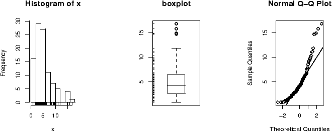
Figure 48: c2 data for 5 degrees of freedom
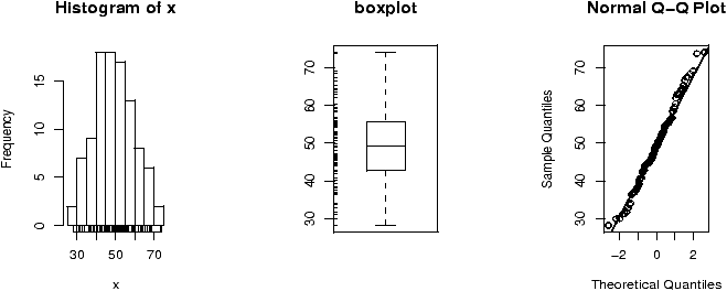
Figure 49: c2 data for 50 degrees of freedom
Notice for a small number of degrees of freedom it is very
skewed. However, as the number gets large the distribution begins to
look normal. (Can you guess the mean and standard deviation?)
12.2 Chi-squared goodness of fit tests
A goodness of fit test checks to see if the data came from some specified
population. The chi-squared goodness of fit test allows one to test
if categorical data corresponds to a model where the data is chosen
from the categories according to some specified set of
probabilities. For dice rolling, the 6 categories (faces) would be
assumed to be equally likely. For a letter distribution, the
assumption would be that some categories are more likely than
other.
Example: Is the die fair?
If we toss a die 150 times and find that we have the following
distribution of rolls is the die fair?
| face |
1 |
2 |
3 |
4 |
5 |
6 |
| Number of rolls |
22 |
21 |
22 |
27 |
22 |
36 |
Of course, you suspect that if the die is fair, the probability of
each face should be the same or 1/6. In 150 rolls then you would
expect each face to have about 25 appearances. Yet the 6 appears
36 times. Is this coincidence or perhaps something else?
The key to answering this question is to look at how far off the
data is from the expected. If we call
fi the frequency of
category
i, and
ei the expected count of category
i, then
the
c2 statistic is defined to be
Intuitively this is large if there is a big discrepancy between
the actual frequencies and the expected frequencies, and small if
not.
Statistical inference is based on the assumption that none of
the expected counts is smaller than 1 and most (80%) are bigger than
5. As well, the data must be independent and identically
distributed -- that is multinomial with some specified
probability distribution.
If these assumptions are satisfied, then the
c2 statistic is
approximately
c2 distributed with
n-1 degrees of freedom.
The null hypothesis is that the probabilities are as specified,
against the alternative that some are not.
Notice for our data, the categories all have enough entries and
the assumption that the individual entries are multinomial
follows from the dice rolls being independent.
R has a built in test for this type of problem. To use it we
need to specify the actual frequencies, the assumed probabilities
and the necessary language to get the result we want. In this
case -- goodness of fit -- the usage is very simple
> freq = c(22,21,22,27,22,36)
# specify probabilities, (uniform, like this, is default though)
> probs = c(1,1,1,1,1,1)/6  # or use rep(1/6,6)
> chisq.test(freq,p=probs)

     Chi-squared test for given probabilities

data:  freq
X-squared = 6.72, df = 5, p-value = 0.2423
The formal hypothesis test assumes the null hypothesis is that each
category
i has probability
pi (in our example each
pi = 1/6)
against the alternative that at least one category doesn't have
this specified probability.
As we see, the value of
c2 is 6.72 and the degrees of
freedom are 6-1=5. The calculated
p-value is 0.2423 so we have
no reason to reject the hypothesis that the die is fair.
Example: Letter distributions
The letter distribution of the 5 most popular letters in the
English language is known to be approximately
13
| letter |
E |
T |
N |
R |
O |
| freq. |
29 |
21 |
17 |
17 |
16 |
That is when either E,T,N,R,O appear, on average 29 times out of 100 it
is an E and not the other 4. This information is useful in
cryptography to break some basic secret codes. Suppose a text is analyzed and
the number of E,T,N,R and O's are counted. The following distribution
is found
| letter |
E |
T |
N |
R |
O |
| freq. |
100 |
110 |
80 |
55 |
14 |
Do a chi-square goodness of fit hypothesis test to see if the letter
proportions for this text are
pE=.29,
pT=.21,
pN=.17,
pR=.17,
pO=.16 or are different.
The solution is just slightly more difficult, as the probabilities
need to be specified. Since the assumptions of the chi-squared test
require independence of each letter, this is not quite appropriate, but supposing it
is we get
> x = c(100,110,80,55,14)
> probs = c(29, 21, 17, 17, 16)/100
> chisq.test(x,p=probs)
    Chi-squared test for given probabilities

data:  x
X-squared = 55.3955, df = 4, p-value = 2.685e-11
This indicates that this text is unlikely to be written in English.
Some Extra Insight: Why the cs?
What makes the statistic have the
c2 distribution? If we
assume that
fi -
ei =
Zi. That is the error is
somewhat proportional to the square root of the expected number,
then if
Zi are normal with mean 0 and variance 1, then the
statistic is exactly
c2. For the multinomial distribution,
one needs to verify, that asymptotically, the differences from the
expected counts are roughly this large.
12.3 Chi-squared tests of independence
The same statistic can also be used to study if two rows in a
contingency table are ``independent''. That is, the null hypothesis
is that the rows are independent and the alternative hypothesis is
that they are not independent.
For example, suppose you find the following data on the severity of
a crash tabulated for the cases where the passenger had a seat belt,
or did not:
| |
|
|
Injury Level |
|
|
| |
|
None |
minimal |
minor |
major |
| Seat Belt |
Yes |
12,813 |
647 |
359 |
42 |
| |
No |
65,963 |
4,000 |
2,642 |
303 |
Are the two rows independent, or does the seat belt make a
difference? Again the chi-squared statistic makes an
appearance. But, what are the expected counts? Under a null
hypothesis assumption of independence, we can use the marginal
probabilities to calculate the expected counts. For example
P(none and yes) = P(none)P(yes)
which is estimated by the proportion of ``none'' (the column sum divided
by n) and the proportion of ``yes: (the row sum divided by n). The
expected frequency for this cell is then this product times n. Or
after simplifying, the row sum times the column sum divided by
n. We need to do this for each entry. Better to let the computer
do so. Here it is quite simple.
> yesbelt = c(12813,647,359,42)
> nobelt = c(65963,4000,2642,303)
> chisq.test(data.frame(yesbelt,nobelt))

    Pearson's Chi-squared test

data:  data.frame(yesbelt, nobelt)
X-squared = 59.224, df = 3, p-value = 8.61e-13
This tests the null hypothesis that the two rows are independent
against the alternative that they are not. In this example, the
extremely small p-value leads us to believe the two rows are not
independent (we reject).
Notice, we needed to make a data frame of the two
values. Alternatively, one can just combine the two vectors as rows
using rbind.
12.4 Chi-squared tests for homogeneity
The test for independence checked to see if the rows are independent,
a test for homogeneity, tests to see if the rows come from the same
distribution or appear to come from different
distributions. Intuitively, the proportions in each category should
be about the same if the rows are from the same distribution. The
chi-square statistic will again help us decide what it means to be
``close'' to the same.
Example: A difference in distributions?
The test for homogeneity tests categorical data to see if the rows
come from different distributions. How good is it? Let's see by
taking data from different distributions and seeing how it does.
We can easily roll a die using the
sample command. Let's
roll a fair one, and a biased one and see if the chi-square test
can decide the difference.
First to roll the fair die 200 times and the biased one 100 times
and then tabulate:
> die.fair = sample(1:6,200,p=c(1,1,1,1,1,1)/6,replace=T)
> die.bias = sample(1:6,100,p=c(.5,.5,1,1,1,2)/6,replace=T)
> res.fair = table(die.fair);res.bias = table(die.bias)
> rbind(res.fair,res.bias)
          1  2  3  4  5  6
res.fair 38 26 26 34 31 45
res.bias 12  4 17 17 18 32
Do these appear to be from the same distribution? We see that the
biased coin has more sixes and far fewer twos than we should
expect. So it clearly doesn't look so. The chi-square test for
homogeneity does a similar analysis as the chi-square test for
independence. For each cell it computes an expected amount and
then uses this to compare to the frequency. What should be
expected numbers be?
Consider how many 2's the fair die should roll in 200 rolls.
The expected number would be 200 times the probability of rolling
a 1. This we don't know, but if we assume that the two
rows of numbers are from the same distribution, then the marginal
proportions give an estimate. The marginal total is 30/300 =
(26 + 4)/300 = 1/10. So we expect 200(1/10) = 20. And we had 26.
As before, we add up all of these differences squared and scale
by the expected number to get a statistic:
Under the null hypothesis that both sets of data come from the
same distribution (homogeneity) and a proper sample, this has the chi-squared
distribution with (2-1)(6-1)=5 degrees of freedom. That is the
number of rows minus 1 times the number of columns minus 1.
The heavy lifting is done for us as follows with the
chisq.test function.
> chisq.test(rbind(res.fair,res.bias))
    Pearson's Chi-squared test
data:  rbind(res.fair, res.bias)
X-squared = 10.7034, df = 5, p-value = 0.05759
Notice the small
p-value, but by some standards we still accept
the null in this numeric example.
If you wish to see some of the intermediate steps you may. The
result of the test contains more information than is printed.
As an illustration, if we wanted just the expected counts we can
ask with the
exp value of the test
> chisq.test(rbind(res.fair,res.bias))[['exp']]
                1  2        3  4        5        6
res.fair 33.33333 20 28.66667 34 32.66667 51.33333
res.bias 16.66667 10 14.33333 17 16.33333 25.66667
12.5 Problems
- 12.1
- In an effort to increase student retention, many colleges have tried
block programs. Suppose 100 students are broken into two groups of
50 at random. One half are in a block program, the other half
not. The number of years in attendance is then measured. We wish to
test if the block program makes a difference in retention. The data is:
| Program |
1 yr |
2 yr. |
3 yr |
4yr |
5+ yrs. |
| Non-Block |
18 |
15 |
5 |
8 |
4 |
| Block |
10 |
5 |
7 |
18 |
10 |
Do a test of hypothesis to decide if there is a difference between
the two types of programs in terms of retention.
- 12.2
- A survey of drivers was taken to see if they had been in an
accident during the previous year, and if so was it a minor or major
accident. The results are tabulated by age group:
| |
|
Accident Type |
|
| AGE |
None |
minor |
major |
| under 18 |
67 |
10 |
5 |
| 18-25 |
42 |
6 |
5 |
| 26-40 |
75 |
8 |
4 |
| 40-65 |
56 |
4 |
6 |
| over 65 |
57 |
15 |
1 |
Do a chi-squared hypothesis test of homogeneity to see if there is
difference in distributions based on age.
- 12.3
- A fish survey is done to see if the proportion of fish types is
consistent with previous years. Suppose, the 3 types of fish
recorded: parrotfish, grouper, tang are historically in a 5:3:4
proportion and in a survey the following counts are found
| |
|
Type of Fish |
|
| |
Parrotfish |
Grouper |
Tang |
| observed |
53 |
22 |
49 |
Do a test of hypothesis to see if this survey of fish has the same
proportions as historically.
- 12.4
- The R dataset UCBAdmissions contains data on
admission to UC Berkeley by gender. We wish to investigate if the
distribution of males admitted is similar to that of females.
To do so, we need to first do some spade work as the data set is
presented in a complex contingency table. The ftable (flatten
table) command is needed. To use it try
> data(UCBAdmissions)           # read in the dataset
> x = ftable(UCBAdmissions)     # flatten
> x                             # what is there
                Dept   A   B   C   D   E   F
Admit    Gender
Admitted Male        512 353 120 138  53  22
         Female       89  17 202 131  94  24
Rejected Male        313 207 205 279 138 351
         Female       19   8 391 244 299 317
We want to compare rows 1 and 2. Treating x as a matrix, we
can access these with x[1:2,].
Do a test for homogeneity between the two rows. What do you conclude?
Repeat for the rejected group.
13 Regression Analysis
Regression analysis forms a major part of the statisticians tool
box. This section discusses statistical inference for the regression
coefficients.
13.1 Simple linear regression model
R can be used to study the linear relationship between two
numerical variables. Such a study is called linear regression for
historical reasons.
The basic model for linear regression is that pairs of data,
(xi,yi), are related through the equation
yi = b0 + b1 xi + ei
The values of b0 and b1 are unknown and will
be estimated from the data. The value of ei is the amount
the y observation differs from the straight line model.
In order to estimate b0 and b1 the method of least
squares is employed. That is, one finds the values of (b0,b1)
which make the differences b0 + b1 xi - yi as small as
possible (in some sense). To streamline notation define yi^ =
b0 + b1 xi and ei = yi^ - yi be the residual amount of
difference for the ith observation. Then the method of least squares
finds (b0,b1) to make åei2
as small as possible. This
mathematical problem can be solved and yields values of
Note the latter says the line goes through the point
(x--,y--) and has slope b1.
In order to make statistical inference about these values, one needs
to make assumptions about the errors ei. The standard
assumptions are that these errors are independent, normals with mean
0 and common variance s2. If these assumptions are valid
then various statistical tests can be made as will be illustrated
below.
Example: Linear Regression with R
The maximum heart rate of a person is often said to be related to
age by the equation
Max = 220- Age.
Suppose this is to be empirically proven and 15 people of varying
ages are tested for their maximum heart rate. The following
data
14
is found:
Age       18  23  25  35  65  54  34  56  72  19  23  42  18  39  37
Max Rate  202 186 187 180 156 169 174 172 153 199 193 174 198 183 178
In a previous section, it was shown how to use
lm to do a
linear model, and the commands
plot and
abline to
plot the data and the regression line. Recall, this could also be
done with the
simple.lm function. To review, we can plot the
regression line as follows
> x = c(18,23,25,35,65,54,34,56,72,19,23,42,18,39,37)
> y = c(202,186,187,180,156,169,174,172,153,199,193,174,198,183,178)
> plot(x,y)                     # make a plot
> abline(lm(y ~ x))             # plot the regression line
> lm(y ~ x)                     # the basic values of the regression analysis

Call:
lm(formula = y ~ x)

Coefficients:
(Intercept)            x
   210.0485      -0.7977
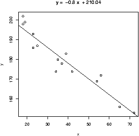
Figure 50: Regression of max heart rate on age
Or with,
> lm.result=simple.lm(x,y)
> summary(lm.result)

Call:
lm(formula = y ~ x)
          ...
Coefficients:
             Estimate Std. Error t value Pr(>|t|)
(Intercept) 210.04846    2.86694   73.27  < 2e-16 ***
x            -0.79773    0.06996  -11.40 3.85e-08 ***
          ...
The result of the
lm function is of class lm and so the
plot and
summary commands adapt themselves to
that. The variable
lm.result contains the result. We
used
summary to view the entire thing. To view parts of it,
you can call it like it is a list or better still use the
following methods:
resid for residuals,
coef for
coefficients and
predict for prediction. Here are a few examples, the
former giving the coefficients
b0 and
b1, the latter
returning the residuals which are then summarized.
> coef(lm.result)             # or use lm.result[['coef']]
(Intercept)           x
210.0484584  -0.7977266
> lm.res = resid(lm.result)   # or lm.result[['resid']]
> summary(lm.res)
      Min.    1st Qu.     Median       Mean    3rd Qu.       Max.
-8.926e+00 -2.538e+00  3.879e-01 -1.628e-16  3.187e+00  6.624e+00
Once we know the model is appropriate for the data, we will begin to
identify the meaning of the numbers.
13.2 Testing the assumptions of the model
The validity of the model can be checked graphically via eda. The
assumption on the errors being i.i.d. normal random variables
translates into the residuals being normally distributed. They are not independent
as they add to 0 and their variance is not uniform, but they should
show no serial correlations.
We can test for normality with eda tricks: histograms, boxplots and
normal plots. We can test for correlations by looking if there are
trends in the data. This can be done with plots of the residuals vs.
time and order. We can test the assumption that the errors have
the same variance with plots of residuals
vs. time order and fitted values.
The plot command will do these tests for us if we give it the
result of the regression
> plot(lm.result)
(It will plot 4 separate graphs unless you first tell R to place
4 on one graph with the command par(mfrow=c(2,2)).
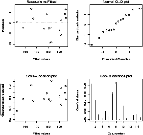
Figure 51: Example of plot(lm(y ~ x))
Note, this is different from plot(x,y) which produces a
scatter plot. These plots have:
-
Residuals vs. fitted
- This plots the fitted (y^) values
against the residuals. Look for spread around the line y=0 and
no obvious trend.
- Normal qqplot
- The residuals are normal if this graph falls close
to a straight line.
- Scale-Location
- This plot shows the square root of the
standardized residuals. The tallest points, are the largest
residuals.
- Cook's distance
- This plot identifies points which have a lot
of influence in the regression line.
Other ways to investigate the data could be done with the
exploratory data analysis techniques mentioned previously.
13.3 Statistical inference
If you are satisfied that the model fits the data, then statistical
inferences can be made. There are 3 parameters in the model:
s, b0 and b1.
Recall, s is the standard deviation of the error
terms. If we had the exact regression line, then the error terms
and the residuals would be the same, so we expect the residuals to
tell us about the value of s.
What is true, is that
is an unbiased estimator of s2. That is, its sampling
distribution has mean of s2. The division by n-2 makes
this correct, so this is not quite the sample variance of the
residuals. The n-2
intuitively comes from the fact that there are two values
estimated for this problem: b0 and b1.
13.5 Inferences about b1
The estimator b1 for b1, the slope of the regression line,
is also an unbiased estimator. The standard error is given by
|
SE(b1) = |
| s |
|
æ
ç
ç
è |
å(xi - |
|
)2 |
ö
÷
÷
ø |
|
|
|
The distribution of the normalized value of b1 is
and it has the t-distribution with n-2 d.f. Because of this, it is
easy to do a hypothesis test for the slope of the regression line.
If the null hypothesis is H0: b1 = a against the alternative
hypothesis HA: b1 ¹ a then one calculates the t statistic
and finds the p-value from the t-distribution.
Example: Max heart rate (cont.)
Continuing our heart-rate example, we can do a test to see if
the slope of -1 is correct. Let
H0 be that
b1=-1, and
HA be that
b1 ¹ -1. Then we can create the test
statistic and find the
p-value by hand as follows:
> es = resid(lm.result)         # the residuals lm.result
> b1 =(coef(lm.result))[['x']]  # the x part of the coefficients
> s = sqrt( sum( es^2 ) / (n-2) )
> SE = s/sqrt(sum((x-mean(x))^2))
> t = (b1 - (-1) )/SE           # of course  - (-1) = +1
> pt(t,13,lower.tail=FALSE)     # find the right tail for this value of t
                                # and 15-2 d.f.
[1] 0.0023620
The actual
p-value is twice this as the problem is two-sided.
We see that it is unlikely that for this data the slope is
-1. (Which is the slope predicted by the formula 220 - Age.)
R will automatically do a hypothesis test for the assumption
b1=0 which means no slope. See how the p-value is included in the output
of the summary command in the column Pr(>|t|)
Coefficients:
             Estimate Std. Error t value Pr(>|t|)
(Intercept) 210.04846    2.86694   73.27  < 2e-16 ***
x            -0.79773    0.06996  -11.40 3.85e-08 ***
13.6 Inferences about b0
As well, a statistical test for b0 can be made (and is). Again,
R includes the test for b0 = 0 which tests to see if the
line goes through the origin. To do other tests, requires a
familiarity with the details.
The estimator b0 for b0 is also unbiased, and has standard
error given by
|
SE(b0) = s |
æ
ç
ç
ç
ç
ç
è |
|
ö
÷
÷
÷
÷
÷
ø |
|
= s |
æ
ç
ç
ç
ç
ç
è |
|
+ |
|
ö
÷
÷
÷
÷
÷
ø |
|
Given this, the statistic
has a t-distribution with n-2 degrees of freedom.
Example: Max heart rate (cont.)
Let's check if the data supports the intercept of 220. Formally,
we will test
H0:
b0 = 220 against
HA:
b0 < 220. We
need to compute the value of the test statistic and then look up
the one-sided
p-value. It is similar to the previous example and
we use the previous value of
s:
> SE = s * sqrt( sum(x^2)/( n*sum((x-mean(x))^2)))
> b0 = 210.04846                # copy or use
> t = (b0 - 220)/SE             # (coef(lm.result))[['(Intercept)']]
> pt(t,13,lower.tail=TRUE)      # use lower tail (220 or less)
[1] 0.0002015734
We would reject the value of 220 based on this
p-value as well.
13.7 Confidence intervals
Visually, one is interested in confidence intervals. The
regression line is used to predict the value of y for a given
x, or the average value of y for a given x and one would
like to know how accurate this prediction is. This is the job of a
confidence interval.
There is a subtlety between the two points above. The mean value
of y is subject to less variability than the value of y and so
the confidence intervals will be different although, they are both
of the same form:
b0 + b1 ± t* SE.
The mean or average value of y for a given x is often denoted
µy | x and has a standard error of
|
SE = s |
æ
ç
ç
ç
ç
ç
è |
|
+ |
|
ö
÷
÷
÷
÷
÷
ø |
|
If we are trying to predict a single value of y, then SE changes ever so slightly to
|
SE = s |
æ
ç
ç
ç
ç
ç
è |
1+ |
|
+ |
|
ö
÷
÷
÷
÷
÷
ø |
|
But this makes a big difference. The plotting of confidence intervals
in R is aided with the predict function. For convenience,
the function simple.lm will plot both confidence intervals if
you ask it by setting show.ci=TRUE.
Example: Max heart rate (cont.)
Continuing, our example, to find simultaneous confidence intervals
for the mean and an individual, we proceed as follows
## call simple.lm again
> simple.lm(x,y,show.ci=TRUE,conf.level=0.90)
This produces this graph (figure
52) with
both 90% confidence bands drawn. The wider set of bands is for the individual.
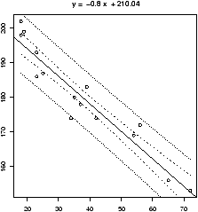
Figure 52: simple.lm with show.ci=TRUE
R Basics: The low-level R commands
The function
simple.lm will do a lot of the work for you,
but to really get at the regression model, you need to learn how to
access the data found by the
lm command. Here is a short
list.
-
To make a lm object
- First, you need use the
lm function and store the results. Suppose x and
y are as above. Then
> lm.result = lm(y ~ x)
will store the results into the variable lm.result.
- To view the results
- As usual, the summary method will
show you most of the details.
> summary(lm.result)
... not shown ...
- To plot the regression line
- You make a plot of the data, and
then add a line with the abline command
> plot(x,y)
> abline(lm.result)
- To access the residuals
- You can use the resid method
> resid(lm.result)
... output is not shown ...
- To access the coefficients
- The coef function will
return a vector of coefficients.
> coef(lm.result)
(Intercept)           x
210.0484584  -0.7977266
To get at the individual ones, you can refer to them by number, or
name as with:
> coef(lm.result)[1]
(Intercept)
   210.0485
> coef(lm.result)['x']
         x
-0.7977266
- To get the fitted values
- That is to find yi^ = b0
+ b1 xi for each i, we use the fitted.values command
> fitted(lm.result)             # you can abbreviate to just fitted
... output is not shown ...
- To get the standard errors
- The values of s and SE(b0)
and SE(b1) appear in the output of summary. To access them
individually is possible with the right know how. The key is that
the coefficients method returns all the numbers in a
matrix if you use it on the results of summary
> coefficients(lm.result)
(Intercept)           x
210.0484584  -0.7977266
> coefficients(summary(lm.result))
               Estimate Std. Error   t value     Pr(>|t|)
(Intercept) 210.0484584 2.86693893  73.26576 0.000000e+00
x            -0.7977266 0.06996281 -11.40215 3.847987e-08
To get the standard error for x then is as easy as taking the
2nd row and 2nd column. We can do this by number or name:
> coefficients(summary(lm.result))[2,2]
[1] 0.06996281
> coefficients(summary(lm.result))['x','Std. Error']
[1] 0.06996281
- To get the predicted values
- We can use the predict
function to get predicted values, but it is a little clunky to
call. We need a data frame with column names matching the
predictor or explanatory variable. In this example this is
x so we can do the following to get a prediction for a 50
and 60 year old we have
> predict(lm.result,data.frame(x= c(50,60)))
       1        2
170.1621 162.1849
- To find the confidence bands
- The confidence bands would be a
chore to compute by hand. Unfortunately, it is a bit of a chore to get
with the low-level commands as well. The predict method
also has an ability to find the confidence bands if we learn how
to ask. Generally speaking, for each value of x we want a point
to plot. This is done as before with a data frame containing all
the x values we want. In addition, we need to ask for the
interval. There are two types: confidence, or prediction. The
confidence will be for the mean, and the prediction for the
individual. Let's see the output, and then go from there. This is
for a 90% confidence level.
> predict(lm.result,data.frame(x=sort(x)), # as before
+ level=.9, interval="confidence") # what is new
fit lwr upr
1 195.6894 192.5083 198.8705
2 195.6894 192.5083 198.8705
3 194.8917 191.8028 197.9805
... skipped ...
We see we get 3 numbers back for each value of x. (note we sorted
x first to get the proper order for plotting.) To plot the lower
band, we just need the second column which is accessed with
[,2]. So the following will plot just the lower. Notice, we
make a scatterplot with the plot command, but add the
confidence band with points.
> plot(x,y)
> abline(lm.result)
> ci.lwr = predict(lm.result,data.frame(x=sort(x)),
+ level=.9,interval="confidence")[,2]
> points(sort(x), ci.lwr,type="l") # or use lines()
Alternatively, we could plot this with the curve function as
follows
> curve(predict(lm.result,data.frame(x=x),
+ interval="confidence")[,3],add=T)
This is conceptually easier, but harder to break up, as the curve
function requires a function of x to plot.
13.8 Problems
-
13.1
- The cost of a home depends on the number of bedrooms in the
house. Suppose the following data is recorded for homes in a given
town
| price (in thousands) |
300 |
250 |
400 |
550 |
317 |
389 |
425 |
289 |
389 |
559 |
| No. bedrooms |
3 |
3 |
4 |
5 |
4 |
3 |
6 |
3 |
4 |
5 |
Make a scatterplot, and fit the data with a regression line. On the
same graph, test the hypothesis that an extra bedroom costs $60,000
against the alternative that it costs more.
- 13.2
- It is well known that the more beer you drink, the more your
blood alcohol level rises. Suppose we have the following data on
student beer consumption
| Student |
1 |
2 |
3 |
4 |
5 |
6 |
7 |
8 |
9 |
10 |
| Beers |
5 |
2 |
9 |
8 |
3 |
7 |
3 |
5 |
3 |
5 |
| BAL |
0.10 |
0.03 |
0.19 |
0.12 |
0.04 |
0.095 |
0.07 |
0.06 |
0.02 |
0.05 |
Make a scatterplot and fit the data with a regression line. Test
the hypothesis that another beer raises your BAL by 0.02 percent
against the alternative that it is less.
- 13.3
- For the same Blood alcohol data, do a hypothesis test that the
intercept is 0 with a two-sided alternative.
- 13.4
- The lapse rate is the rate at which temperature drops as you
increase elevation. Some hardy students were interested in checking
empirically if the lapse rate of 9.8 degrees C/km was accurate for
their hiking. To investigate, they grabbed their thermometers and
their Suunto wrist altimeters and found the following data on their
hike
| elevation (ft) |
600 |
1000 |
1250 |
1600 |
1800 |
2100 |
2500 |
2900 |
| temperature (F) |
56 |
54 |
56 |
50 |
47 |
49 |
47 |
45 |
Draw a scatter plot with regression line, and investigate if the
lapse rate is 9.8C/km. (First, it helps to convert to the rate of
change in Fahrenheit per feet with is 5.34 degrees per 1000 feet.)
Test the hypothesis that the lapse rate is 5.34 degrees per 1000
feet against the alternative that it is less than this.
14 Multiple Linear Regression
Linear regression was used to model the effect one variable, an
explanatory variable, has on another, the response variable.
In particular, if one variable changed by some amount, you assumed the
other changed by a multiple of that same amount. That multiple being
the slope of the regression line. Multiple
linear regression does the same, only there are multiple
explanatory variables or regressors.
There are many situations where intuitively this is the correct
model. For example, the price of a new home depends on many factors -- the
number of bedrooms, the number of bathrooms, the location of the
house, etc. When a house is built, it costs a certain amount for the
builder to build an extra room and so the cost of house reflects
this. In fact, in some new developments, there is a pricelist for
extra features such as $900 for an upgraded fireplace.
Now, if you are buying an older house it isn't so clear what the price
should be. However, people do develop rules of thumb to help figure
out the value. For example, these may be add $30,000 for an extra bedroom and $15,000 for an
extra bathroom, or
subtract $10,000 for the busy street. These are intuitive uses of a
linear model to explain the cost of a house based on several
variables. Similarly, you might develop such insights when buying a
used car, or a new computer. Linear regression is also used to predict
performance. If you were accepted to college, the college may have
used some formula to assess your application based on high-school GPA,
standardized test scores such as SAT, difficulty of high-school
curriculum, strength of your letters of recommendation, etc. These
factors all may predict potential performance. Despite there being no
obvious reason for a linear fit, the tools are easy to use and so may
be used in this manner.
14.1 The model
The standard regression model modeled the response variable yi
based on xi as
yi = b0 + b1 xi + ei
where the e are i.i.d. N(0,s2). The task at hand was
to estimate the parameters b0, b1, s2 using the data
(xi,yi). In multiple regression, there are potentially many
variables and each one needs one (or more) coefficients. Again we use
b but more subscripts. The basic model is
yi = b0 + b1 xi1 + b2 xi2 + ··· + bp xip + ei
where the e are as before. Notice, the subscript on the
x's involves the ith sample and the number of the variable 1, 2,
..., or p.
A few comments before continuing
The method of least squares is typically used to find the coefficients
bj, j = 0,1,...,p. As with simple regression, if we have estimated the
b's with b's then the estimator for yi is
|
|
|
i = b0 + b1 xi1 + ··· + bn xip
|
If the model is appropriate for the data, statistical inference can be made as
before. The estimators, bi (also known as bi), have known standard
errors, and the distribution of (bi - bi)/SE(bi) will be the
t-distribution with n-(p+1) degrees of freedom. Note, there are p+1
terms estimated these being the values of b0,b1,...,bp.
Example: Multiple linear regression with known answer
Let's investigate the model and its implementation in
R with data
which we generate ourselves so we know the answer. We explicitly
define the two regressors, and then the response as a linear
function of the regressors with some normal noise added. Notice,
linear models are still solved with the
lm function, but we
need to recall a bit more about the
model formula syntax.
> x = 1:10
> y = sample(1:100,10)
> z = x+y # notice no error term -- sigma = 0
> lm(z ~ x+y) # we use lm() as before
... # edit out Call:...
Coefficients:
(Intercept) x y
4.2e-15 1.0e+00 1.0e+00
# model finds b_0 = 0, b_1 = 1, b_2 = 1 as expected
> z = x+y + rnorm(10,0,2) # now sigma = 2
> lm(z ~ x+y)
...
Coefficients:
(Intercept) x y
0.4694 0.9765 0.9891
# found b_0 = .4694, b_1 = 0.9765, b_2 = 0.9891
> z = x+y + rnorm(10,0,10) # more noise -- sigma = 10
> lm(z ~ x+y)
...
Coefficients:
(Intercept) x y
10.5365 1.2127 0.7909
Notice that as we added more noise the guesses got worse and
worse as expected. Recall that the difference
between
bi and
bi is controlled by the standard error of
bi and the standard deviation of
bi (which the standard error
estimates) is related to
s2 the variance of the
ei.
In short, the more noise the worse the confidence, the more data the
better the confidence.
The model formula syntax is pretty easy to use in this case. To add
another explanatory variable you just ``add'' it to the right side of
the formula. That is to add
y we use
z ~ x + y
instead of simply
z ~ x as in simple regression. If you
know for sure that there is no intercept term (
b0 = 0) as it is
above, you can explicitly remove this by adding -1 to the formula
> lm(z ~ x+y -1) # no intercept beta_0
...
Coefficients:
x y
2.2999 0.8442
Actually, the
lm command only returns the coefficients (and
the formula call) by default. The two methods
summary and
anova can yield more information. The output of
summary
is similar as for simple regression.
> summary(lm(z ~ x+y ))
Call:
lm(formula = z ~ x + y)
Residuals:
Min 1Q Median 3Q Max
-16.793 -4.536 -1.236 7.756 14.845
Coefficients:
Estimate Std. Error t value Pr(>|t|)
(Intercept) 10.5365 8.6627 1.216 0.263287
x 1.2127 1.4546 0.834 0.431971
y 0.7909 0.1316 6.009 0.000537 ***
---
Signif. codes: 0 `***' 0.001 `**' 0.01 `*' 0.05 `.' 0.1 ` ' 1
Residual standard error: 11.96 on 7 degrees of freedom
Multiple R-Squared: 0.8775, Adjusted R-squared: 0.8425
F-statistic: 25.08 on 2 and 7 DF, p-value: 0.000643
First,
summary returns the method that was used with
lm, next is a five-number summary of the residuals. As before,
the residuals are available with the
residuals command. More
importantly, the regression coefficients are presented in a table
which includes their estimates (under
Estimate), their
standard error (under
Std. Error), the
t-value for a
hypothesis test that
bi = 0 under
t value and the
corresponding
p-value for a two-sided test. Small
p-values are
flagged as shown with the 3 asterisks,
***, in the
y
row. Other tests of hypotheses are easily done knowing the first two
columns and the degrees of freedom. The standard error for the residuals is given along with its
degrees of freedom. This allows one to investigate the residuals
which are again available with the
residuals method. The
multiple and adjusted
R2 is given.
R2 is interpreted as the
``fraction of the variance explained by the model.'' Finally the
F
statistic is given. The
p-value for this is from a hypotheses test
that
b1 = 0 =
b2 = ··· =
bp. That is, the
regression is not appropriate. The theory for this comes
from that of the analysis of variance (ANOVA).
Example: Sale prices of homes
The
homeprice
dataset contains information about homes that
sold in a town of New Jersey in the year 2001. We wish to develop
some rules of thumb in order to help us figure out what are
appropriate prices for homes. First, we need to explore the data a
little bit. We will use the
lattice graphics package for the
multivariate analysis. First we define the useful
panel.lm
function for our graphs.
> library(lattice);data(homeprice);attach(homeprice)
> panel.lm = function(x,y) {
+ panel.xyplot(x,y)
+ panel.abline(lm(y~x))}
> xyplot(sale ~ rooms | neighborhood,panel= panel.lm,data=homeprice)
## too few points in some of the neighborhoods, let's combine
> nbd = as.numeric(cut(neighborhood,c(0,2,3,5),labels=c(1,2,3)))
> table(nbd) # check that we partitioned well
nbd
1 2 3
10 12 7
> xyplot(sale ~ rooms | nbd, panel= panel.lm,layout=c(3,1))
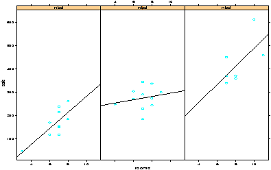
Figure 53: lattice graphic with sale price by number of rooms and
neighborhood
The last graph is plotted in
figure
53.
We compressed the
neighborhood variable as the data was to thinly
spread out. We kept it numeric using
as.numeric as
cut returns a
factor. This is not necessary for
R
to do the regression, but to fit
the above model without modification we need to use a numeric
variable and not a categorical one. The figure shows the
regression lines for the 3 levels of the neighborhood. The multiple
linear regression model assumes that the regression line should have
the same slope for all the levels.
Next, let's find the coefficients for the model. If you are still
unconvinced that the linear relationships are appropriate, you might
try some more plots. The
pairs(homeprice) command gives a
good start.
We'll begin with the regression on bedrooms and neighborhood.
> summary(lm(sale ~ bedrooms + nbd))
...
Coefficients:
Estimate Std. Error t value Pr(>|t|)
(Intercept) -58.90 48.54 -1.213 0.2359
bedrooms 35.84 14.94 2.400 0.0239 *
nbd 115.32 15.57 7.405 7.3e-08 ***
This would say an extra bedroom is worth $35 thousand, and a better
neighborhood $115 thousand. However, what does that negative
intercept mean? If there are 0 bedrooms (a small house!) then the
house is worth
> -58.9 + 115.32*(1:3) # nbd is 1, 2 or 3
[1] 56.42 171.74 287.06
This is about correct, but looks funny.
Next, we know that home buyers covet bathrooms. Hence, they should
add value to a house. How much?
> summary(lm(sale ~ bedrooms + nbd + full))
...
Coefficients:
Estimate Std. Error t value Pr(>|t|)
(Intercept) -67.89 47.58 -1.427 0.1660
bedrooms 31.74 14.77 2.149 0.0415 *
nbd 101.00 17.69 5.709 6.04e-06 ***
full 28.51 18.19 1.567 0.1297
...
That is $28 thousand dollars per full bathroom. This seems a little high, as the
construction cost of a new bathroom is less than this. Could it
possibly be $15 thousand?
To test this we will do a formal hypothesis test -- a one-sided test
to see if this
b is 15 against the alternative it is greater
than 15.
> SE = 18.19
> t = (28.51 - 15)/SE
> t
[1] 0.7427158
> pt(t,df=25,lower.tail=F)
[1] 0.232288
We accept the null hypothesis in this case. The standard error is
quite large.
Before rushing off to buy or sell a home, try to do some of the
problems on this dataset.
Example: Quadratic regression
In 1609 Galileo proved that the trajectory of a body falling with a
horizontal component is a parabola.
15 In the course of gaining insight
into this fact, he set up an experiment which measured two variables,
a height and a distance, yielding the following data
| height (punti) |
100 |
200 |
300 |
450 |
600 |
800 |
1000 |
| dist (punti) |
253 |
337 |
395 |
451 |
495 |
534 |
574 |
In plotting the data, Galileo apparently saw the parabola and with
this insight proved it mathematically.
Our modern eyes, now expect parabolas. Let's see if linear
regression can help us find the coefficients.
> dist = c(253, 337,395,451,495,534,574)
> height = c(100,200,300,450,600,800,1000)
> lm.2 = lm(dist ~ height + I(height^2))
> lm.3 = lm(dist ~ height + I(height^2) + I(height^3))
> lm.2
...
(Intercept) height I(height^2)
200.211950 0.706182 -0.000341
> lm.3
...
(Intercept) height I(height^2) I(height^3)
1.555e+02 1.119e+00 -1.254e-03 5.550e-07
Notice we need to use the construct
I(height2), The
I
function allows us to use the usual notation for powers. (The
^ is used differently in the model notation.)
Looking at a plot of the data with the quadratic curve and the cubic
curve is illustrative.
> quad.fit = 200.211950 + .706182 * pts -0.000341 * pts^2
> cube.fit = 155.5 + 1.119 * pts - .001234 * pts^2 + .000000555 * pts^3
> plot(height,dist)
> lines(pts,quad.fit,lty=1,col="blue")
> lines(pts,cube.fit,lty=2,col="red")
> legend(locator(1),c("quadratic fit","cubic fit"),lty=1:2,col=c("blue","red"))
All this gives us figure
54.
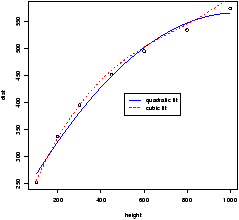
Figure 54: Galileo's data with quadratic and cubic least squares fit.
Both curves seem to fit well. Which to choose? A hypothesis test of
b3 = 0 will help decide between the two choices. Recall this is
done for us with the
summary command
> summary(lm.3)
...
Coefficients:
Estimate Std. Error t value Pr(>|t|)
(Intercept) 1.555e+02 8.182e+00 19.003 0.000318 ***
height 1.119e+00 6.454e-02 17.332 0.000419 ***
I(height^2) -1.254e-03 1.360e-04 -9.220 0.002699 **
I(height^3) 5.550e-07 8.184e-08 6.782 0.006552 **
---
Signif. codes: 0 `***' 0.001 `**' 0.01 `*' 0.05 `.' 0.1 ` ' 1
...
Notice the
p-value is quite small (0.006552) and so is flagged
automatically by
R. This says the null hypothesis (
b3=0)
should be rejected and the alternative (
b3 ¹ 0) is accepted.
We are tempted to attribute this cubic presence to resistance which
is ignored in the mathematical solution which finds the quadratic
relationship.
Some Extra Insight: Easier plotting
To plot the quadratic and cubic lines above was a bit of typing. You
might expect the computer to do this stuff for you. Here is an
alternative which can be generalized, but requires much more sophistication (and just as much
typing in this case)
> pts = seq(min(height),max(height),length=100)
> makecube = sapply(pts,function(x) coef(lm.3) %*% x^(0:3))
> makesquare = sapply(pts,function(x) coef(lm.2) %*% x^(0:2))
> lines(pts,makecube,lty=1)
> lines(pts,makesquare,lty=2)
The key is using the function which takes the coefficients returned
by
coef and ``multiplies'' (
%*%) by the
appropriate powers of
x, namely 1,
x,
x2 and
x3. Then this
function is applied to each value of
pts using
sapply
which finds the value of the function for each value of
pts.
14.2 Problems
-
14.1
- For the
homeprice
dataset, what does a half
bathroom do for the sale price?
- 14.2
- For the
homeprice
dataset, how do the
coefficients change if you force the intercept, b0 to be 0?
(Use a -1 in the model formula notation.) Does it make any
sense for this model to have no intercept term?
- 14.3
- For the
homeprice
dataset, what is the effect of
neighborhood on the difference between sale price and list price? Do
nicer neighborhoods mean it is more likely to have a house go over the
asking price?
- 14.4
- For the
homeprice
dataset, is there a
relationship between houses which sell for more than
predicted (a positive residual) and houses which sell for more than
asking? (If so, then perhaps the real estate agents aren't pricing
the home correctly.)
- 14.5
- For the
babies
dataset, do a multiple regression
of birthweight with regressors the mothers age, weight and
height. What is the value of R2? What are the coefficients? Do
any variables appear to be 0?
15 Analysis of Variance
Recall, the t-test was used to test hypotheses about the means of
two independent samples. For example, to test if there is a difference between
control and treatment groups. The method called analysis of variance
(ANOVA) allows one to compare means for more than 2 independent samples.
15.1 one-way analysis of variance
We begin with an example of one-way analysis of variance.
Example: Scholarship Grading
Suppose a school is trying to grade 300 different scholarship
applications. As the job is too much work for one grader, suppose
6 are used. The scholarship committee would like to ensure that
each grader is using the same grading scale, as otherwise the
students aren't being treated equally. One approach to checking
if the graders are using the same scale is to randomly assign each
grader 50 exams and have them grade. Then compare the grades for
the 6 graders knowing that the differences should be due to chance
errors if the graders all grade equally.
To illustrate, suppose we have just 27 tests and 3 graders (not
300 and 6 to simplify data entry.). Furthermore, suppose the
grading scale is on the range 1-5 with 5 being the best and the
scores are reported as
| grader 1 |
4 |
3 |
4 |
5 |
2 |
3 |
4 |
5 |
| grader 2 |
4 |
4 |
5 |
5 |
4 |
5 |
4 |
4 |
| grader 3 |
3 |
4 |
2 |
4 |
5 |
5 |
4 |
4 |
We enter this into our
R session as follows and then make a data
frame
> x = c(4,3,4,5,2,3,4,5)
> y = c(4,4,5,5,4,5,4,4)
> z = c(3,4,2,4,5,5,4,4)
> scores = data.frame(x,y,z)
> boxplot(scores)
Before beginning, we made a side-by-side boxplot which allows us to
compare the three distributions. From this graph (not shown) it
appears that grader 2 is different from graders 1 and 3.
Analysis of variance allows us to investigate if all the graders
have the same mean. The
R function to do the analysis of
variance hypothesis test (
oneway.test) requires the data to be in a
different format. It wants to have the data with a single variable
holding the scores, and a factor describing the grader or category.
The
stack command will do this for us:
> scores = stack(scores) # look at scores if not clear
> names(scores)
[1] "values" "ind"
Looking at the names, we get the values in the variable
values and the category in
ind. To call
oneway.test we need to use the model formula notation
as follows
> oneway.test(values ~ ind, data=scores, var.equal=T)
One-way analysis of means
data: values and ind
F = 1.1308, num df = 2, denom df = 21, p-value = 0.3417
We see a
p-value of 0.34 which means we accept the null hypothesis of
equal means.
More detailed information about the analysis is available through
the function
anova and
aov as shown below.
15.2 Analysis of variance described
The oneway test above is a hypothesis test to see if the means of
the variables are all equal. Think of it as the generalization of
the two-sample t-test. What are the assumptions on the data? As
you guessed, the data is assumed normal and independent. However, to
be clear lets give some notation. Suppose there are p variables
X1, ...XP. Then each variable has data for it.
Say there are nj data points for the variable Xj (these
can be of different sizes). Finally, Let Xij be the ith
value of the variable labeled Xj. (So in the dataframe
format i is the row and j the column. This is also the usual
convention for indexing a matrix.) Then we assume all of the
following: Xij is normal with mean µj and variance
s2. All the values in the jth column are independent of
each other, and all the other columns. That is, the Xij are
i.i.d. normal with common variance and mean µj.
Notationally we can say
Xij = µj + eij, eij i.i.d
N(0,s2).
The one-way test is a hypothesis test that tests the null hypothesis
that µ1 = µ2 = ··· = µp against that alternative that
one or more means is different. That is
H0: µ1 = µ2 = ··· = µp,
HA: atleast one is not equal.
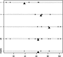
Figure 55: Stripchart showing distribution of 3 variables, all together, and just the means
How does the test work? An example is illustrative.
Figure 55 plots a stripchart of the
3 variables labeled x, y, and z. The variable x is a
simulated normal with mean 40 whereas y and z have mean 60.
All three have variance 102. The figure also plots a stripchart
of all the numbers, and one of just the means of x, y and z.
The point of this illustration16
is to show variation around the means for each row which are
marked with triangles. For the upper three notice there is much
less variation around their mean than for all the 3 sets of
numbers considered together (the 4th row). Also notice that there
is very little variation for the 3 means around the mean of all
the values in the last row. We are led to believe that the large
variation if row 4 is due to differences in the means of x, y
and z and not just random fluctuations. If the three
means were the same, then variation for all the values would be
similar to the variation of any given variable. In this figure,
this is clearly not so.
Analysis of variance makes this specific. How to compare the
variations? ANOVA uses sums of squares. For example, for each
group we have the within group sum of squares
Here X· j-- is the mean of the jth variable. That
is
In many texts this is simply called Xj--.
For all the data, one uses the grand mean, X--, (all the
data averaged) to find the total sum of squares
Finally, the between sum of squares is the name given to the
amount of variation of the means of each variable. In many
applications, this is called the ``treatment'' effect. It is given by
|
between SS |
= |
|
|
|
( |
|
- |
|
)2
= |
|
nj ( |
|
- |
|
)2
= treatment SS.
|
A key relationship is
total SS = within SS + between SS
Recall, the model involves i.i.d. errors with common variance
s2. Each term of the within sum of squares (if normalized) estimates
s2 and so this variable is an estimator for s2.
As well, under the null hypothesis of equal means, the treatment sum
of squares is also an estimator for s2 when properly
scaled.
To compare differences between estimates for a variance, one uses
the F statistic defined below. The sampling distribution is
known under the null hypothesis if the data follow the specified
model. It is an F distribution with (p-1,n-p) degrees of
freedom.
Some Extra Insight: Mean sum of squares
The sum of squares are divided by their respective degrees of
freedom. For example, the within sum of squares uses the
p
estimated means
Xi-- and so there are
n-
p degrees of
freedom. This normalizing is called the
mean sum of squares.
Now, we have formulas and could do all the work ourselves, but
were here to learn how to let the computer do as much work for us
as possible. Two functions are useful in this example:
oneway.test to perform the hypothesis test, and
anova to give detailed
For the data used in figure 55 the output of oneway.test yields
> df = stack(data.frame(x,y,z)) # prepare the data
> oneway.test(values ~ ind, data=df,var.equal=T)
One-way analysis of means
data: values and ind
F = 6.3612, num df = 2, denom df = 12, p-value = 0.01308
By default, it returns the value of F and the p-value but
that's it. The small p value matches our analysis of the figure.
That is the means are not equal. Notice, we set explicitly that
the variances are equal with var.equal=T.
The function anova gives more detail. You need to call it
on the result of lm
> anova(lm(values ~ ind, data=df))
Analysis of Variance Table
Response: values
Df Sum Sq Mean Sq F value Pr(>F)
ind 2 4876.9 2438.5 6.3612 0.01308 *
Residuals 12 4600.0 383.3
---
Signif. codes: 0 `***' 0.001 `**' 0.01 `*' 0.05 `.' 0.1 ` ' 1
The row ind gives the between sum of squares. Notice, it
has p-1 degrees of freedom (p=3 here), the column Mean Sq. is just
the column Sum sq divided by the respective value of
Df. The F value is the ratio of the two mean sums of
squares, and the p-value for the hypothesis test of equal
means. Notice it is identical to that given by
oneway.test.
Some Extra Insight: Using aov
Alternatively, you could use the function aov to
replace the combination of anova(lm()). However, to get
a similar output you need to apply the summary command
to the output of aov.
15.3 The Kruskal-Wallis test
The Kruskal-Wallis test is a nonparametric test that can be used
in place of the one-way analysis of variance test if the data is
not normal. It used in a similar manner as the Wilcoxen
signed-rank test is used in place of the t-test. It too is a
test on the ranks of the original data and so the normality of the
data is not needed.
The Kruskal-Wallis test will be appropriate if you don't believe
the normality assumption of the oneway test. Its use in R is similar
to oneway.test
> kruskal.test(values ~ ind, data=df)
Kruskal-Wallis rank sum test
data: values by ind
Kruskal-Wallis chi-squared = 6.4179, df = 2, p-value = 0.0404
You can also call it directly with a data frame as in
kruskal.test(df). Notice the p-value is small, but not
as small as the oneway ANOVA, however in both cases the null
hypothesis seems doubtful.
15.4 Problems
- 15.1
- The dataset InsectSpray has data on the count of insects in
areas treated with one of 6 different types of sprays. The dataset
is already in the proper format for the oneway analysis of variance
-- a vector with the data (count), and one with a factor describing the
level (spray). First make a side-by-side boxplot to see if
the means are equal. Then perform a oneway ANOVA to check if they
are. Do they agree?
- 15.2
- The simple dataset
failrate
contains the percentage of
students failing for 7 different teachers in their recent
classes. (Students might like to know who are the easy
teachers). Do a one-way analysis of variance to test the
hypothesis that the rates are the same for all 7 teachers.
(You can still use stack even though the columns are not
all the same size.) What do you conclude?
- 15.3
- (Cont.) For the
failrate
dataset construct a test to
see if the professors V2 to V7 have the same mean failrate.
16 Installing R
The main website for R is
http://www.r-project.org. You can
find information about obtaining R. It is freely downloadable and
there are pre-compiled versions for Linux, Mac OS and Windows.
To install the binaries is usually quite straightforward and is
similar to installation of other software. The binaries are
relatively large (around 10Mb) and often there are sets of smaller
files available for download.
As well, the ``R Installation and Administration'' manual
from the distribution is available for download from
http://cran.r-project.org/.
This offers detailed instructions on installation for your machine.
17 External Packages
R comes complete with its base libraries and often some
``recommended'' packages. You can extend your version of R by
installing additional packages. A package is a collection of functions
and data sets that are ``packaged'' up for easy installation. There
are several (over 150) packages available from
http://cran.r-project.org/.
If you want to add a new package to your system, the process is very
easy. On Unix, you simply issue a command such
R CMD INSTALL package_name.tgz
If you have the proper authority, that should be it. Painless.
On Windows you can do the same
Rcmd INSTALL package_name.zip
but this likely won't work as Rcmd won't be on your path, etc. You are
better off using your mouse and the menus available in the GUI
version. Look for the install packages menu item and select the
package you wish to install.
The installation of a package may require compilation of some C or Fortran
code. usually, a Windows machine does not have such a compiler, so authors
typically provide a pre-compiled package in zip format.
For more details, please consult the ``R Installation and
Administrator'' manual.
18 A sample R session
18.1 A sample session involving regression
For illustrative purposes, a sample R session may look like the
following. The graphs are not presented to save space and to
encourage the reader to try the problems themself.
Assignment: Explore mtcars.
Here are some things
to do:
-
Start R.
- First we need to start R. Under Windows this
involves finding the icon and clicking it. Wait a few seconds and
the R application takes over. If you are at a UNIX command
prompt, then typing R will start the R program. If you are using
XEmacs and
ESS then you start XEmacs and then
enter the command M-x R. (That is Alt and x at the same
time, and then R and then enter. Other methods may be applicable to
your case.
- Load the dataset mtcars.
- This dataset is built-in to
R. To access it, we need to tell R we want it. Here is how to do
so, and how to find out the names of the variables. Use
?mtcars to read the documentation on the data set.
> data(mtcars)
> names(mtcars)
[1] "mpg" "cyl" "disp" "hp" "drat" "wt" "qsec" "vs" "am" "gear"
[11] "carb"
- Access the data.
- The data is in a data frame. This makes
it easy to access the data. As a summary, we could access the ``miles
per gallon data'' (mpg) lots of ways. Here are a few: Using
$ as with mtcars$mpg; as a list element as in mtcars[['mpg']]; or as the first column of data using
mtcars[,1]. However, the preferred method is to
attach the dataset to your environment. Then the data is
directly accessible as this illustrates
> mpg # not currently visible
Error: Object "mpg" not found
> attach(mtcars) # attach the mtcars names
> mpg # now it is visible
[1] 21.0 21.0 22.8 21.4 18.7 18.1 14.3 24.4 22.8 19.2 17.8 16.4 17.3 15.2 10.4
[16] 10.4 14.7 32.4 30.4 33.9 21.5 15.5 15.2 13.3 19.2 27.3 26.0 30.4 15.8 19.7
[31] 15.0 21.4
- Categorical Data.
- The value of cylinder is categorical. We can
use table to summarize, and barplot to view the
values. Here is how
> table(cyl)
cyl
4 6 8
11 7 14
> barplot(cyl) # not what you want
> barplot(table(cyl))
If you do so, you will see that for this data 8 cylinder cars are
more common. (This is 1974 car data. Read
more with the help command: help(mtcars) or ?mtcars.)
- Numerical Data.
- The miles per gallon is numeric. What is the
general shape of the distribution? We can view this with a
stem and leaf chart, a histogram, or a boxplot. Here are commands to
do so
> stem(mpg)
The decimal point is at the |
10 | 44
12 | 3
14 | 3702258
16 | 438
18 | 17227
20 | 00445
22 | 88
24 | 4
26 | 03
28 |
30 | 44
32 | 49
> hist(mpg)
> boxplot(mpg)
From the graphs (in particular the histogram) we can see the miles
per gallon are pretty low. What are the summary statistics including
the mean? (This stem graph is a bit confusing. 33.9, the max value,
reads like 32.9. Using a different scale is better as in stem(mpg,scale=3).)
> mean(mpg)
[1] 20.09062
> mean(mpg,trim=.1) # trim off 10 percent from top, bottom
[1] 19.69615 # for a more resistant measure
> summary(mpg)
Min. 1st Qu. Median Mean 3rd Qu. Max.
10.40 15.43 19.20 20.09 22.80 33.90
So half of the cars get 19.20 miles per gallon or less. What is the
variability or spread? There are several ways to measure this: the standard deviation or the
IQR or mad (the median absolute deviation). Here are all three
> sd(mpg)
[1] 6.026948
> IQR(mpg)
[1] 7.375
> mad(mpg)
[1] 5.41149
They are all different, but measure approximately the same thing --
spread.
- Subsets of the data.
-
What about the average mpg for cars that have just 4 cylinders? This
can be answered with the mean function as well, but first we
need a subset of the mpg vector corresponding to just the 4
cylinder cars. There is an easy way to do so.
> mpg[cyl == 4]
[1] 22.8 24.4 22.8 32.4 30.4 33.9 21.5 27.3 26.0 30.4 21.4
> mean(mpg[cyl == 4])
[1] 26.66364
Read this like a sentence -- ``the miles per gallon of the cars with
cylinders equal to 4''. Just remember ``equals'' is == and
not simply =, and functions use parentheses while accessing data uses
square brackets..
- Bivariate relationships.
- The univariate data on miles per gallon
is interesting, but of course we expect there to be some
relationship with the size of the engine. The engine size is stored
in various ways: with the cylinder size, or the horsepower or even
the displacement. Let's view it two ways. First, cylinder size is a
discrete variable with just a few values, a scatterplot will produce an
interesting graph
> plot(cyl,mpg)
We see a decreasing trend as the number of cylinders increases, and
lots of variation between the different cars. We might be tempted to
fit a regression line. To do so is easy with the command
simple.lm which is a convenient front end to the lm
command. (You need to have loaded the Simple package prior to this.)
> simple.lm(cyl,mpg)
Call:
lm(formula = y ~ x)
Coefficients:
(Intercept) x
37.885 -2.876
Which says the slope of the line is -2.876 which in practical terms
means if you step up to the next larger sized engine, your
m.p.g. drops by 5.752 on average.
What are the means for each cylinder size? We did this above for 4
cylinders. If we wanted do this for the 6 and 8 cylinder cars we
could simply replace the 4 in the line above with 6 or 8. If you
wanted a fancy way to do so, you can use tapply which will
apply a function (the mean) to a vector broken down by a
factor:
> tapply(mpg,cyl,mean)
4 6 8
26.66364 19.74286 15.10000
Next, lets investigate the relationship between the numeric variable
horsepower and miles per gallon. The same commands as above will
work, but the scatterplot will look different as horsepower is
essentially a continuous variable.
> simple.lm(hp,mpg)
Call:
lm(formula = y ~ x)
Coefficients:
(Intercept) x
30.09886 -0.06823
The fit doesn't look quite as good. We can test this with the
correlation function cor
> cor(hp,mpg)
[1] -0.7761684
> cor(cyl,mpg)
[1] -0.852162
This is the Pearson correlation coefficient, R. Squaring it gives R2.
> cor(hp,mpg)^2
[1] 0.6024373
> cor(cyl,mpg)^2
[1] 0.72618
The usual interpretation is that 72% of the variation is explained by
the linear relationship for the relationship between the number of
cylinders and the miles per gallon.
We can view all three variables together by using different plotting symbols
based on the number of cylinders. The argument pch controls
this as in
> plot(hp,mpg,pch=cyl)
You can add a legend with the legend command to tell the
reader what you did.
> legend(250,30,pch=c(4,6,8),
+ legend=c("4 cylinders","6 cylinders","8 cylinders"))
(Note the + indicates a continuation line.)
- Testing the regression assumptions.
-
In order to make statistical inferences about the regression line,
we need to ensure that the assumptions behind the statistical model
are appropriate. In this case, we want to check that the residuals
have no trends, and are normallu distributed. We can do
so graphically once we get our hands on the residuals. These are
available through the resid method for the result of an
lm usage.
> lm.res = simple.lm(hp,mpg)
> lm.resids = resid(lm.res) # the residuals as a vector
> plot(lm.resids) # look for change in spread
> hist(lm.resids) # is data bell shaped?
> qqnorm(lm.resids) # is data on straight line?
From the first plot we see that the assumptions are suspicious as
the residuals are basically negative for a while and then they are
mostly positive. This is an indication that the straight line model
is not a good one.
- Clean up.
- There is certainly more to do with this, but not here.
Let's take a break. When leaving an example, you should detach any
data frames. As well, we will quit our R session. Notice you will
be prompted to save your session. If you choose yes, then the next
time you start R in this directory, your session (variables,
functions etc.) will be
restored.
> detach() # clear up namespace
> q() # Notice the parentheses!
The t-tests are the standard test for making statistical
inferences about the center of a dataset.
Assignment: Explore chickwts using t-tests.
-
Start up.
- We start up R as before. If you started in the
same directory, your previous work has been saved. How can you
tell? Try the ls() command to see what is available.
- Attach the data set.
- First we load in the data and attach the
data set
> data(chickwts)
> attach(chickwts)
> names(chickwts)
[1] "weight" "feed"
- EDA
- Let's see what we have. The data is stored in
two columns. The weight and the level of the factor feed
is given for each chick. A boxplot is a good place to look. For
data presented this way, the goal is to make a separate boxplot
for each level of the factor feed. This is done using the
model formula notation of R.
> boxplot(weight ~ feed)
We see that ``casein'' appears to be better than the others. As a
naive check, we
can test its mean against the mean weight.
> our.mu = mean(weight)
> just.casein = weight[feed == 'casein']
> t.test(just.casein,mu = our.mu)
One Sample t-test
data: just.casein
t = 3.348, df = 11, p-value = 0.006501
alternative hypothesis: true mean is not equal to 261.3099
95 percent confidence interval:
282.6440 364.5226
sample estimates:
mean of x
323.5833
The low p-value of 0.006501 indicates that the mean weight for the chicks
fed 'casein' is more than the average weight.
The 'sunflower' feed also looks higher. Is it similar to the
'casein' feed? A two-sample t-test will tell us
> t.test(weight[feed == 'casein'],weight[feed == 'sunflower'])
Welch Two Sample t-test
data: weight[feed == "casein"] and weight[feed == "sunflower"]
t = -0.2285, df = 20.502, p-value = 0.8215
alternative hypothesis: true difference in means is not equal to 0
95 percent confidence interval:
-53.94204 43.27538
sample estimates:
mean of x mean of y
323.5833 328.9167
Notice the p-value now is 0.8215 which indicates that the null
hypothesis should be accepted. That is, there is no indication
that the mean weights are not the same.
The feeds 'linseed' and 'soybean' appear to be the same, and have
the same spread. We can test for the equivalence of the mean, and
in addition use the pooled estimate for the standard
deviation. This is done as follows using var.equal=TRUE
> t.test(weight[feed == 'linseed'],weight[feed == 'soybean'],
+ var.equal=TRUE)
Two Sample t-test
data: weight[feed == "linseed"] and weight[feed == "soybean"]
t = -1.3208, df = 24, p-value = 0.1990
alternative hypothesis: true difference in means is not equal to 0
95 percent confidence interval:
-70.92996 15.57282
sample estimates:
mean of x mean of y
218.7500 246.4286
The null hypothesis of equal means is accepted as the p-value is
not too small.
- Close up.
- Again, lets close things down just for practice.
> detach() # clear up namespace
> q() # Notice the parentheses!
18.3 A simulation example
The t-statistic for a data sets X1,X2,...,Xn is
where X-- is the sample mean and s is the sample standard deviation. If the
Xi's are normal, the distribution is the t-distribution. What if
the Xi are not normal?
Assignment: How robust is the
distribution of t to changes in the distribution of Xi?
This is the job of simulation. We use the computer to generate random
data and investigate the results. Suppose our R session is already
running and just want to get to work.
First, let's define a useful function to create the t statistic for
a data set.
> make.t = function(x,mu) (mean(x)-mu)/( sqrt(var(x)/length(x)))
Now, when we want to make the t-statistic we simply use this function.
> mu = 1;x=rnorm(100,mu,1)
> make.t(x,mu)
[1] -1.552077
That shows the t statistic for one random sample of size 100 from
the normal distribution with mean 1 and standard deviation 1.
We need to use a different distribution, and create lots of random
samples so that we can investigate the distribution of the t
statistic. Here is how to create samples when the Xi are
exponential
> mu = 10;x=rexp(100,1/mu);make.t(x,mu)
[1] 1.737937
Now, we need to create lots of such samples and store them
somewhere. We use a for loop, but first we define a variable to store
our data
> results = c() # initialize the results vector
> for (i in 1:200) results[i] = make.t(rexp(100,1/mu),mu)
That's it. Our numbers are now stored in the variable results.
We could have spread this out over a few lines, but instead we
combined a few functions together. Now we can view the distribution
using graphical tools such as histograms, boxplots and probability
plots.
> hist(res) # histogram looks bell shaped
> boxplot(res) # symmetric, not long-tailed
> qqnorm(res) # looks normal
When n=100, the data looks approximately normal. Which is good as the
t-distribution does too.
What about if n is small? Then the t-distribution has n-1
degrees of freedom and is long-tailed. Will this change things? Let's
see with n=8.
> for (i in 1:200) res[i] = make.t(rexp(8,1/mu),mu)
> hist(res) # histogram is not bell shaped
> boxplot(res) # asymmetric, long-tailed
> qqnorm(res) # not close to $t$ or normal.
We see a marked departure from a symmetric distribution. We conclude
that the t is not this robust.
So, if the underlying distribution is skewed and n is small, the t
distribution is not robust, what about if the underlying distribution
is symmetric, but long-tailed? Let's think of a random distribution
that is like this? Hmmm, how about the t distribution with a few
degrees of freedom? Let's see. We will look at the shape of the
t-statistic with n=8 (7 degrees of freedom) when the underlying
distribution is the t-distribution with 5 degrees of freedom.
> for (i in 1:200) res[i] = make.t(rt(8,5),0)
> hist(res) # histogram is bell shaped
> boxplot(res) # symmetric, long-tailed
> qqnorm(res) # not close to normal.
> qqplot(res,rt(200,7) # close to t with 7 degrees of freedom
We see a symmetric, long-tailed distribution which is not normal, but
is close to the t-distribution with 7 degrees of freedom. We
conclude that the t-statistic is robust to this amount of change in
the tails of the underlying population distribution.
19 What happens when R starts?
When R loads itself it parses some start up files that allow the
user to store user changes to the environment and frequently used
commands. The documentation for these files is accessed with the
command help(Startup).
In particular, the user may store frequently used commands in a file
called .RProfile. This file is searched for in the current
directory and if not found the users home directory. This file should
contain R code. There are special functions though. If the
functions .First or .Last are found, they are executed
as the first (or last) thing done in an R session. As a simple
example, if the .RProfile file was
.First <- function() print("Hola")
.Last <- function() print("Hasta La Vista")
Then when starting R and quitting your screen might look something
like
R is free software and comes with ABSOLUTELY NO WARRANTY.
...
[Previously saved workspace restored]
[1] "Hola"
> q()
Save workspace image? [y/n/c]: n
[1] "Hasta La Vista"
Process R:2 finished...
More useful things for this file are of course quite possible.
20 Using Functions
In R the use of functions allows the user to easily extend and
simplify the R session. In fact, most of R, as distributed, is a
series of R functions. In this appendix, we learn a little bit
about creating your own functions.
20.1 The basic template
The basic template for a function is
function_name <- function (function_arguments) {
function_body
function_return_value
}
Each of these is important. Let's cover them in the order they appear
-
function_name
- The function name, can be just about anything --
even functions or variables previously defined so be careful. Once
you have given the name, you can use it just like any other
function -- with parentheses. For example to define a standard deviation
function using the var function we can do
> std <- function (x) sqrt(var(x))
This has the name std. It is used thusly
> data <- c(1,3,2,4,1,4,6)
> std(data)
[1] 1.825742
If you call it without parentheses you will get the function
definition itself
> std
function (x) sqrt(var(x))
- The keyword function
-
Notice in the definition there is always the keyword
function informing R that the new object is of the
function class. Don't forget it.
- The function_arguments
- The arguments to a function range from
straightforward to difficult. Here are some examples
-
No arguments
- Sometimes, you use a function just as a
convenience and it always does the same thing, so input is not
important. An example might be the ubiquitous ``hello world''
example from just about any computer science book
> hello.world <- function() print("hello world")
> hello.world()
[1] "hello world"
- An argument
-
If you want to personalize this, you can use an argument for the
name. Here is an example
> hello.someone <- function(name) print(paste("hello ",name))
> hello.someone("fred")
[1] "hello fred"
First, we needed to paste the words together before
printing. Once we get that right, the function does the same thing
only personalized.
- A default argument
-
What happens if you try this without an argument? Let's see
> hello.someone()
Error in paste("hello ", name) : Argument "name" is missing, with no default
Hmm, an error, we should have a sensible default. R provides an
easy way for the function writer to provide defaults when you
define the function. Here is an example
> hello.someone <- function(name="world") print(paste("hello ",name))
> hello.someone()
[1] "hello world"
Notice argument = default_value. After the name of the variable, we put an equals sign and
the default value. This is not
assignment, which is done with the <-. One thing to be
aware of is the default value can depend on the data as R
practices lazy evaluation. For example
> bootstrap = function(data,sample.size = length(data) {....
Will define a function where the sample size by default is the
size of the data set.
Now, if we are using a single argument, the above should get you the
general idea. There is more to learn though if you are passing
multiple parameters through.
Consider, the definition of a function for simulating the t
statistic from a sample of normals with mean 10 and standard deviation 5.
> sim.t <- function(n) {
+ mu <- 10;sigma<-5;
+ X <- rnorm(n,mu,sigma)
+ (mean(X) - mu)/(sd(X)/n)
+ }
> sim.t(4)
[1] -1.574408
This is fine, but what if you want to make the mean and standard deviation
variable. We can keep the 10 and 5 as defaults and have
> sim.t <- function(n,mu=10,sigma=5) {
+ X <- rnorm(n,mu,sigma)
+ (mean(X) - mu)/(sd(X)/n)
+ }
Now, note how we can call this function
> sim.t(4) # using defaults
[1] -0.4642314
> sim.t(4,3,10) # n=4,mu=3, sigma=10
[1] 3.921082
> sim.t(4,5) # n=4,mu=5,sigma the default 5
[1] 3.135898
> sim.t(4,sigma=100) # n-4,mu the default 10, sigma=100
[1] -9.960678
> sim.t(4,sigma=100,mu=1) # named arguments don't need order
[1] 4.817636
We see, that we can use the defaults or not depending on how we call
the function. Notice we can mix positional arguments and
named arguments. The positional arguments need to match up
with the order that is defined in the function. In particular, the
call sim.t(4,3,10) matches 4 with n, 3 with
mu and 10 with sigma, and sim.t(4,5) matches
4 with n, 5 with mu and since nothing is in the
third position, it uses the default for sigma. Using named
arguments, such as sim.t(4,sigma=100,mu=1) allows you to
switch the order and avoid specifying all the values. For arguments
with lots of variables this is very convenient.
There is one more possibility that is useful, the ... variable
. This means, take these values and pass them on to an
internal function. This is useful for graphics. For example to plot
a function, can be tedious. You define the values for x, apply the
values to create y and then plot the points using the line
type. (Actually, the curve function does this for you). Here is a
function that will do this
> plot.f <- function(f,a,b,...) {
+ xvals<-seq(a,b,length=100)
+ plot(xvals,f(xvals),type="l",...)
+ }
Then plot.f(sin,0,2*pi) will plot the sine curve from 0 to
2p and plot.f(sin,0,2*pi,lty=4) will do the same, only
with a different way of drawing the line.
- The function_body and function_return_value
- The body of the
function and its return value do the work of the function. The value
that gets returned is the last thing evaluated. So if only one thing is
found, it is easy to write a function. For example, here is a simple
way of defining an average
> our.average <- function (x) sum(x)/length(x)
> our.average(c(1,2,3)) # average of 1,2,3 is 2
[1] 2
Of course the function mean does this for you -- and more
(trimming, removal of NA etc.).
If your function is more complicated, then the function's body and
return value are enclosed in braces: {}.
In the body, the function may use variables. usually these are
arguments to the function. What if they are not though? Then R goes
hunting to see what it finds. Here is a simple example. Where and
how R goes hunting is the topic of scope which is
covered more thoroughly in some of the other documents listed in
the ``Sources of help, documentation'' appendix.
> x<-c(1,2,3) # defined outside the function
> our.average()
[1] 2
> rm(x)
> our.average()
Error in sum(x) : Object "x" not found
20.2 For loops
A for loop allows you to loop over values in a vector or list of
numbers. It is a powerful programming feature. Although, often in
R one writes functions that avoid for loops in favor of those using
a vector approach, a for loop can be a useful thing. When learning
to write functions, they can make the thought process much easier.
Here are some simple examples. First we add up the numbers in the
vector x (better done with sum)
> silly.sum <- function (x) {
+ ret <- 0;
+ for (i in 1:length(x)) ret <- ret + x[i]
+ ret
+ }
> silly.sum(c(1,2,3,4))
[1] 10
Notice the line for (i in 1:length(x)) ret <- ret + x[i].
This has the basic structure
for (variable in vector) {
expression(s)
}
where in this example variable is i, the
vector is 1,2,...length(x) (to get at the indices of
x) and the expression is the single command
ret <- ret + x[i] which adds the next value of x to
the previous sum. If there is more than one expression, then we can
use braces as with the definition of a function.
(R's for loops are better used in this example to loop over the
values in the vector x and not the indices as in
> for ( i in x) ret <- ret + i
)
Here is an example that is more useful. Suppose you want to plot
something for various values of a parameter. In particular, lets
graph the t distribution for 2,5,10 and 25 degrees of
freedom. (Use par(mfrow=c(2,2)) to get this all on one
graph)
for (i in c(2,5,10,25)) hist(rt(100,df=i),breaks=10)
20.3 Conditional expressions
Conditional expressions allow you to do different things based on
the value of a variable. For example, a naive definition of the absolute
value function could look like this
> abs.x <- function(x) {
+ if (x<0) {x <- -x}
+ x
+ }
> abs.x(3)
[1] 3
> abs.x(-3)
[1] 3
> abs.x(c(-3,3)) # hey this is broken for vectors!
[1] 3 -3
The last line clearly shows, we could do much better than this
(try x[x<0]<- -x[x<0] or the built in function abs).
However, the example should
be clear. If x is less than 0, then we set it equal to
-x just as an absolute value function should.
The basic template is
if (condition) expression
or
if (condition) {
expression(s) if true
} else {
expression(s) to do otherwise
}
There is much, much more to function writing in R. The topic is
covered nicely in some of the materials mentioned in the
appendix ``Sources of help, documentation''.
21 Entering Data into R
It is very convenient to use built-in data sets, but at some point
one wants to enter data into the session from outside of R. However,
there are so many different ways to find data such as on the web, in
a spreadsheet, in a database, in a text file, in the paper.... As
such, there are nearly an equal number of ways to enter in data.
For the authoritative account on how to do this, consult the ``R Data
Import/Export'' guide from
http://cran.r-project.org
What follows below is a much-shortened summary to illustrate quickly
several different methods. Which method is best depends
upon the context. Here, we will show you a variety of them and explain
when they make sense to use.
The c operator combines values. One of its simplest usages is
to combine a sequence of values into a vector of values. For example
> x = c(1,2,3,4)
stores the values 1,2,3,4 into x. This is the easiest way to enter in
data quickly, but suffers if the data set is long.
21.2 using scan
The function scan at its simplest can do the same as c.
It saves you having to type the commas though:
> x=scan()
1 2 3
4
Notice, we start typing the numbers in, If we hit the return key
once we continue on a new row, if we hit it twice in a row, scan
stops. This can be fairly convenient when entering in a few data
points (10-40 say), but you might want to use a file if you have
more.
The scan function has other options, one particularly useful
one is the choice of separator.
21.3 Using scan with a file
If we have our numbers stored in a text file, then scan can
be used to read them in. You just need to tell scan to open
the file and read them in. Here are two examples
Suppose the file ReadWithScan.txt has contents
1 2 3
4
Then the command
> x = scan(file = "ReadWithScan.txt")
will read the contents into your R session.
Now suppose you had some formatting between the numbers you want to
get rid of for example this is now your file ReadWithScan.txt
1,2,3,
4
then
> x=scan(file = "ReadWithScan.txt",sep=",")
works.
21.4 Editing your data
The data.entry command will let you edit existing variables
and data frames with a spreadsheet-like interface. The only gotcha is
that variable you want to edit must already be defined. A simple
usage is
> data.entry(x) # x already defined
> data.entry(x=c(NA)) # if x is not defined already
When the window is closed, the values are saved.
The R command edit will also open a simple window to
edit data. This will let you edit functions easily. It can be used
for data, but if you try, you'll see why it isn't recommended.
An important caveat, you must remember to store the results of the
edit or they vanish when you are done. For example
> x = edit(x) ### NOT edit(x) alone!
The command fix will do the same thing but will
automatically store the results.
21.5 Reading in tables of data
If you want to enter multivariate sets of data, you can do any of
the above for each variable. However, it may be more convenient to read
in tables of data at once.
Suppose you data is in tabular form such as this file
ReadWithReadTable.txt.
Age Weight Height Gender
18 150 65 F
21 160 68 M
45 180 65 M
54 205 69 M
Notice the first row supplies column names,the second and following
rows the data. The command read.table will read this in and
store the results in a data frame. A data frame is a
special matrix where all the variables are stored as columns and each
has the same length. (Notice we need to specify that the headers are
there in this case.)
> x =read.table(file="ReadWithReadTable.txt",header=T)
> x[['Gender']] # a factor, it prints the levels
[1] F M M M
Levels: F M
> x[['Age']] # a numeric vector
[1] 18 21 45 54
> x # default print out for a data.frame
Age Weight Height Gender
1 18 150 65 F
2 21 160 68 M
3 45 180 65 M
4 54 205 69 M
Read table treats the variables as numeric or as factors. A factor
is special class to R and has a special print method. The
"levels" of the factor are displayed after the values are printed.
As well, the internal representation can be a bit surprising.
21.6 Fixed-width fields
Sometimes data comes without breaks. Especially if you interface with
old databases. This data may be of fixed width format (fwf). An
example data set for student information at the College of Staten
Island is of this form (say student.txt)
123456789MTH 2149872 A 0220002
314159319MTH 2149872 B+ 0220002
271828232MTH 2149872 A- 0220002
The first 9 characters are a student id, then 7 characters for the
class, 4 for the section, 4 for the grade, 2 for the semester and 4
for the year. To read such a file in, we can use the read.fwf
command. You need to tell it how big the fields are, and optionally
provide names. Here is how the example above could be read in if the
file were titled student.txt:
> x=read.fwf(file="student.txt",widths=c(9,7,4,4,2,4),
+ col.names=c("id","class","section","grade","sem","year"))
> x
id class section grade sem year
1 123456789 MTH 214 9872 A 2 2000
2 314159319 MTH 214 9872 B+ 2 2000
3 271828232 MTH 214 9872 A- 2 2000
21.7 Spreadsheet data
Alternatively, you may have data from a spreadsheet. The simplest
way to enter this into R is through a file format that both
applications can talk. Typically, this is CSV format (comma
separated values). First, save the data from the spreadsheet as a
CSV file say data.csv. Then the R command
read.csv will read it in as follows
> x=read.csv(file="data.csv")
If you use Windows, there is a developing package RExcel
which allows you to do much much more with R and that
spreadsheet. If you use linux, there is a package for interfacing
with the spreadsheet gnumeric.
21.8 XML, urls
XML or extensible markup language is a file storage format of the
future. R has support for this but you may need to add the XML package to your
R installation. Many external applications can write in XML format. On
UNIX the gnumeric spreadsheet does so. The Microsoft .NET initiative
does too.
R has a function url which will allow you to
read in properly formatted web pages as though you were reading them
with read.table. The syntax is identical, except that when
one specifies the filename, it is replaced with a call to url. For
example, the command might look like
> address="http://www.math.csi.cuny.edu/Statistics/R/R-Notes/sample.txt"
> read.table(file=url(address))
21.9 ``Foreign'' formats
The oddly titled package foreign allows you to read in
other file formats from popular statistics packages such as SAS,
SPSS, and MINITAB. For example, to read MINITAB portable files the
R command is read.mtp.
22 Teaching Tricks
There are several tricks that are of use to teachers of statistics
using R in the lab. Here are a few.
-
Exchanging data with students
- The task of getting data and
functions to the students so that they may easily use it in the lab
is really quite simple using R thanks to some handy commands
provided by R's developers.
The scenario is you, the instructor, have created some functions and
have data sets that will save your students from typing or something
else. You want to get them from your computer to the students. Thus
there are two things: saving and reading in.
-
Saving your work
- The package mechanism for R can be used
for this and should be if you have major amounts of work. However,
if you have a lab sessions worth of data and functions you may not
want to go to the trouble. Instead, you can save the commands and data
using dump into one file.
For example, suppose you have a function
really.convenient.function and a dataset
too.large.to.type and you want to save these in a file to
distribute to your students. This can be done with
> dump( c("really.convenient.function","too.large.to.type"),
file = "file-for-my-students.R")
This creates the file with your given file name which can later be
"sourced" into your student's R session.
- Distributing your work
- You probably can put your file on
floppies and distribute to your students to read in during a lab
session using source.
This is very easy, but not the best
solution if you have access to the internet.
In this case, you can place your file on a web site and then have
your students "source" the file using a url for the file. To be
specific, suppose you put your file so that its web address (url)
is http://www.simpleR.edu/file-for-my-students.R. Then,
students can read this into their session using the following command
> source(file=url("http://www.simpleR.edu/file-for-my-students.R"))
That's it. Make sure your students know how important punctuation
is. If you have a really long base for your url's, you might
suggest to students to define this as a variable so they don't
need to type it. Then the paste command can be used. For
example
> baseurl = "http://www.simpleR.edu/reallylongbaseurl"
> source(file=url(paste(baseurl,"file-for-my-students.R",sep='')))
- Students saving their work
- If a student wishes to save their
working session they can easily do so.
If a student is always assigned to the same machine or is working
with the same account, then when R quits it stores a copy of its
session in a file called .Rdata in the current directory. If R is
started from that directory it will automatically load this in.
If the students move about and want to take a copy of their work
with them, the underlying mechanism is available to them via the
function save.image(). For example, if the student is on the
windows platform, then the following should save the image to a file
on the ``a'' drive in a file called ``rdata.Rd''
> save.image("a:\rdata.Rd")
To load the session back in, the load command is used. This
command will restore from the floppy
> load("a:\rdata.Rd")
As well, the menus in windows allow this to be done with a mouse.
23 Sources of help, documentation
Many questions about R are asked and answered on the R mailing
list. Details for subscribing or posting are on the webpage
www.r-project.org. Please be respectful of the time of others
and only ask questions after giving yourself enough time to figure it out.
There are a number of tutorials, documents and books that can help
one learn R. The fact that the language is very similar to S-Plus
means that the large number of books that pertain to this are readily
applicable to learning R. In this appendix, a list of free
documentation is offered and a few books are quickly reviewed.
-
The R program
-
The R-source contains much documentation. Online help, and several
manuals (in PDF format) are available with the R-software. The
manual ``An Introduction to R'' by the R core
development team is an excellent introduction to R for people
familiar with statistics. It has many interesting examples of R
and a comprehensive treatment of the features of R. It is an
excellent source of information for you after you have finished
these notes.
- Free documentation
- The R project website
http://www.r-project.org has several user
contributed documents. These are located at
http://cran.R-project.org/other-docs.html.
-
statsRus at
http://lark.cc.ukans.edu/ pauljohn/R/statsRus.html
is a well done compilation of R tips and tricks.
- The notes ``Using R for Data Analysis and Graphics'' by John
Maindonald are excellent. They are more advanced than these, but
the first 5 chapters will be very good reading for students at the
level of these notes.
- ``R for Beginners / R pour les débutants'' by Emmanuel
Paradis offers a very concise, but quite helpful guide to the
features of R. It is a valuable resource for looking up aspects
of R.
- ``Kickstarting R'' compiled by Jim Lemon, is a nice, a
short introduction in English.
- ``Notes on the use of R for psychology experiments
and questionnaires'' by Jonathan Baron and Yuelin Li is useful
for students in the social sciences and offers a nice, quick
overview of the data extraction and statistical features of R.
- Books
-
The book ``Introductory Statistics with R'' by P. Dalagard
is aimed at the same audience as these notes. It is much more
comprehensive though. The only drawback is the price which is on the
expensive side for
casual usage.
For advanced users, the book ``Modern Applied
Statistics with S-PLUS'' by W.N. Venables and B.D. Ripley is
fantastic. It is authoritative, informative and full of useful
functions and data sets.
The book "Learning S-Plus" (Duxbury) is a fairly comprehensive
introduction to the powers of S-Plus. It is written at a similar
level as "An Introduction to R".
Index
-
.First, 19
- .Last, 19
- .RProfile, 19, 19
- :, 2.5
- <-, ??, 2.2
- =, ??, 2.2
- ?, 3.9
- #, 2.5
- ANOVA, 15
- abline, 4.7, 4.7, 4.11, 4, 4, 4, 13.1, 13.7
- analysis of variance, 15
- anova, 14.1, 15.2
- apply, 4.2
- apropos(), 3.9
- as.factor, 3.3, 8.2
- attach, 4.6, 5.2
- barplot, 3.4, 3.4, 4.2, 5.5
- boxplot, 5.4, 5.5, 8.2
- bwplot, 5.6
- CLT, 9.3, 9.4
- c, 2.2, 2.2, 2.5, 21.1, 21.1, 21.2
- cbind, 5.5
- chi-squared distribution, 12.1
- chisq.test, 12.4
- coef, 4.7, 13.1, 13.7
- coefficients, 13.7
- col, 3.5
- cor, 4.9
- cor(), 4.9
- covariance, 4.9
- cummax, 2.5
- curve, 4, 4, 4, 4, 4, 6.1, 20.1
- cut, 3.9, 14.1
- cut(), 3.9
- data, 3.11
- data frame, 21.5, 21.5
- data frames, 5.1
- data(), 4.6
- data.entry, 21.4
- data.entry(), 1
- data.frame, 5.1
- density, 3.13, 4.5, 5.5
- diff, 1
- dump, 22
- dunif, 6.1
- Example
-
A difference in distributions?, 12.4
- A function to sum normal numbers, 7.4
- Boxplot of samples of random data, 5.5
- CEO salaries, 3.7, 8.2
- CLT with exponential data, 7.4
- CLT with normal data, 7.2
- Dilemma of two graders, 11.5
- GDP vs. CO2 emissions, 5.5
- Home data, 4.6
- Homedata, 8.2
- Is the die fair?, 12.2
- Keeping track of a stock; adding to the data, 2.5
- Letter distributions, 12.2
- Linear Regression with R, 13.1
- Making numeric data categorical, 3.9
- Max heart rate (cont.), 13.5, 13.6, 13.7
- Movie sales, reading in a dataset, 3.11
- Multiple linear regression with known answer, 14.1
- Presidential Elections: Florida, 4.10
- Quadratic regression, 14.1
- Recovery time for new drug, 11.3
- Sale prices of homes, 14.1
- Scholarship Grading, 15.1
- Seeing both the histogram and boxplot, 3.11
- Smoking survey, 3.2
- Symmetric or skewed, Long or short?, 8.2
- Taxi out times, 11.6
- Taxi time at EWR, 8.2
- Tooth growth, 5.5
- Two surveys, 11.1
- Working with mathematics, 2.5
- Extra
-
prop.test is more accurate, 9.2
- Comparing p-values from t and z, 9.4
- Conditional proportions, 4.2
- Confidence interval isn't always right, 9.1
- Easier plotting, 14.1
- Mean sum of squares, 15.2
- Rank tests, 10
- The difference between fivenum and the quantiles., 3.7
- Using simple.lm to predict, 4.10
- Using aov, 15.2
- Why the cs?, 12.2
- edit, 21.4
- exp, 12.4
- explanatory variable, 14
- extraction by a logical vector, 2.5
- factor, 3.3, 3.9, 14.1
- fitted.values, 13.7
- fivenum, 3.7, 3.7, 7.4
- fivenum(), 3.7
- fix, 21.4
- for, 7.2, 7.2, 8.2
- ftable, 5.5, 4
- function, 7.4, 20.1
- gray, 3.5
- grid, 5.6
- help, 3.9
- help(Startup), 19
- hist, 5.6
- histogram, 5.6
- I, 5.4, 14.1
- IQR, 3.8
- i.i.d., 9.1, 9.1, 12.1
- identify, 4.10, 4.10, 1
- jitter, 4.5
|
- lattice, 5.6, 14.1
- layout, 5.5
- legend, 4.12
- legend.text, 4.2
- level, 5.5
- library, 3.11
- lines, 3.13, 4, 4
- lm, 4.12, 5.4, 5.6, 13.1, 13.1, 13.7, 14.1
- load, 22
- locator, 4.10
- lqs, 4.12, 4.12, 4.12
- lty, 4.12
- Multiple
linear regression, 14
- mad, 3.8
- matplot, 9.1
- max, 1, 6.1
- mean, 2.4, 1, 3.7, 3.8, 9, 9, 9.1, 20.1
- mean sum of squares, 15.2
- mean(), 3.8
- median, 2.4, 3.7
- min, 1, 6.1
- model formula notation, 4.12, 5.4, 5.5, 15.1, 18.2
- model formula syntax, 14.1
- model syntax, 4.3
- names, 3.5, 5.1
- oneway.test, 15.1, 15.2
- outer, 6.2
- Pearson correlation coefficient, 4.9
- pairs, 5.5
- panel.abline, 5.6
- panel.xyplot, 5.6, 5.6
- paste, 6.2, 20.1, 22
- pch, 5.5, 5.5
- pie, 3.5, 3.5
- piechart, 3.5
- plot, 4, 4, 4, 4, 4, 4, 5.5, 13.1, 13.1, 13.2
- pnorm, 6.5, 9.1
- points, 4, 4, 5.5
- predict, 4.10, 13.1, 13.7, 13.7, 13.7
- prompt, 2.1
- prop.table, 4.1
- prop.test, 9, 9.2, 9.2, 9.2, 9.5, 10.1, 11.1
- qnorm, 9.1
- qqline, 7.3
- qqnorm, 7.3, 9.4
- qqplot, 7.3
- quantile, 3.7
- R, 2.1
- RBasics
-
help, ? and apropos, 3.9
- Accessing Data, 2.5
- Graphical Data Entry Interfaces, 2.5
- Plotting graphs using R, 4
- Reading in datasets with library and data, 3.11
- Syntax for for, 7.2
- The low-level R commands, 13.7
- What does attaching do?, 4.6
- rainbow, 3.5
- read.csv, 21.7
- read.fwf, 21.6
- read.mtp, 21.9
- read.table, 1, 21.5, 21.8
- really.convenient.function, 22
- rep, 6.2
- resid, 4.8, 13.1, 13.7
- residual, 14.1
- residuals, 14.1
- rlm, 4.12, 4.12, 4.12, 4.12, 4.12
- rnorm, 5.5
- row.names, 5.1
- rug, 3.10, 4.5, 5.5
- Spearman rank correlation, 4.9
- System.sleep, 6
- sample, 6.2, 6.2, 12.4
- sapply, 14.1
- save.image(), 22
- scale, 4.5, 6.5, 6.5
- scan, 3.4, 21.2, 21.2, 21.3, 21.3, 21.3
- scan(), 3.4
- scatterplot, 4.6
- sd, 3.7
- sd(), 2.5
- seq(), 2.5
- simple.densityplot, 5.5
- simple.eda, 8.1, 8.2
- simple.lm, 4.7, 4.8, 4.12, 13.1, 13.7
- simple.sim, 7.4, 7.4
- simple.violinplot, 4.5, 5.5
- slicing, 2.5
- source, 22
- stack, 5.3, 15.1
- standard deviation, 2.5, 9
- stem(), 3.9
- stripchart, 5.5
- subset, 11.6
- sum of squares, 15.2
- summary, 3.7, 3.7, 3.7, 13.1, 13.1, 13.7, 14.1
- t(), 4.2
- t.test, 9, 9.5, 10.2, 11.5
- table, 3.2, 3.2, 3.2, 3.4, 3.9, 4.1, 4.1, 5.5, 5.5, 5.5
- trellis.device, 5.6
- trimmed mean, 3.8
- ts, 3.11
- typos, 2.2, 2.2, 2.5
- unbiased estimator, 13.5
- unstack, 5.3, 5.3
- url, 21.8
- var, 2.4, 3.7
- variance, 2.5, 9.1
- vector, 2.2, 2.5, 2.5
- which, 2.5, 2.5
- wilcox.test, 9, 9.5, 10.3, 10, 11.6, 11.6
- x, 13.7
- xtabs, 5.5
- xyplot, 5.6, 5.6
|
- 1
- The underscore was originally used as
assignment so a name such as The_Data would actually
assign the value of Data to the variable The. The
underscore is being phased out and the equals sign is being phased
in.
- 2
- Prior to version 1.5.0 this function was called
piechart
- 3
- The tide is turning on the usage of
piecharts and they are no longer used much by statisticians. They
are still frequently found in the media. An interesting editorial
comment is made in the help page for piechart. Try ?pie to
see.
- 4
- Such data is
available from
movieweb.com
- 5
- The data sets for
these notes are available from the CSI
math department and must be installed prior to this.
- 6
- such data is available from
espn.com
- 7
- Of course, this
data is made up by a non-smoker so there may be some bias.
- 8
- This data came from
``Using R for Data Analysis and Graphics'' by John Maindonald.
Further discussions of this data, of a more substantial nature,
may be found on several web sites.
- 9
- A thorough explanation of the syntax and
its usage is found in the manual ``An Introduction to R'' which
accompanies the R software, and the contributed document ``Using
R for Data Analysis and Graphics'' by Maindonald. See the
appendix for more information on these.
- 10
-
Technically R is using a correction to the
above discussion.
- 11
- from the
exec.pay
dataset
- 12
- This example assumes the
fill ups were all roughly the same amount of gas. Otherwise, their
could be errors as the data is averaged.
- 13
- Of course,
the true distribution is for all 26 letters. This is simplified
down to look just at these 5 letters.
- 14
- This data is
simulated, however, the following article suggests a maximum
rate of 207 - 0.7(age): ``Age-predicted maximal heart
rate revisited'' Hirofumi Tanaka, Kevin D. Monahan, Douglas R.
Seals Journal of the American College of Cardiology,
37:1:153-156.
- 15
- This example is taken
from example 10.1.1 in the excellent book ``The Statistical
Sleuth'', Ramsay and Schafer.
- 16
- Which is based on one
appearing in ``The Statistical Sleuth'' by Ramsey and Schafer
Copyright © John Verzani, 2001-2. All rights reserved.
This document was translated from LATEX by
HEVEA.