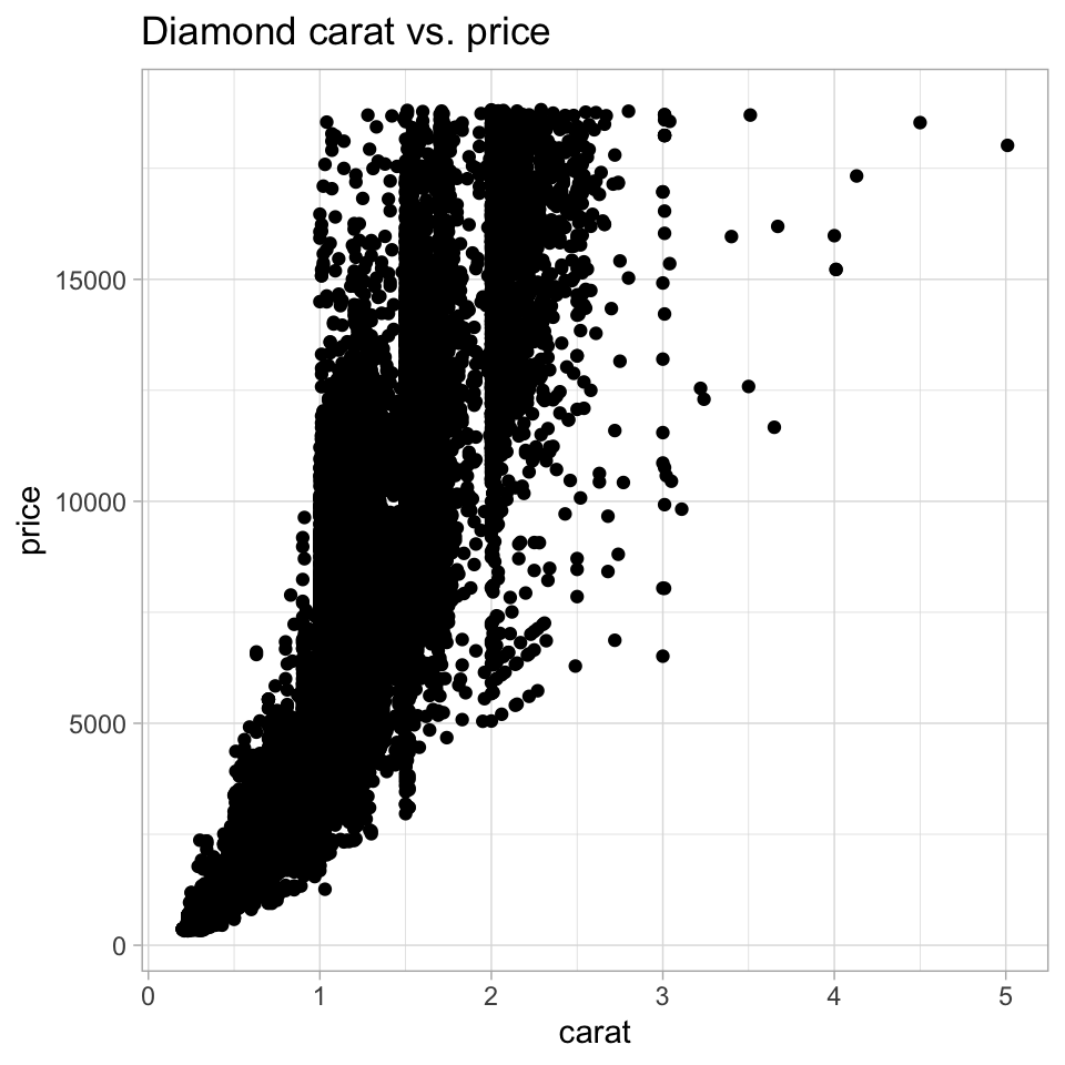
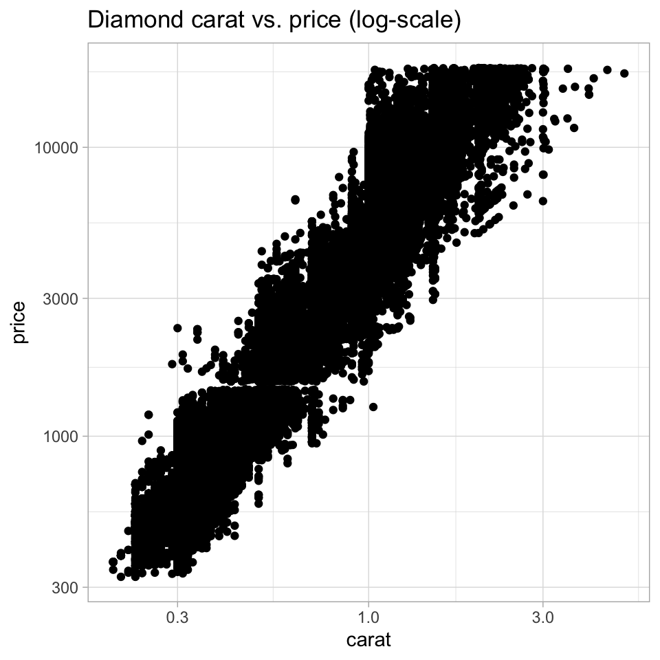
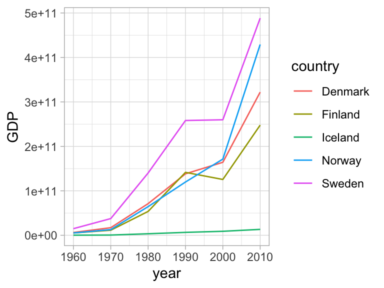
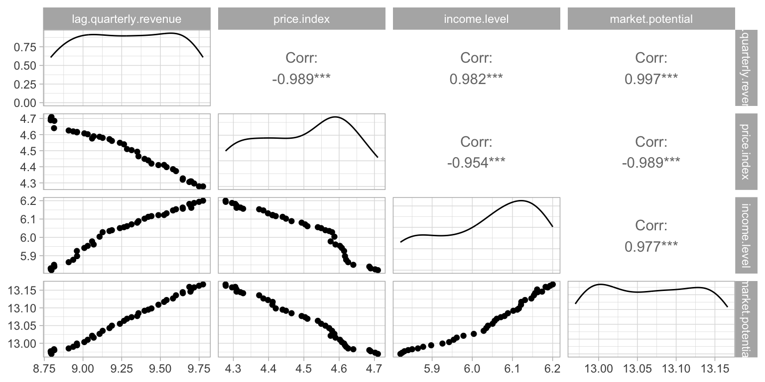
The scatterplot is a widely spread idiom for expressing 2 primary quantitative variables, possibly adding any number of additional attributes in secondary visual channels.
Code
ggplot(diamonds) +geom_point(aes(x=carat, y=price)) +labs(title="Diamond carat vs. price")ggplot(diamonds) +geom_point(aes(x=carat, y=price)) +scale_x_log10() +scale_y_log10() +labs(title="Diamond carat vs. price (log-scale)")ggplot(diamonds) +geom_point(aes(x=carat, y=price, color=color, shape=clarity)) +scale_shape_manual(values=0:10) +scale_x_log10() +scale_y_log10() +labs(title="Diamond carat vs. price (log-scale)")
Separate/Sort/Align: Bi-stacked bar charts
Code
import numpy as npimport scipy as spimport altair as afrom altair import expr, datumfrom vega_datasets import databarley = data.barley()baseline_sel = a.selection_point(name="baseline_sel", on="click", fields=["variety"], bind="legend")a.Chart(barley, title=a.Title("Barley yields in 1931", subtitle="Click a variety to realign the display along that variety")).add_params(baseline_sel).transform_filter( datum.year ==1931).transform_calculate( signed_yield="datum.variety > baseline_sel.variety ? datum.yield : -datum.yield").transform_stack( stack="signed_yield", groupby=["site"], sort=[a.SortField(field="variety", order="ascending")], as_=["yield_lo","yield_hi"]).mark_bar().encode( x=a.X("site:N", title="Site"), y=a.Y("yield_lo:Q", axis=a.Axis(labelExpr="abs(datum.value)"), title="Yield"), y2="yield_hi:Q", fill=a.Fill("variety:N", title="Variety")).properties(width=300, height=300)
Dot-charts, line-charts and bar-charts communicate very similar data types in very similar ways. Crucial distinction in how the viewer perceives the chart:
Lines imply connectivity between the individual observations - leads the eye to look for trends, even if there is no inherent connectivity between the corresponding key attributes.
Bars communicate quantity primarily with an area mark - leads the eye to lend attention proportional to the visual impact of the bar. This is one case where for instance truncated axes lead to misleading charts.
Dot-charts, line-charts, bar-charts
Resulting recommendation:
Dot-charts for quantitative vs. nominal, truncated axis not inherently dishonest
Line-charts for quantitative vs. ordinal
Bar-charts for quantitative vs. nominal, truncated axis inherently dishonest
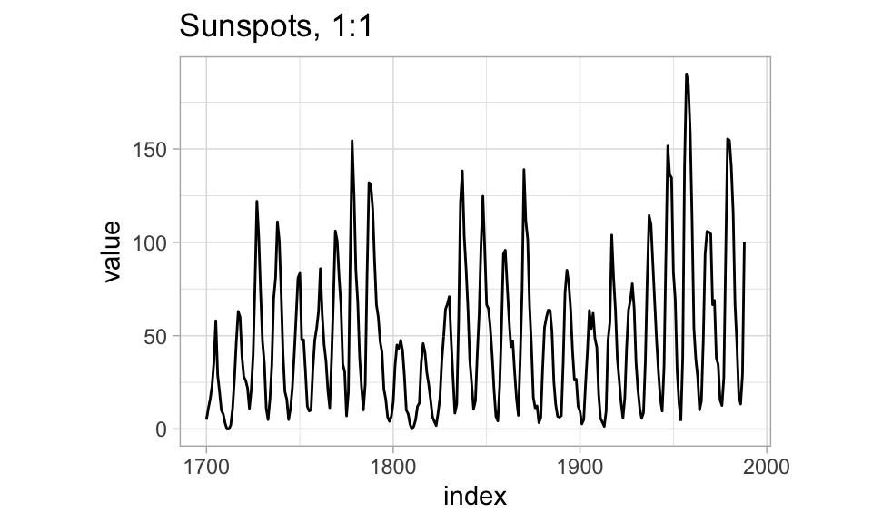
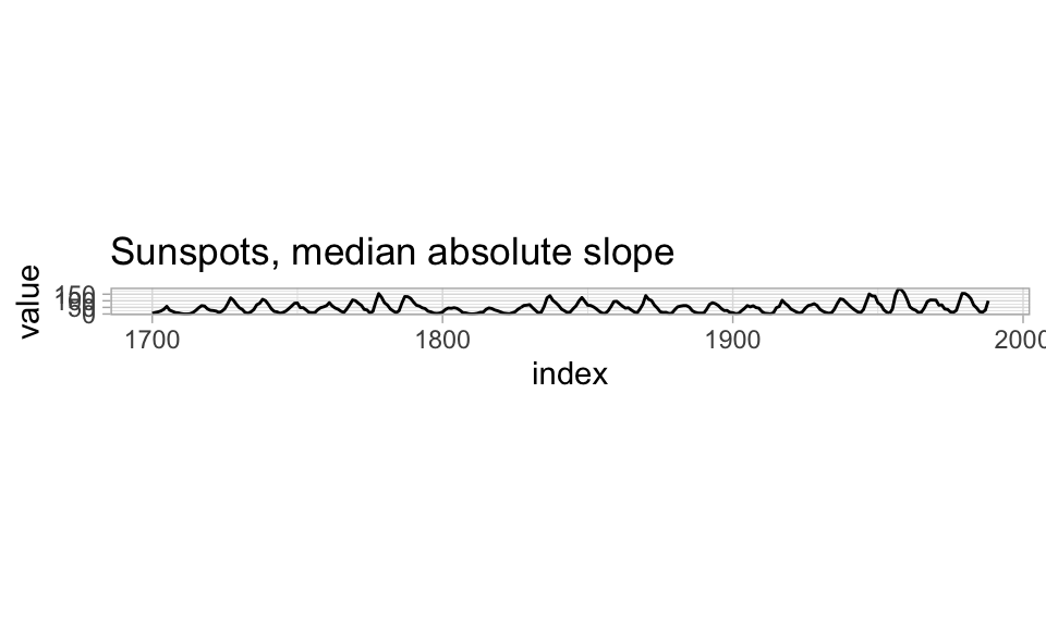
Cleveland and McGill (1987) study perceptual accuracy of slope judgements, approaching the question of which slopes are most accurately read for the shape of a curve.
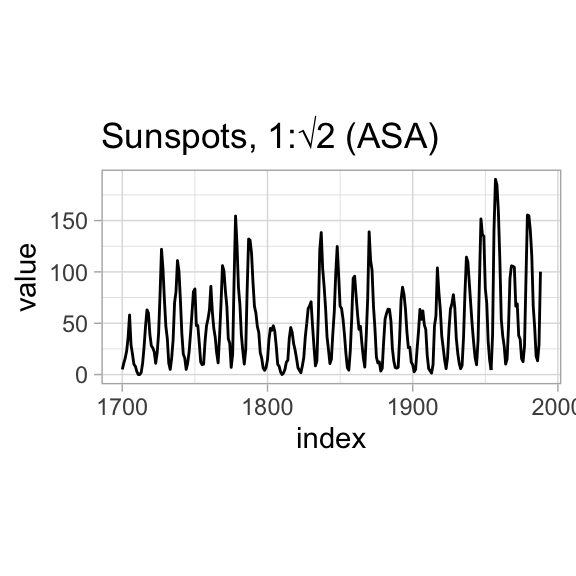
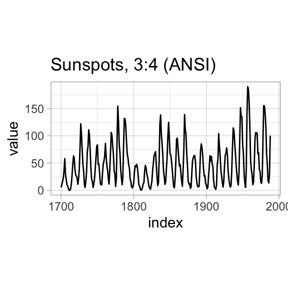
Historically, Karsten (1923) suggested an aspect ratio for graphs of 2:3, American Standards Association (1938) suggested 1:\(\sqrt{2}\), and American Standards Institute (1979) suggested 3:4.
Even if we decide to let the data control the choice of aspect ratio, different writers have different suggestion for which angles might be optimal: Von Huhn (1931) “somewhere between 30º and 45º”, Weld (1947) 35º to 45º, Hall (1958) 30º to 60º, Bertin (1967, 1983) 70º.
In perceptural accuracy experiments on judging similarity between adjacent slanted lines, Cleveland and McGill established the highest accuracy (within a span of 0º - 60º) to be right near slopes of 45º.
As a result, one recommendation for line plots is to make either the median absolute slope or the average absolute slope of the line segments in the line plot be close to 45º: to bank to 45º.
R has support for automatically computing the resulting aspect ratios in the ggthemes::bank_slopes function, while in Python you may have to compute by hand or eyeball the aspect ratio.
More on line plots
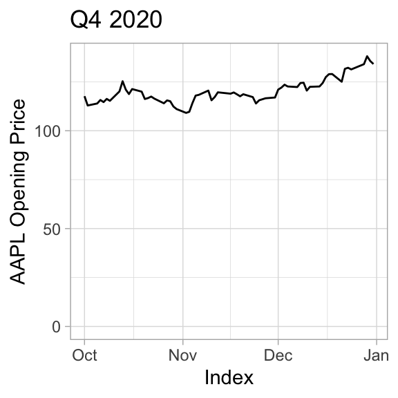
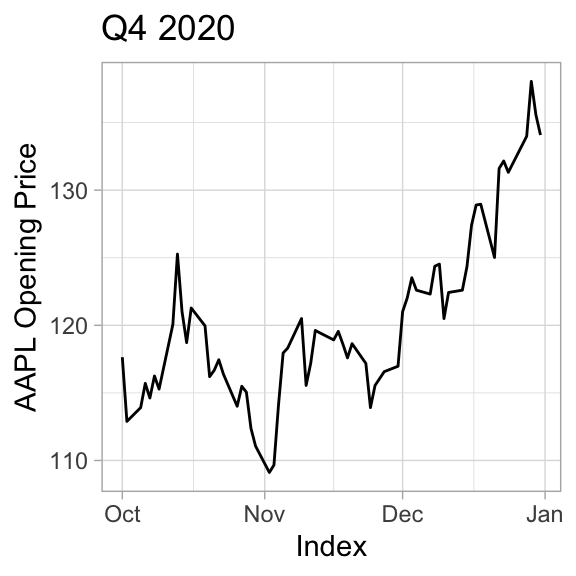
The need to accurately judge shapes and slopes of line graphs also contributes to recommendations on axis truncation.
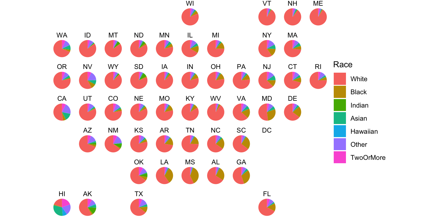
The R help files has the following to say in their description of the pie command to draw pie-charts:
Pie charts are a very bad way of displaying information. The eye is good at judging linear measures and bad at judging relative areas. A bar chart or dot chart is a preferable way of displaying this type of data.
Cleveland (1985), page 264: “Data that can be shown by pie charts always can be shown by a dot chart. This means that judgements of position along a common scale can be made instead of the less accurate angle judgements.” This statement is based on the empirical investigations of Cleveland and McGill as well as investigations by perceptual psychologists.
Radial Layouts
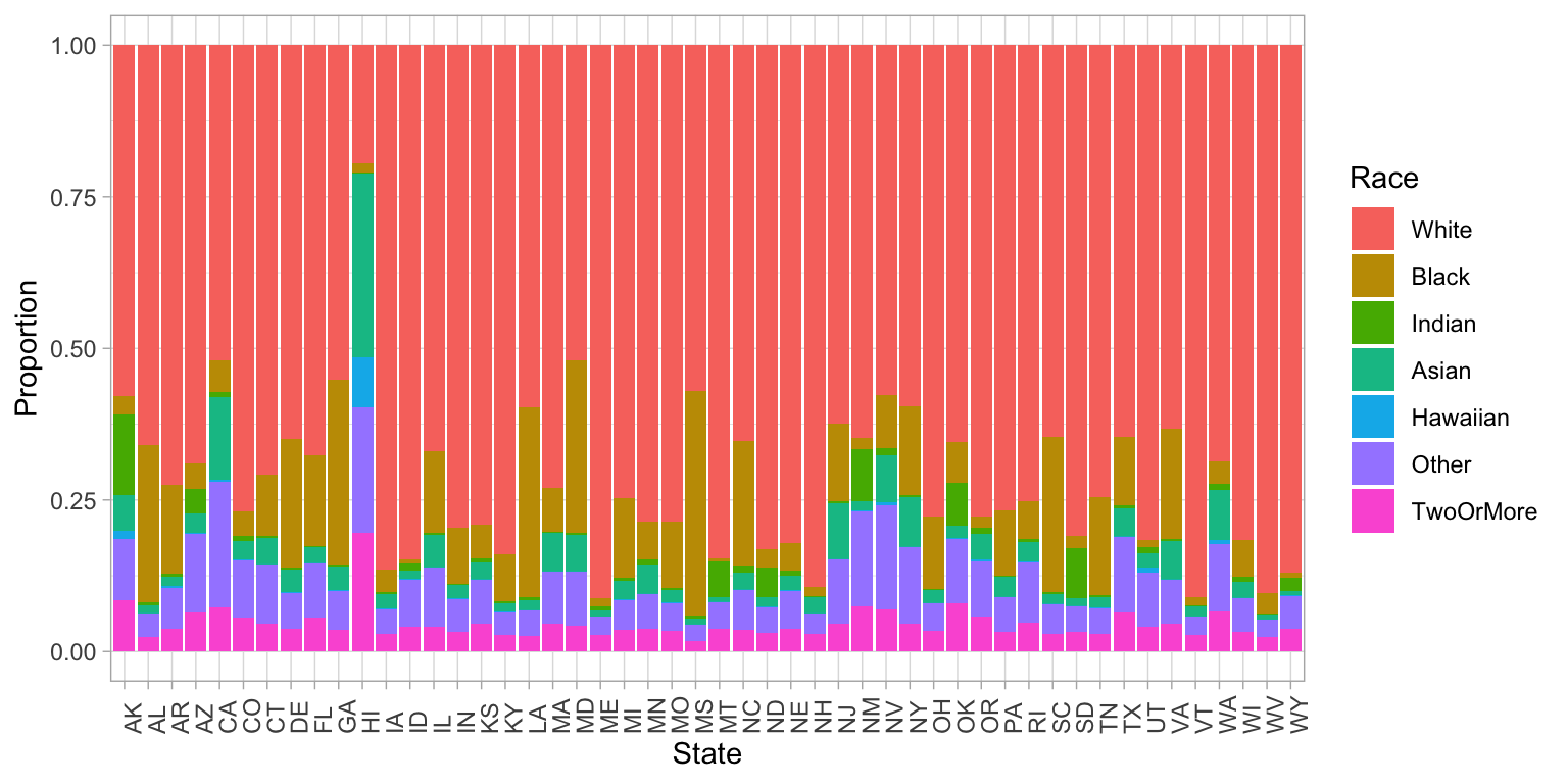
More compact representation than a pie chart, as well as more accurate visual channels, comes with normalized stacked bar charts.
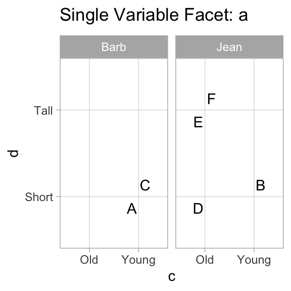
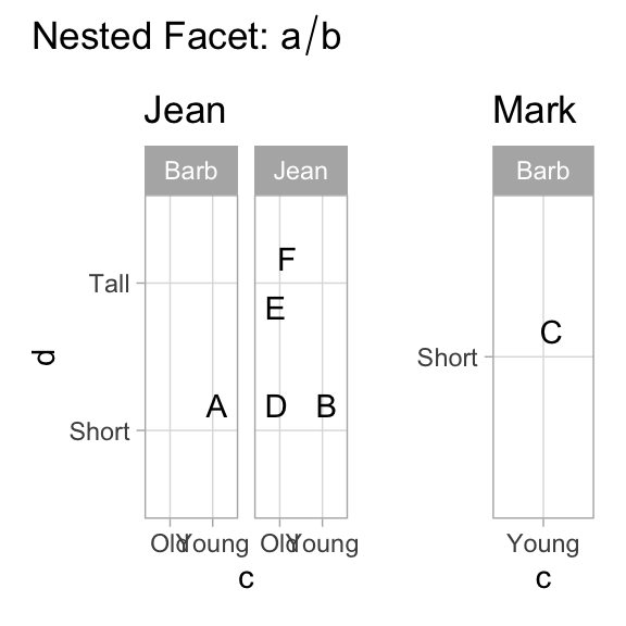
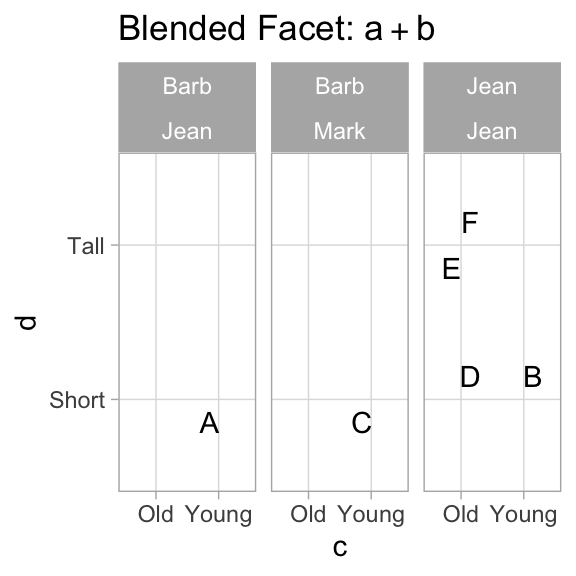
Wilkinson develops an entire algebra of facet specifications. ggplot2 can comfortably handle Wilkinson’s * and + operators, and can be coaxed into handling / with added packages and some hands-on work.