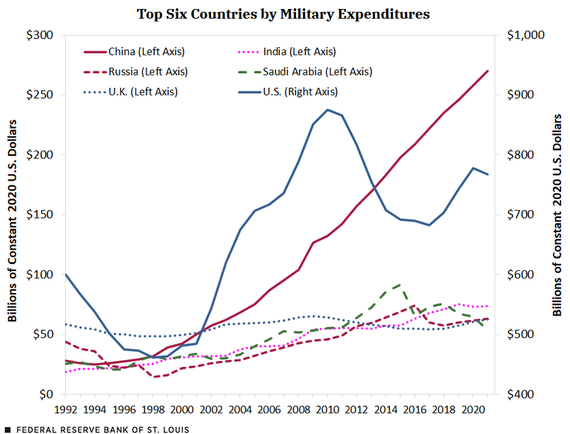
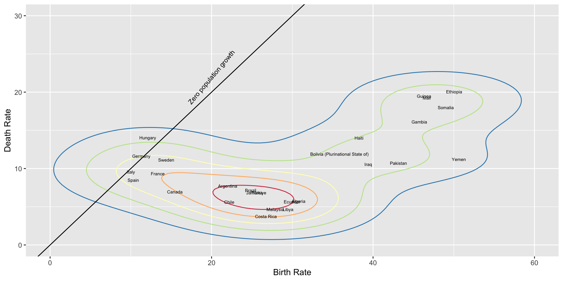
Today’s visualization is not chosen for skillful or appropriate results, but for the somewhat duplicitous use of scales to communicate something other than the data.
Task: Describe, as completely as you can, the design of this graph. Pay attention to whether distinctions are drawn between parts of the data.
Question: Why did I call this duplicitous? What do you think the editorial intent was?
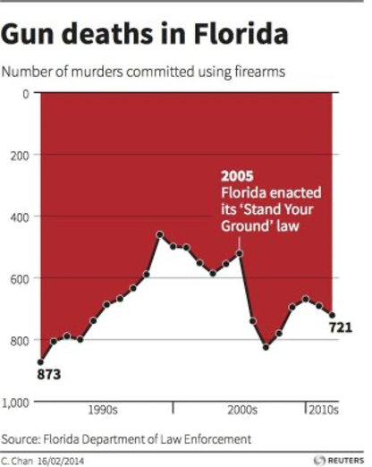
Catching up: Gun Deaths in Florida
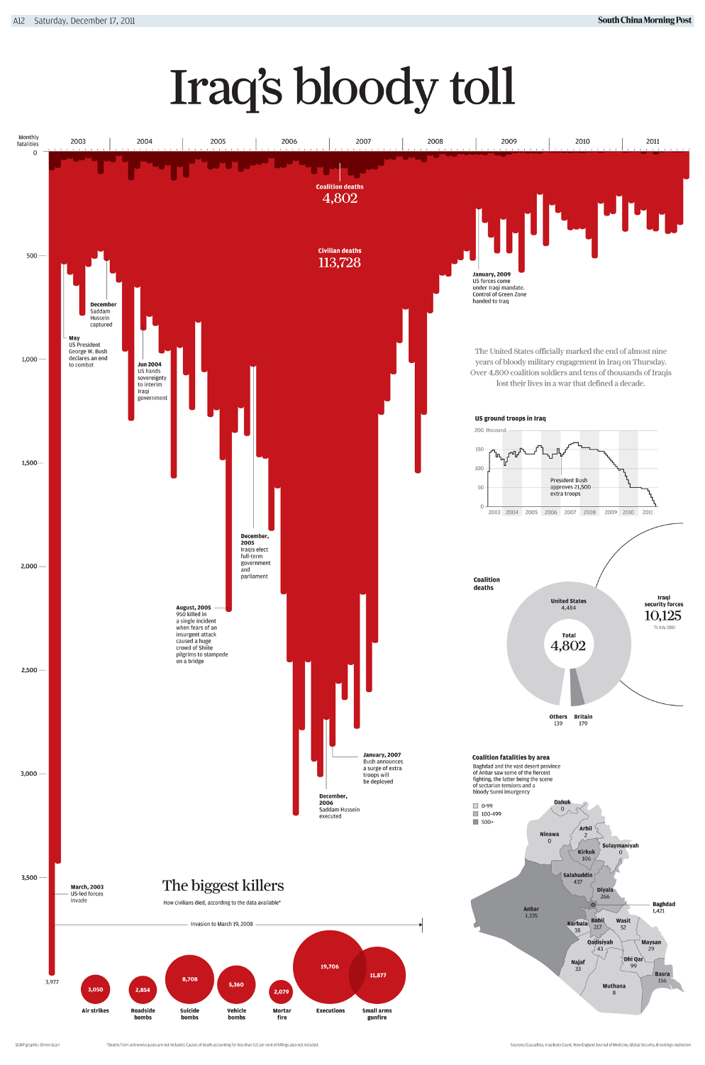
Question: Was the intended metaphor successful? In “Gun deaths in Florida”? In “Iraq’s bloody toll”? What could have been done differently to make the message more efficiently conveyed?
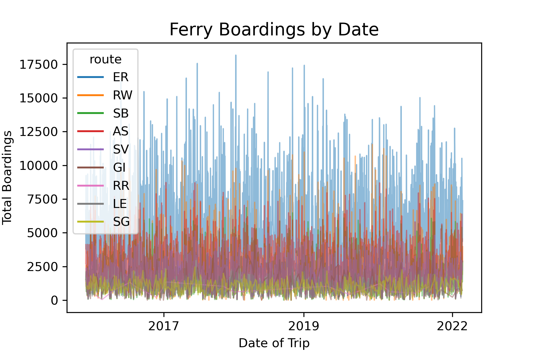
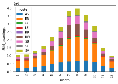
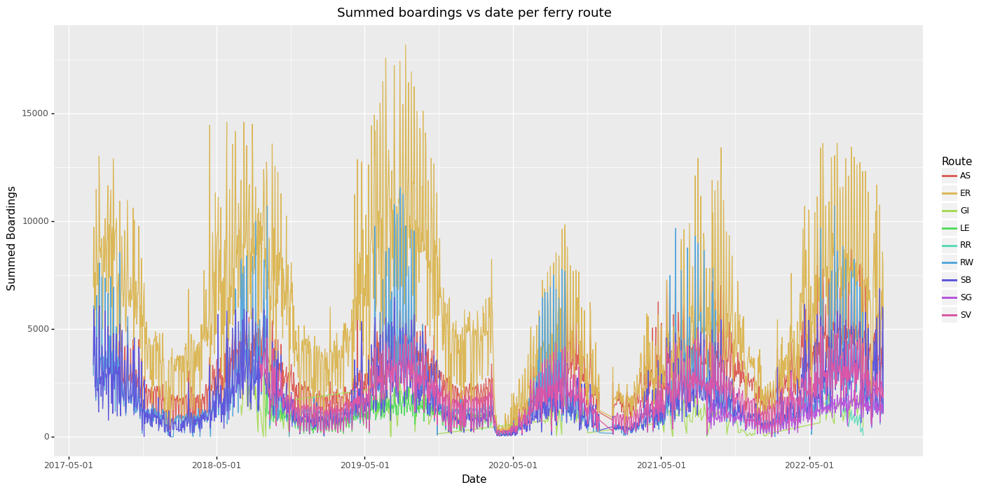
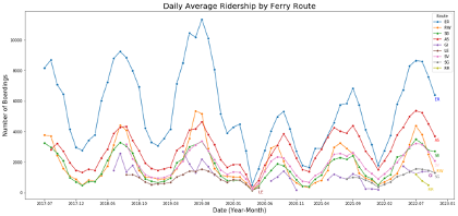
Catching up: Your First Aesthetic Critique
What differences and similarities do you see between the different “Out of the box” plots here?
What would you like to change?
What would you like to check / verify?
Would you like more (or less) binning and aggregation?
What, if any, interactive features would you like?
What, if any, labels, titles, annotations would you like to use?
What would an interesting use case for this plot be?
If you were to pull properties and features freely from all platforms (or add yourself) – how could you specify the most appropriate plot for this use case?
Catching up: Your First Aesthetic Critique
Garima Goyal
Catching up: Your First Aesthetic Critique
Mahfal Naleemul Rahuman
Catching up: Your First Aesthetic Critique
Larry Ryan
Catching up: Your First Aesthetic Critique
Larry Ryan
Catching up: Your First Aesthetic Critique
Sean Sudol
Catching up: Your First Aesthetic Critique
Ryan Mc Neil
Catching up: Your First Aesthetic Critique
GiBeom Park
Catching up: Your First Aesthetic Critique
Joshua Rollins
Catching up: Your First Aesthetic Critique
Giacomo Radaelli
Catching up: Your First Aesthetic Critique
Jordan Matuszewski
Sidebar: on effective homework submission
When submitting your homework, bear in mind that Blackboard only previews a select few file formats. With your submissions, please always make sure you include:
A representative image (JPG or PNG) that I can include in my lecture slides.
Any text included in your notebooks or code extracted in a format that I can easily read (TXT, DOCX, PDF)
For instance, save your ipynb to PDF and upload the PDF as well
Upload image and text as separate files instead of hiding everything instead an archive format (such as ZIP or RAR)
If you do have to use an archive format, make sure it is universally readable (ie, use ZIP and not RAR or other more esoteric formats)
Altair interactive documents can be included into my slides by some fiddly work from an HTML file that includes the graph.
Data Abstraction - how do we represent data?
Types of Data
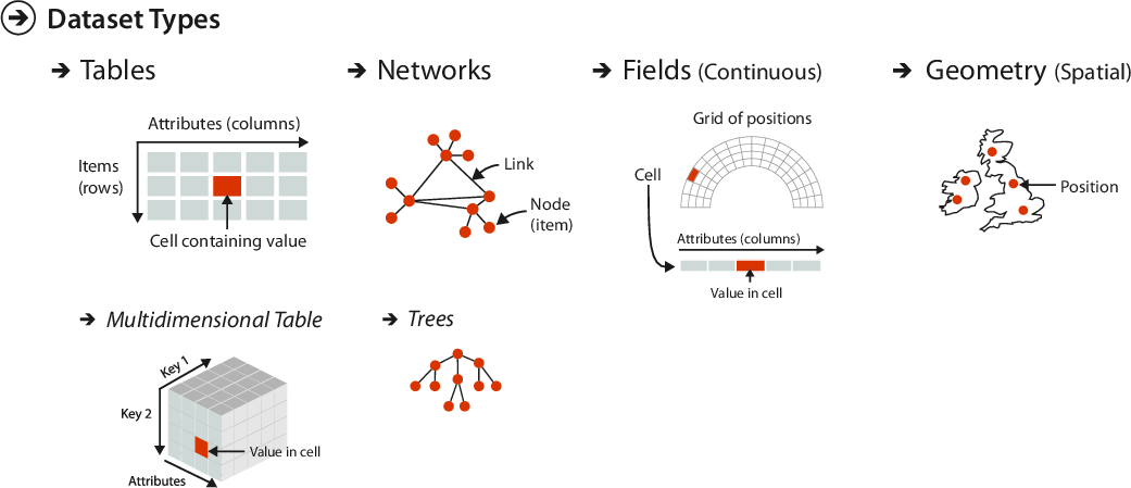
Munzner defines 5 fundamental data types:
Items
Attributes
Links
Positions
Grids
Items
An item is a discrete individual entity - such as a row in a tidy table, or a node in a network.
Attributes
Also called variables or data dimensions or dimensions (thought Munzner reserves dimension for the visual channels of spatial position - ie X/Y/Z-positioning)
Attributes
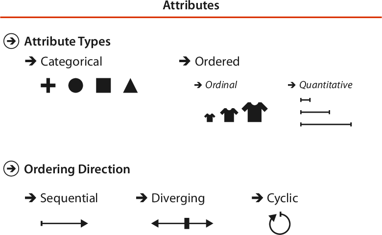
Categorical Data
Categorical (or nominal) data does not intrinsically support arithmetic operations or a total ordering - we can tell the difference between identities but not much more.
Examples include names (of brands, people, places, …), movie genres, file types.
Attributes
Ordered Data
Data that has an implicit (total) ordering we call Ordered Data.
It subdivides into ordinal and quantitative data, depending on whether or not arithmetic operations are meaningful.
Examples include shirt size (ordinal), rankings (ordinal), height (quantitative), weight (quantitative), etc.
Attributes
Ordered - Quantitative Data
Quantitative data itself has several possibly relevant further subdivisions. We can distinguish between integers (\(\mathbb{N}\)) or reals (\(\mathbb{R}\)).
We can distinguish between interval data and ratio data - for interval data, the difference between values is meaningful; for ratio data, the ratio between values is meaningful. Interval data may not have a meaningful 0-value, while ratio data does.
Attributes
Ordered - Sequential / Diverging
Sequential data goes from a minimum value to a maximum value. It does not have to have a meaningful basepoint or 0-value.
Examples: height or weight of a person, course grades, taxation brackets.
Diverging ordinal data instead emerges from one neutral center in two (or, rarely, more) directions of progressively more extreme values.
Examples: temperature (above/below freezing), altitude (above/below sea level), 2-party election forecast (favor one or the other).
Attributes
Ordered - Cyclic
Cyclic “ordinal” data would not necessarily qualify as ordered in a mathematical sense - but features that arrange in a recurrent way impact visualization choices.
An attribute is cyclic if its values wrap around to a starting point after a while.
Examples: time of day, day of week, day of year, year of century; but also compass directions, phase of periodic dynamics.
Links
Links are connections between items. Usually (in networks/graphs), a link will connect two items to each other - but there are interesting phenomena when allowing hypergraphs or simplicial complexes as data representation.
Examples:friends/follows on social networks, connectivity of roads or along train lines, the author/paper bipartite graph, family relationships, organizational charts.
Positions
Position data corresponds to locations in spatial data - primarily as 2-dimensional or 3-dimensional points.
Grids
Grid data in Munzner’s usage is for spatial data, primarily as sampling strategies for continuously varying attributes - encoding both geometric and topological properties of the sampling domain.
Munzner identifies 4 basic types of datasets, each specified by some collection of the preceding data types:
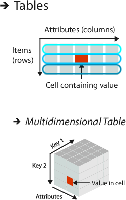
Tables
Networks & Trees
Fields
Geometry
Items
Items (nodes)
Grids
Items
Attributes
Links
Positions
Positions
Attributes (both for items and links)
Attributes
Types of Datasets
Munzner identifies 4 basic types of datasets, each specified by some collection of the preceding data types:
Tables
This is the typical spread sheet data. Of particular interest is the notion of tidy data (Hadley Wickham):
Each variable must have its own column.
Each observation must have its own row.
Each value must have its own cell.
Tabular data also includes multidimensional tables (data hypercubes; tensors) that have composite keys.
Fields and Sampling Grids
The field dataset type concerns data that varies continuously and not discretely over some (geometric) domain.
We may distinguish between scalar fields that assign one attribute value to each point, and vector fields or even tensor fields that assign a vector (or matrix, or tensor) of values to each point.
Examples:Temperature, altitude, water depth,wind direction, local coordinate frames, stress tensors.
Core requirement for interacting with field data is to have access to a determined sampling grid that discretizes the field information.
A type of field data over a 1-dimensional domain is time-varying data. Not all data that contains time attributes are time-varying, but data that requires time attributes to completely specify query keys are what we mean by time-varying.
An Overview of the Grammar of Graphics
Six layers of a specification
Wilkinson breaks up the full specification of a statistical graphic into 6 separate specification steps (and Hadley Wickham breaks it up further by introducing the notion of layers)
Data: a set of operations that create variables from datasets.
Trans: variable transformations (eg rank).
Scale: scale transformations (eg log).
Coord: coordinate system (eg polar).
Element: graphical marks (points? lines?) and their aesthetic attributes (eg color)
Note that contour density plots are still a pending feature for Vega-Lite, and therefore still a pending feature for Altair. We could probably reproduce Wilkinson’s plot completely, but would have to compute the contour curves ourselves at considerable effort.