Lecture 1: Data Visualization
Today’s Visualization
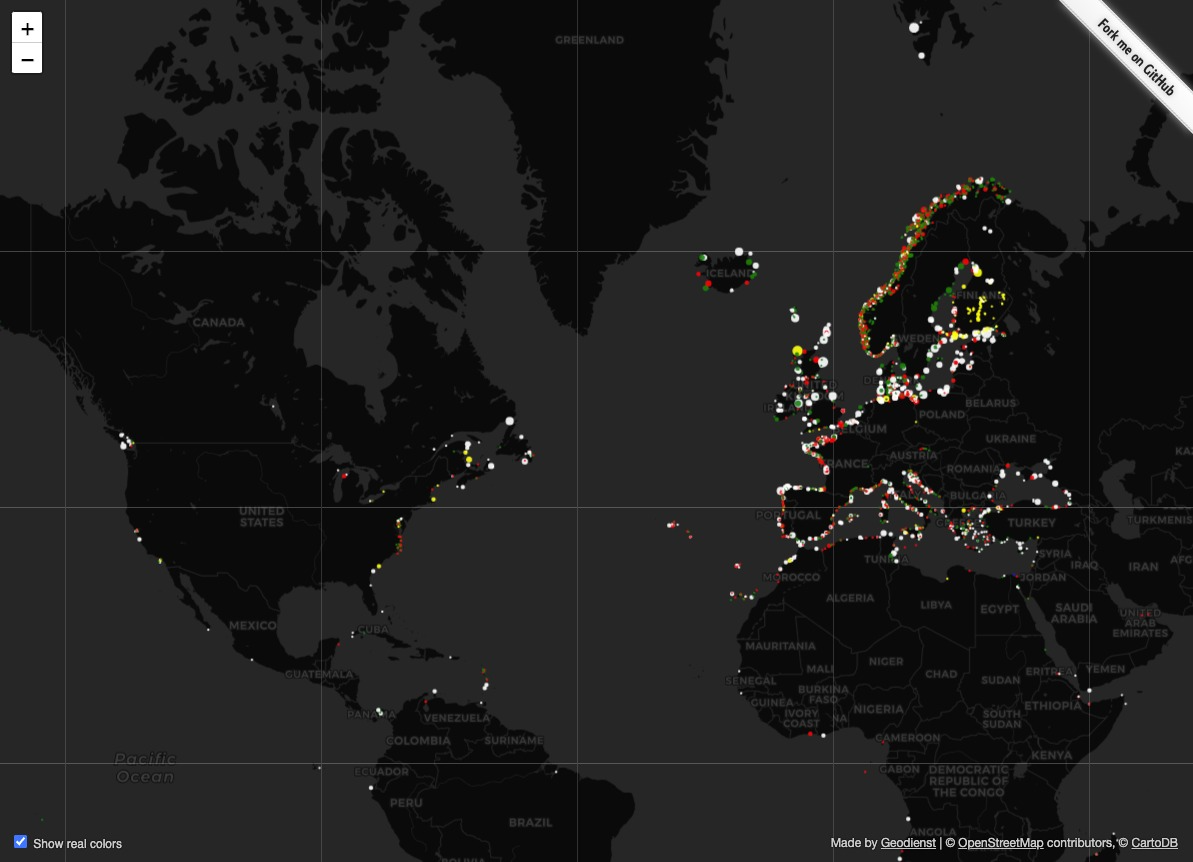

Lighthouses
Full animated world map at https://geodienst.github.io/lighthousemap/
- Color true to real lighthouse
- Timing of blinks true to real lighthouse
- Size of dot corresponds to visibility range
- Data drawn from OpenStreetMap – completion and correction through crowdsourcing
Related, and also excellent: https://twitter.com/i/status/1462095711508516865
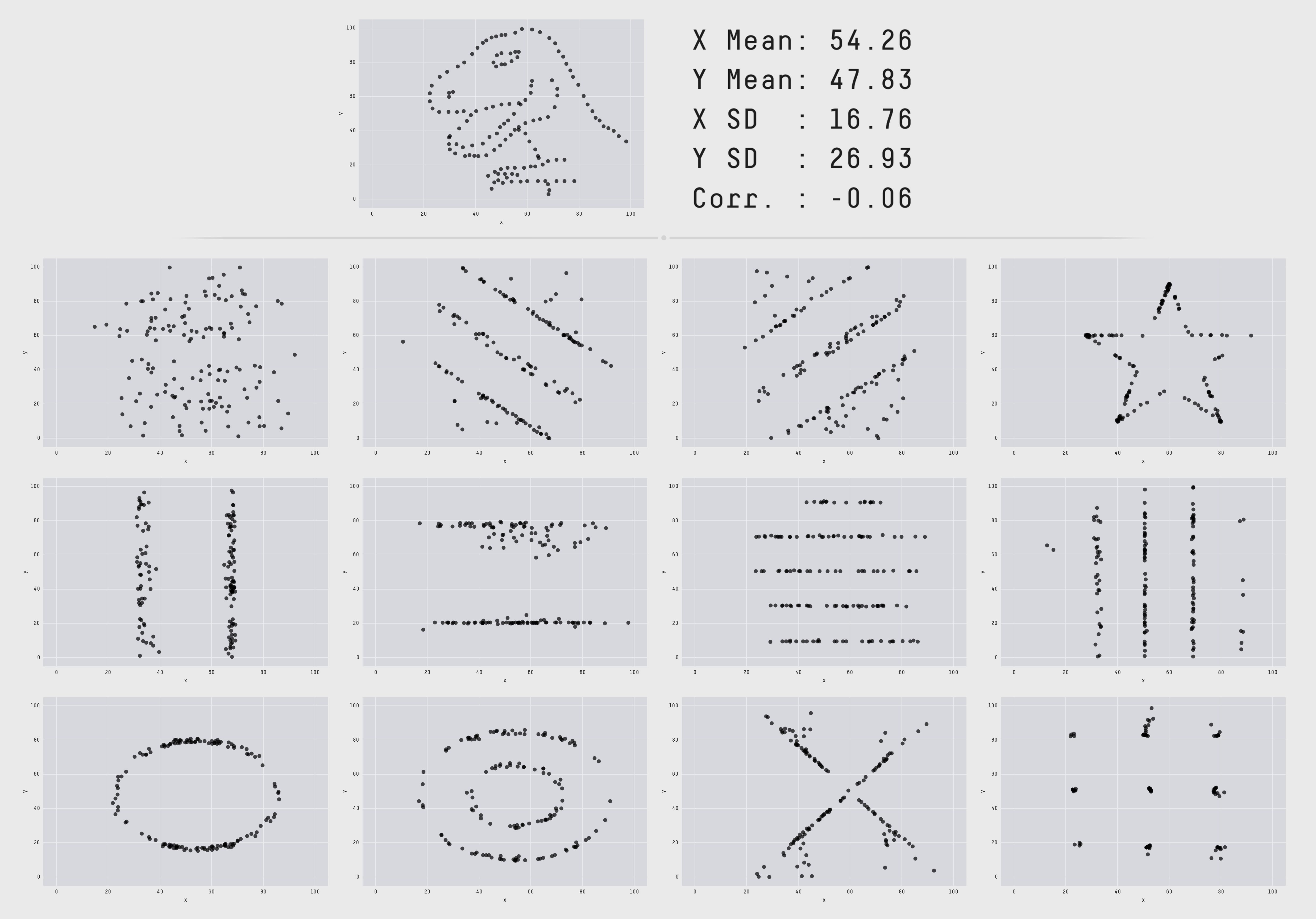
Why all the data?
Visual representation of datasets designed to help people carry out tasks more effectively.
Tamara Munzner
- Summaries inherently lose information
- 4 datasets, identical statistics
| Property | Value |
|---|---|
| Mean of x | 9 |
| Sample variance of x: \(s^2_x\) | 11 |
| Mean of y | 7.50 |
| Sample variance of y: \(s^2_y\) | 4.125 |
| Correlation between x and y | 0.816 |
| Linear regression line | \(y = 3.00 + 0.500x\) |
| Coefficient of determination of the linear regression: \(R^{2}\) | 0.67 |
Each value exact up to at least 2 decimal places.

Why all the data?
Visual representation of datasets designed to help people carry out tasks more effectively.
Tamara Munzner
Summaries inherently lose information
12 datasets, identical statistics
Is this a good graphic?
Tufte: Look at all that chart junk! So much decorations that do not directly encode data!
Kirk: cites Jen Christiansen, Graphics Editor at Scientific American. “I found that when I developed magazine graphics according to [Tufte’s] philosophy, they were most often met with a yawn. The reality is that Scientific American isn’t required reading. We need to engage readers, as well as inform them.”
Decorations provide context for the information – it is immediately apparent what the data is about (something something razors) without impacting the trustworthiness of the data display itself.

Is this a good graphic?
Very popular target as an example of a bad graph. The inverted y-axis is very often invoked as a condemning feature.
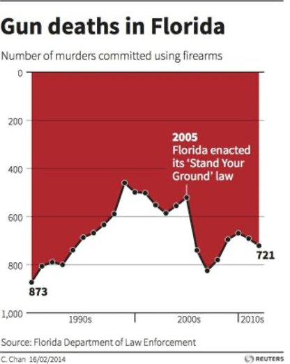
Is this a good graphic?
Very popular target as an example of a bad graph. The inverted y-axis is very often invoked as a condemning feature.
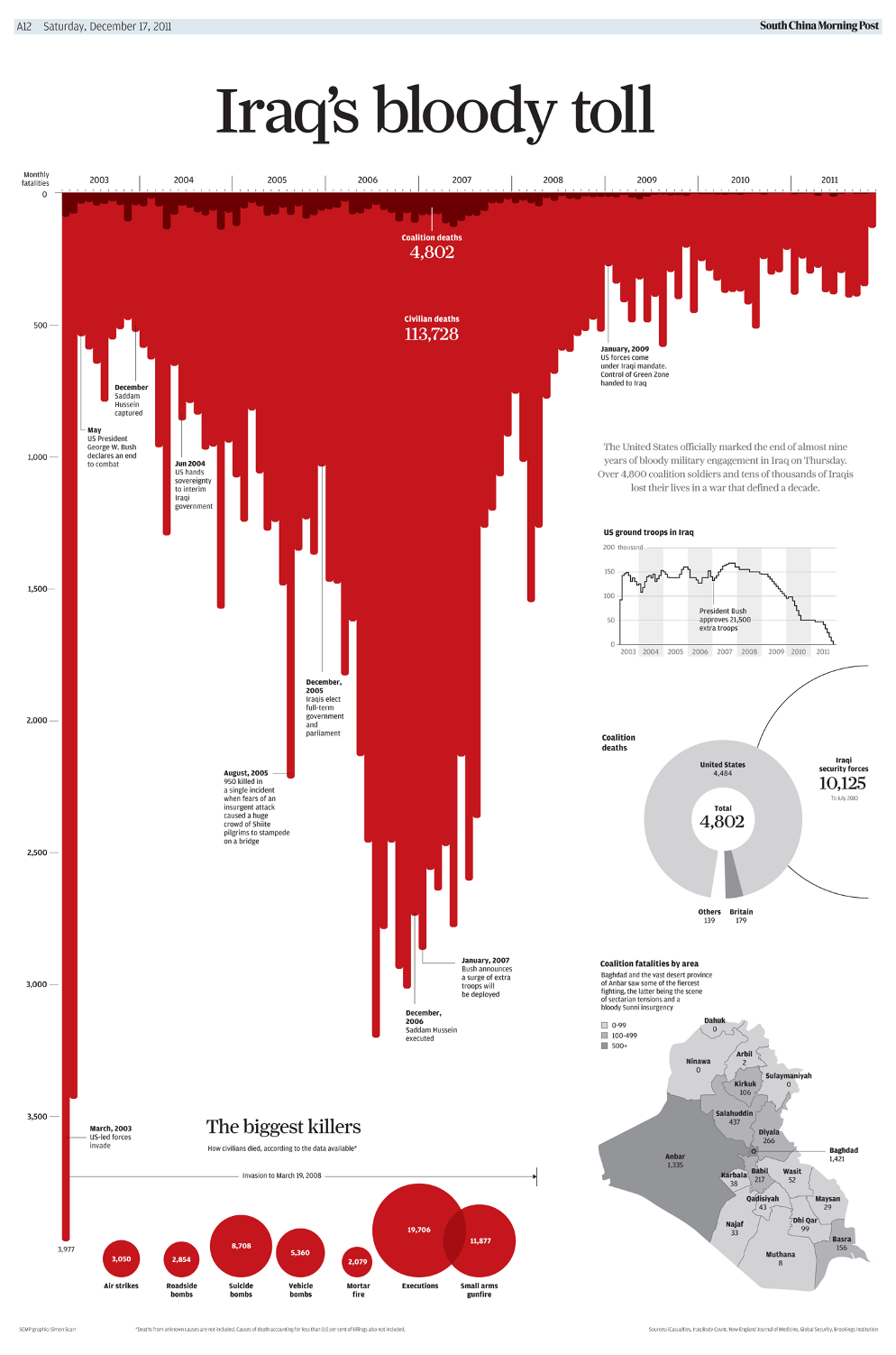
Kirk points out that it was designed to emulate another chart published earlier: “Iraq’s bloody toll”.
The red coloring and the inverted y-axis in combination are attempting to evoke a metaphor of blood dribbling down a wall.
Is this a good graphic?
Very popular target as an example of a bad graph. The inverted y-axis is very often invoked as a condemning feature.
Kirk points out that it was designed to emulate another chart published earlier: “Iraq’s bloody toll”.
The red coloring and the inverted y-axis in combination are attempting to evoke a metaphor of blood dribbling down a wall.
Question: Was the intended metaphor successful? In “Gun deaths in Florida”? In “Iraq’s bloody toll”? What could have been done differently to make the message more efficiently conveyed?
Python / matplotlib + seaborn

R / ggplot2

Python / plotnine
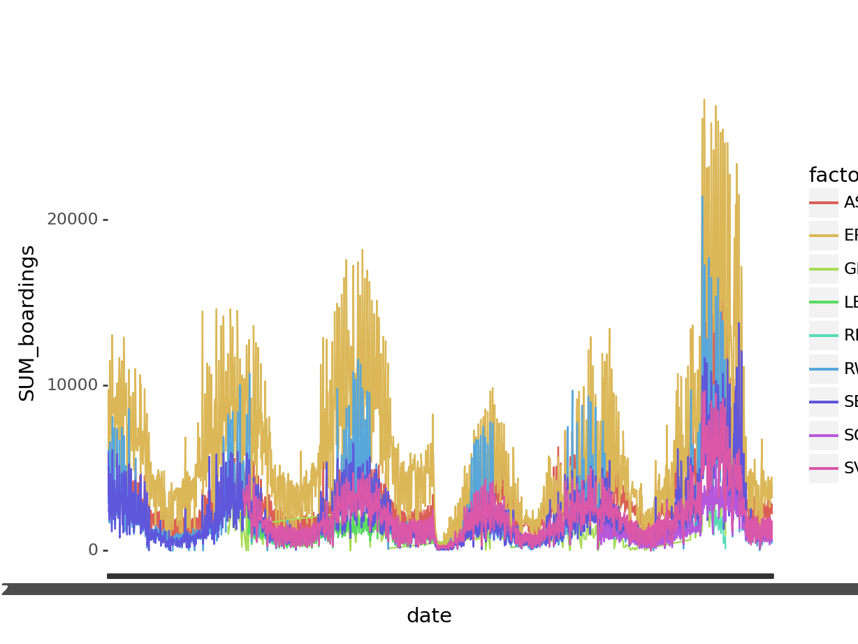
Code
import pandas
from plotnine import ggplot, geom_line, aes

ferry_url = "https://data.cityofnewyork.us/resource/t5n6-gx8c.csv?$select=date,route,SUM(boardings)&$group=date,route&$limit=1000000"
ferry = pandas.read_csv(ferry_url)

ggplot(ferry, aes("date","SUM_boardings", color="factor(route)", group="route")) + geom_line()
<ggplot: (687517027)>