In this document, we will show visualizations of the Palmer Penguins dataset. We will be using the CSV version stored at https://gist.github.com/slopp/ce3b90b9168f2f921784de84fa445651 .
Visualization Example
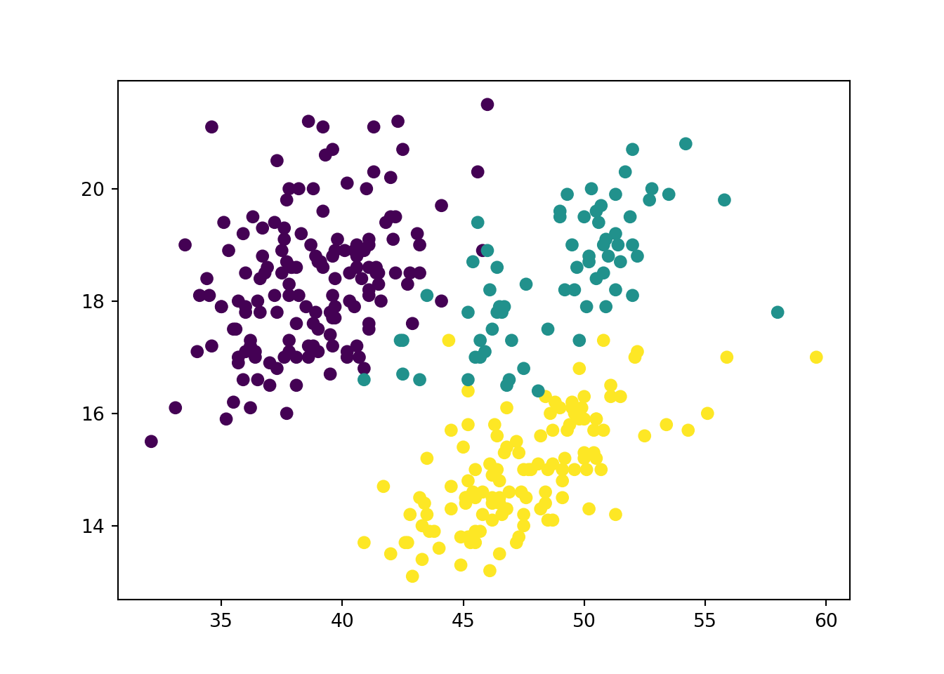
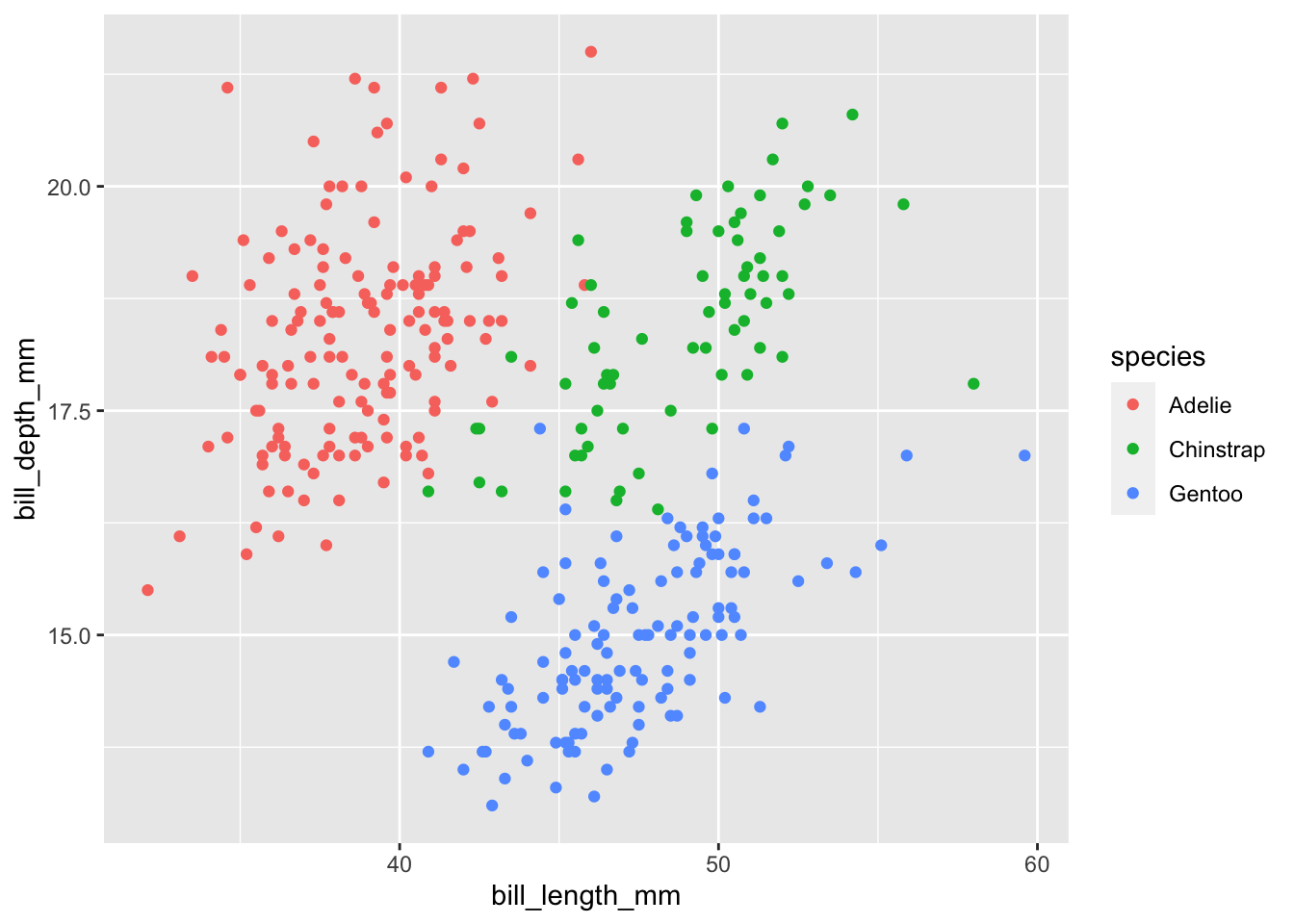
In each platform, we will make a scatterplot of bill_length_mm vs. bill_depth_mm colored by species.
Rows: 344 Columns: 9
── Column specification ────────────────────────────────────────────────────────
Delimiter: ","
chr (3): species, island, sex
dbl (6): rowid, bill_length_mm, bill_depth_mm, flipper_length_mm, body_mass_...

ℹ Use `spec()` to retrieve the full column specification for this data.
ℹ Specify the column types or set `show_col_types = FALSE` to quiet this message.
Both raw D3.js and ObservableJS will need the exact same declarations to get access to the D3 library and to load the dataset we want, so for now we extract that declaration to a separate code block.
y = d3.scaleLinear().domain(d3.extent(palmerpenguins, d =>parseFloat(d.bill_depth_mm))).range([height,0]) // <- because screen coordinates go down, so reverse scalesvg.append("g").call(d3.axisLeft(y))
Code
c = d3.scaleOrdinal().domain(["Adelie","Chinstrap","Gentoo"]).range(["#ffff00","#ff00ff","#00ffff"])svg.append("g").selectAll("circle").data(palmerpenguins).enter().append("circle").attr("cx", d =>x(parseFloat(d.bill_length_mm))).attr("cy", d =>y(parseFloat(d.bill_depth_mm))).attr("r",5).style("fill", d =>c(d.species))
---title: "Example of Quarto and different platforms"format: htmlengine: knitr---## Dataset usedIn this document, we will show visualizations of the [Palmer Penguins dataset](https://github.com/allisonhorst/palmerpenguins). We will be using the CSV version stored at https://gist.github.com/slopp/ce3b90b9168f2f921784de84fa445651 .## Visualization ExampleIn each platform, we will make a scatterplot of `bill_length_mm` vs. `bill_depth_mm` colored by species.## Python / matplotlib```{python}from matplotlib import pyplotimport pandaspalmerpenguins = pandas.read_csv("https://gist.githubusercontent.com/slopp/ce3b90b9168f2f921784de84fa445651/raw/4ecf3041f0ed4913e7c230758733948bc561f434/penguins.csv")palmerpenguins["species"] = palmerpenguins["species"].astype("category")pyplot.scatter("bill_length_mm", "bill_depth_mm", c=palmerpenguins["species"].cat.codes, data=palmerpenguins)```## Python / altair```{python}import altairimport pandaspalmerpenguins = pandas.read_csv("https://gist.githubusercontent.com/slopp/ce3b90b9168f2f921784de84fa445651/raw/4ecf3041f0ed4913e7c230758733948bc561f434/penguins.csv")altair.Chart(palmerpenguins).mark_point().encode( x="bill_length_mm", y="bill_depth_mm", color="species").interactive()```## R / ggplot2```{r}library(tidyverse)palmerpenguins =read_csv("https://gist.githubusercontent.com/slopp/ce3b90b9168f2f921784de84fa445651/raw/4ecf3041f0ed4913e7c230758733948bc561f434/penguins.csv")ggplot(palmerpenguins, aes(bill_length_mm, bill_depth_mm, color=species)) +geom_point()```## Preparation for both the JavaScript optionsBoth raw D3.js and ObservableJS will need the exact same declarations to get access to the D3 library and to load the dataset we want, so for now we extract that declaration to a separate code block.```{ojs}d3 =require("d3@7")palmerpenguins = d3.csv("https://gist.githubusercontent.com/slopp/ce3b90b9168f2f921784de84fa445651/raw/4ecf3041f0ed4913e7c230758733948bc561f434/penguins.csv")```## JS / d3.js::: {#svg}:::```{ojs}width =300height =300margin_top =30margin_bottom =30margin_left =30margin_right =30svg = d3.select("#svg").append("svg").attr("width", width+margin_left+margin_right).attr("height", height+margin_top+margin_bottom).append("g").attr("transform",`translate(${margin_left},${margin_top})`)x = d3.scaleLinear().domain(d3.extent(palmerpenguins, d =>parseFloat(d.bill_length_mm))).range([0, width])svg.append("g").attr("transform",`translate(0, ${height})`).call(d3.axisBottom(x))y = d3.scaleLinear().domain(d3.extent(palmerpenguins, d =>parseFloat(d.bill_depth_mm))).range([height,0]) // <- because screen coordinates go down, so reverse scalesvg.append("g").call(d3.axisLeft(y))c = d3.scaleOrdinal().domain(["Adelie","Chinstrap","Gentoo"]).range(["#ffff00","#ff00ff","#00ffff"])svg.append("g").selectAll("circle").data(palmerpenguins).enter().append("circle").attr("cx", d =>x(parseFloat(d.bill_length_mm))).attr("cy", d =>y(parseFloat(d.bill_depth_mm))).attr("r",5).style("fill", d =>c(d.species))```## JS / ObservableJS```{ojs}Plot.dot(palmerpenguins, {x:"bill_length_mm",y:"bill_depth_mm",stroke:"species",fill:"species"}).plot()```